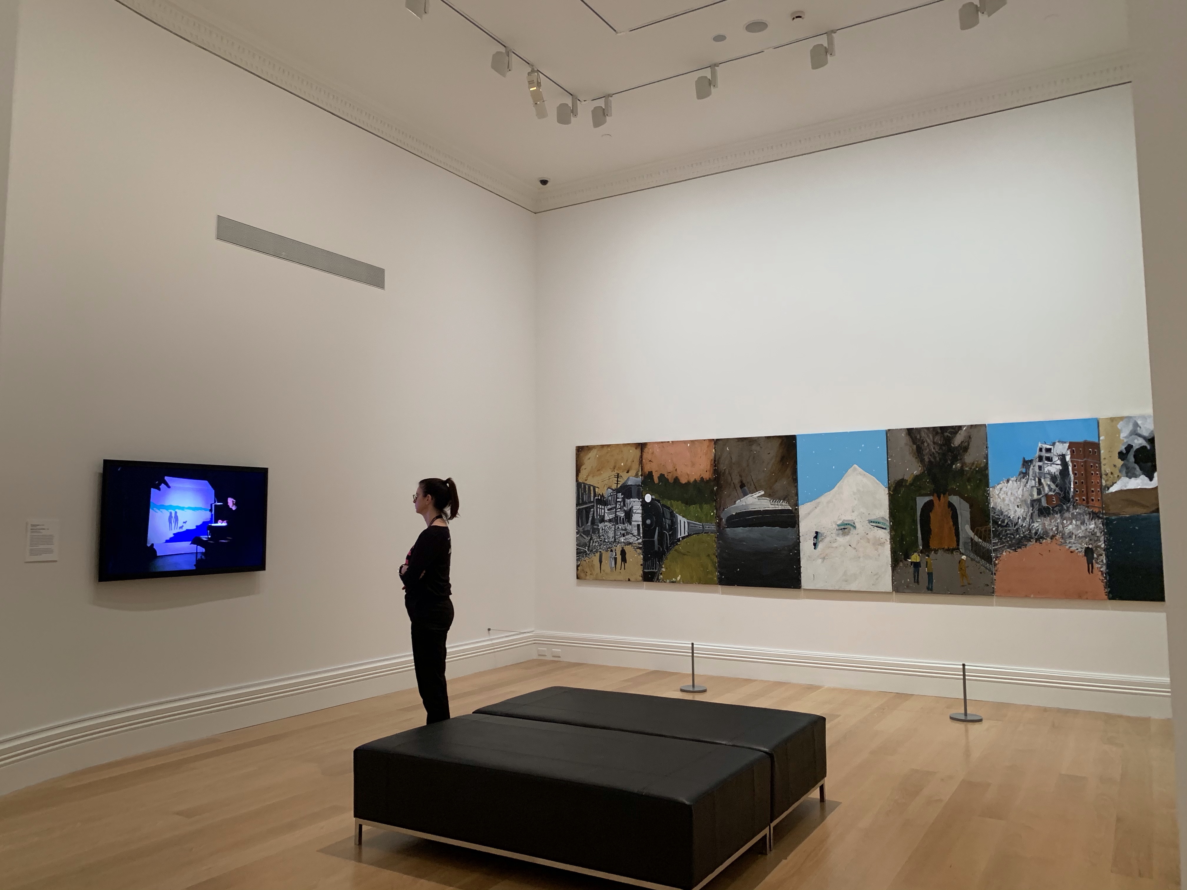
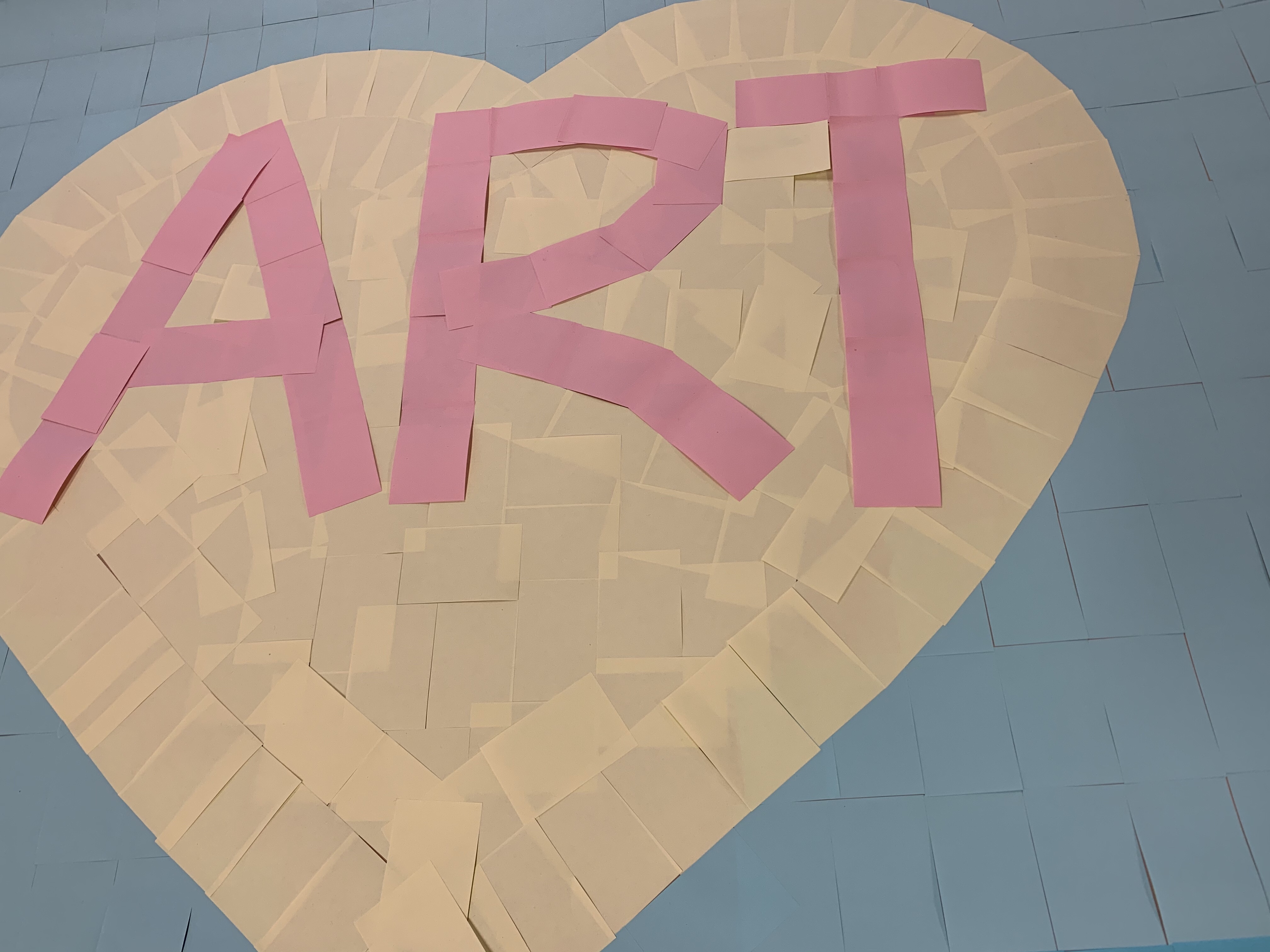
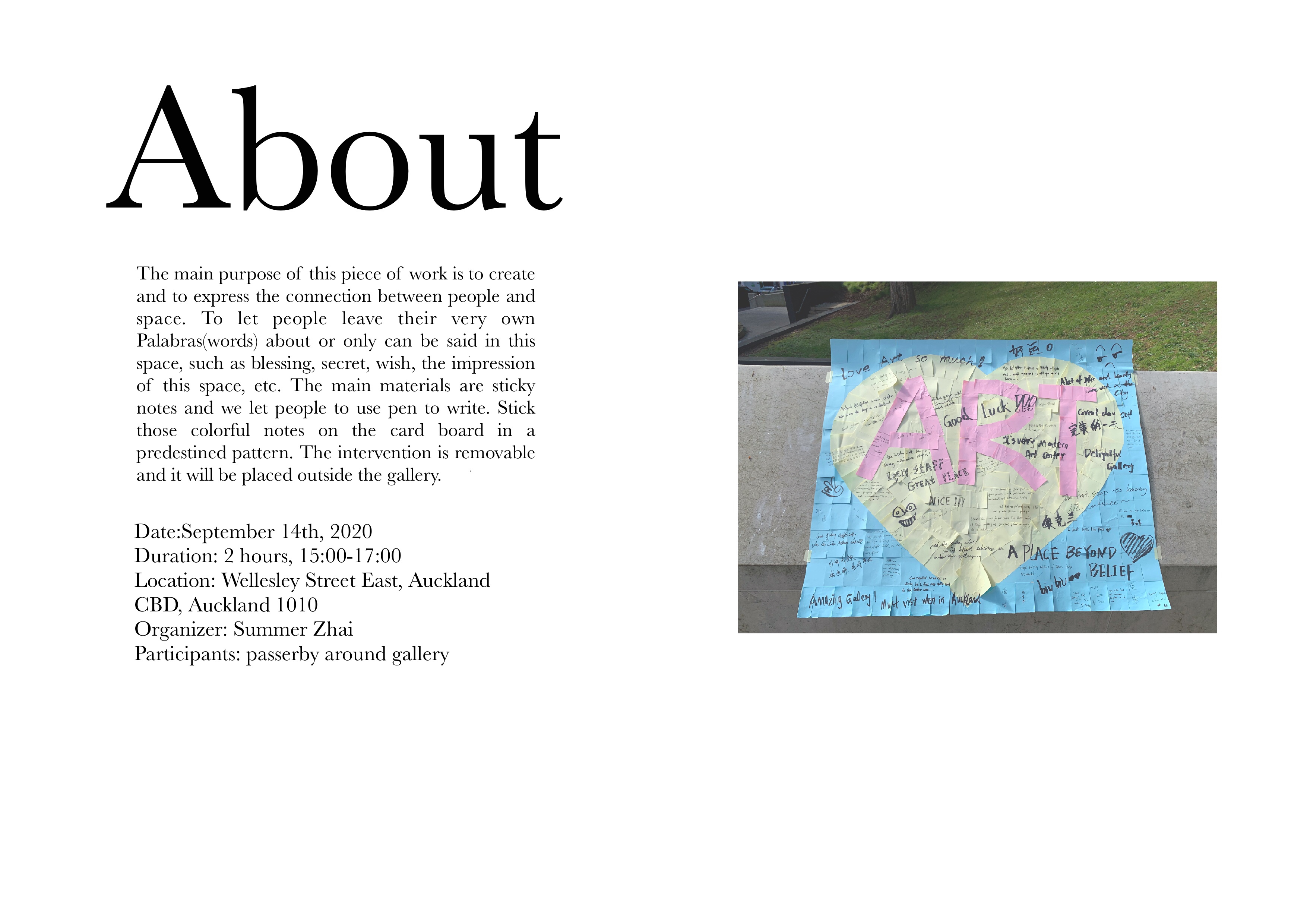
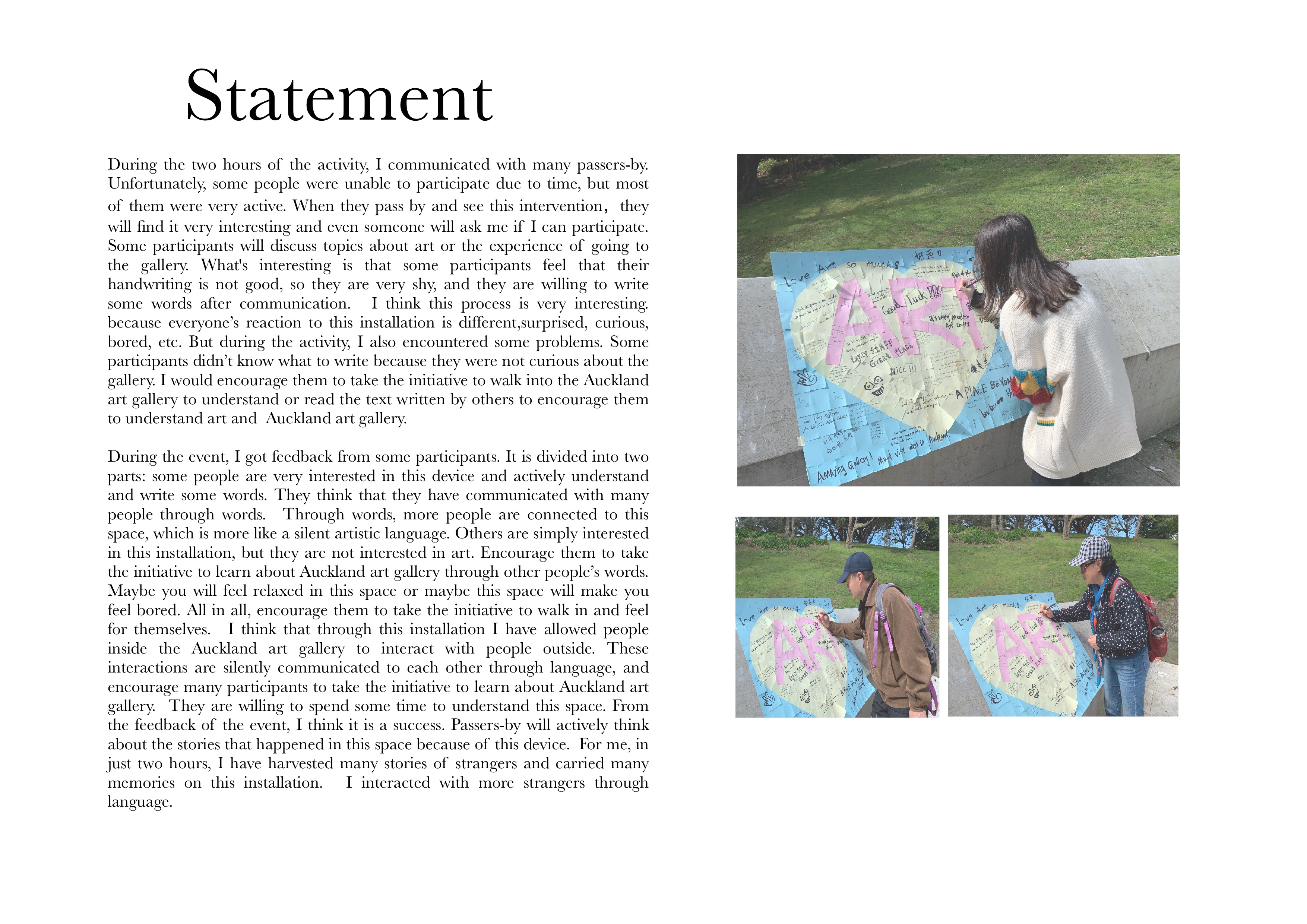
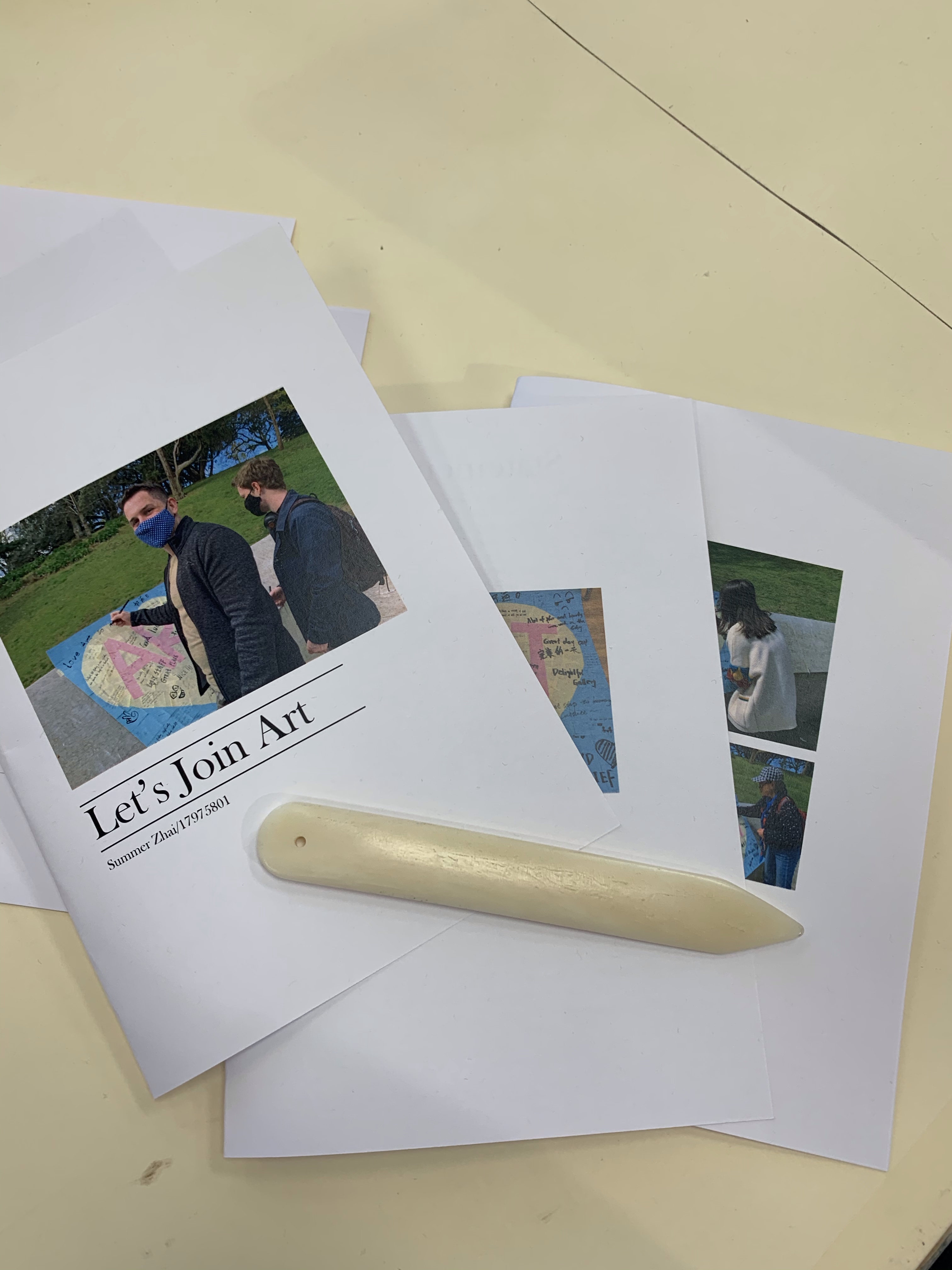
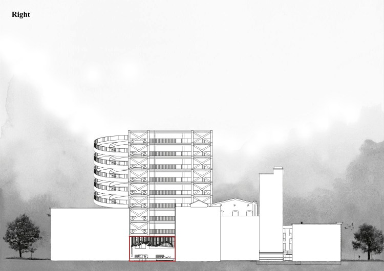
URBAN ITINERARY: CINEMATIC SPACE
Week 1: Site Cinematic Device and Site Visit
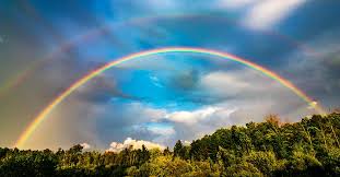
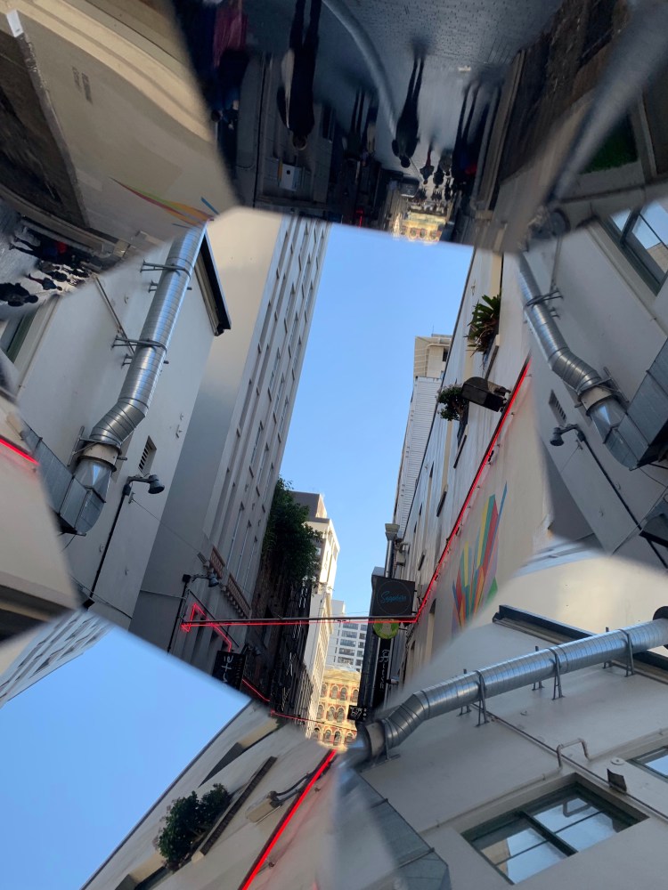
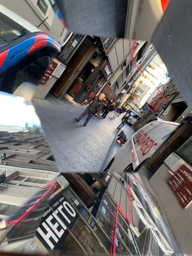
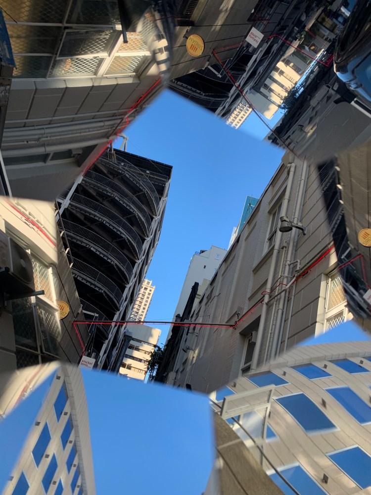
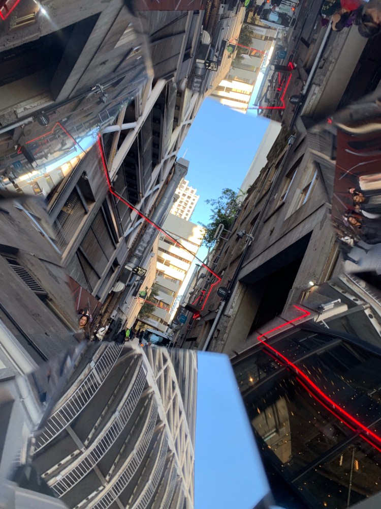
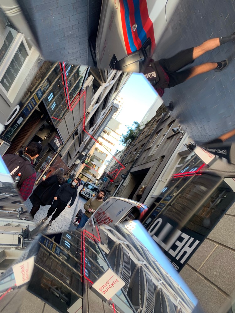
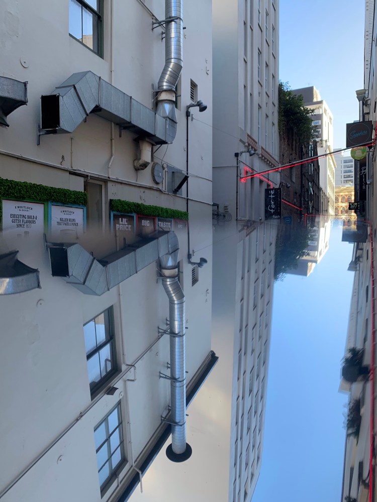
When people look into a mirror, they see an image of themselves behind the glass. That image results from light rays encountering the shiny surface and bouncing back, or reflecting, providing a “mirror image.” People commonly think of the reflection as being reversed left to right; however, this is a misconception. If you face north and look straight into a mirror, the east side of your face is still on the east side of the image, and the same is true for the west side. The mirror does not reverse the image left to right; it reverses it front to back. For example, if you are facing north, your reflection is facing south.
Week 2: Scene Transitions


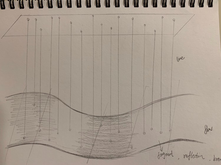
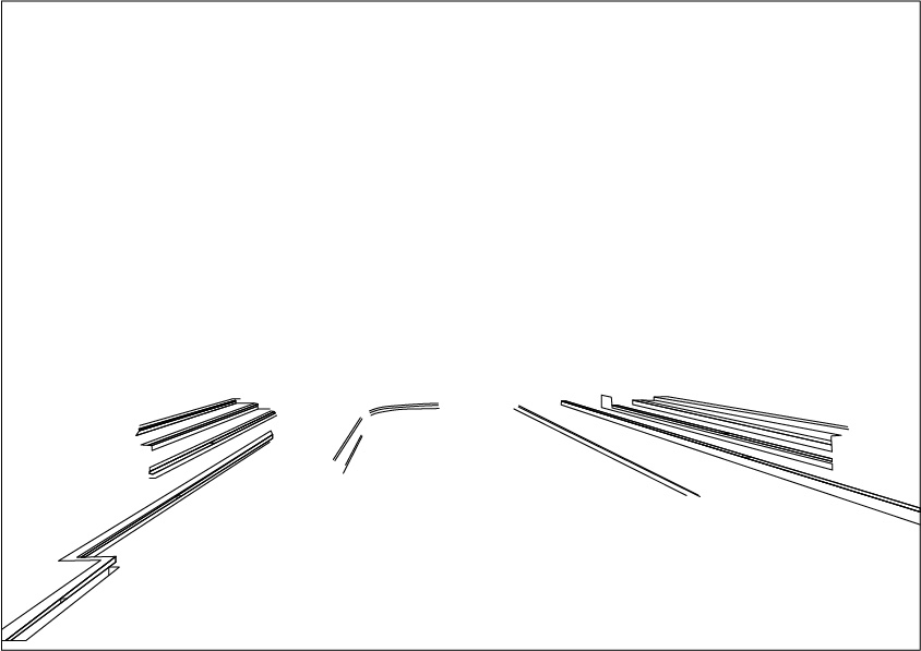
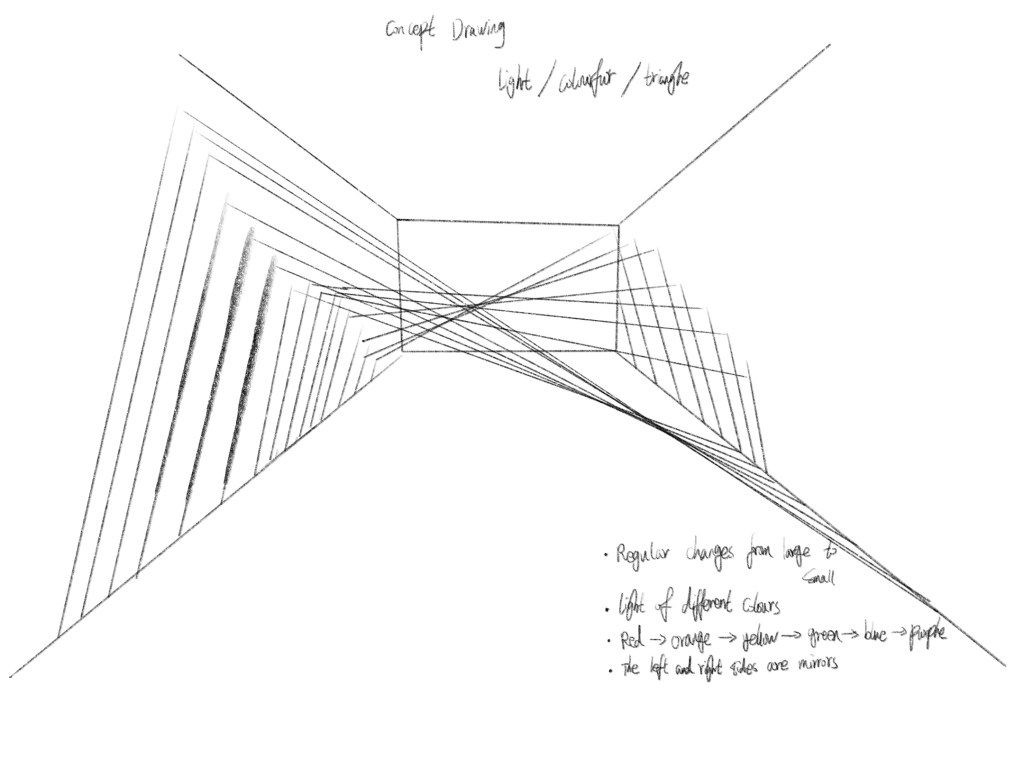
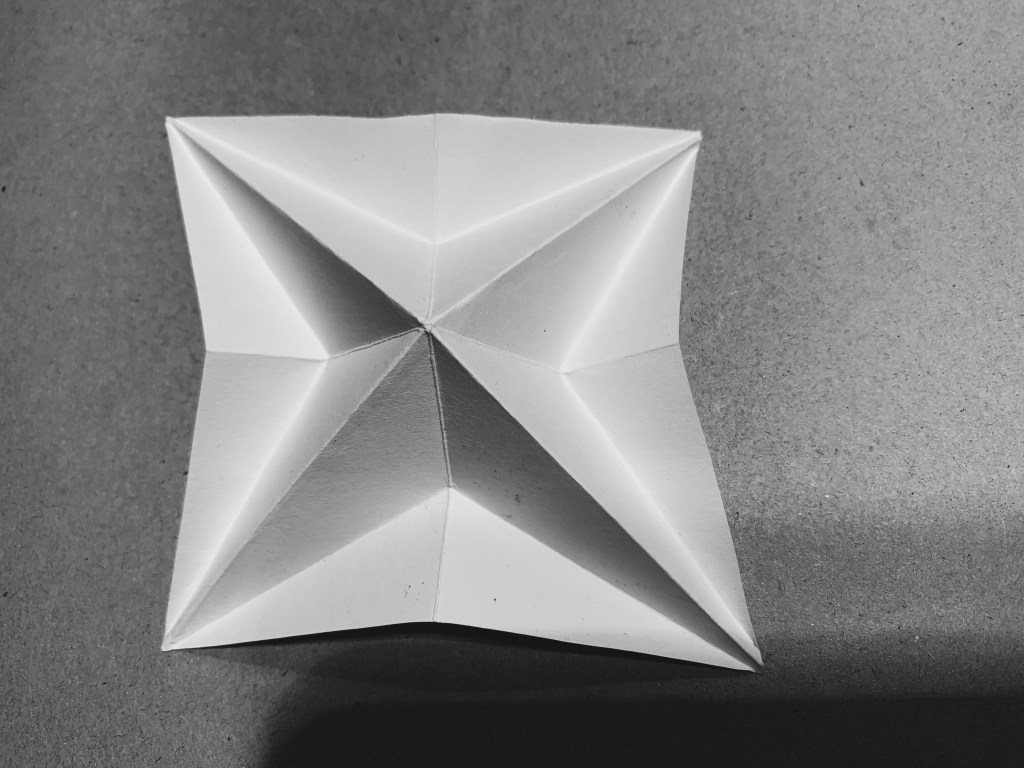
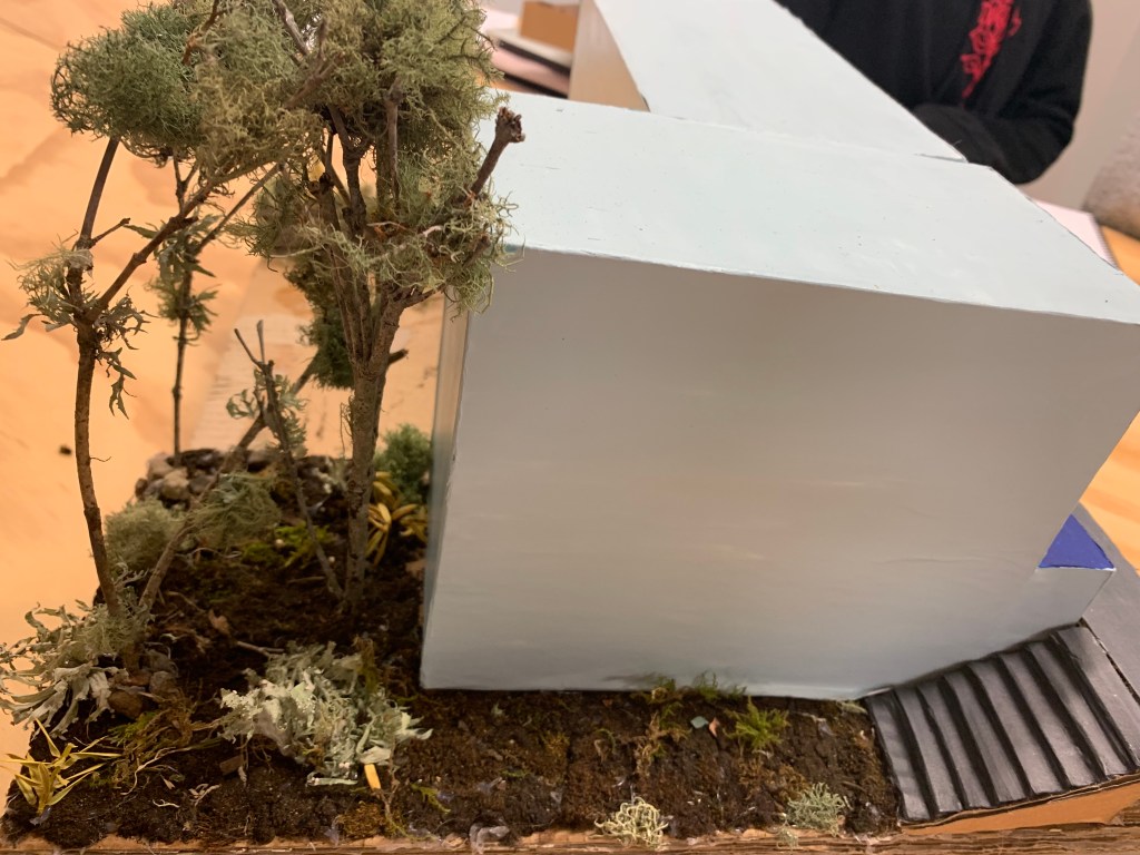
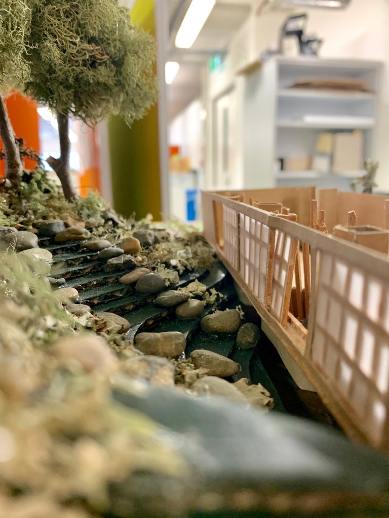
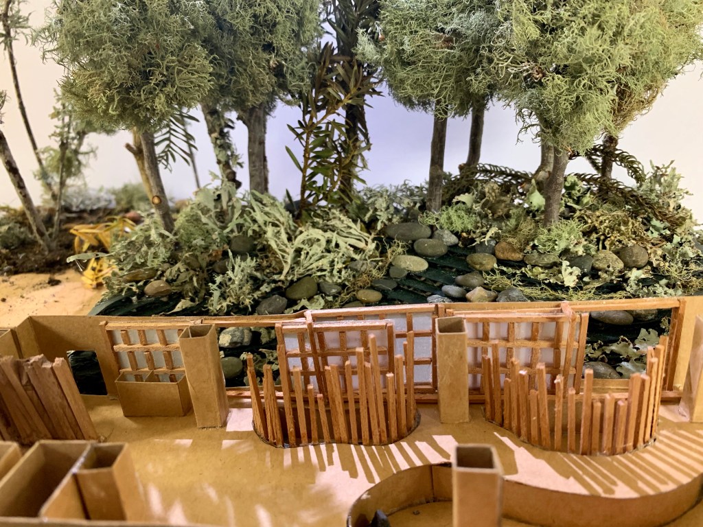
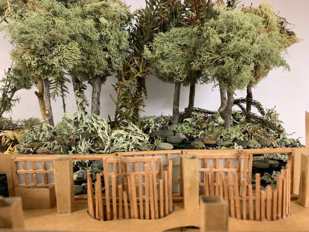
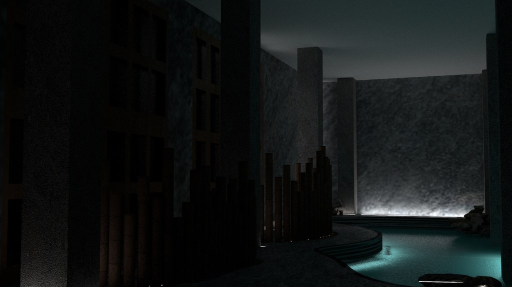
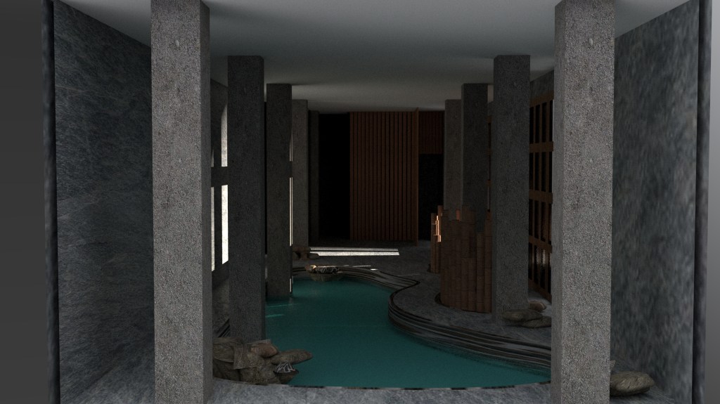
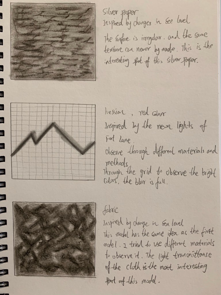
I tried to combine my model with the space. The curved plane at the bottom is like sea level, and the upper line is like sunlight shining into the sea.
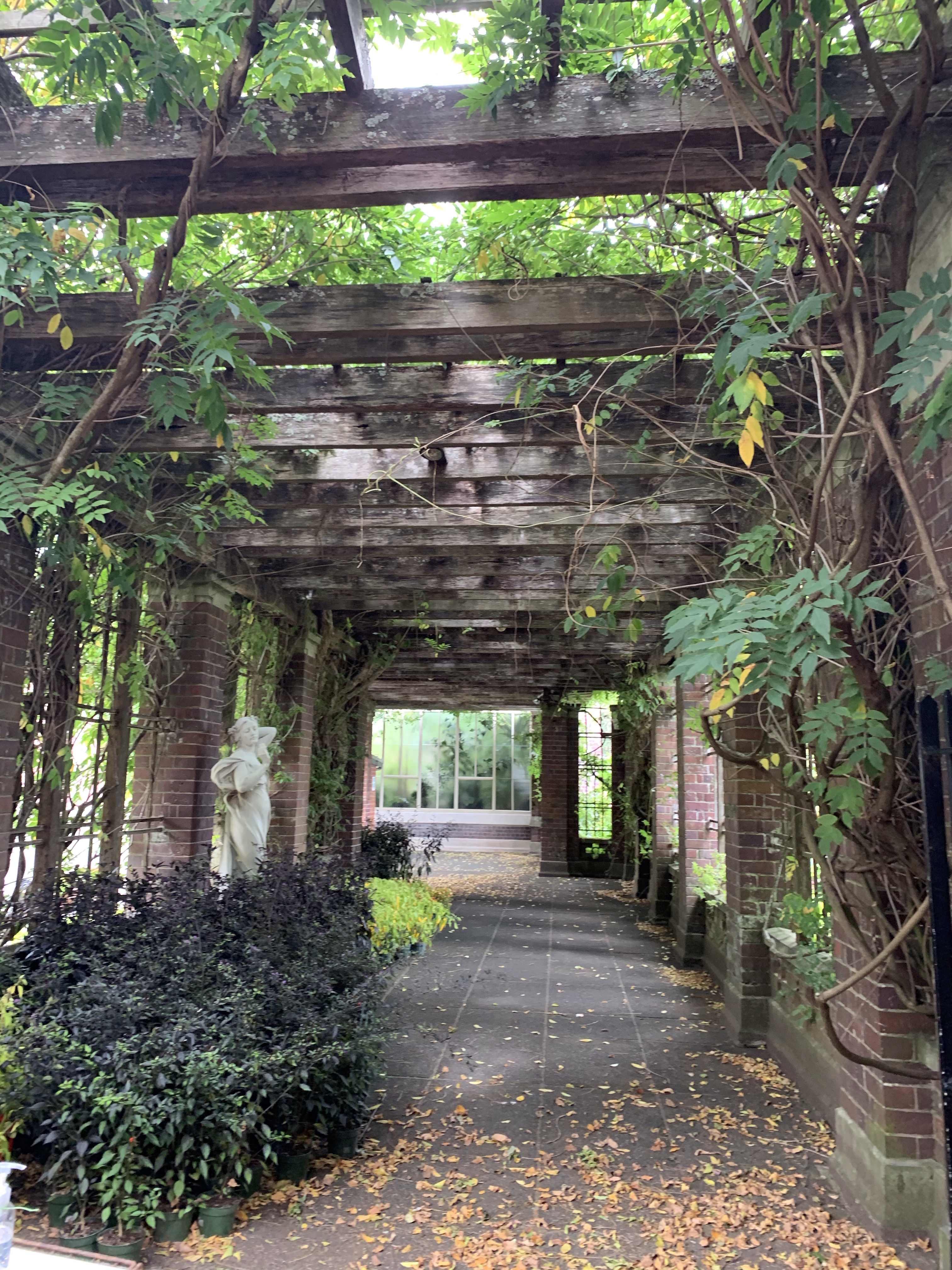
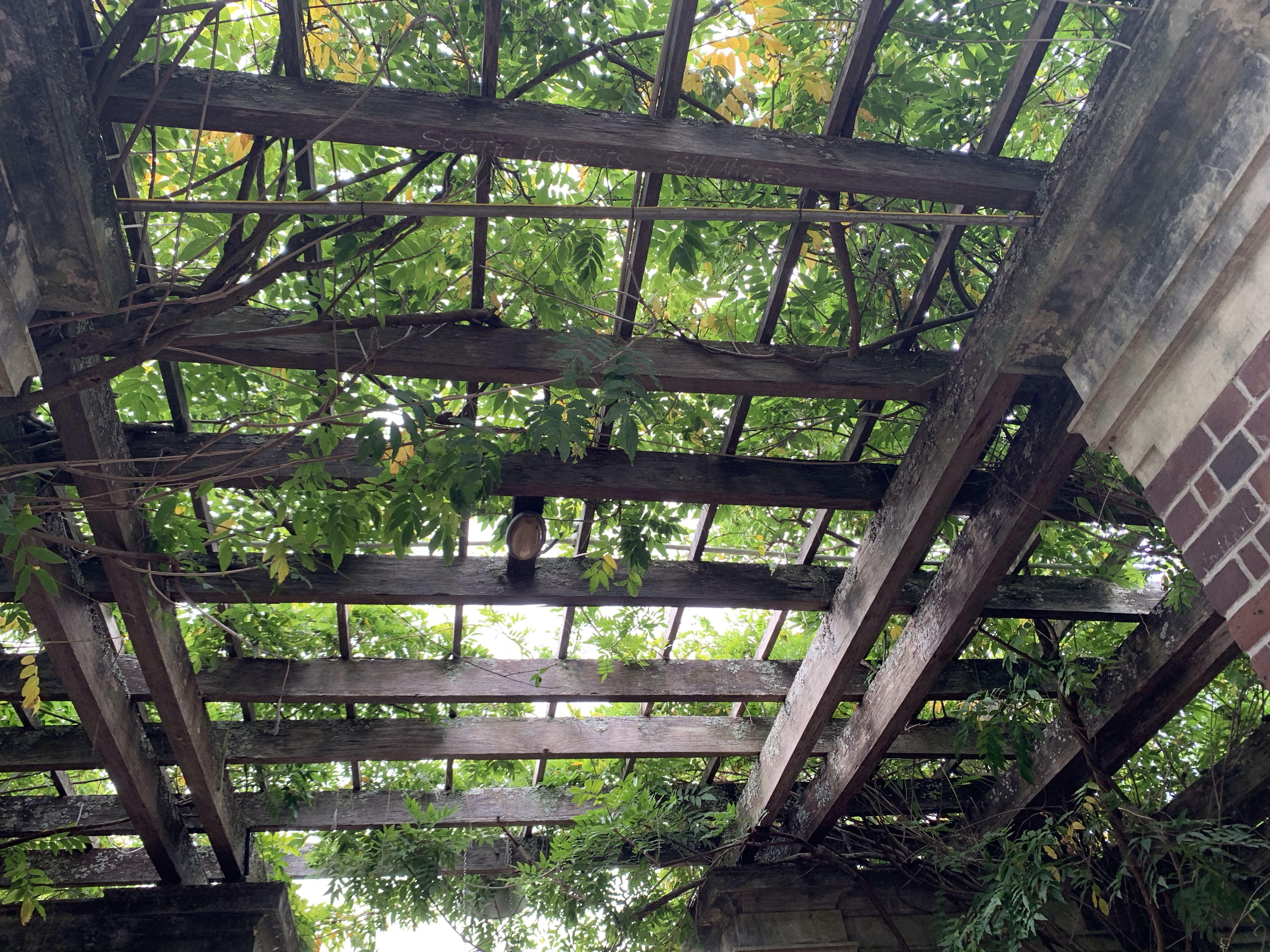
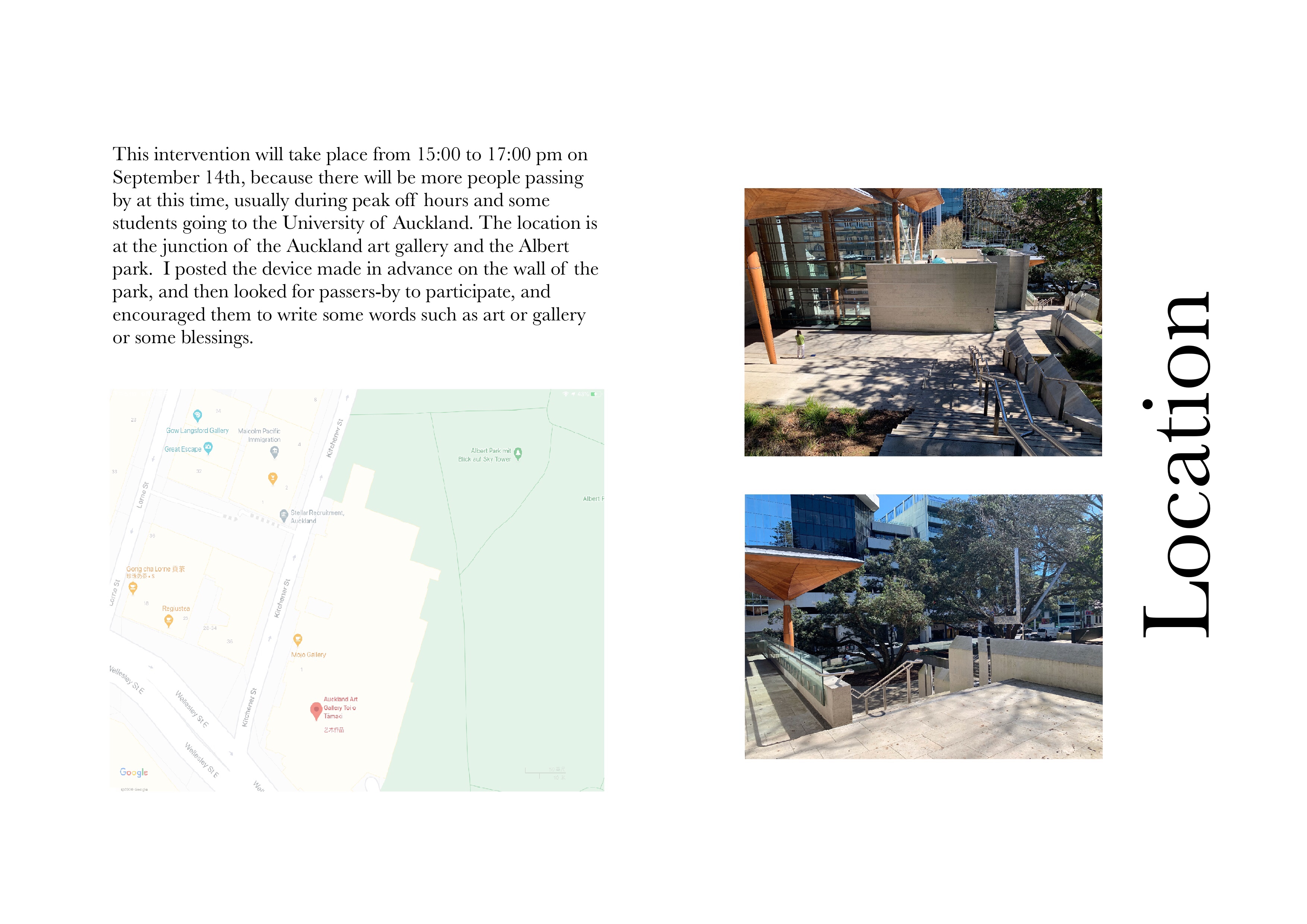
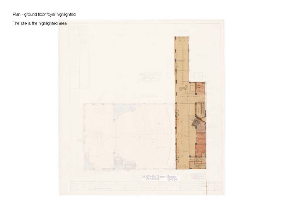
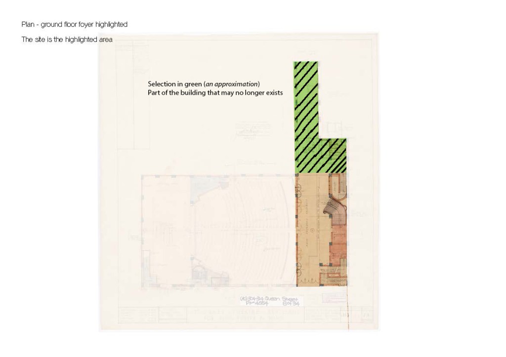
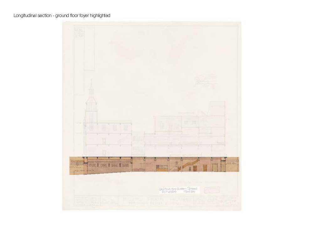
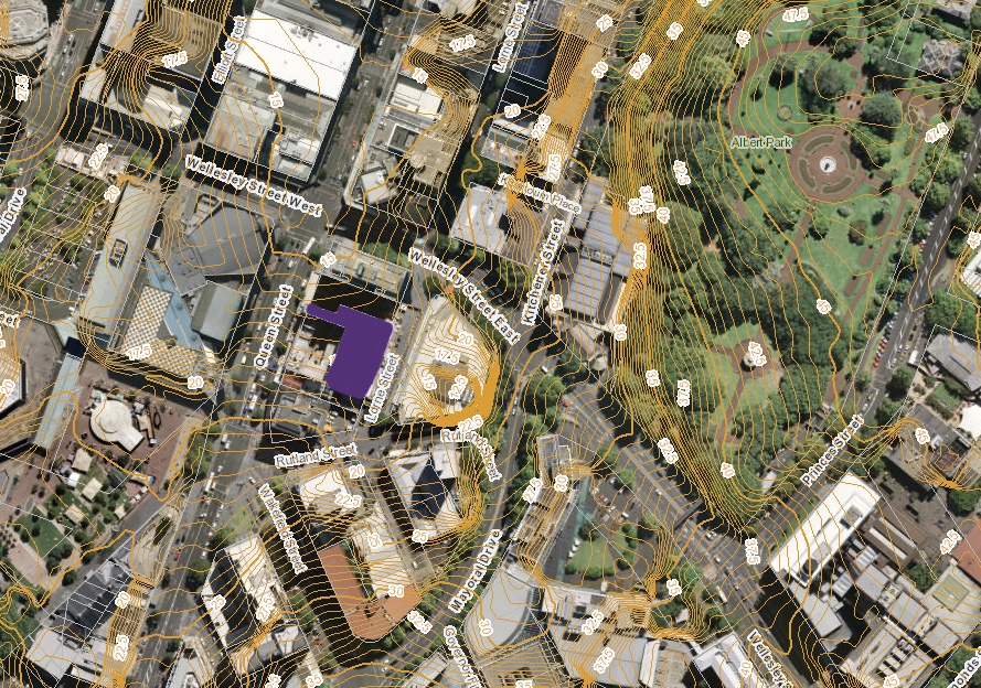
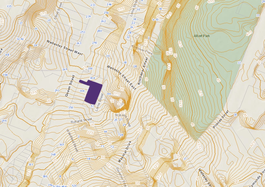
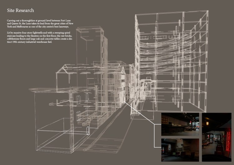
Site Research
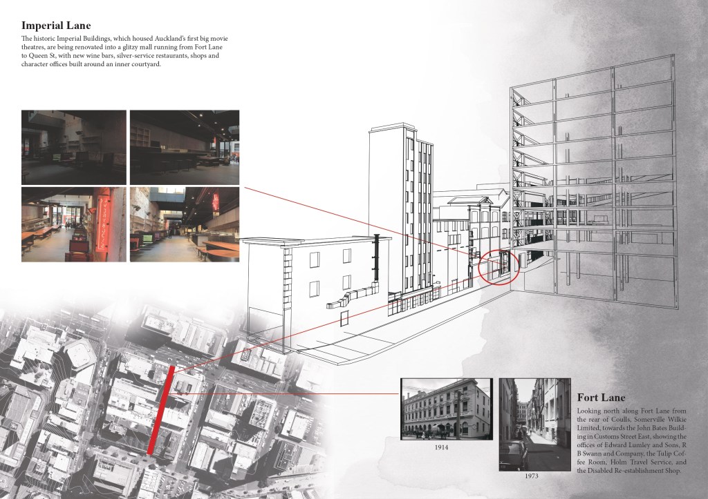
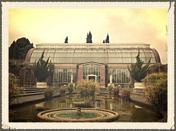
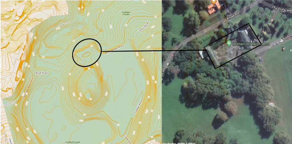
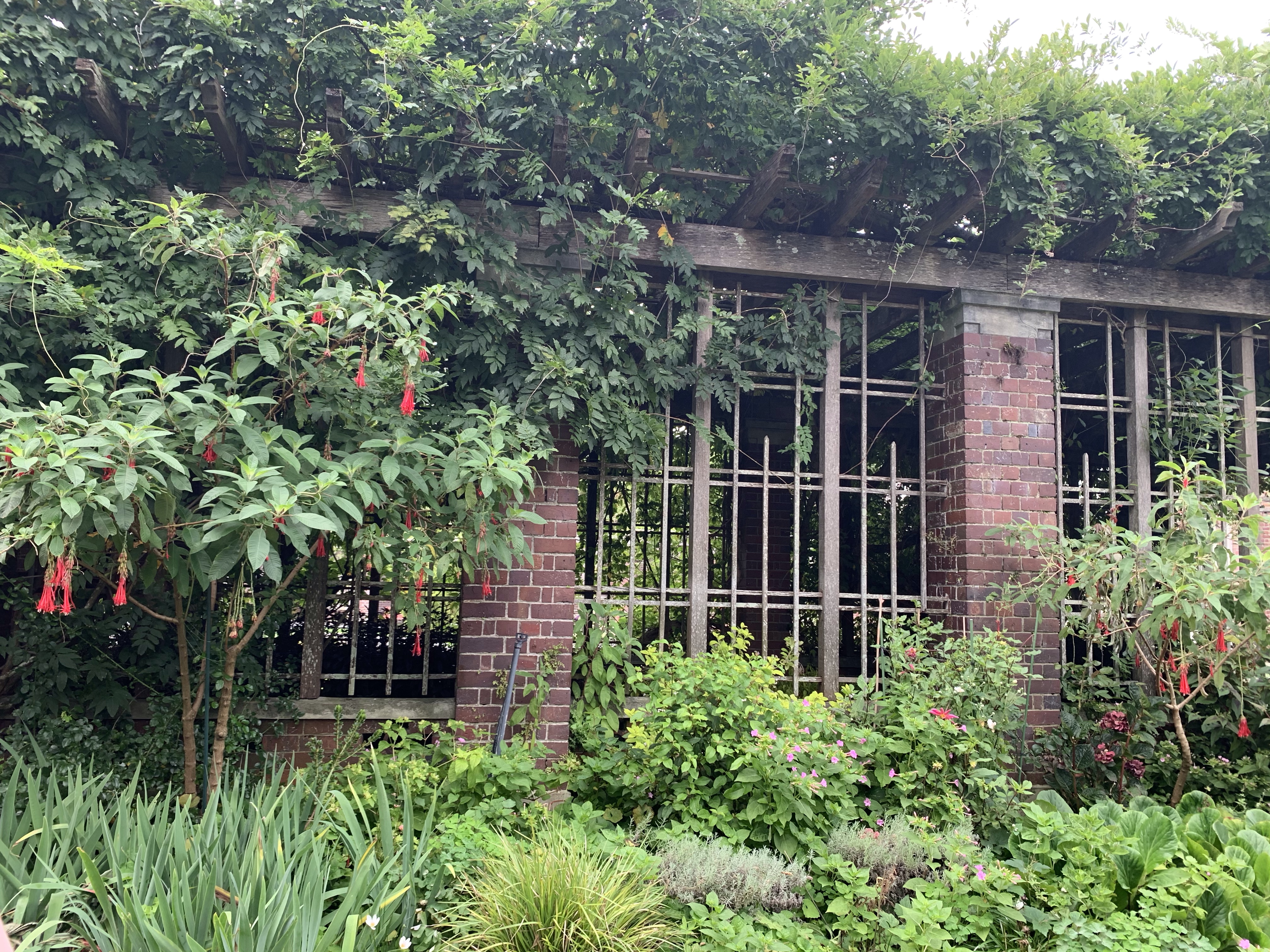
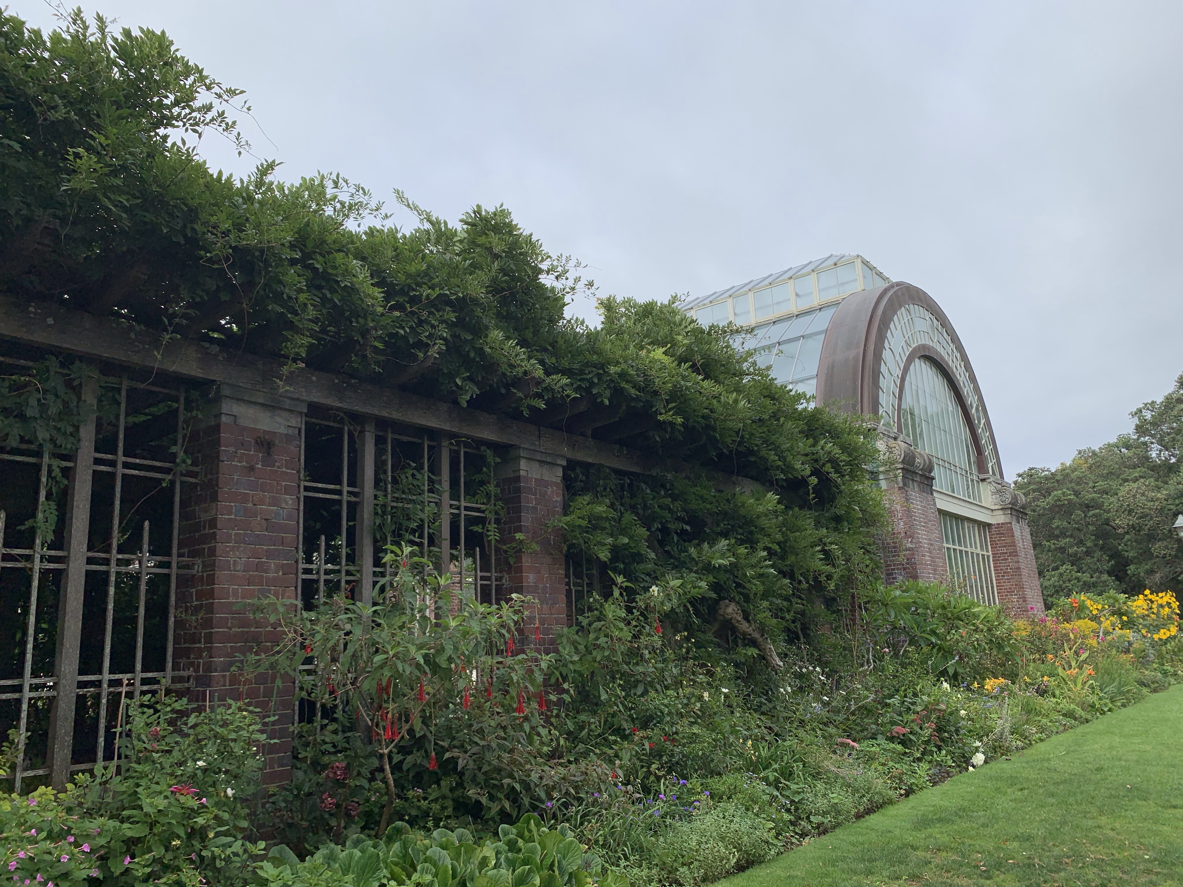
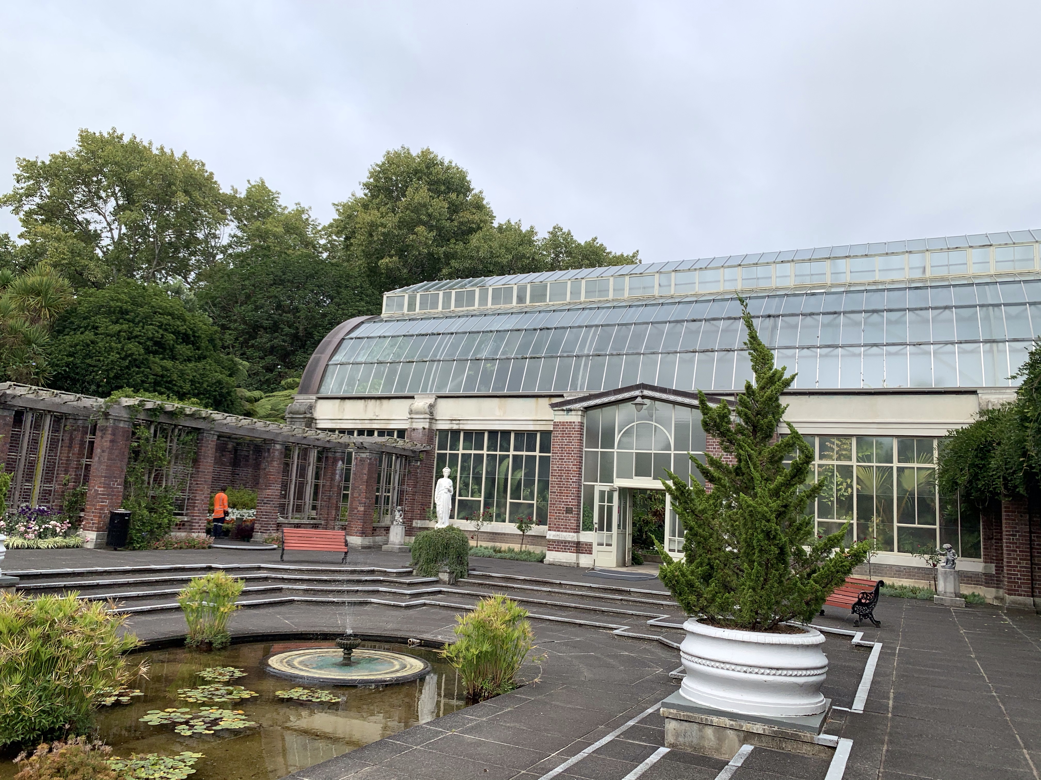
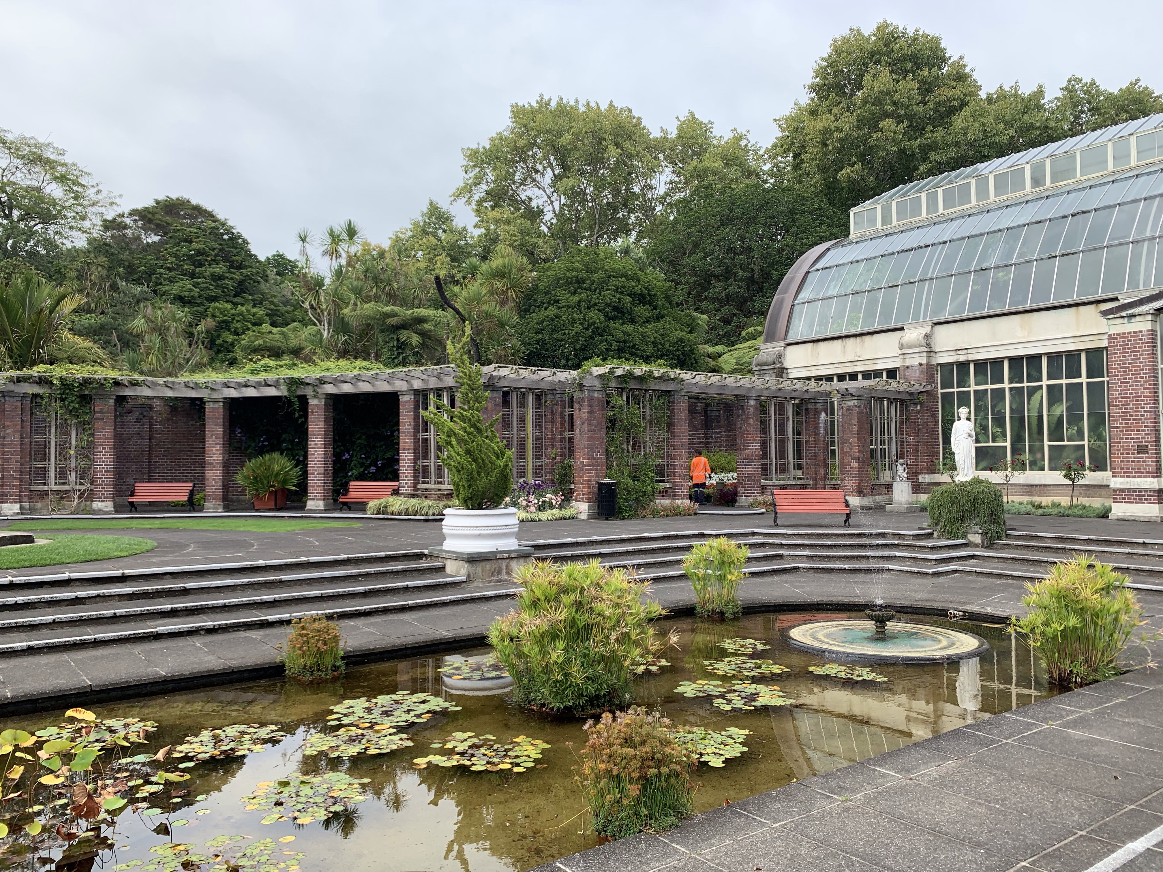
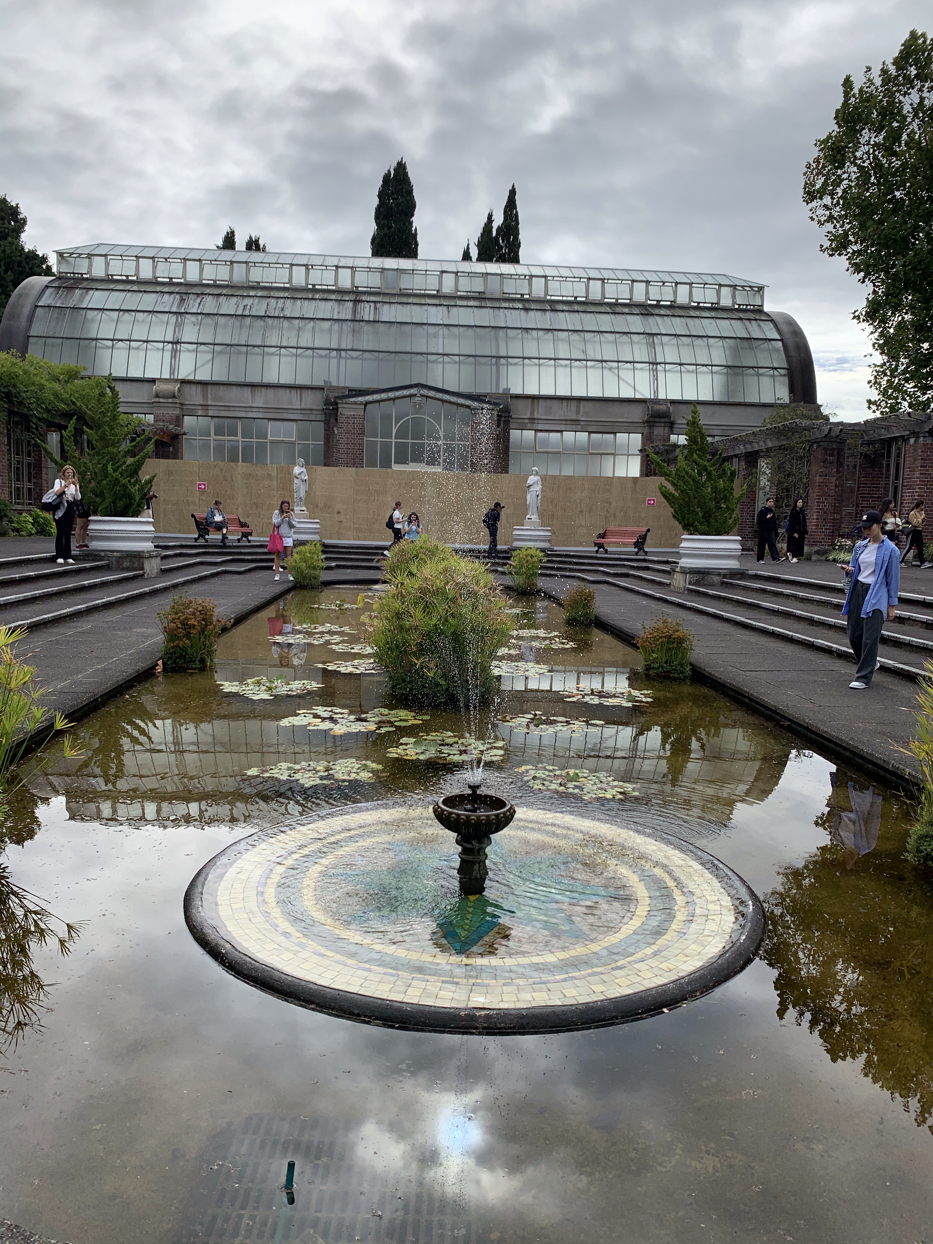
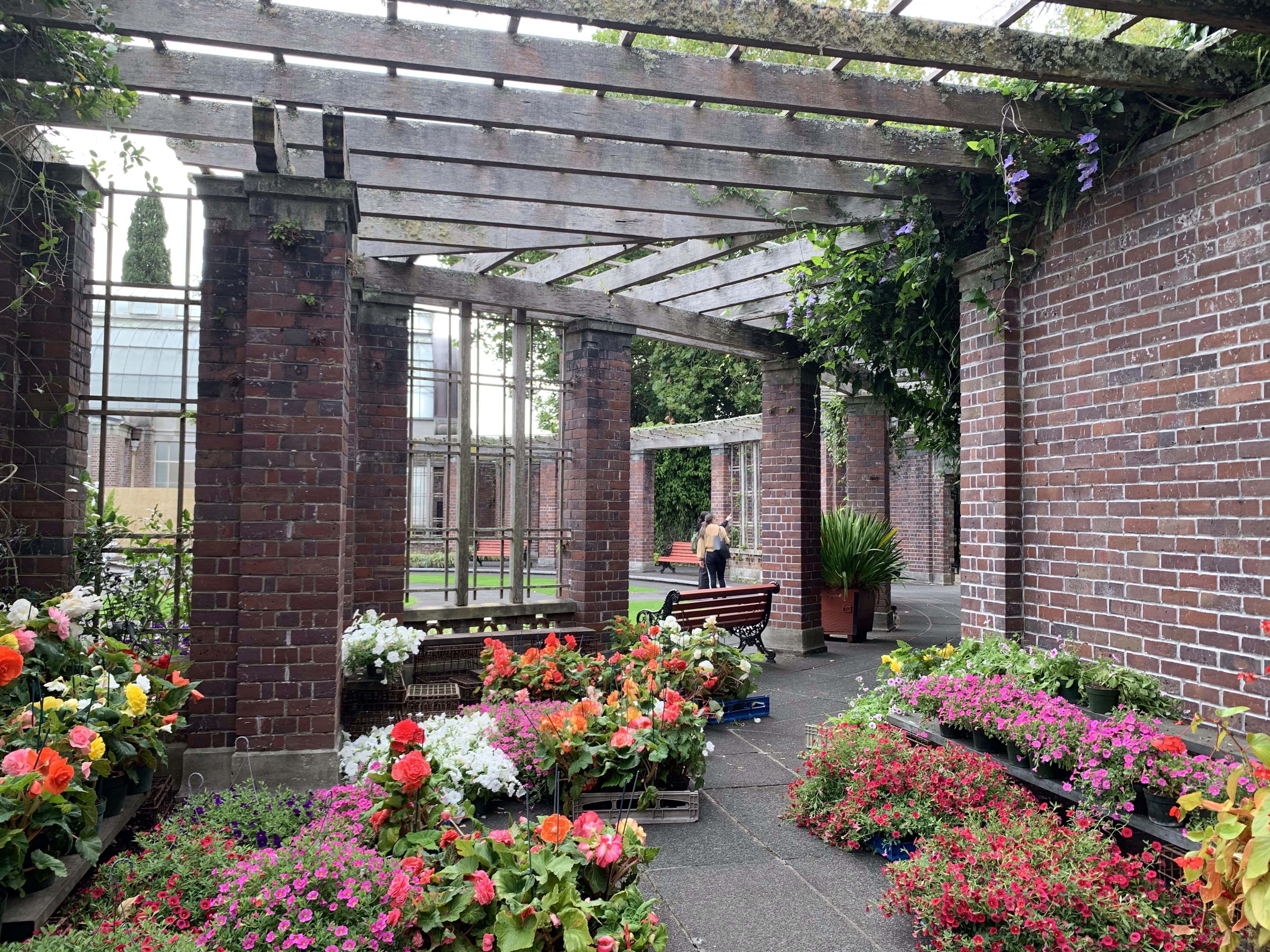
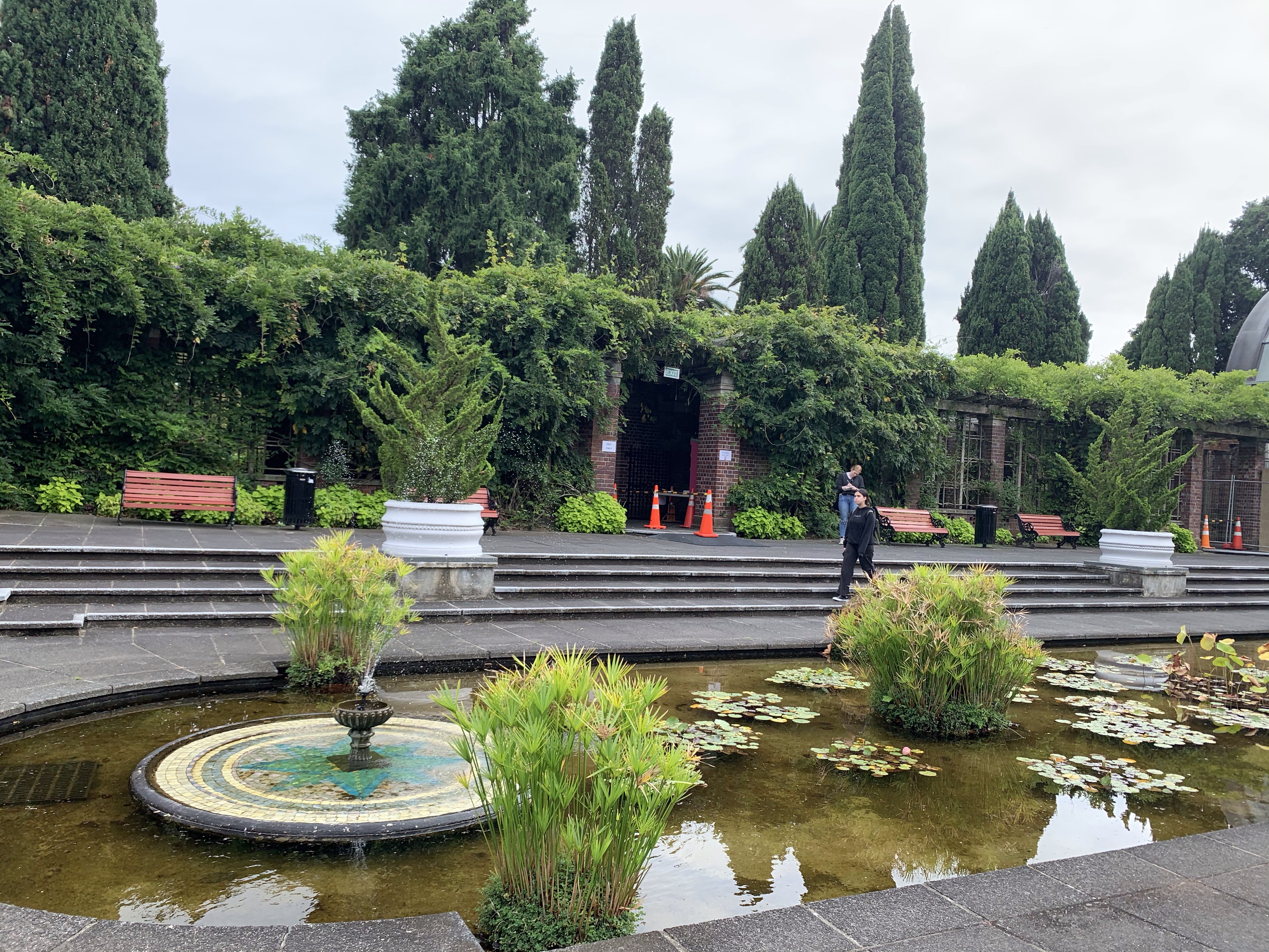
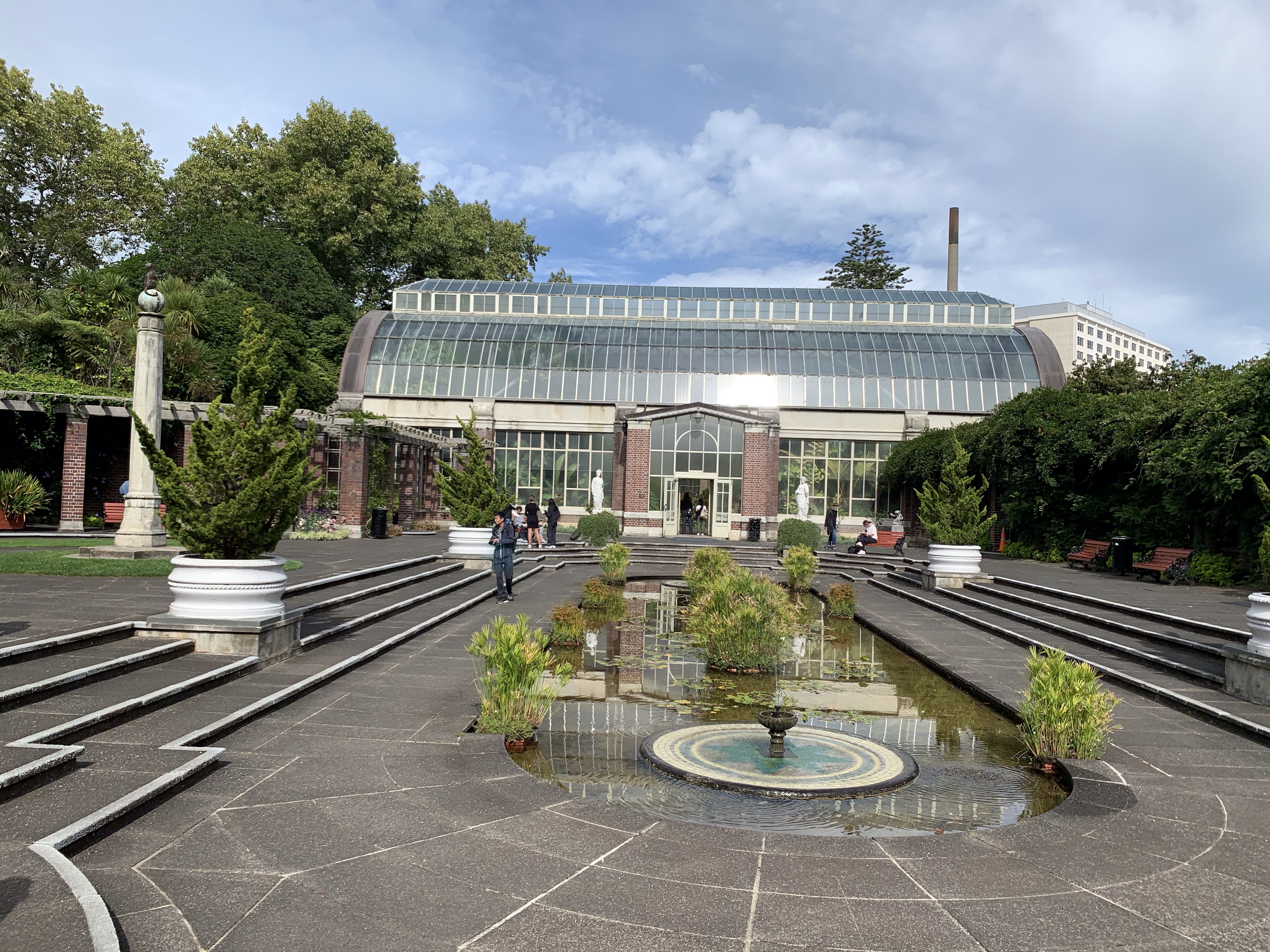
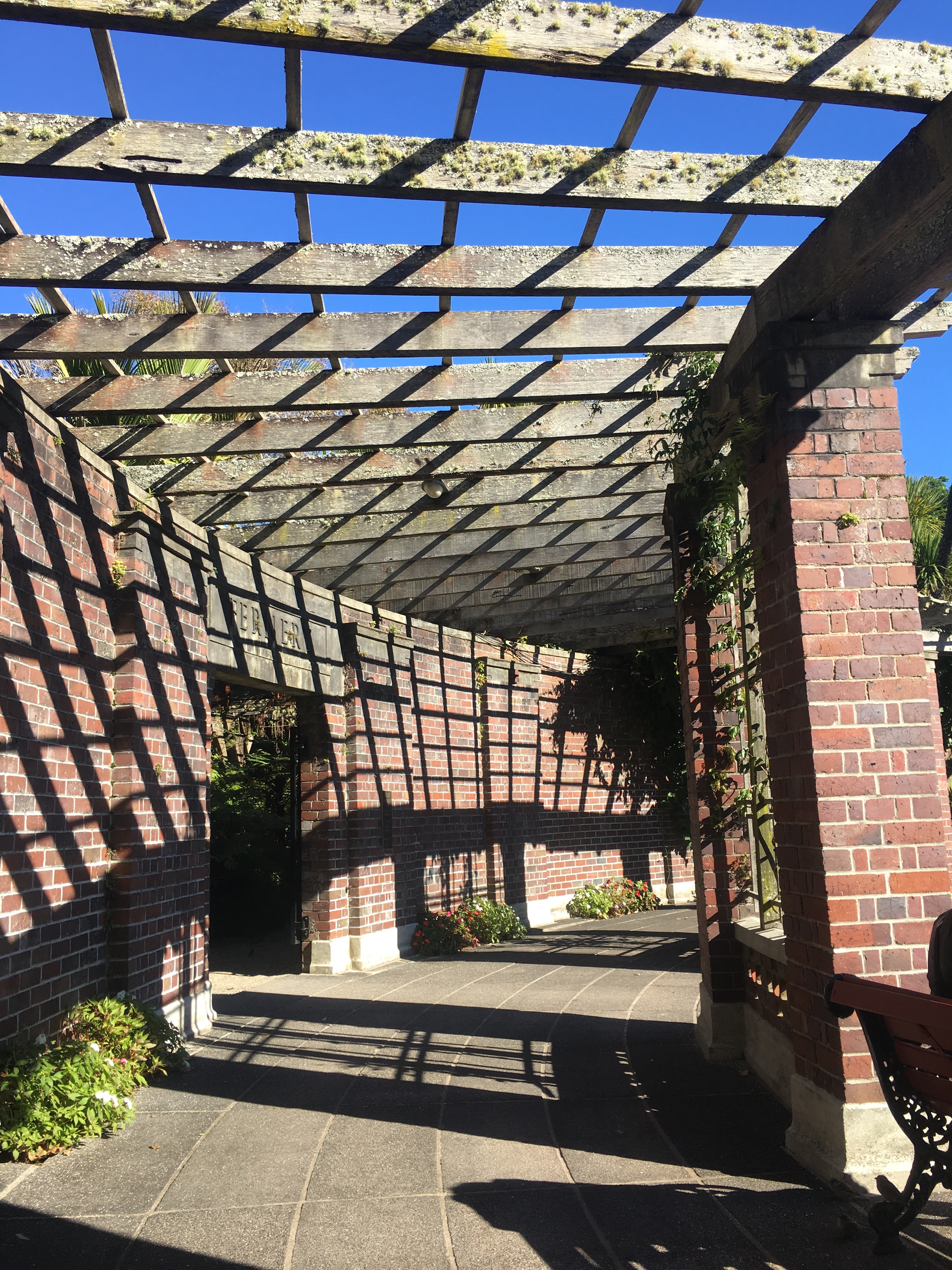
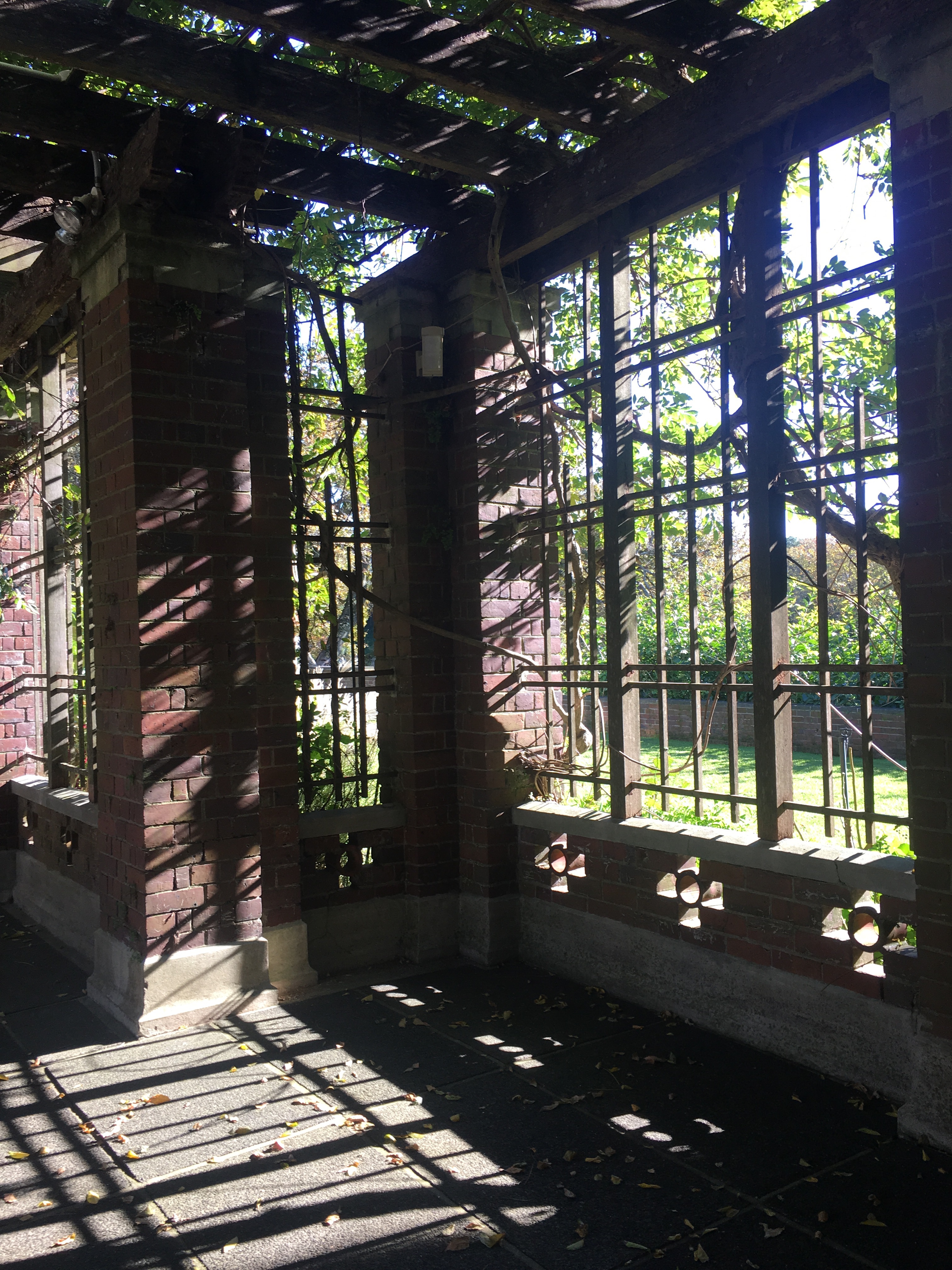
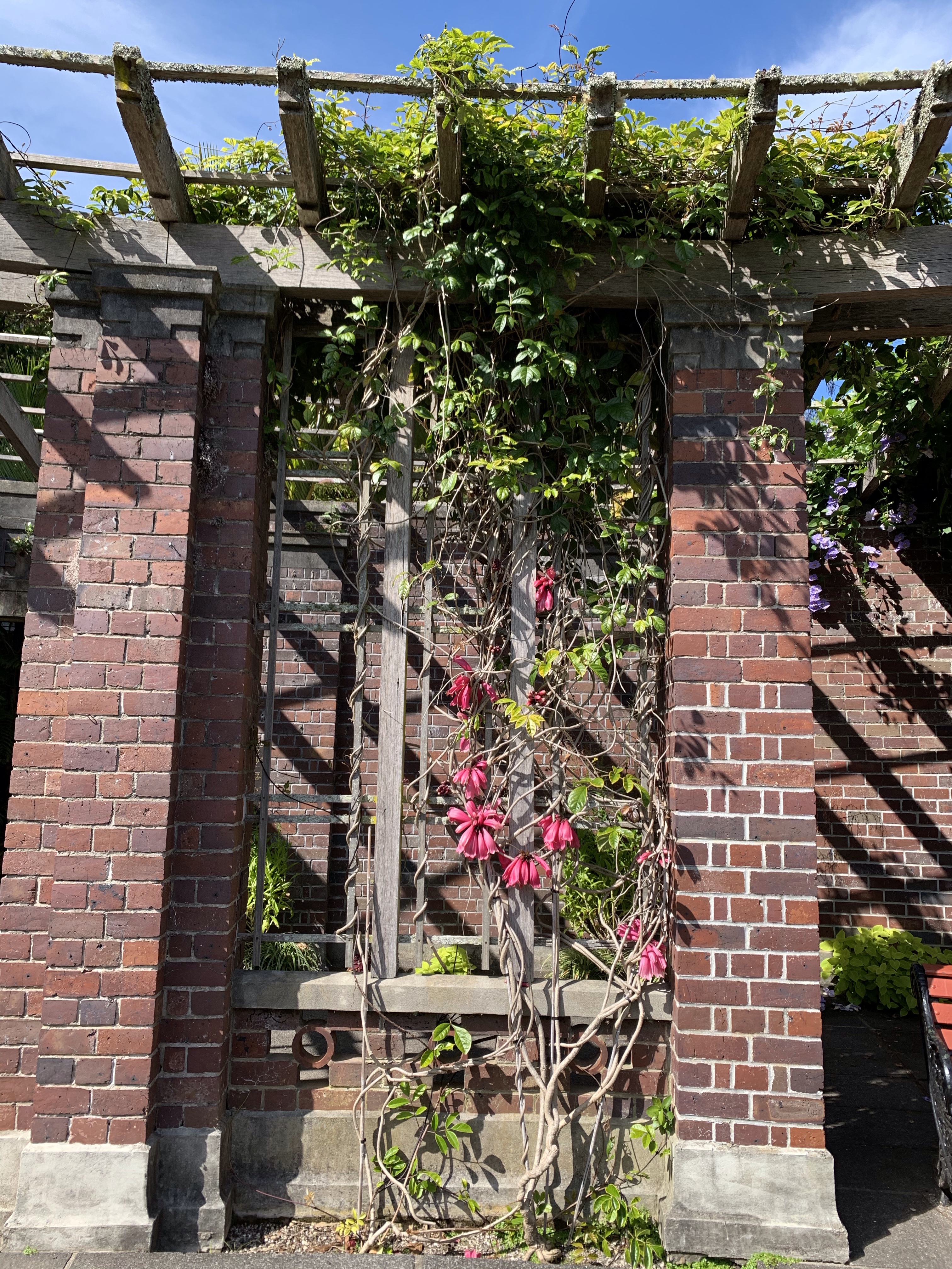
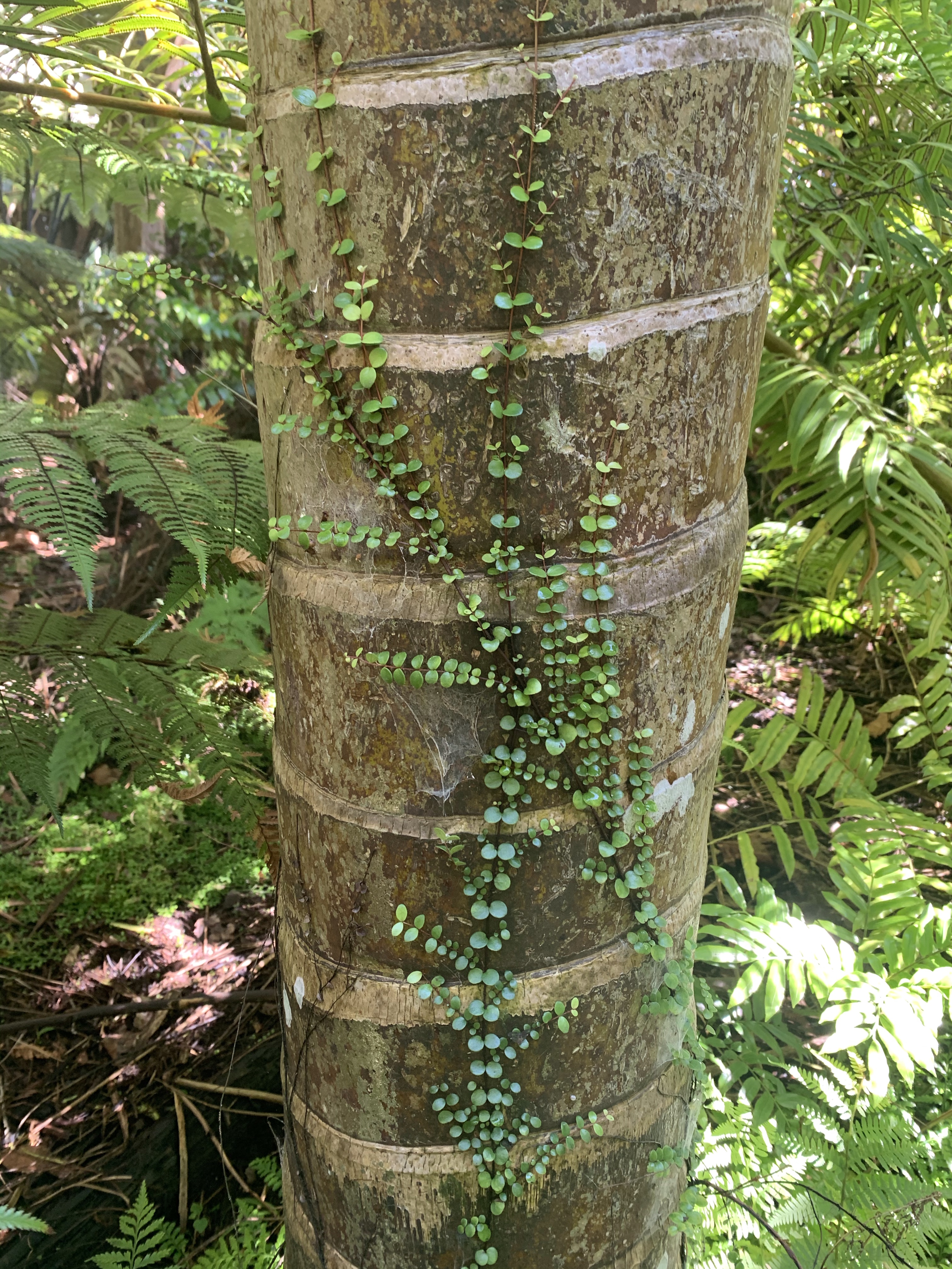
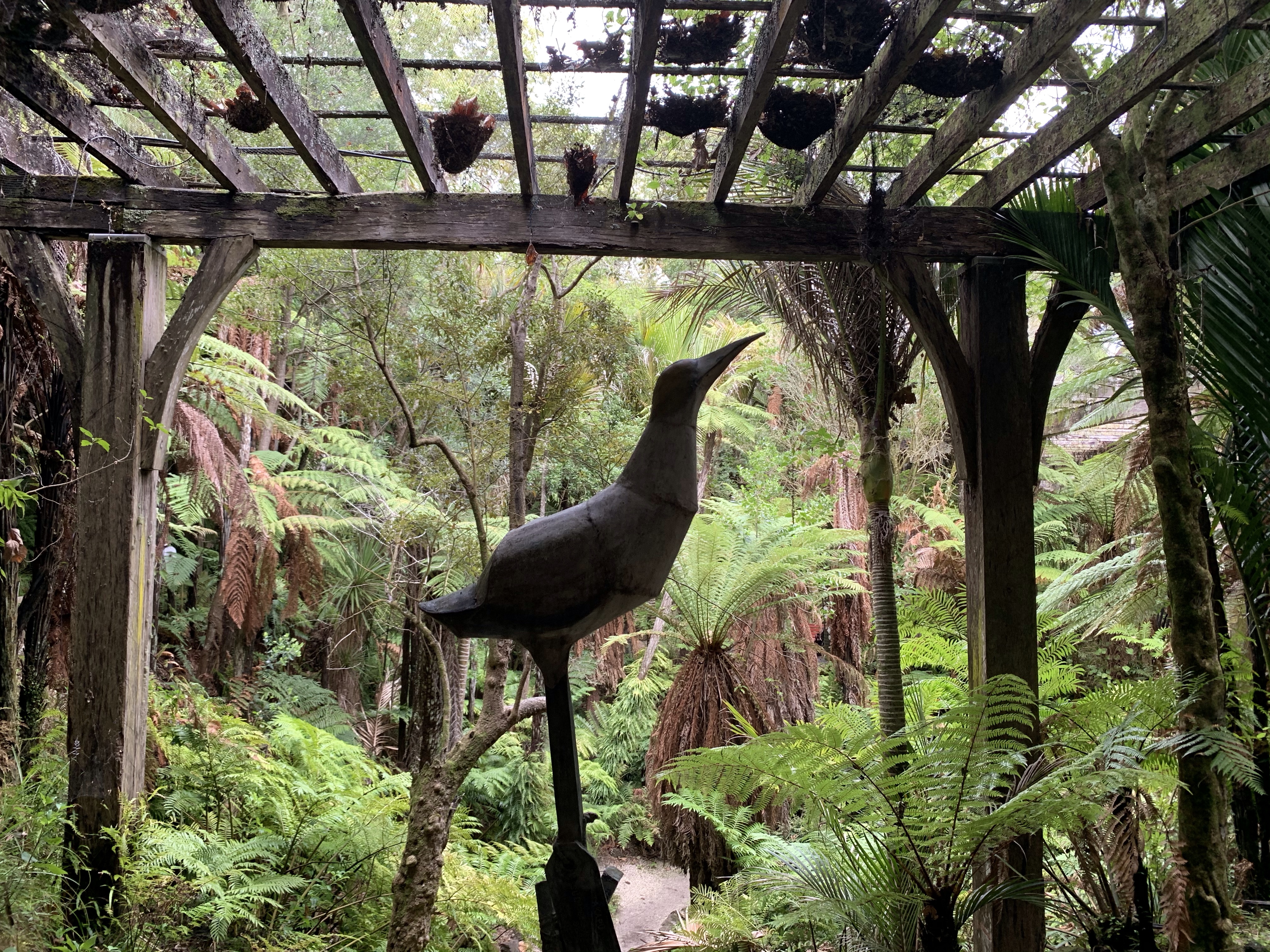
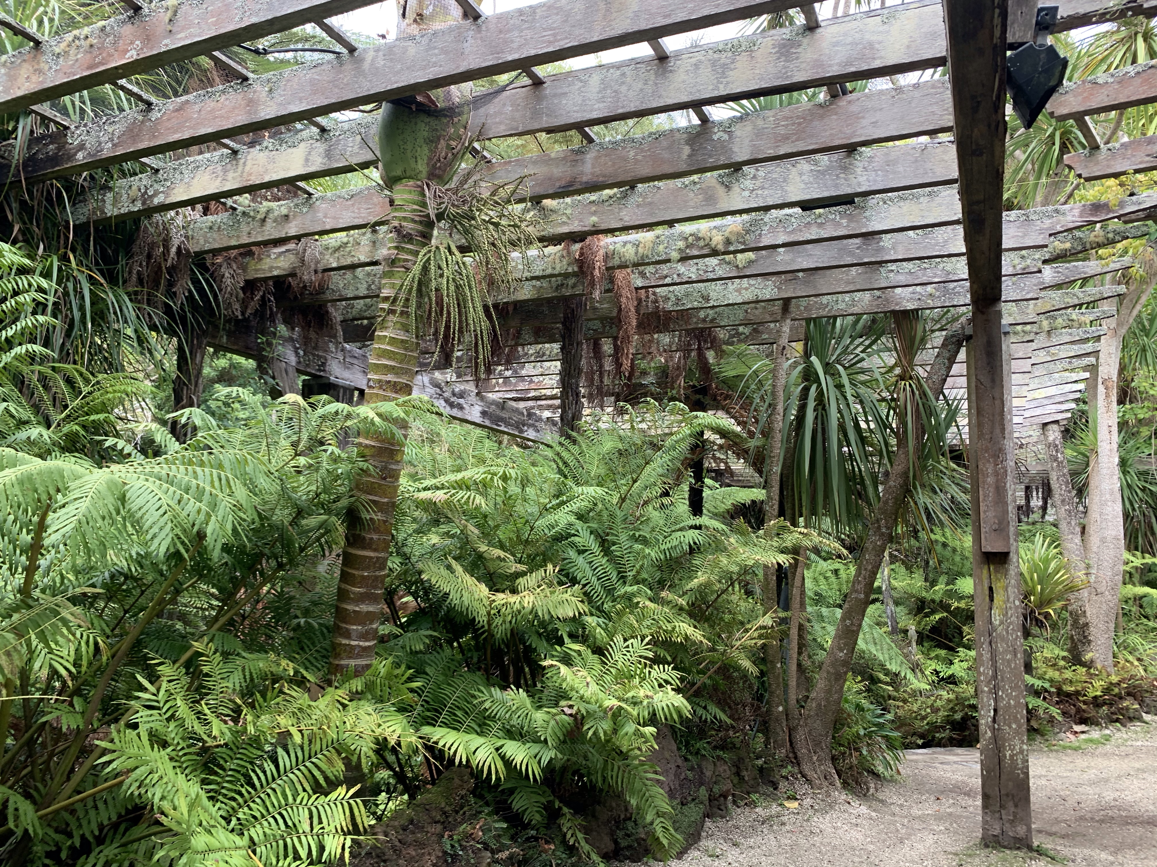
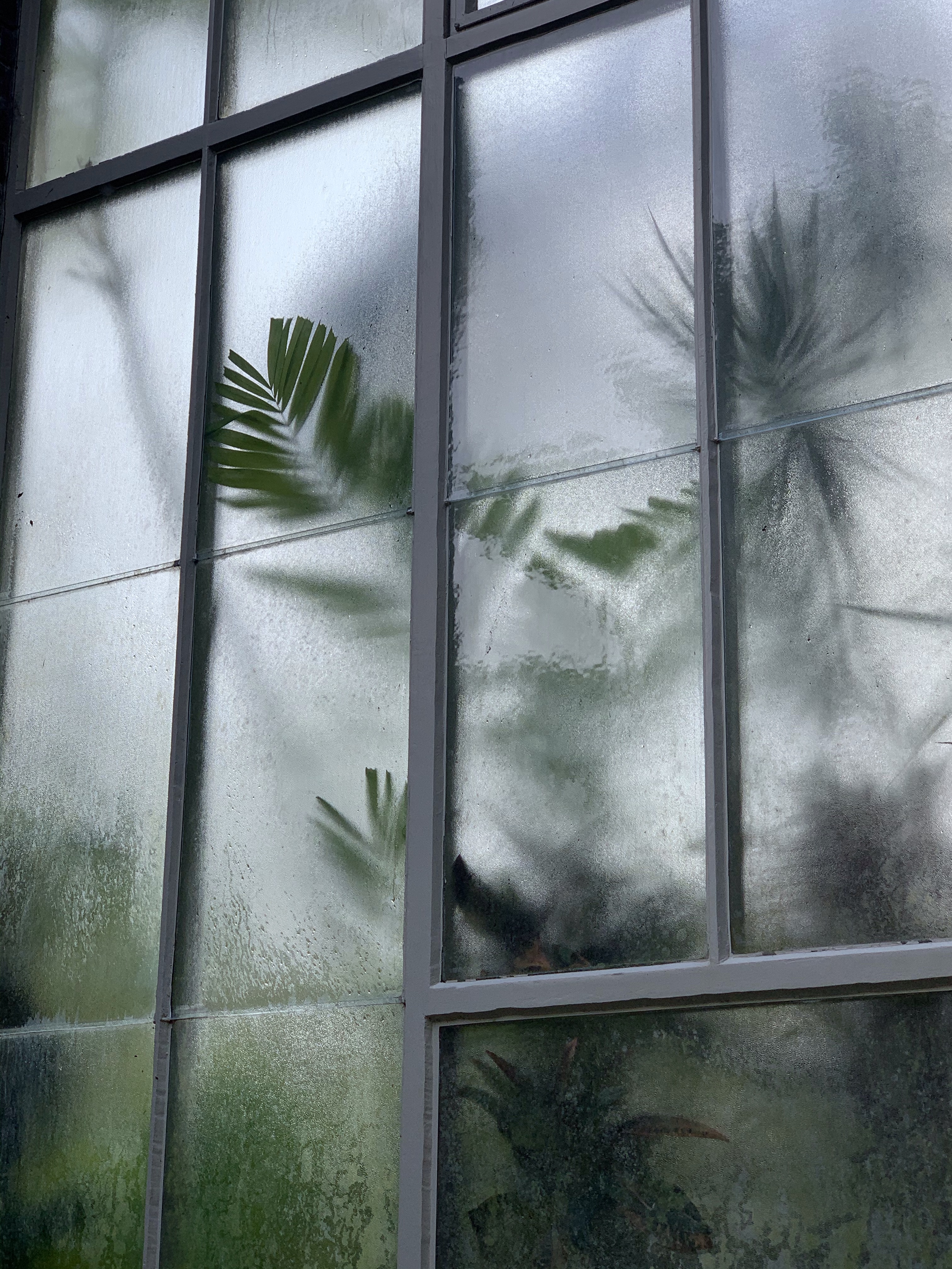
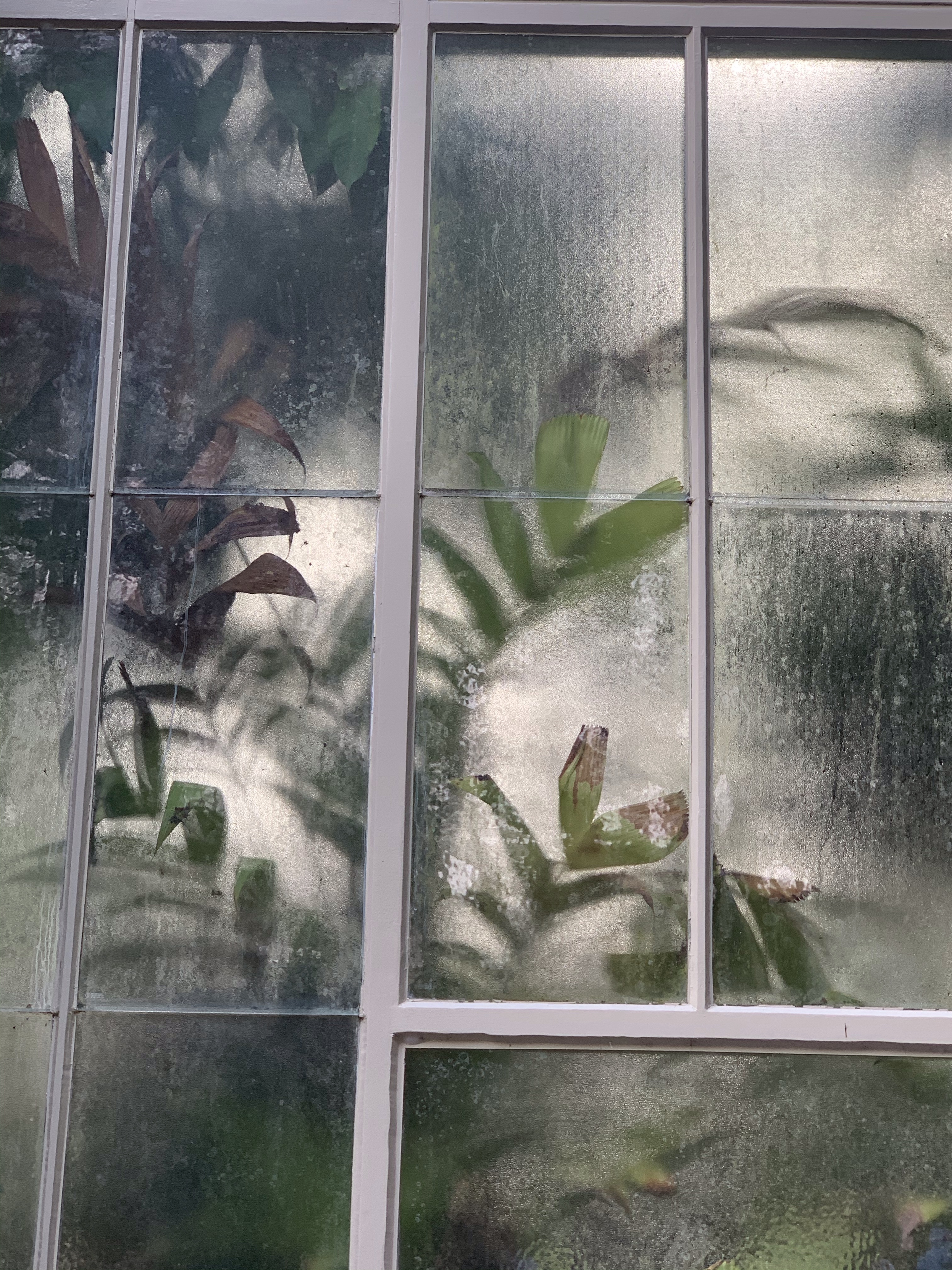
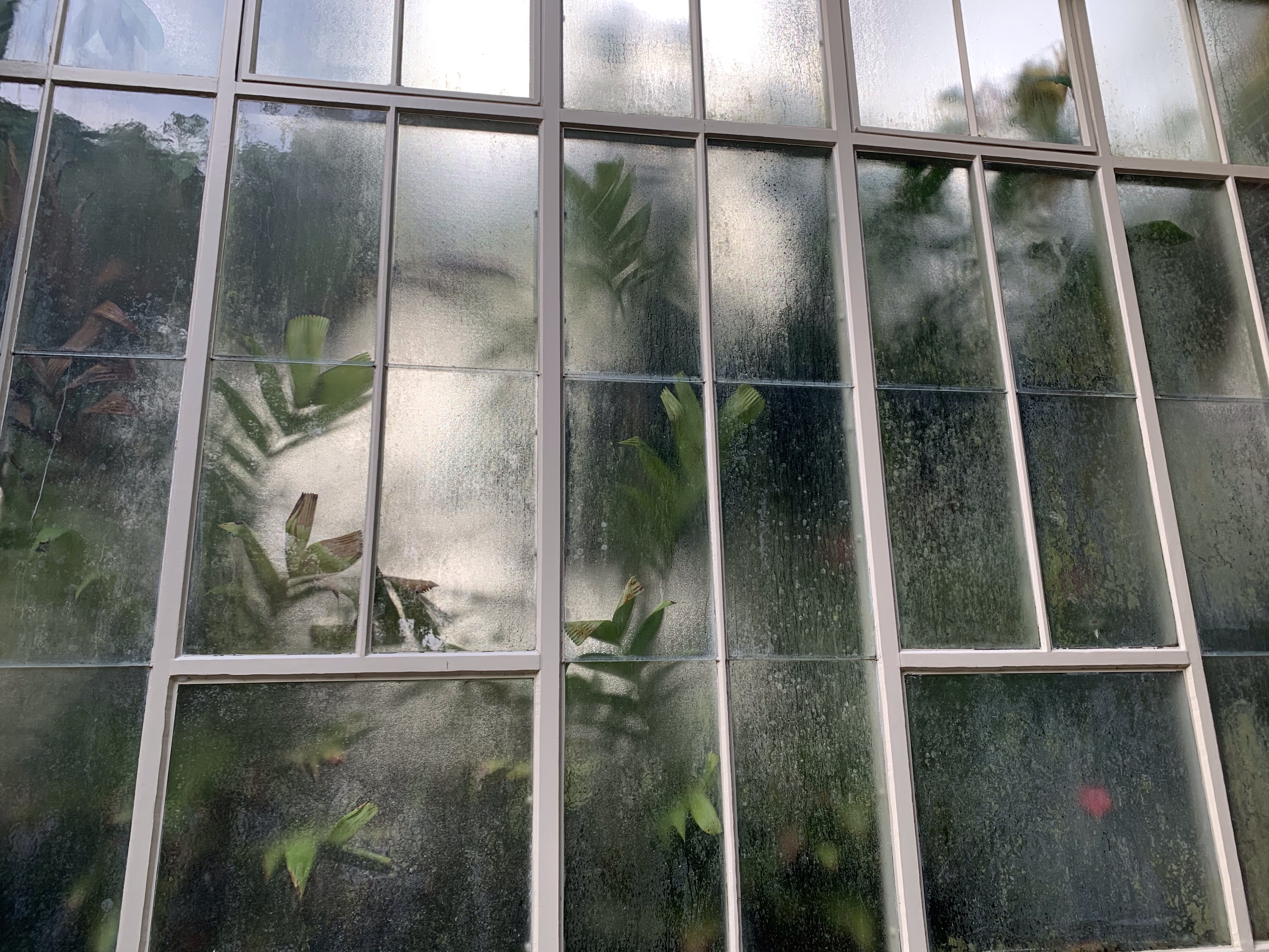
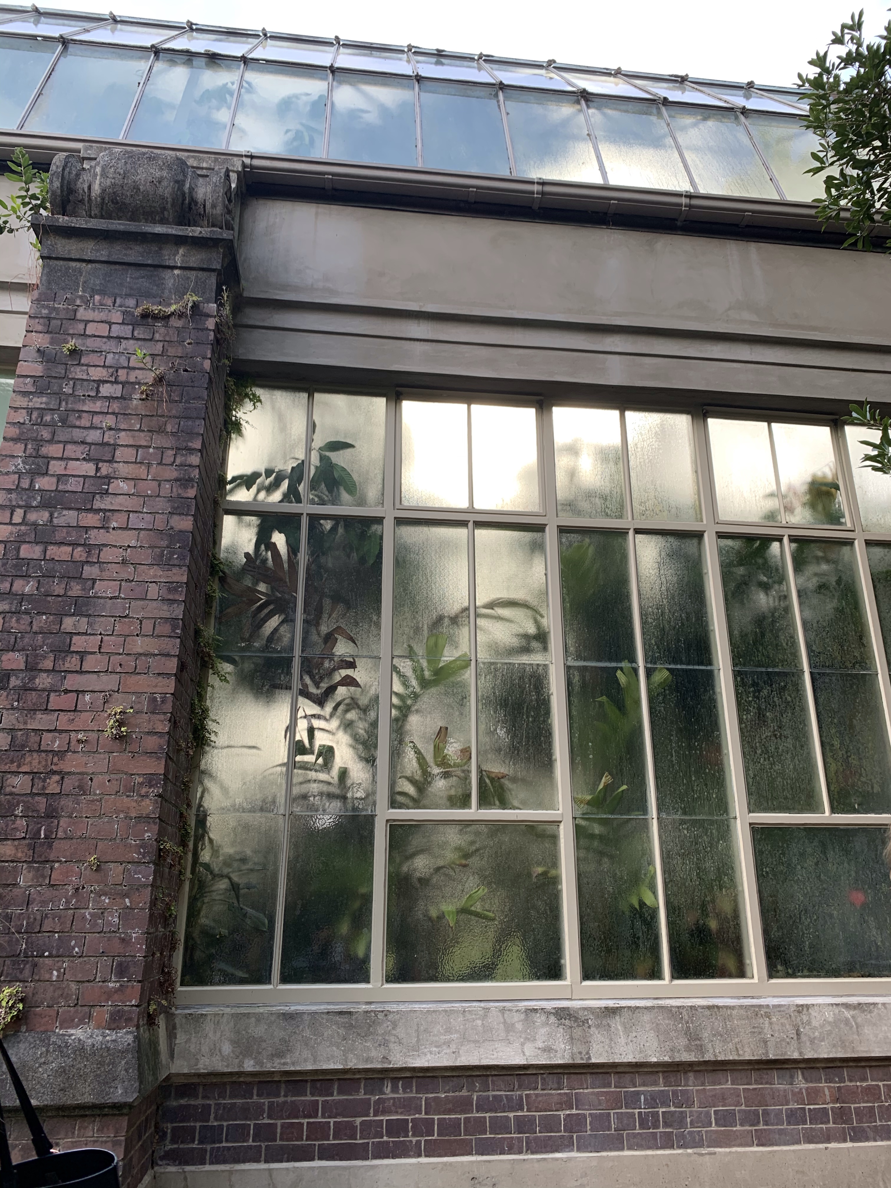
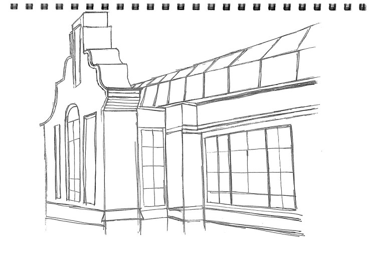
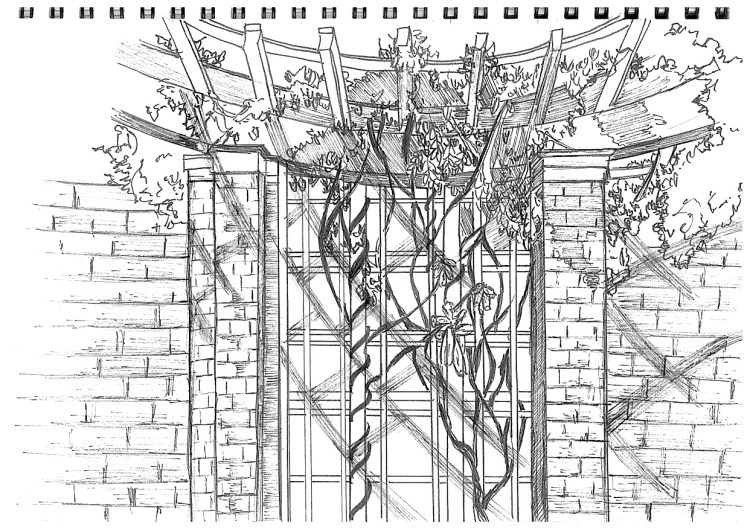
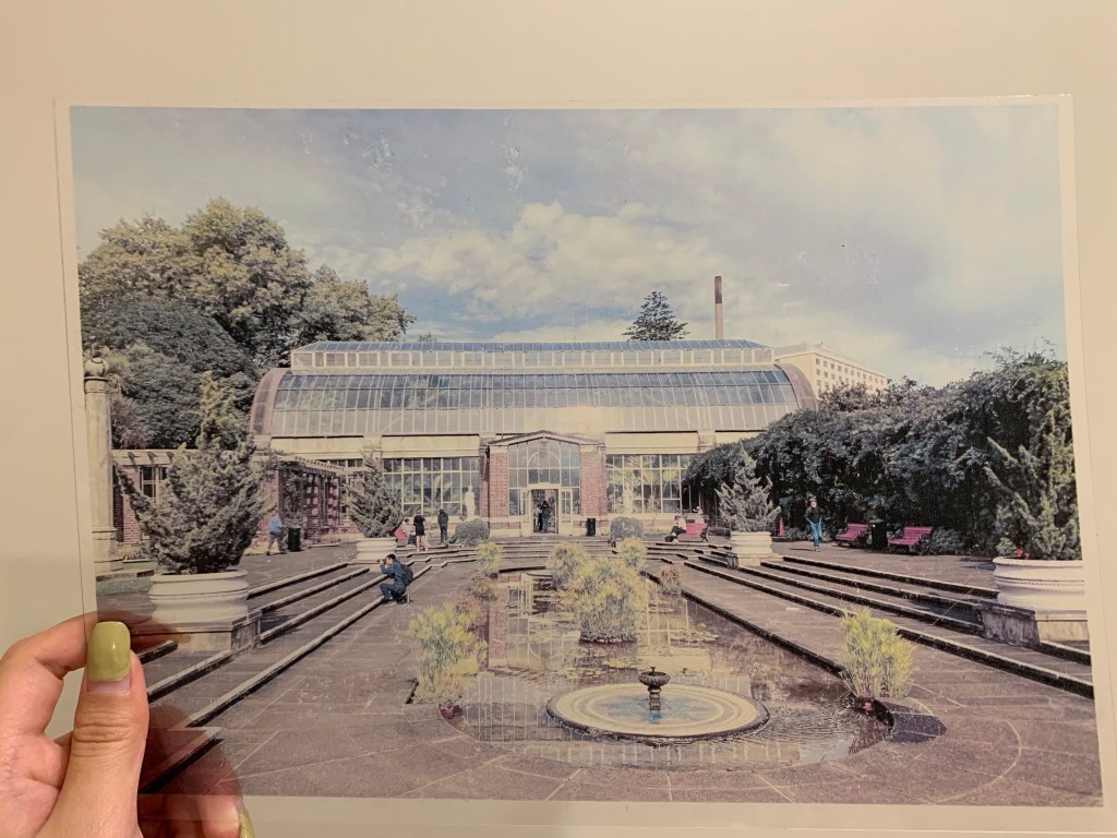
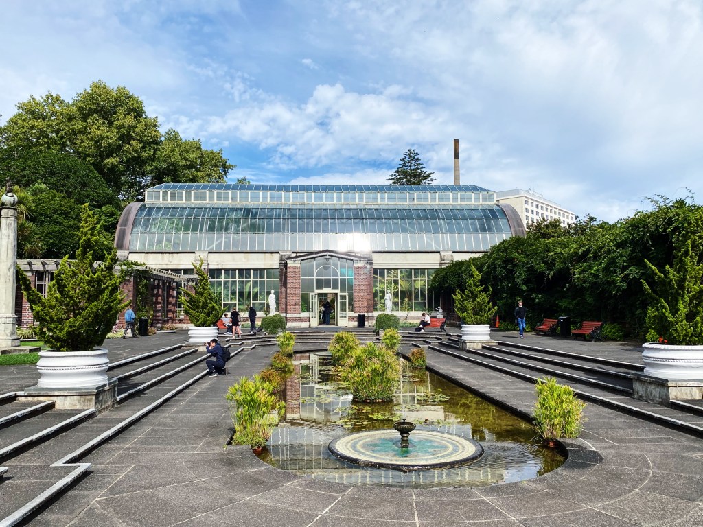
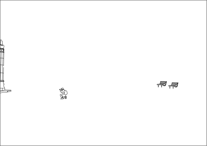
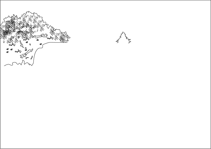
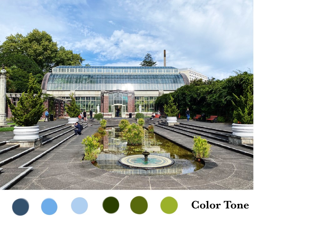
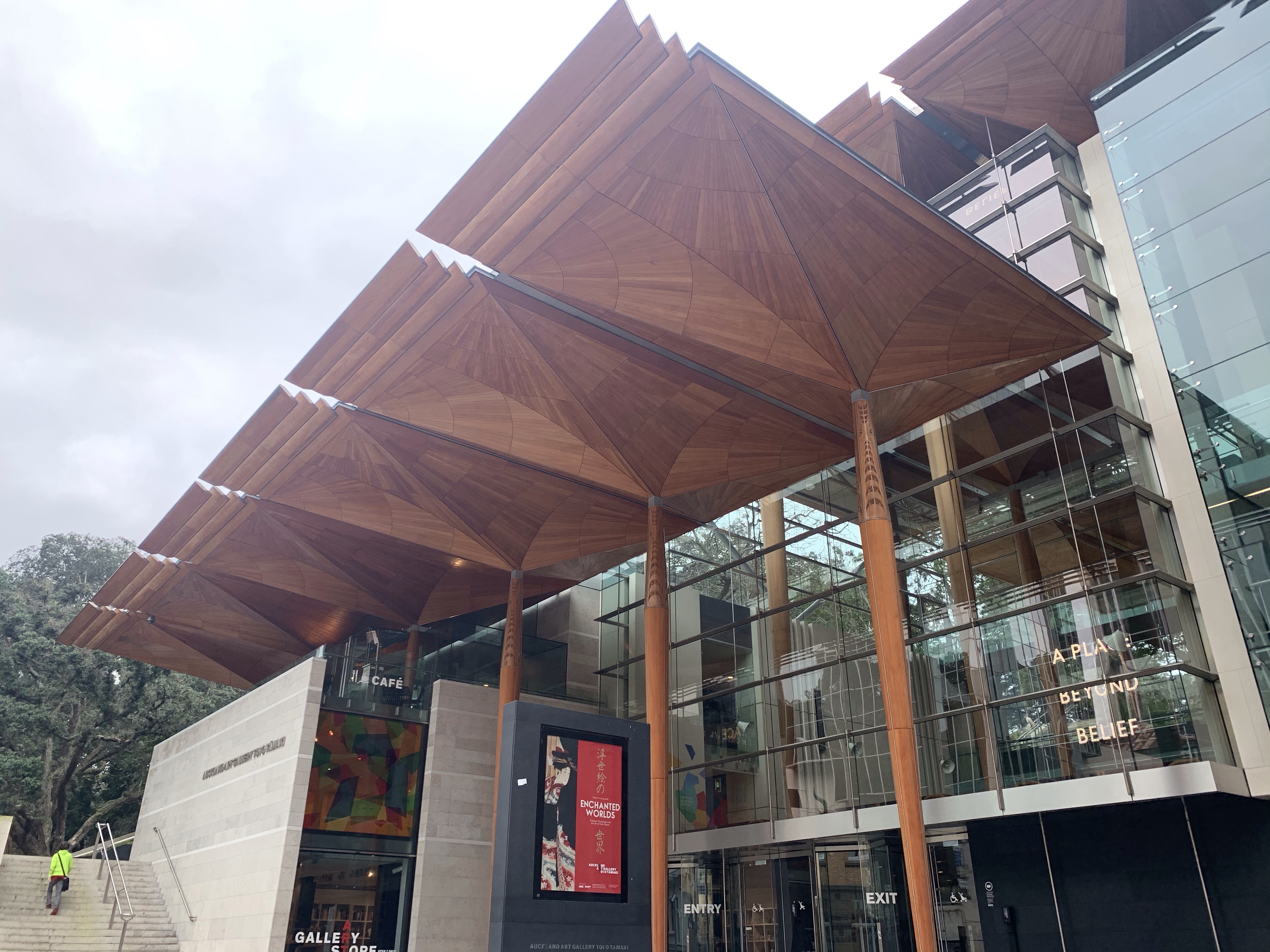
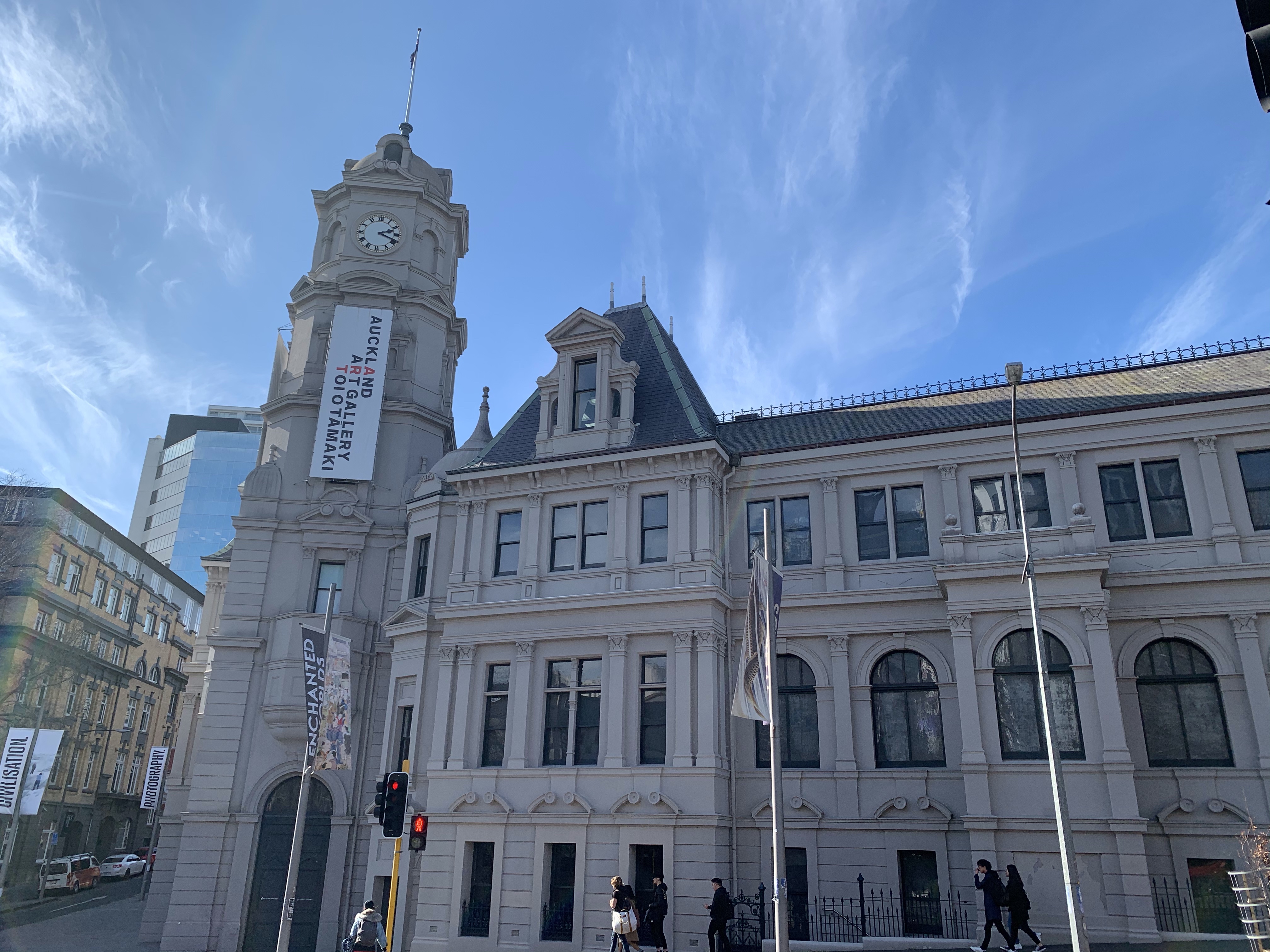
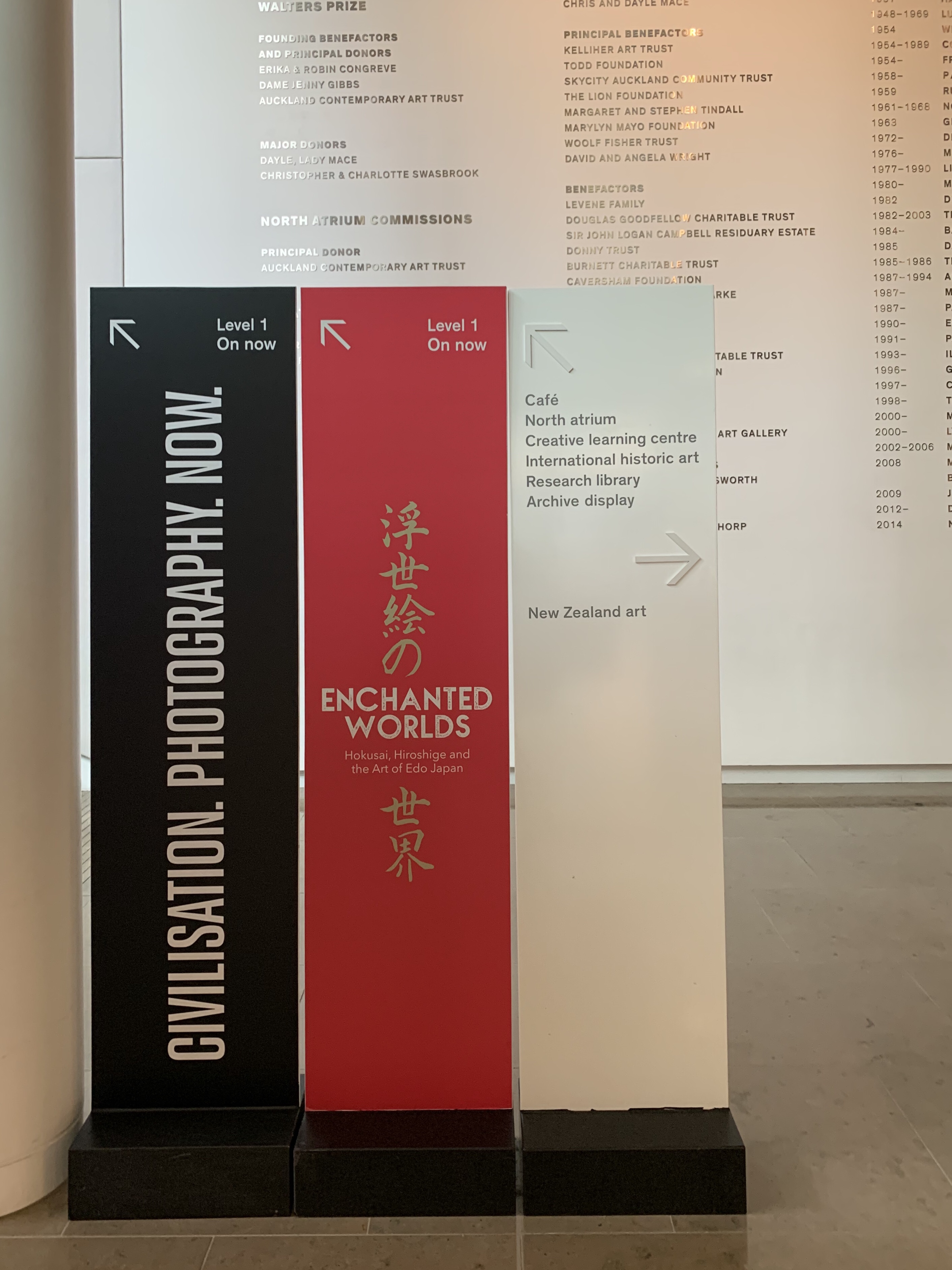
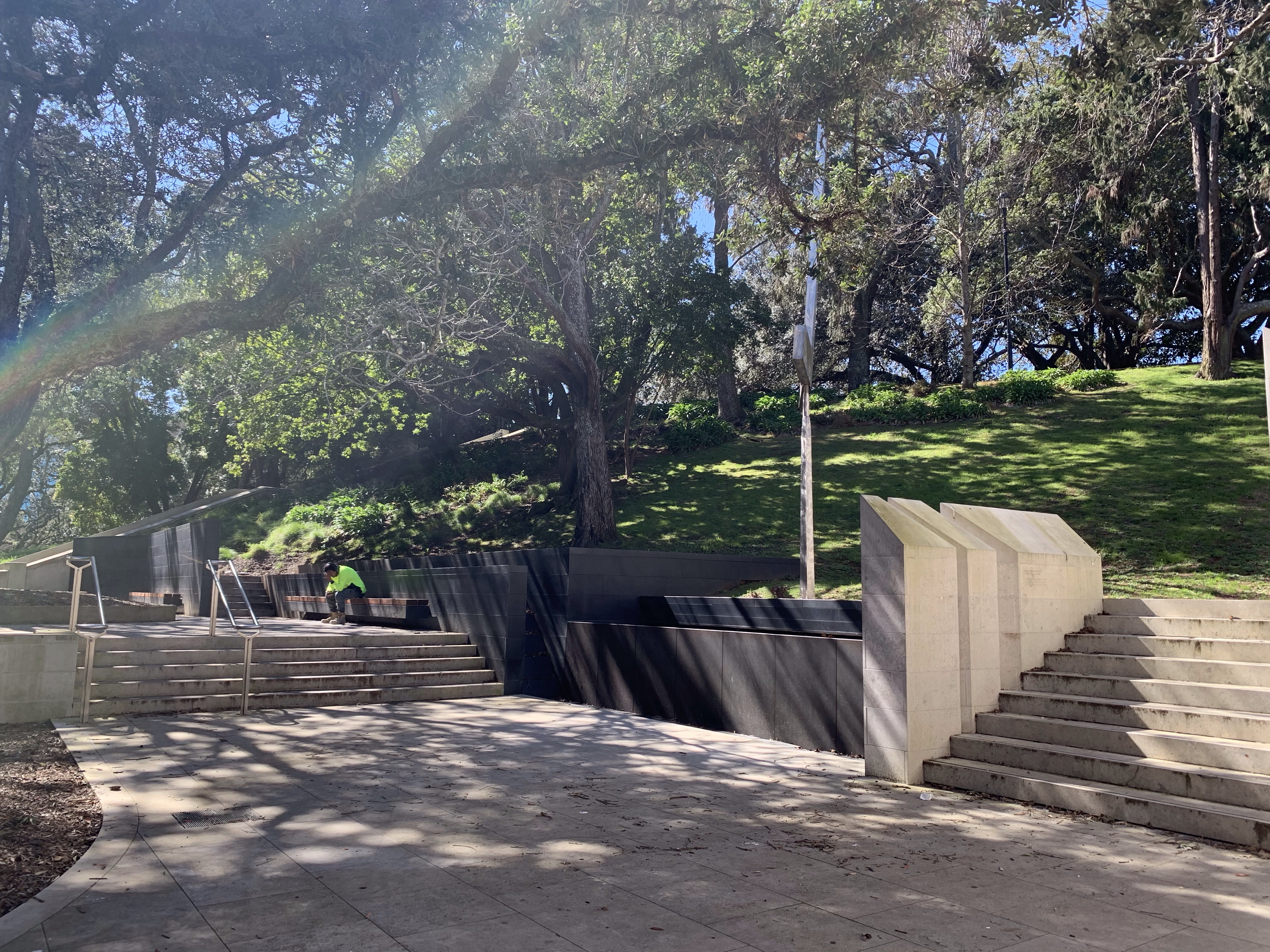
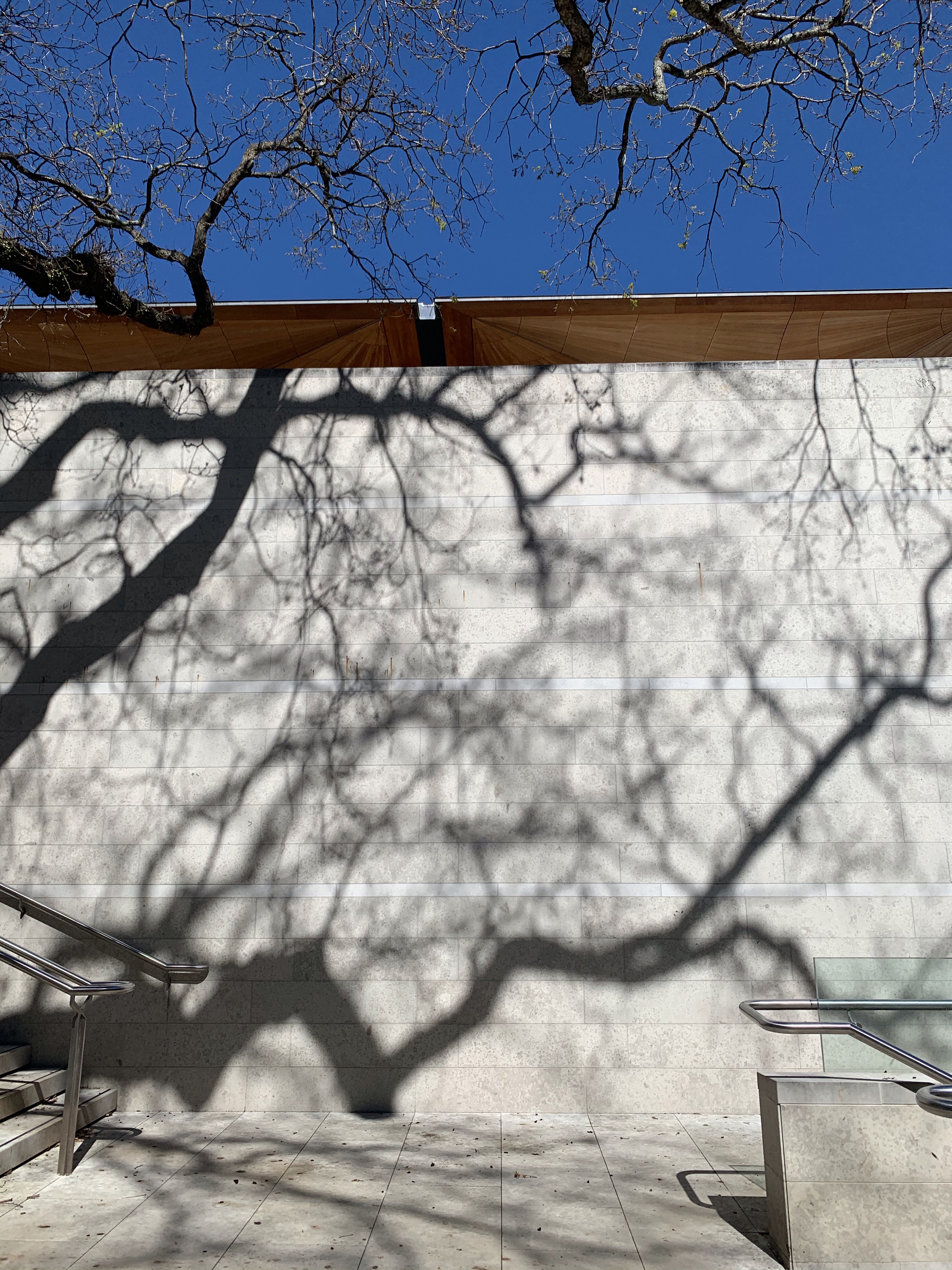
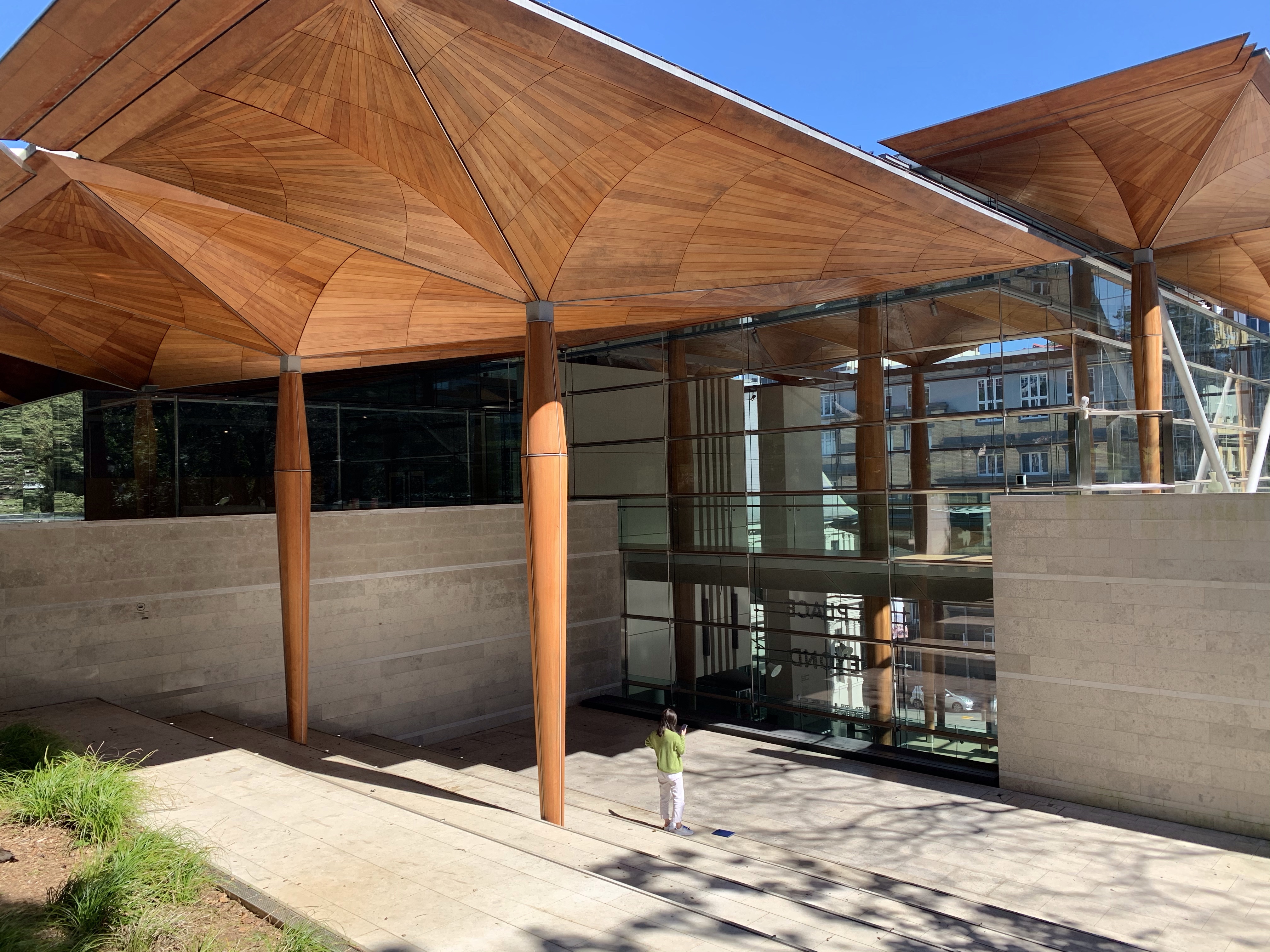
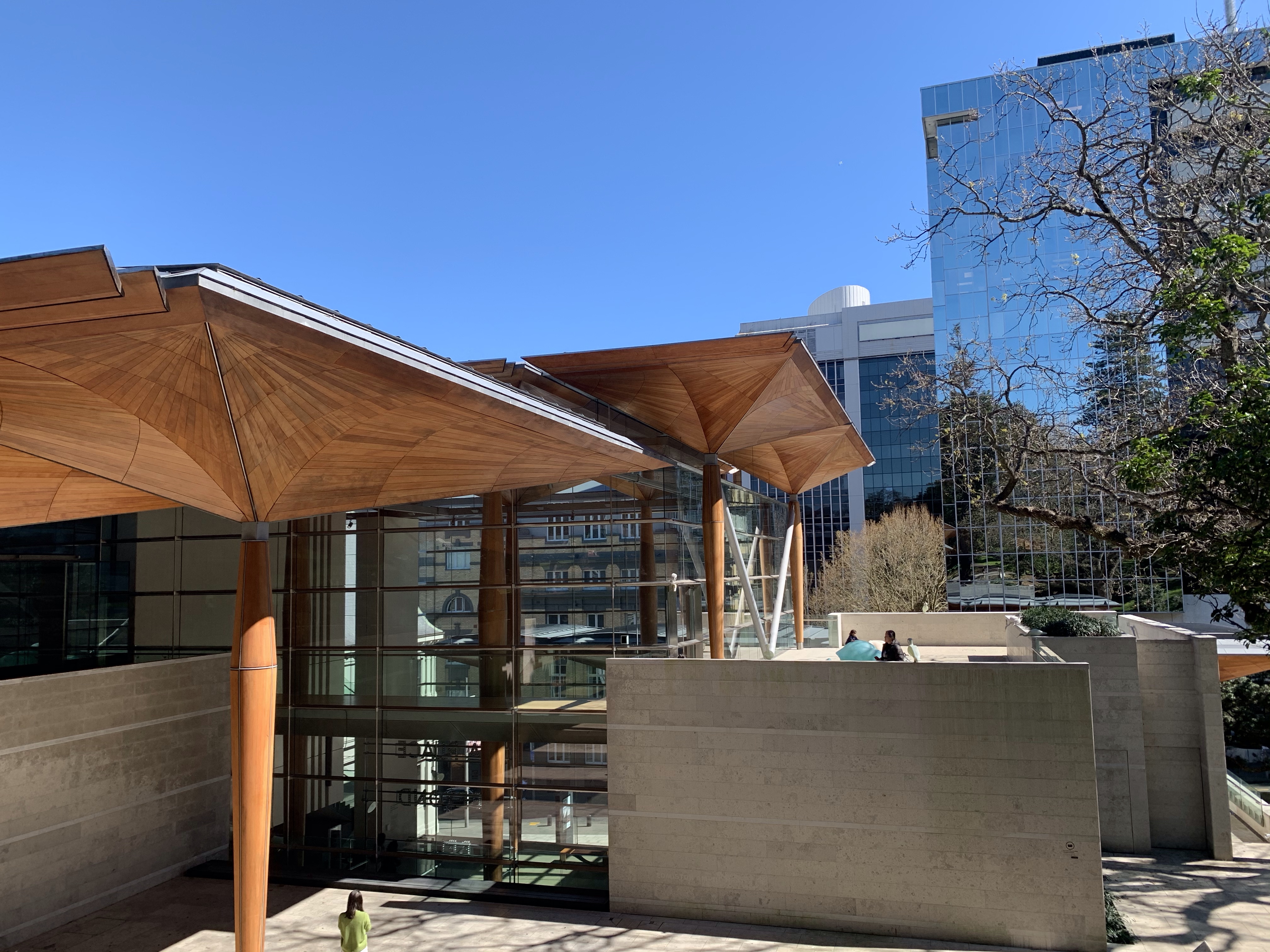
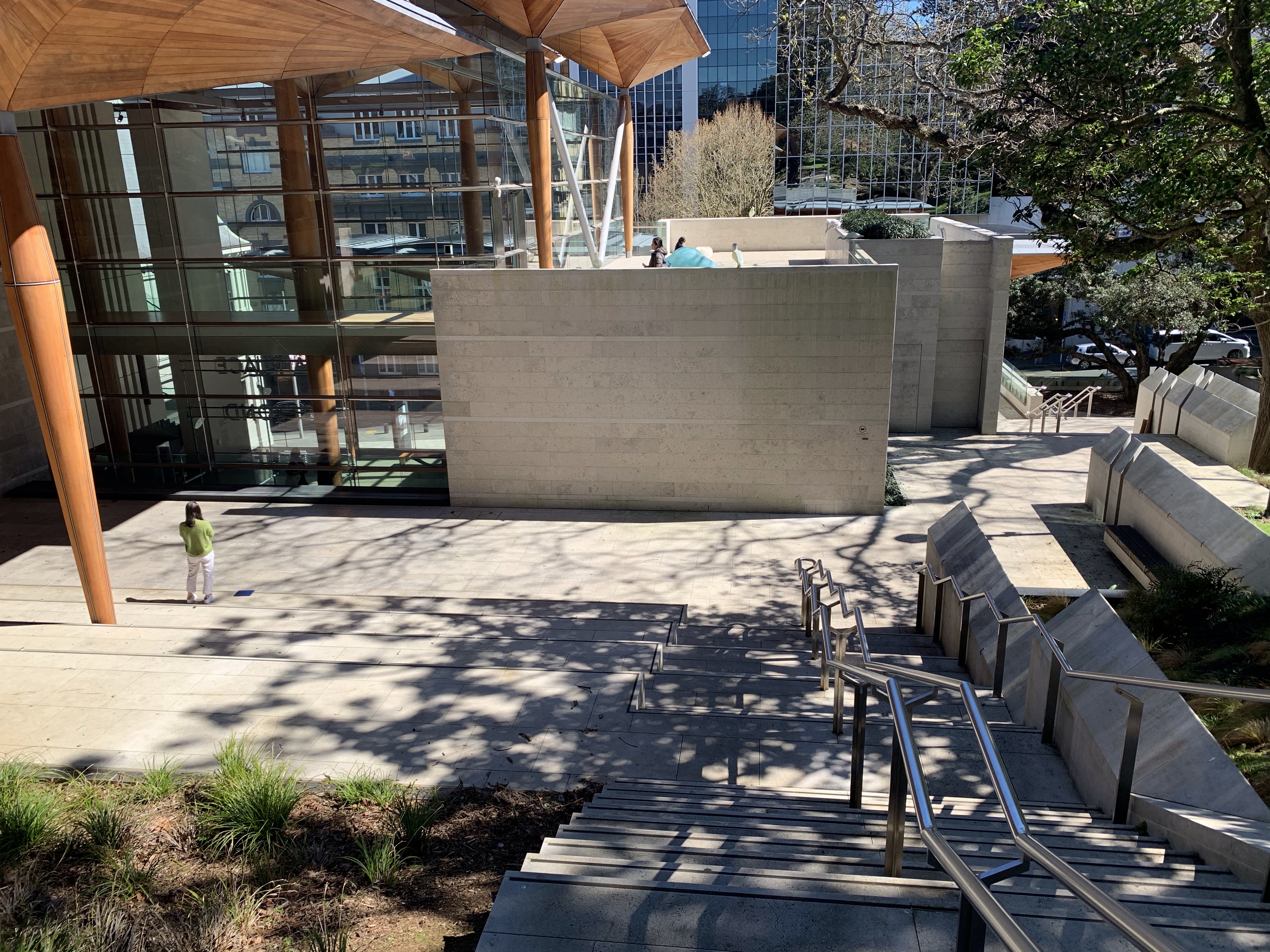
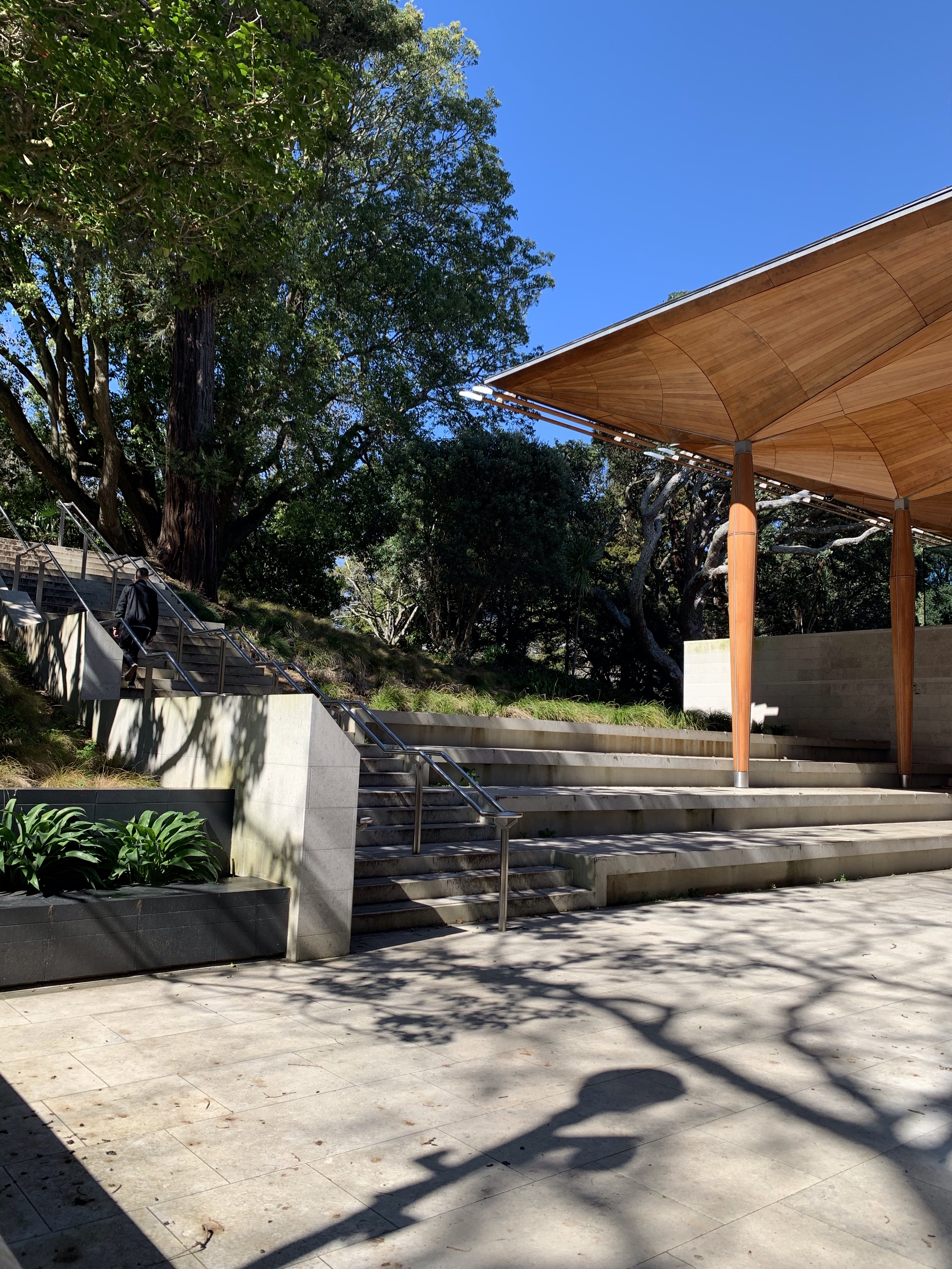
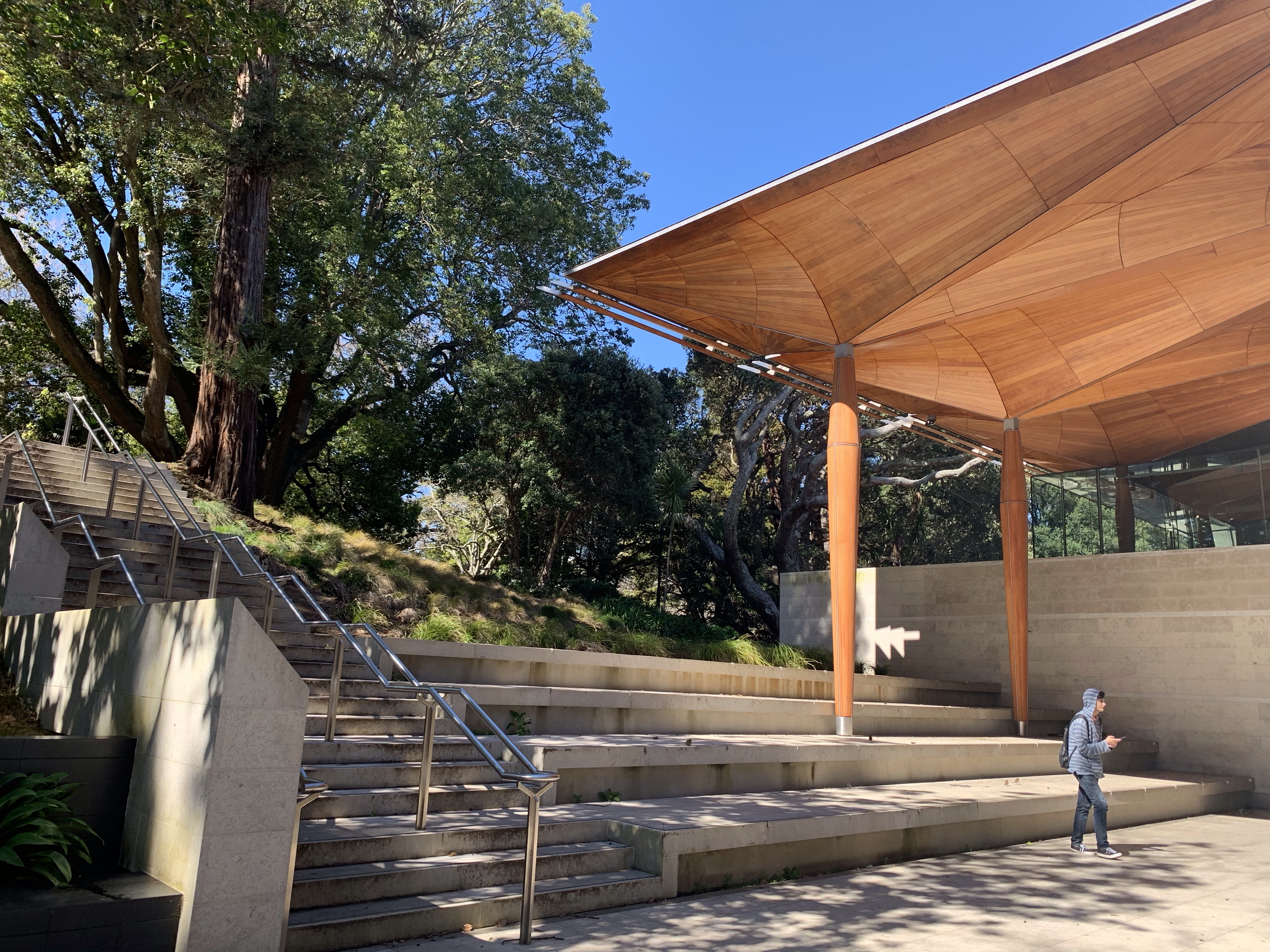
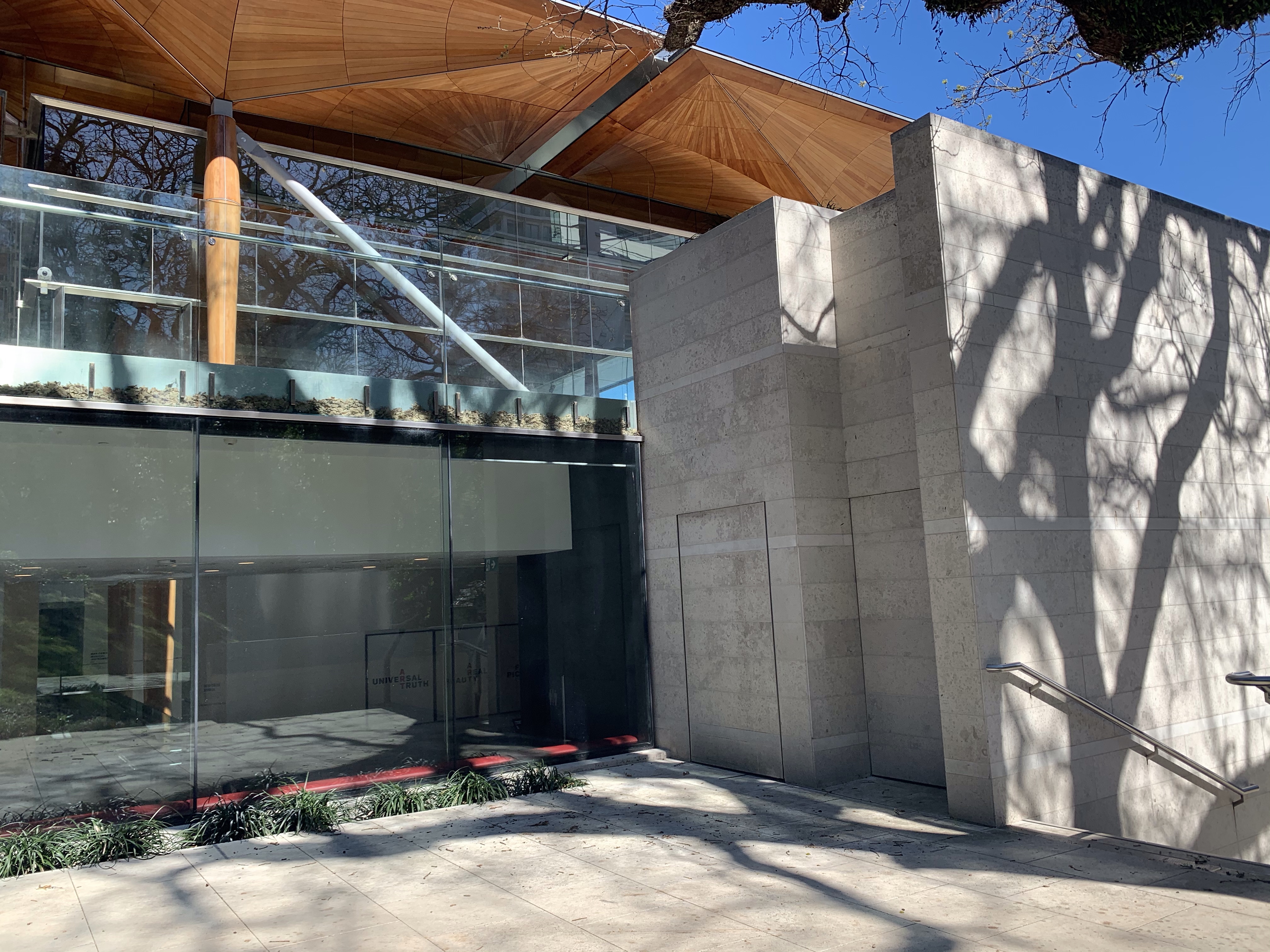
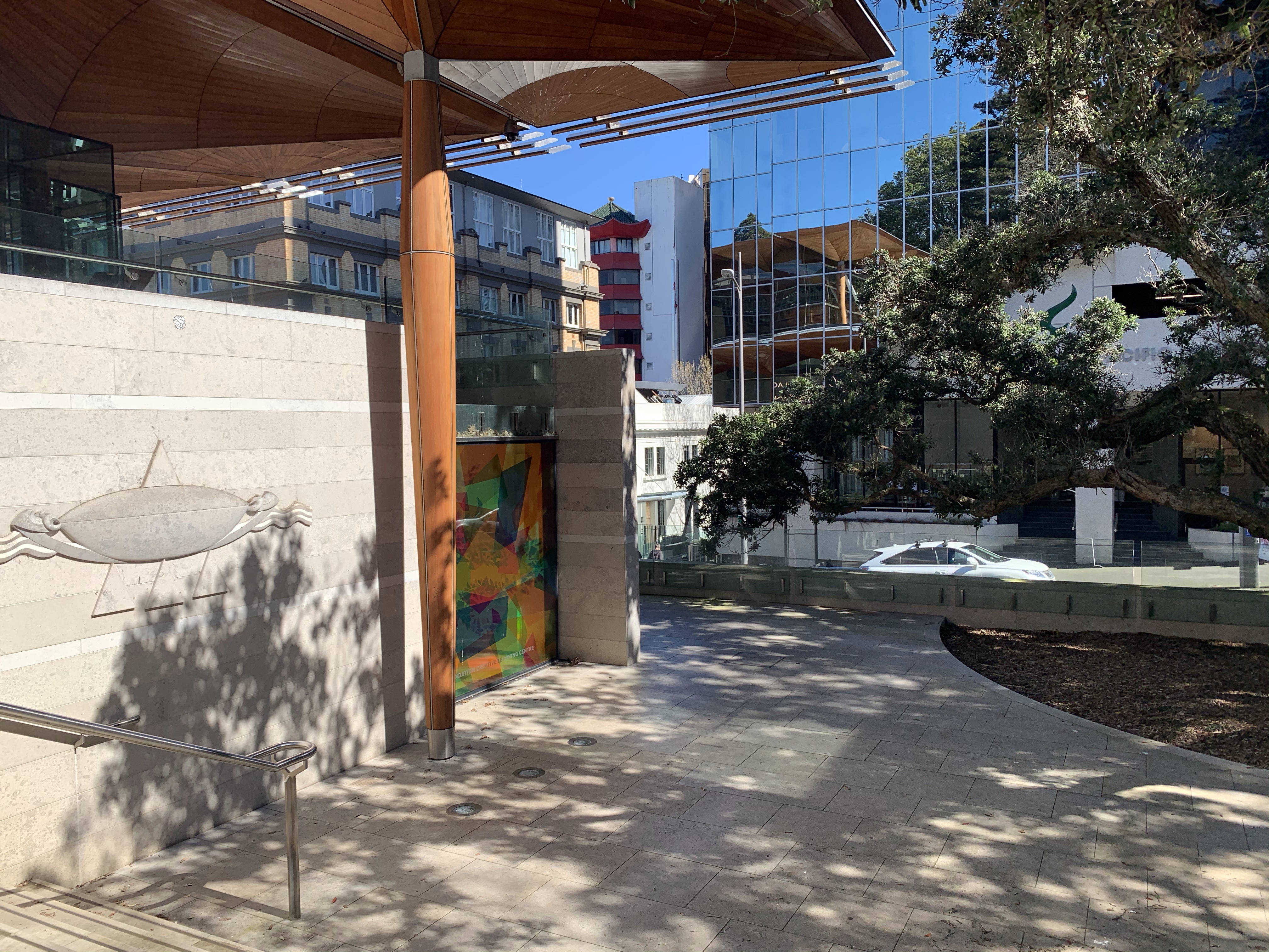
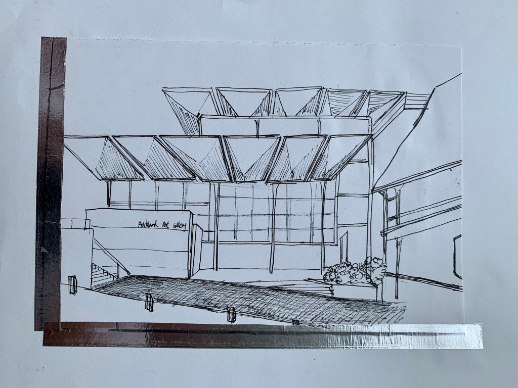
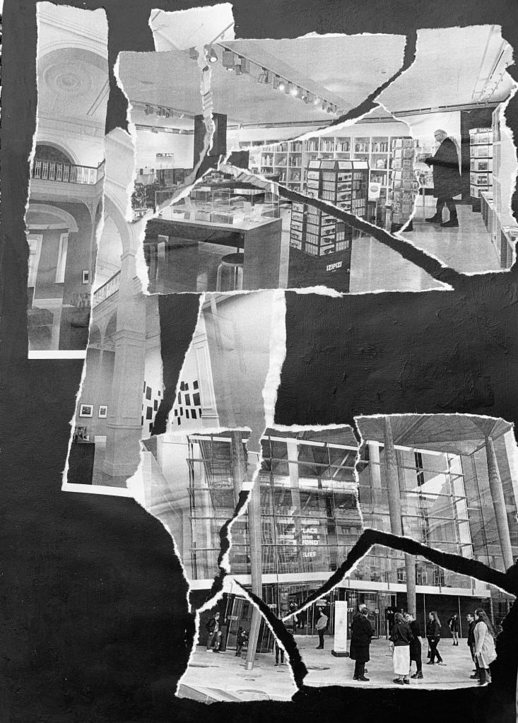
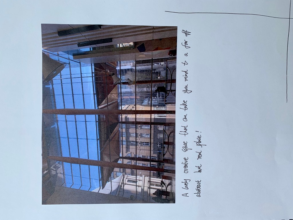
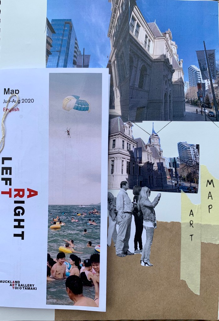
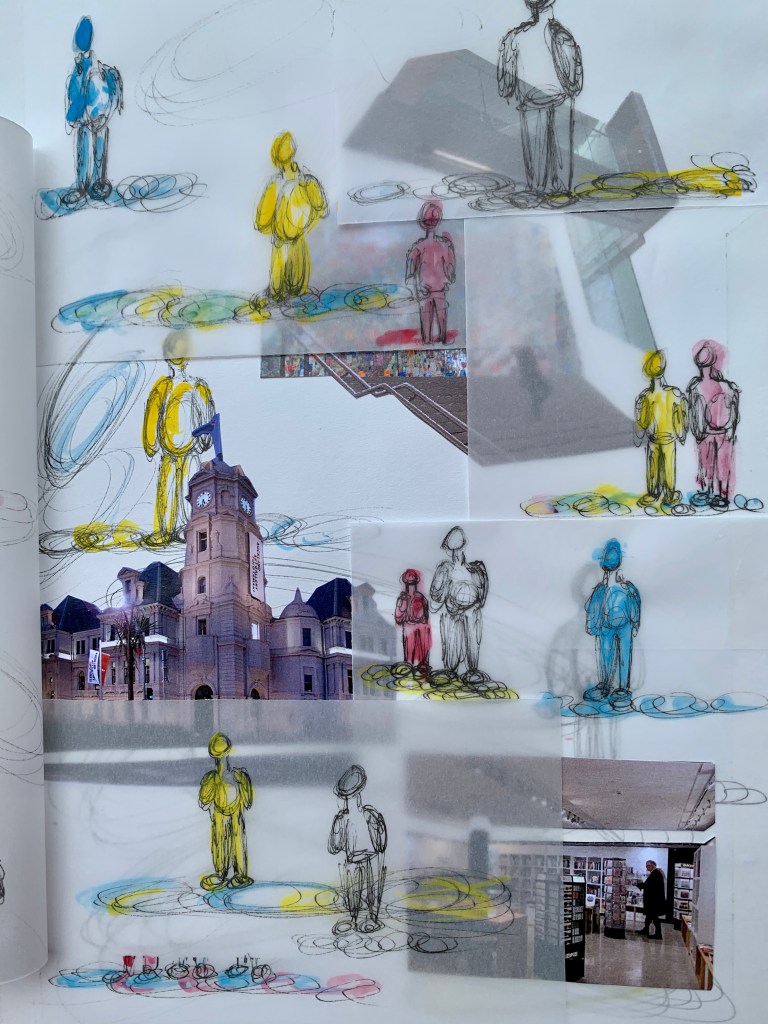
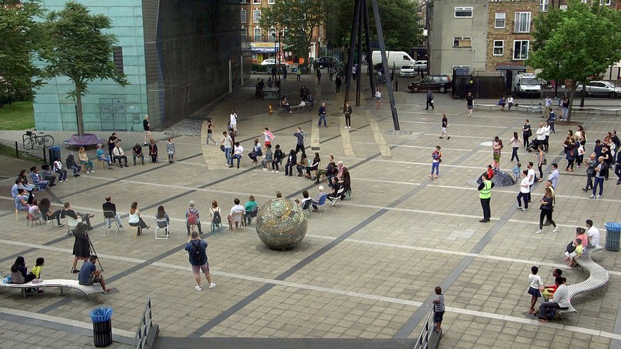
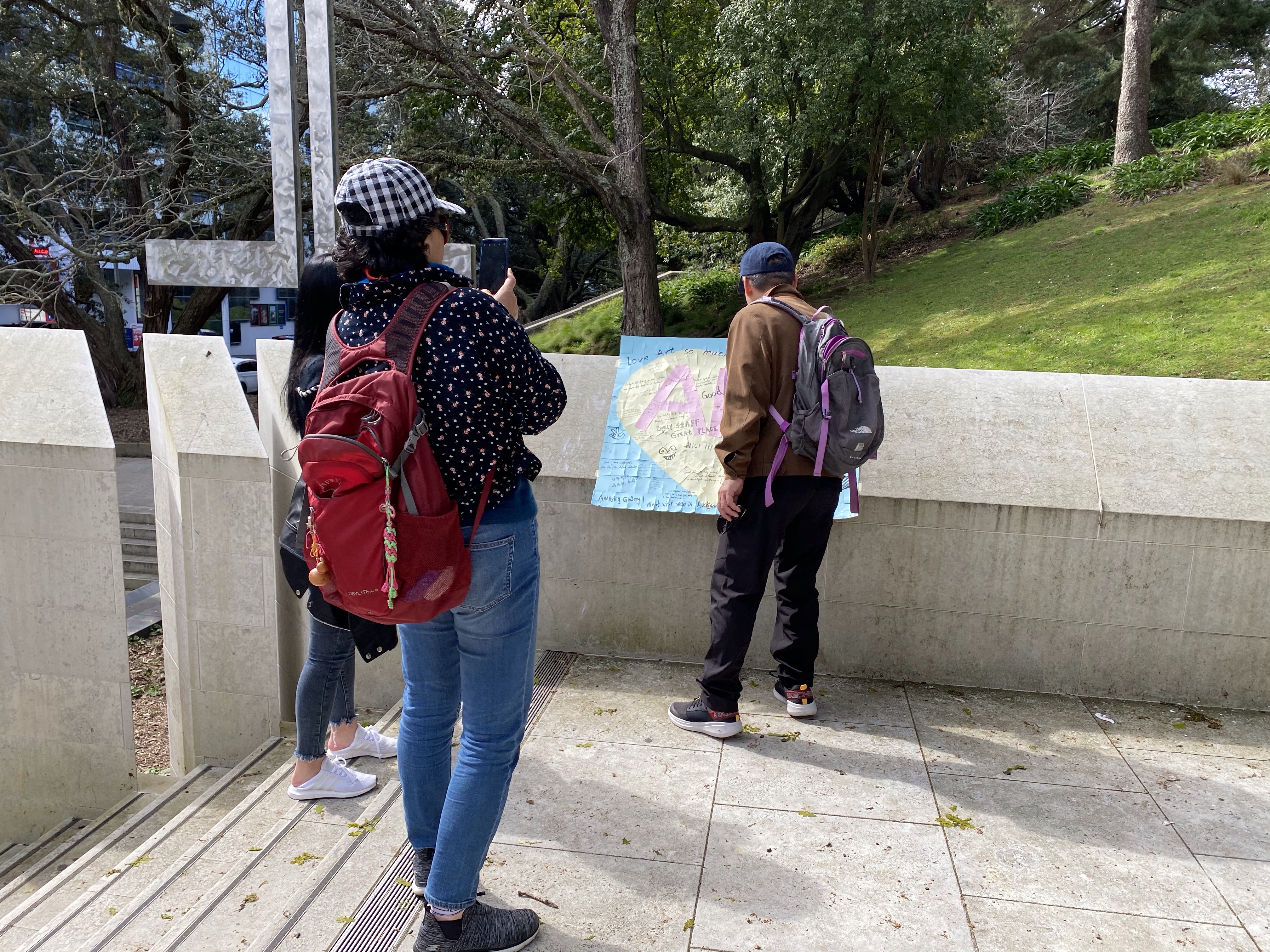
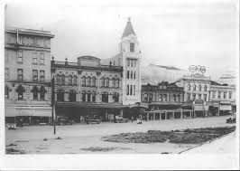
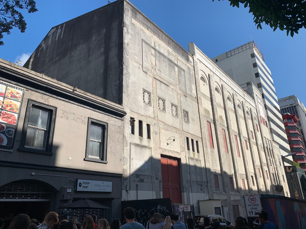
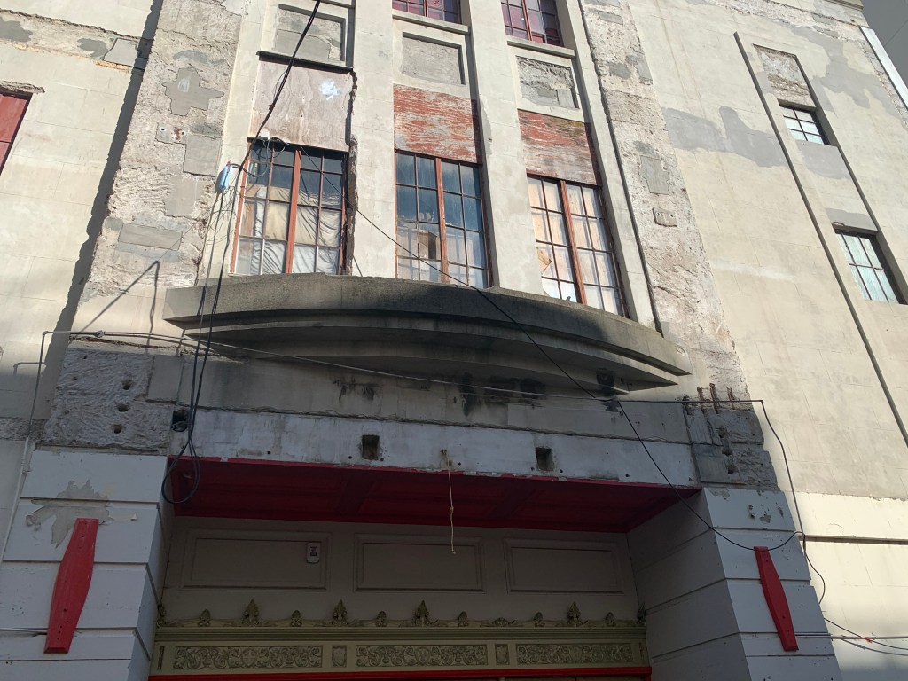
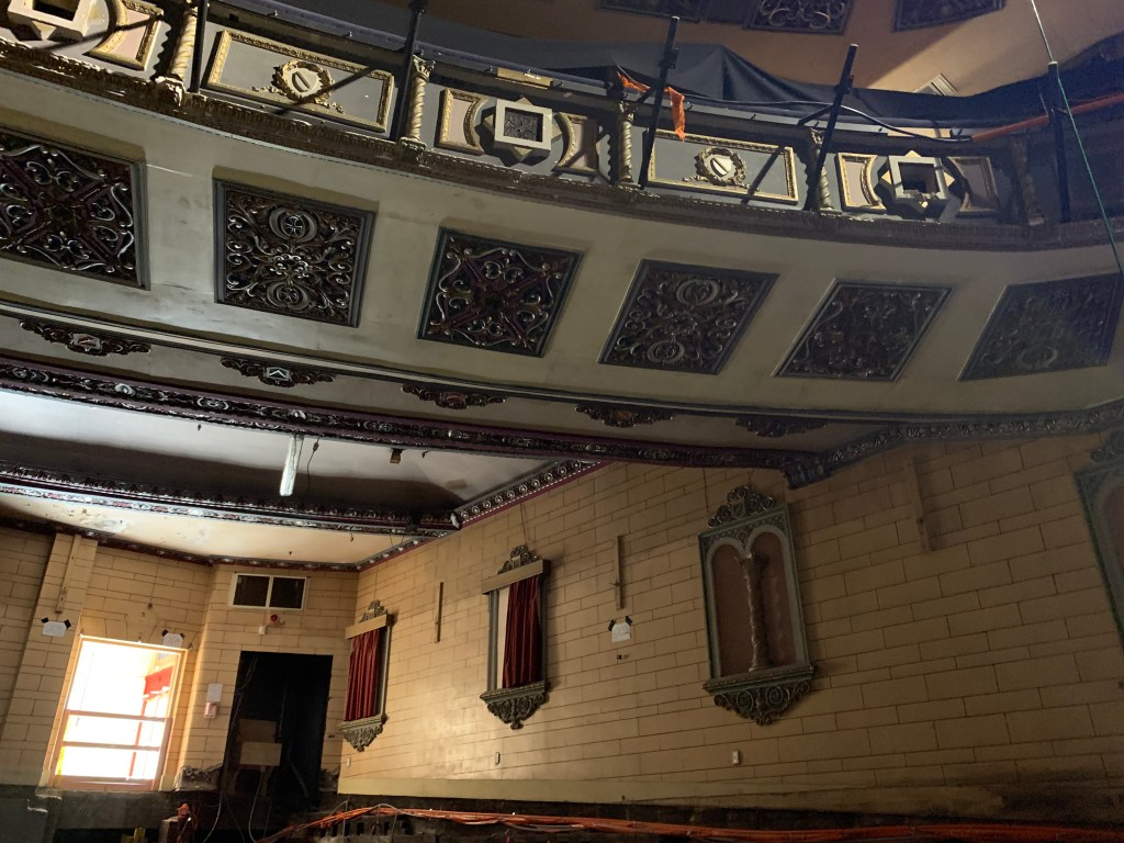
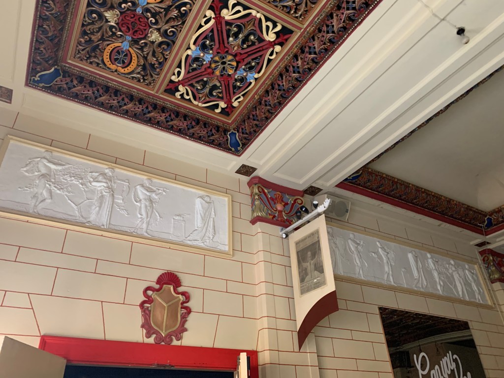
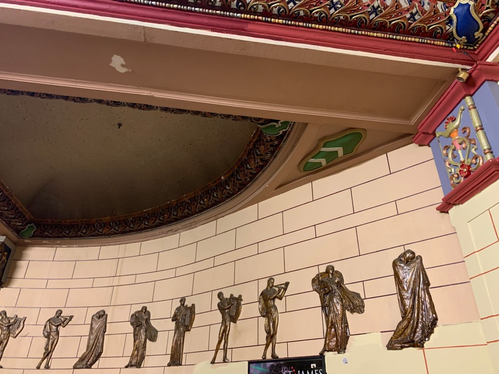
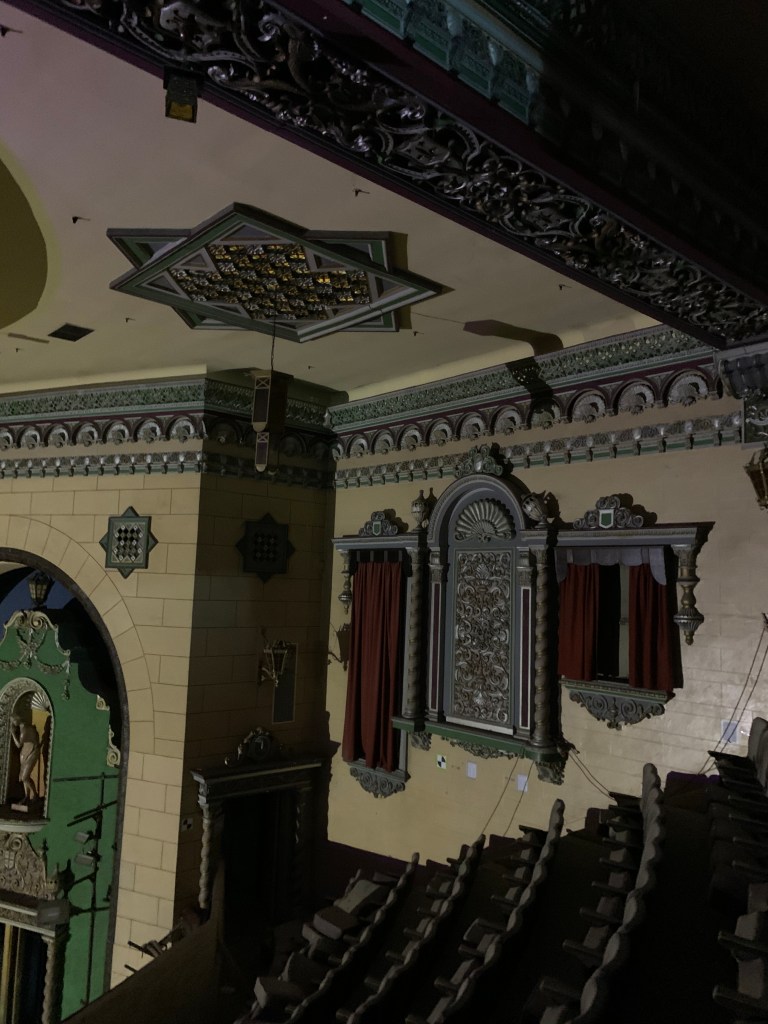
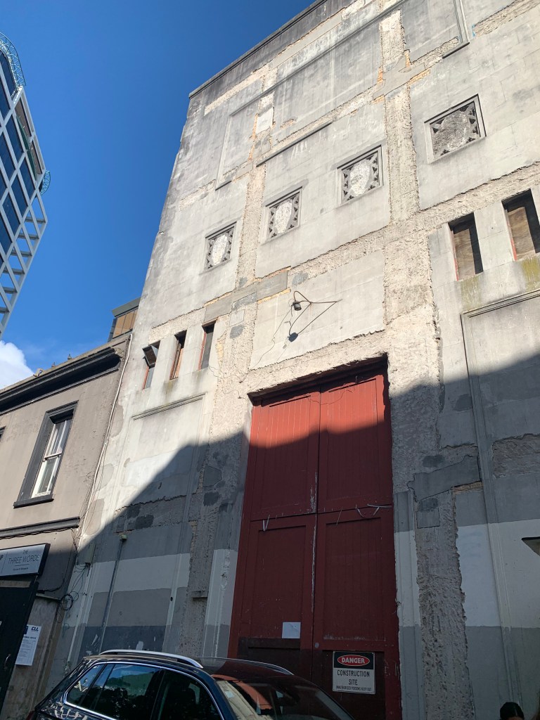
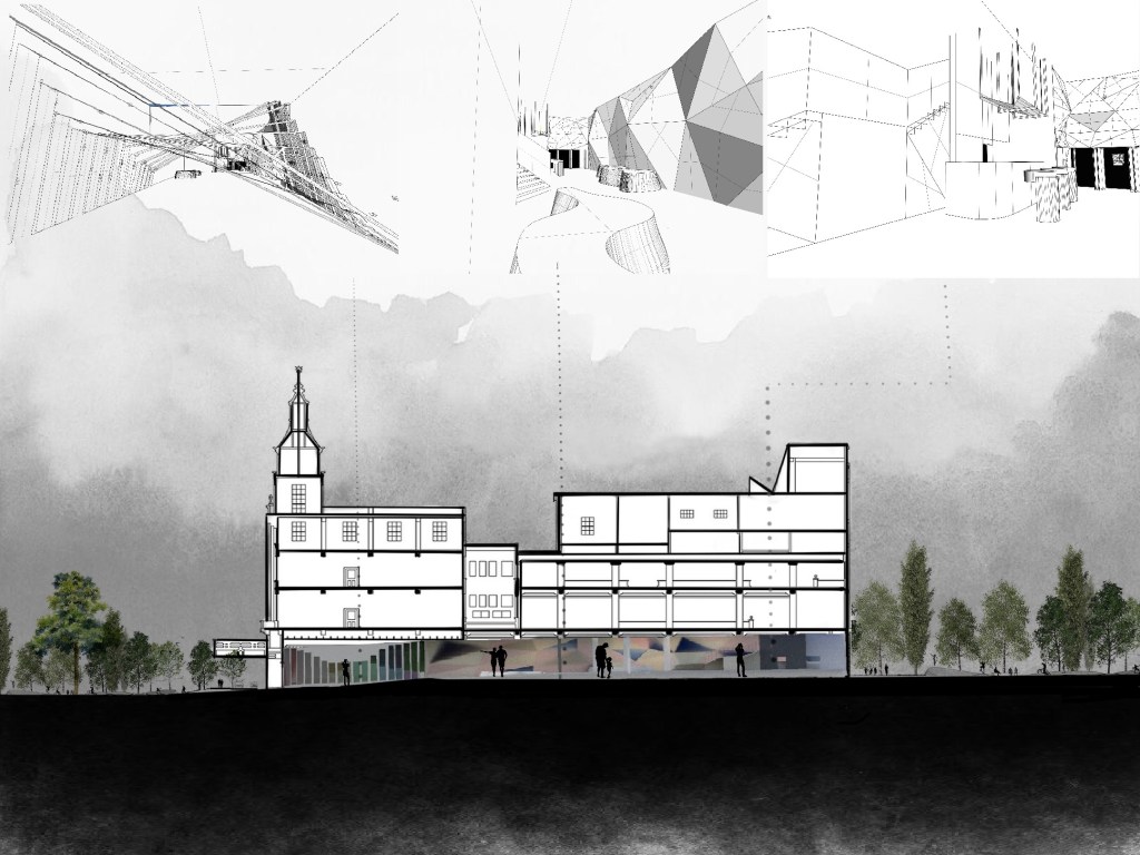
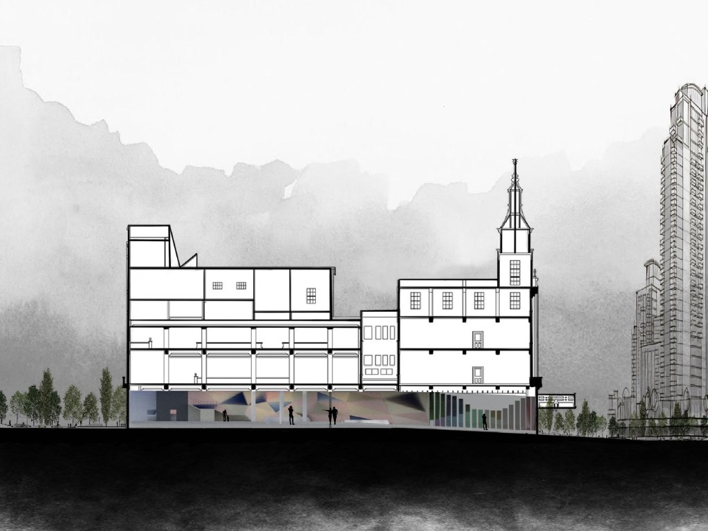
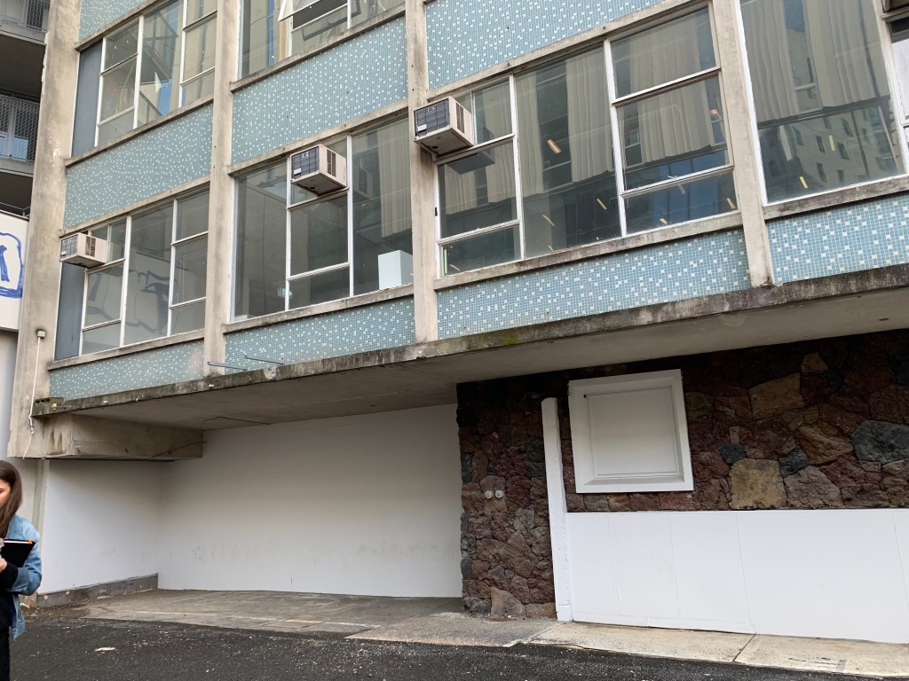
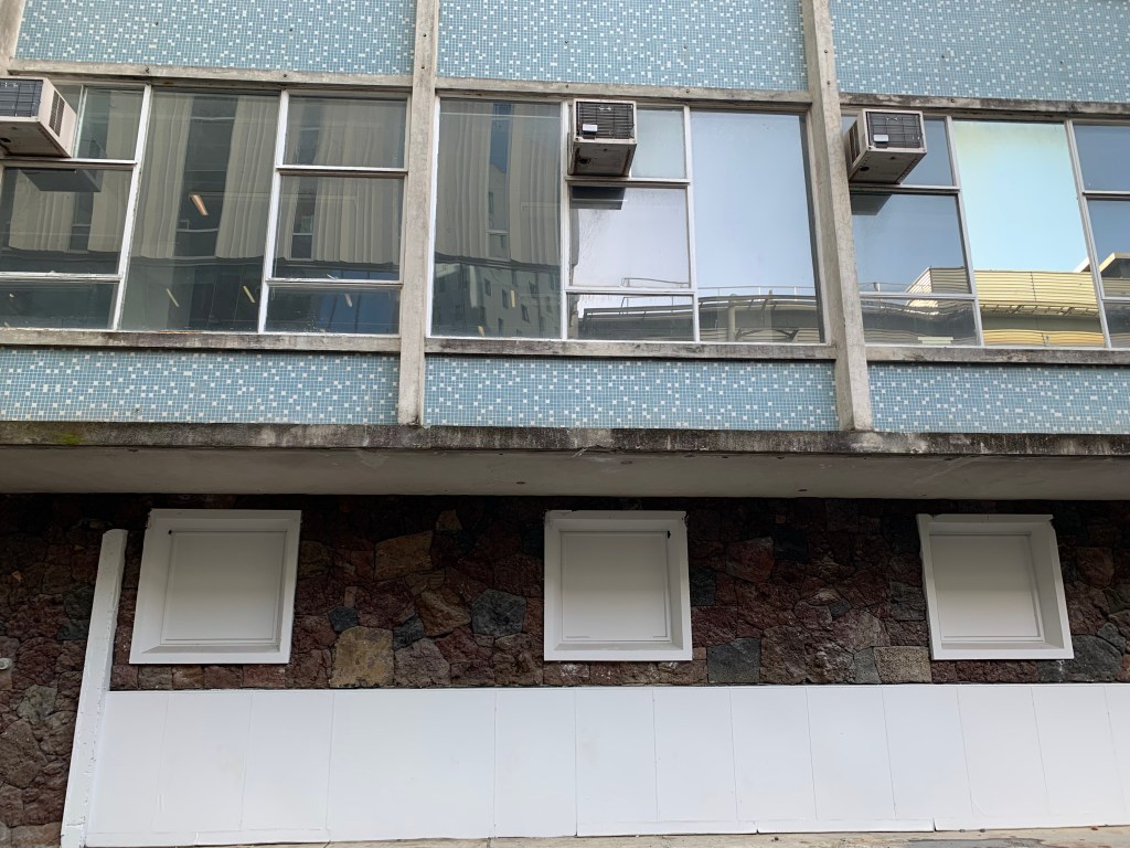
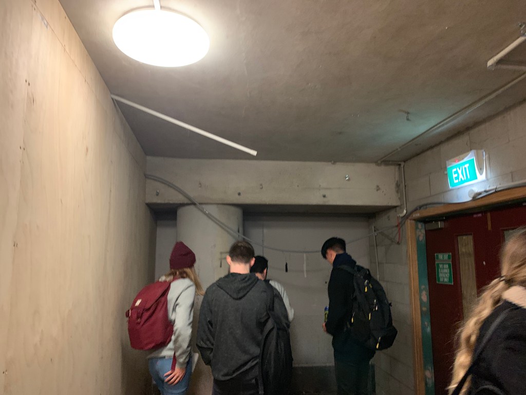
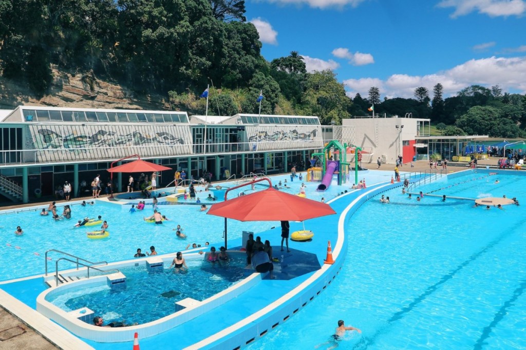
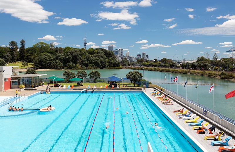
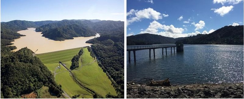
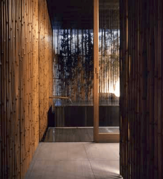
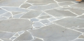
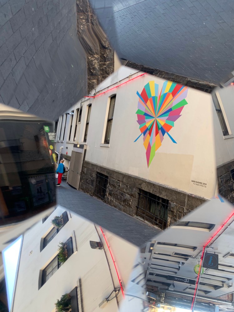
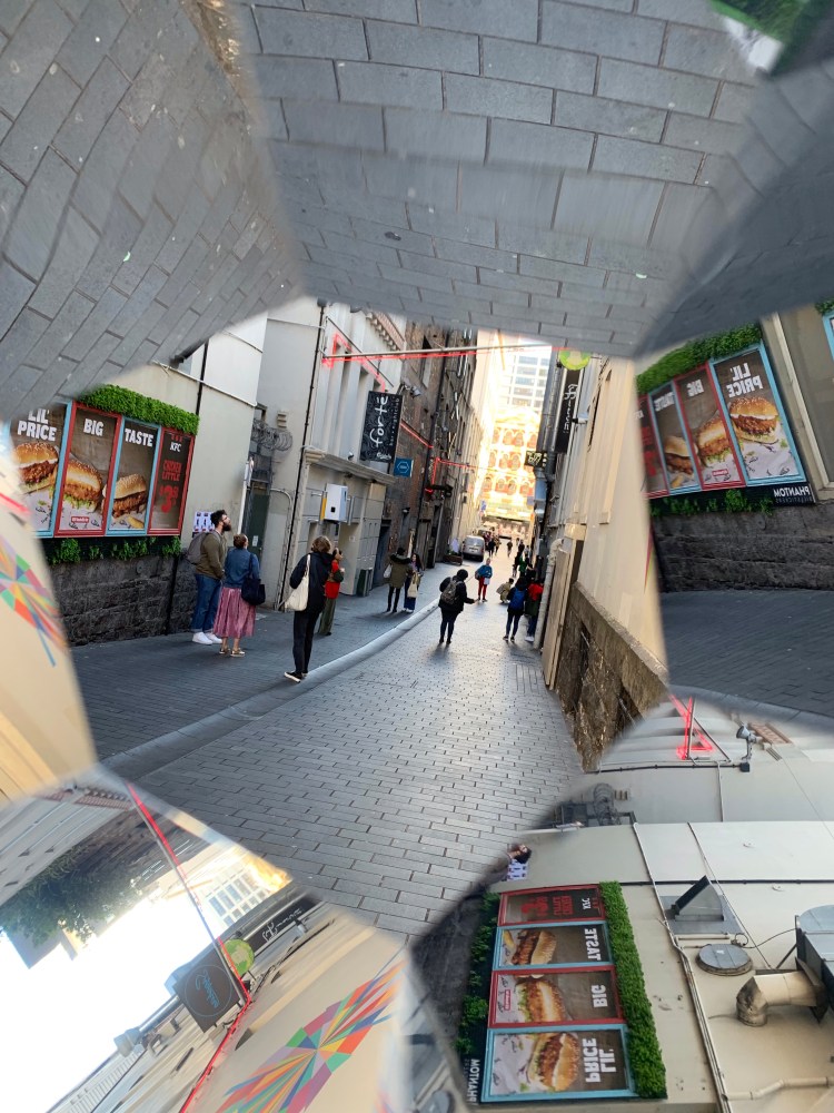
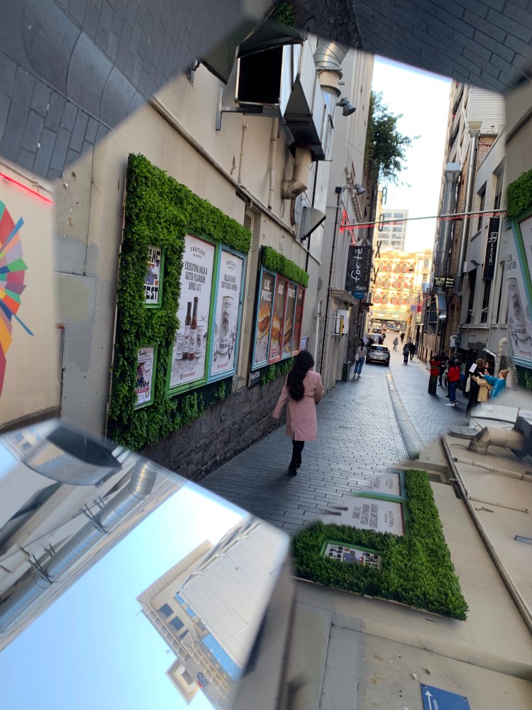
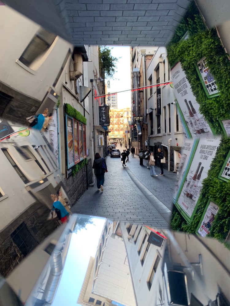
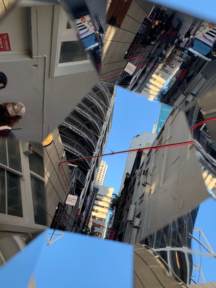
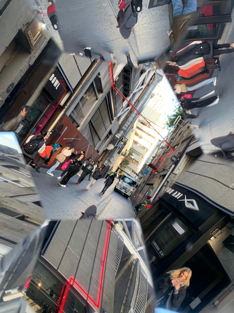
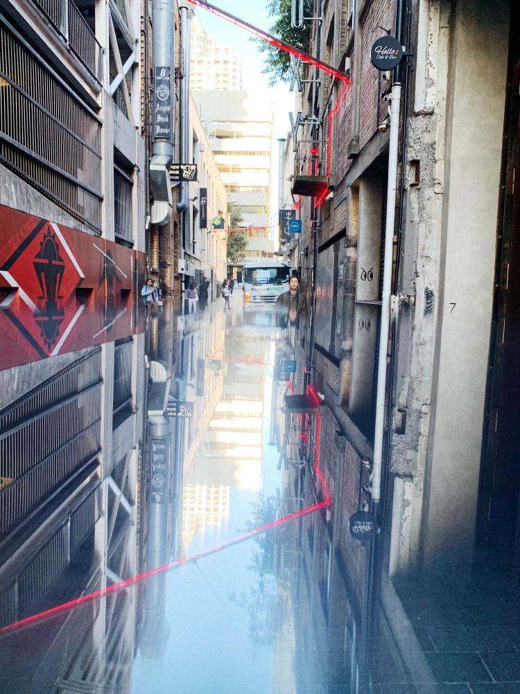
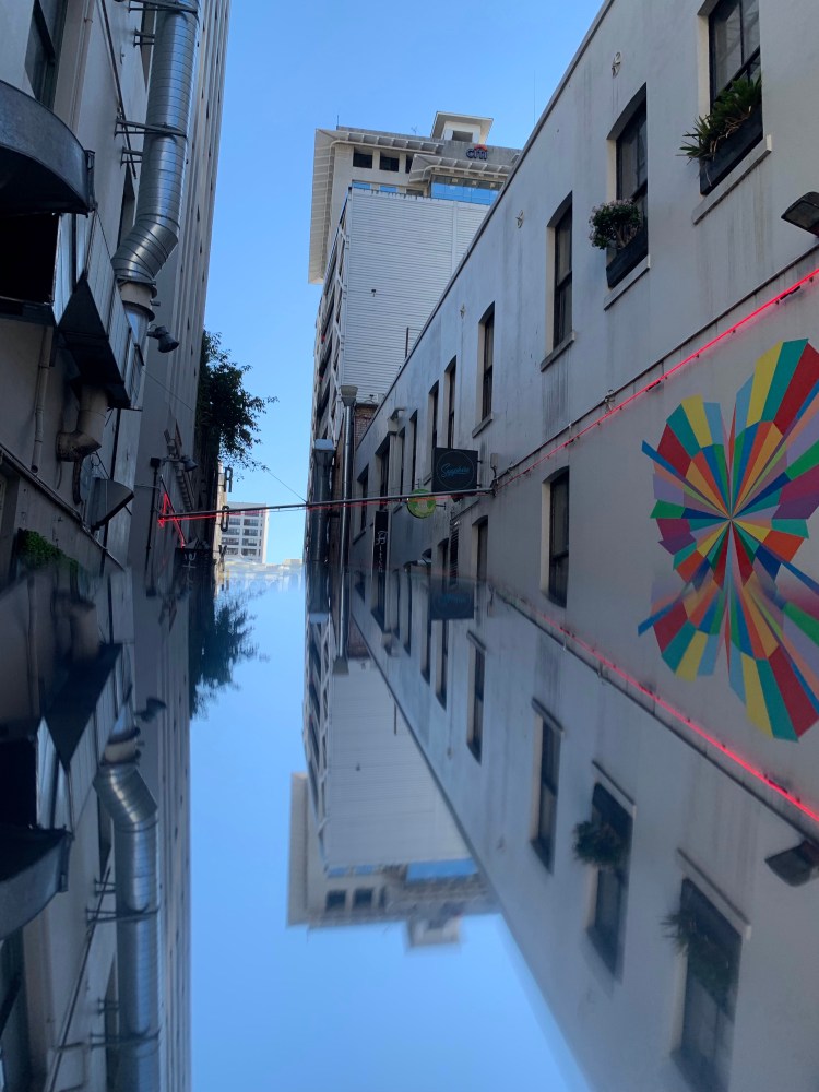
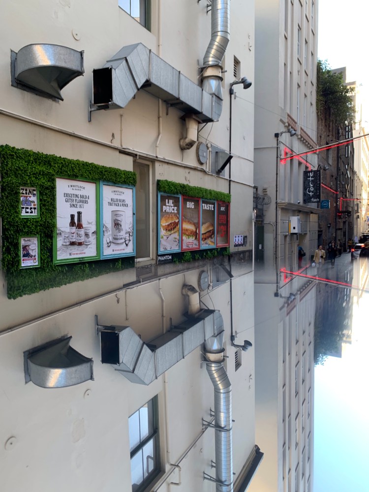
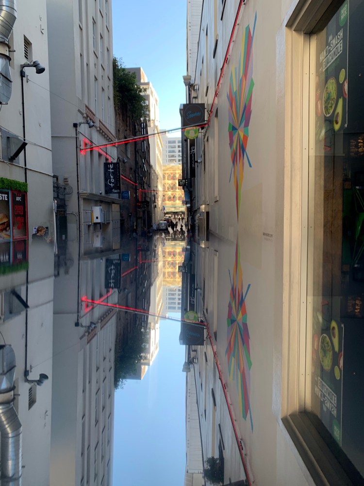
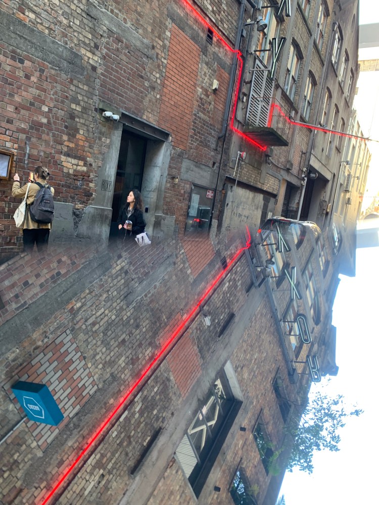
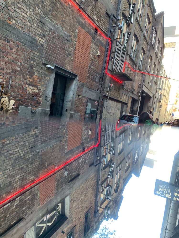
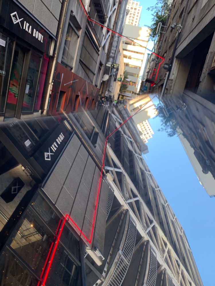
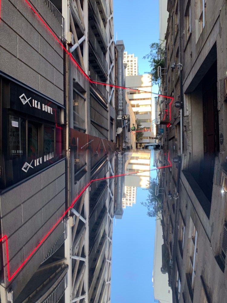
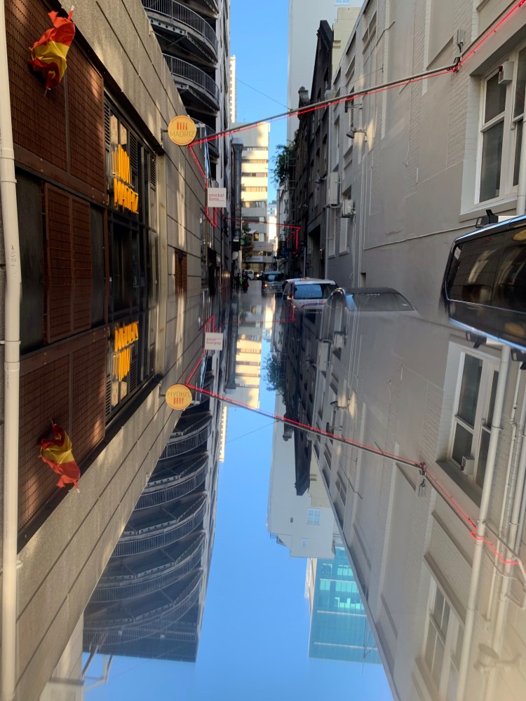
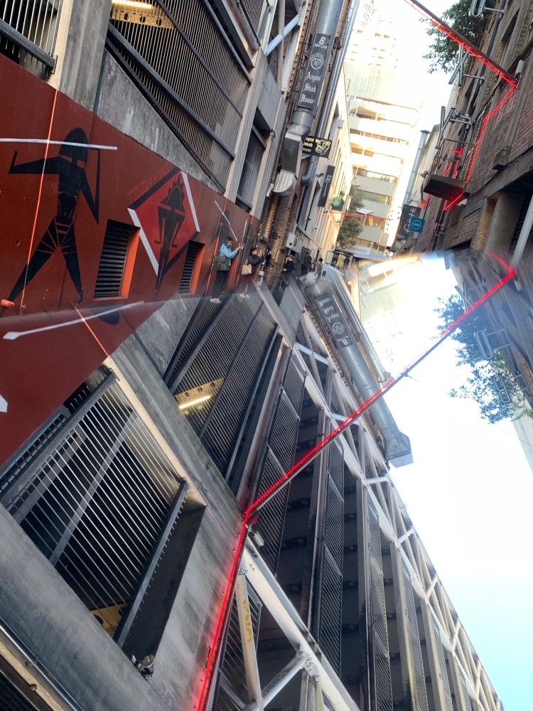
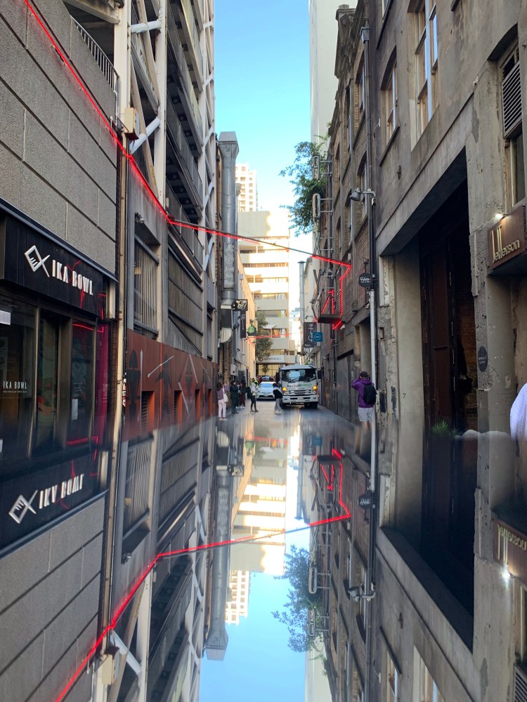
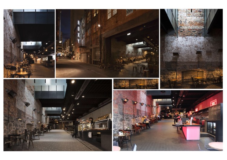
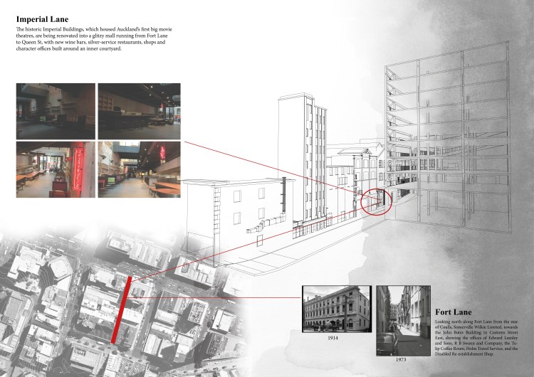
Carving out a thoroughfare at ground-level between Fort Lane and Queen St, the Lane takes its lead from the great cities of New York and Melbourne as one of the city centre’s best laneways.
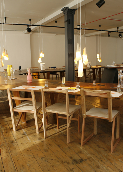
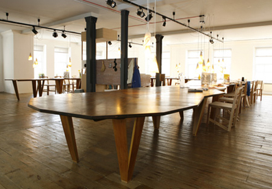
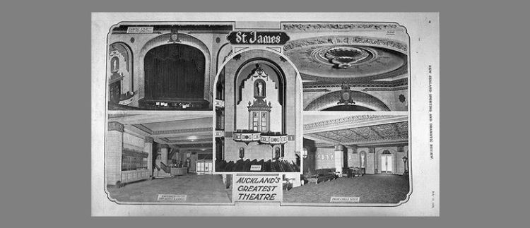
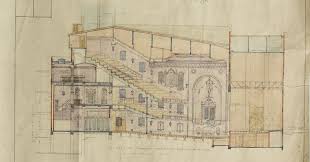
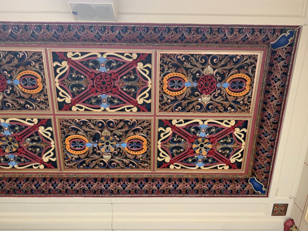
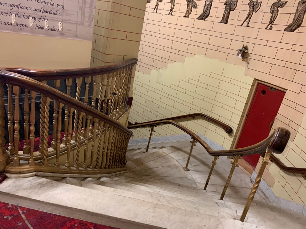
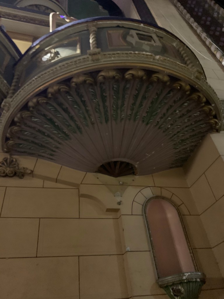
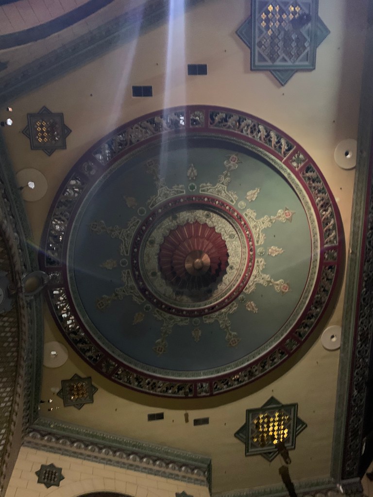
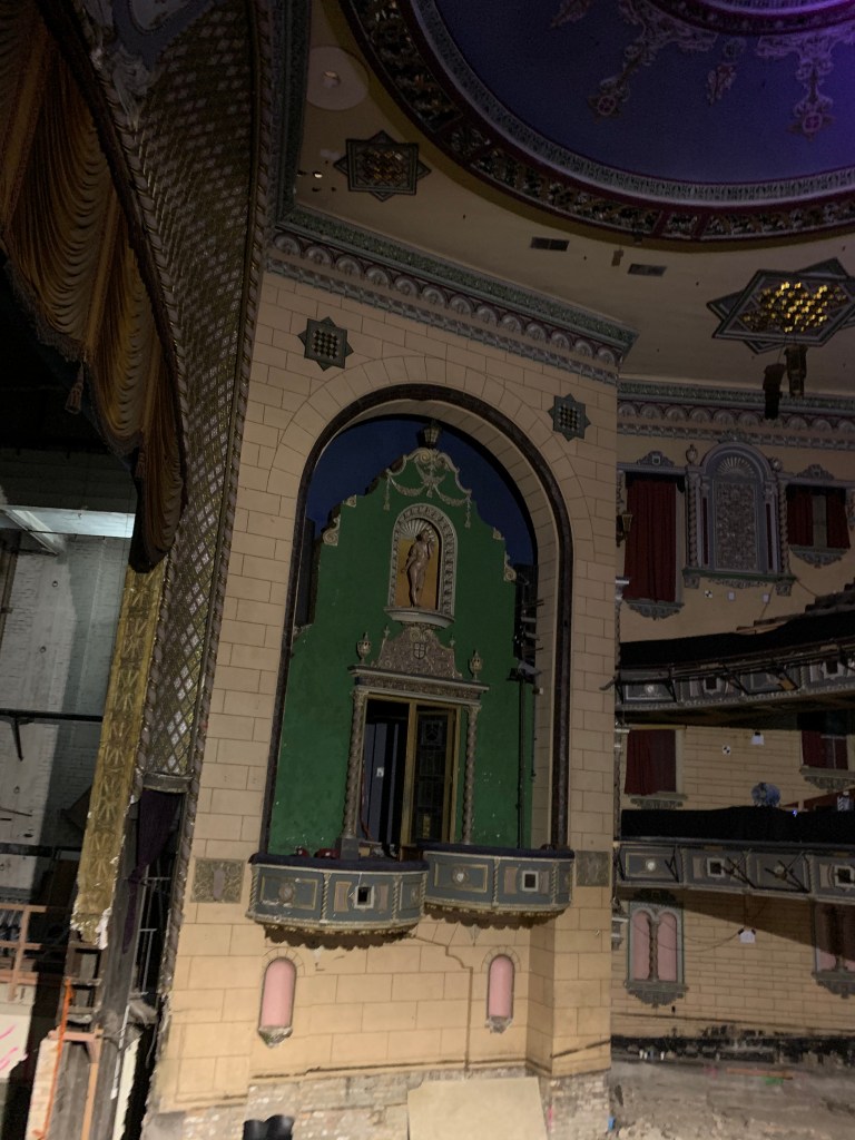
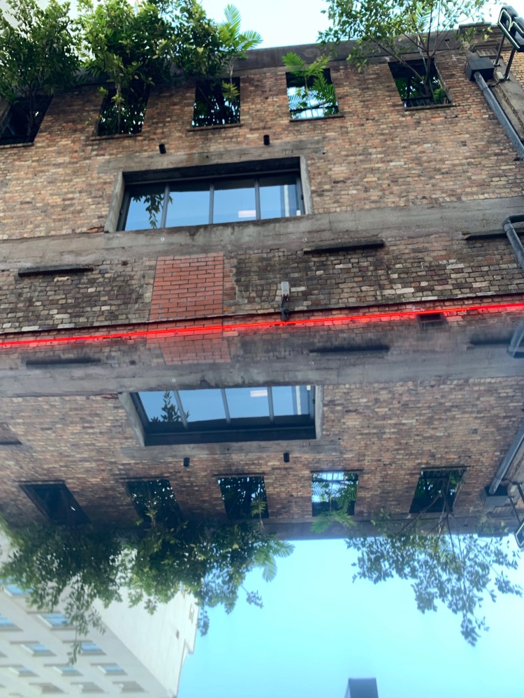
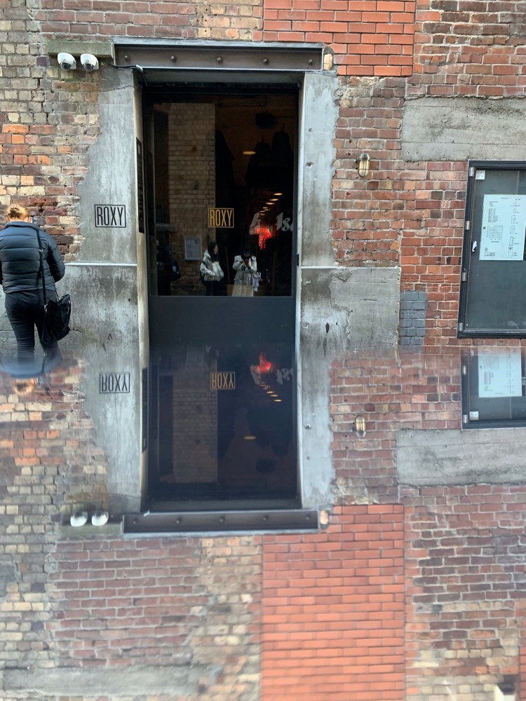
Lit by massive four-story lightwells and with a sweeping spiral staircase leading to the theatres on the first floor, the raw bricks, cobblestone floors and large oak and concrete tables create a distinct 19th century industrial warehouse feel.
Week 3: Scipt
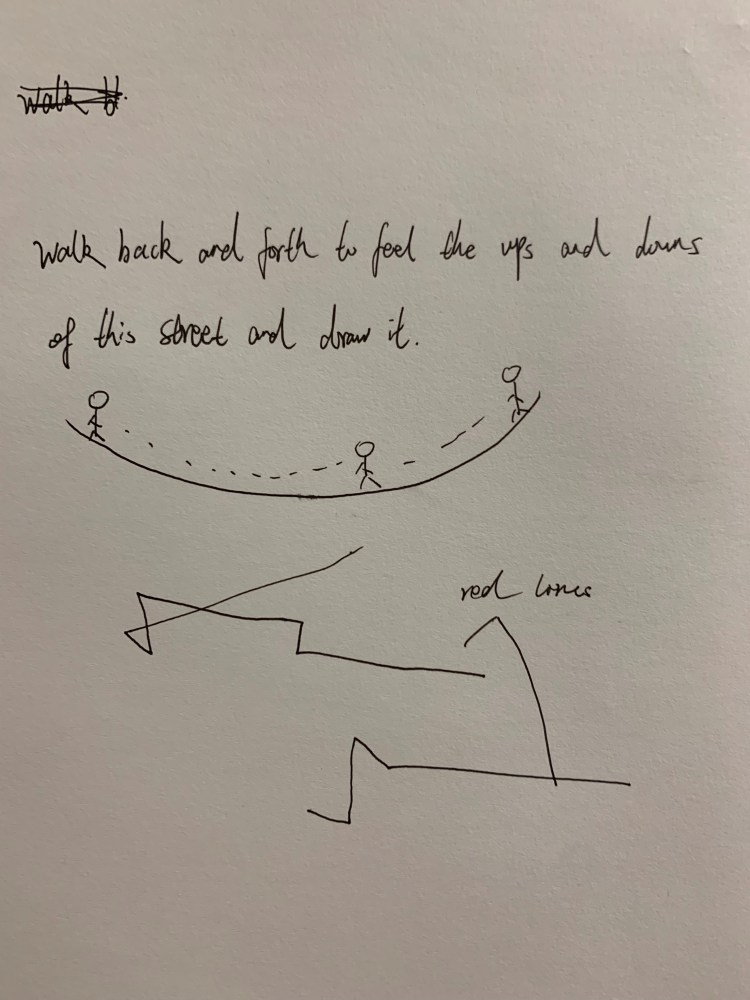
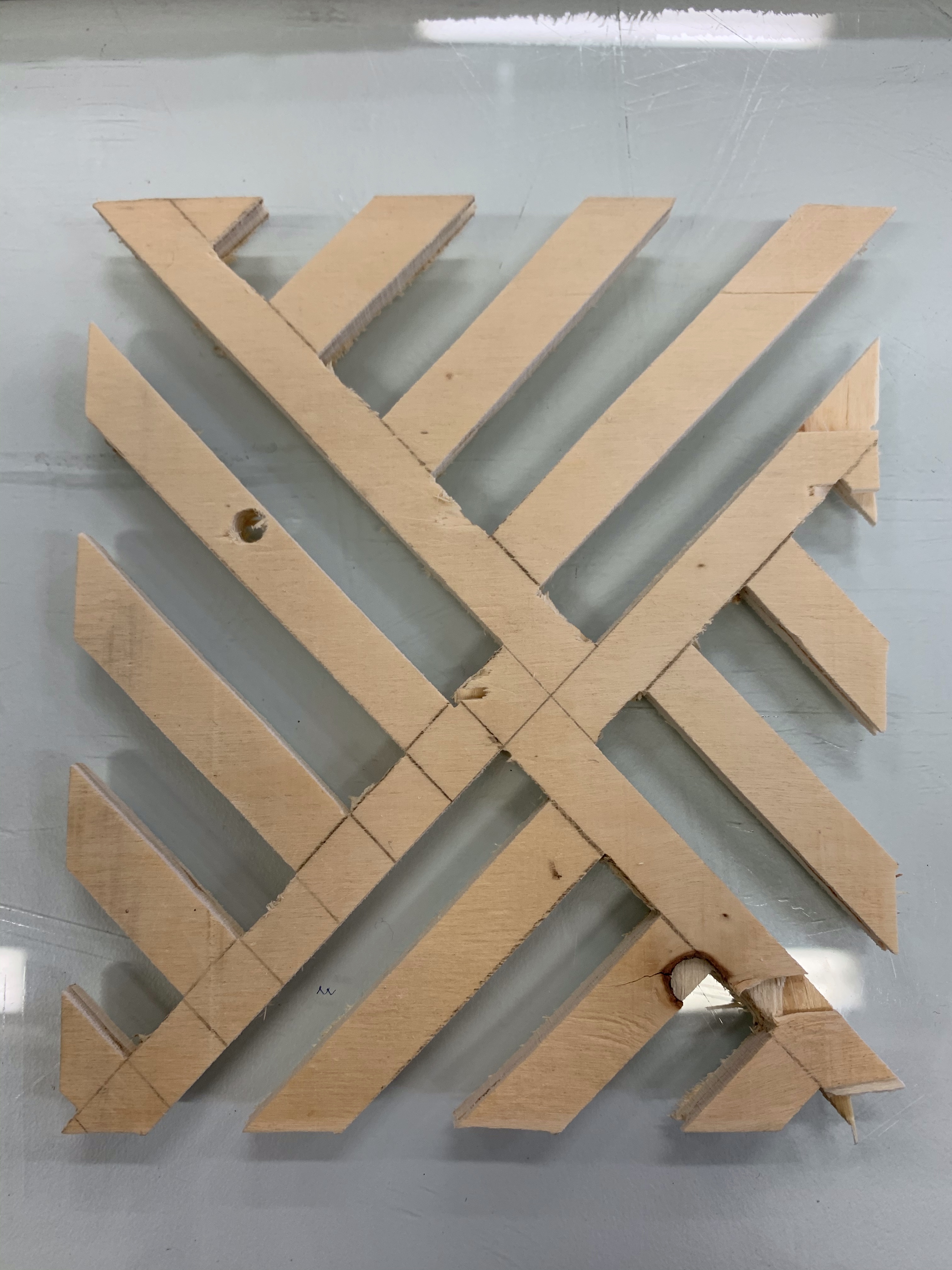
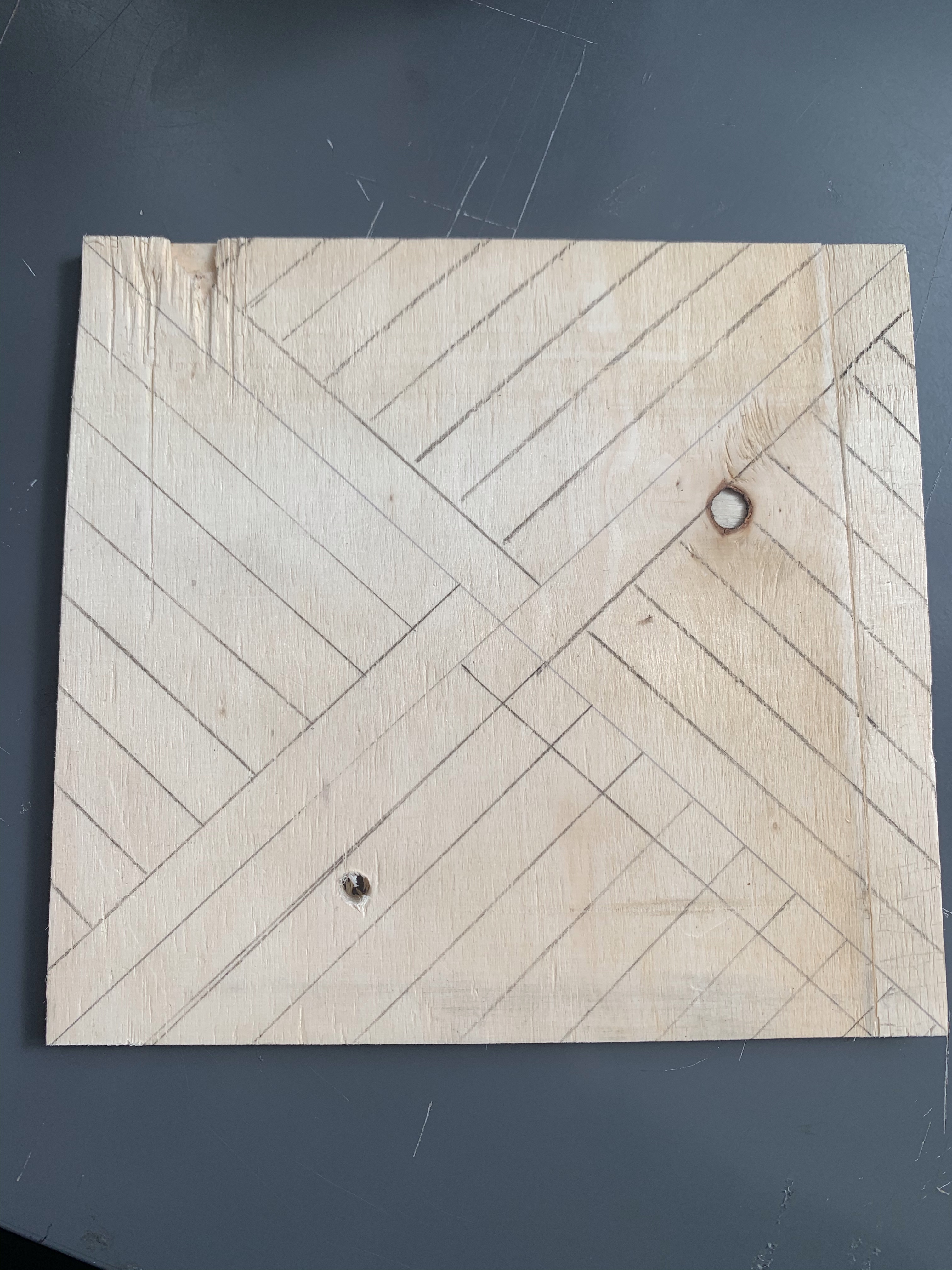
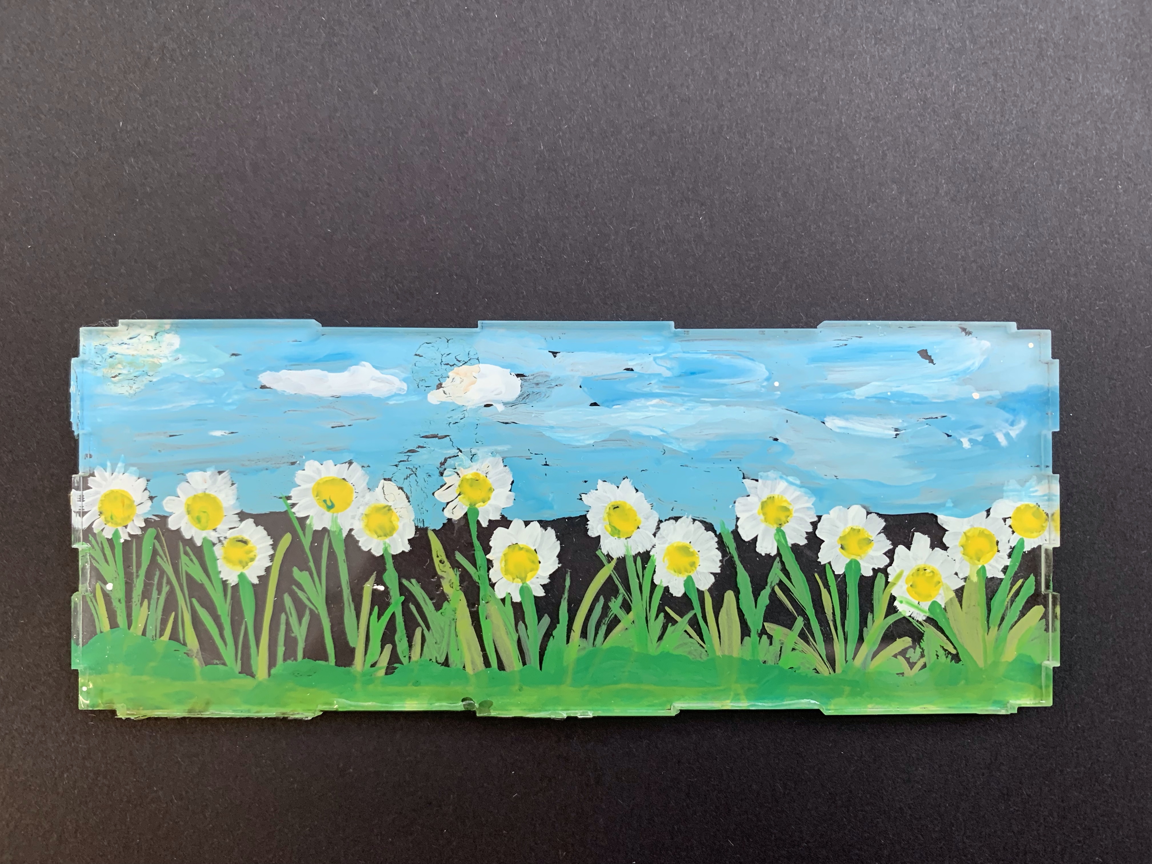
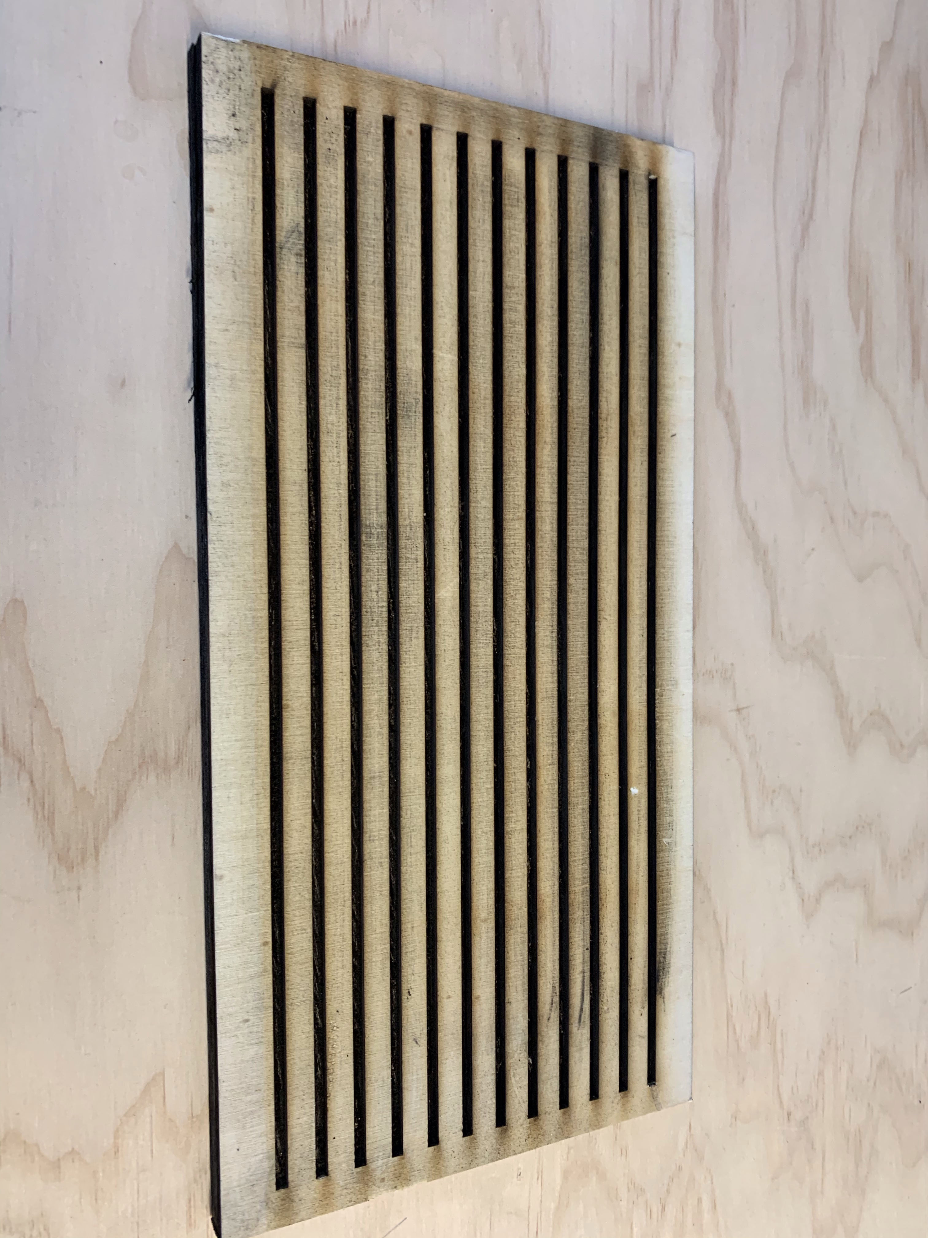
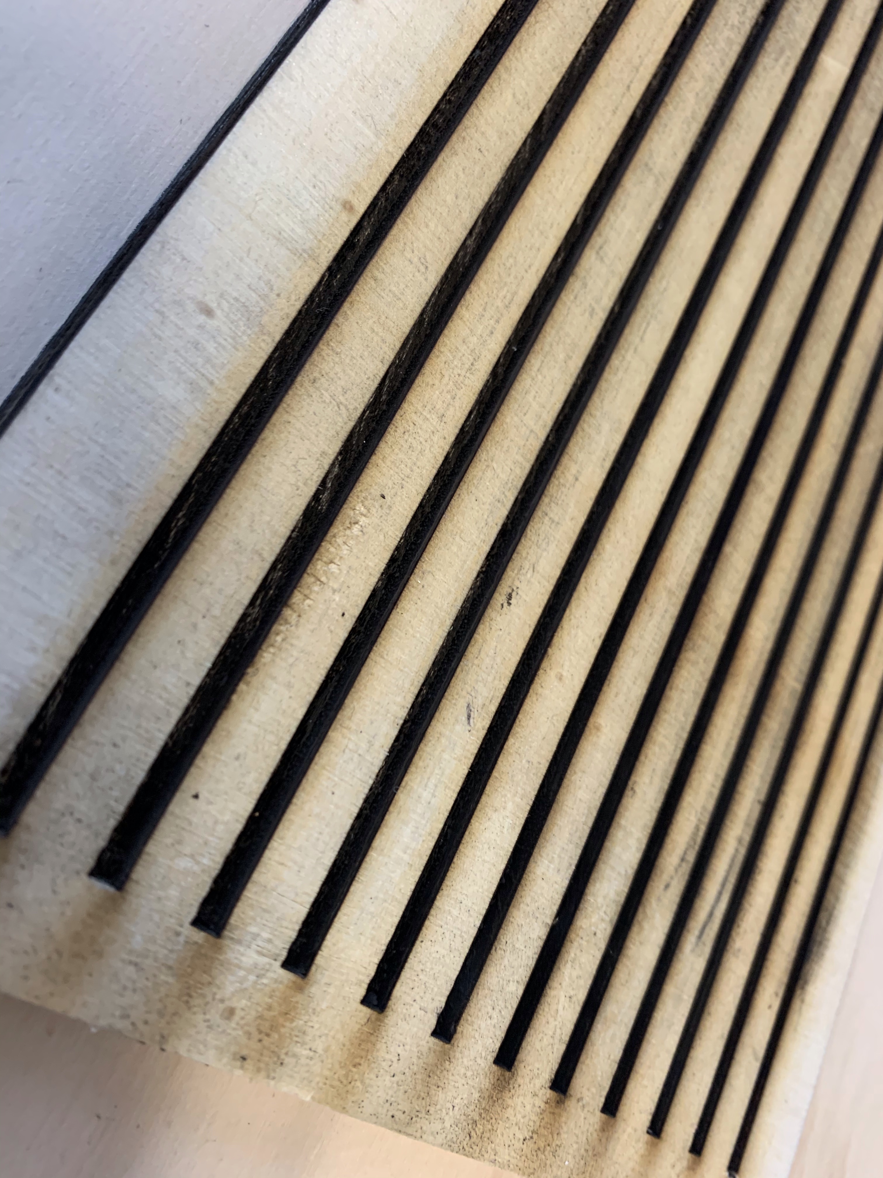
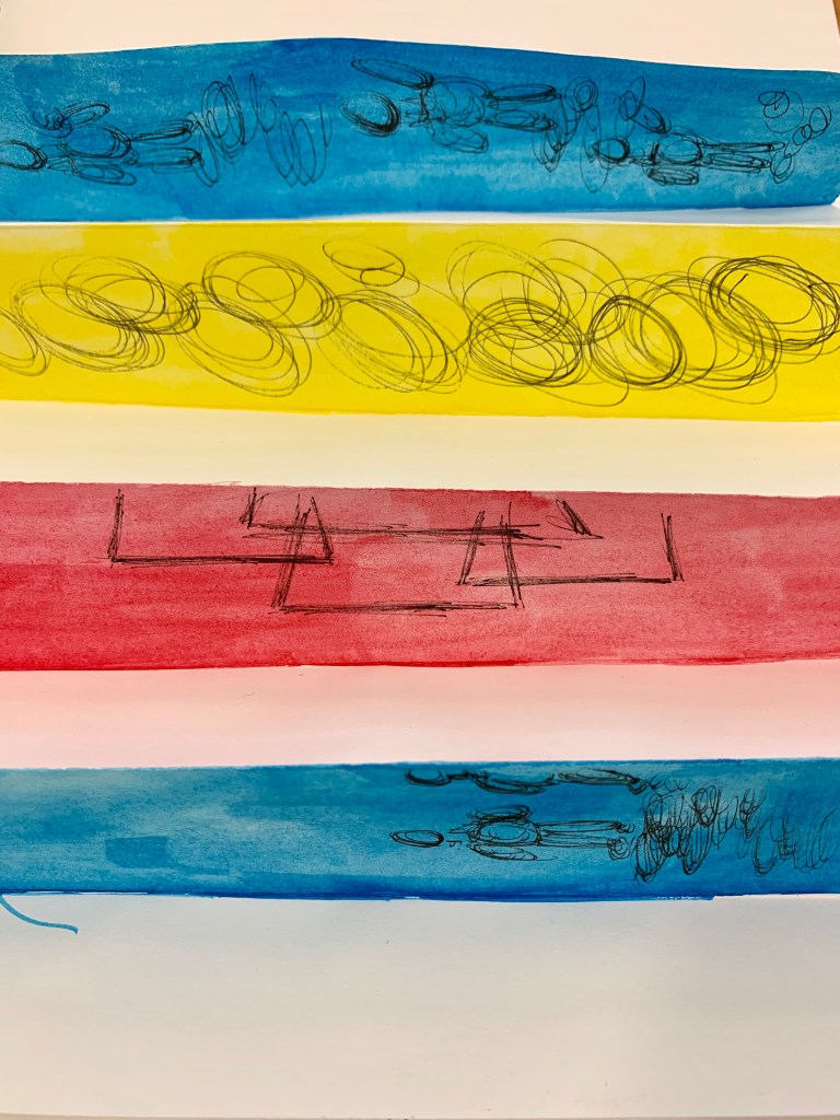
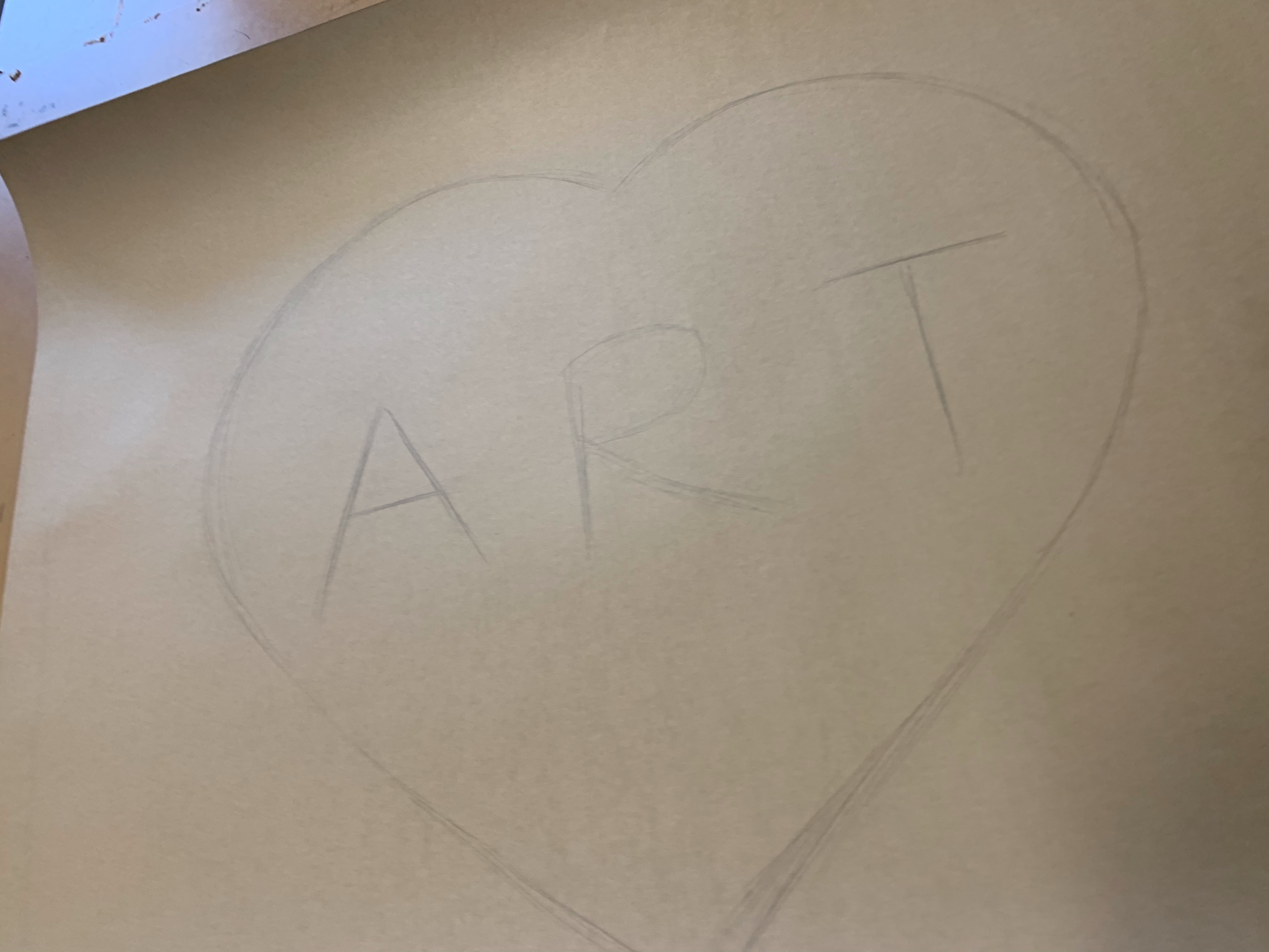
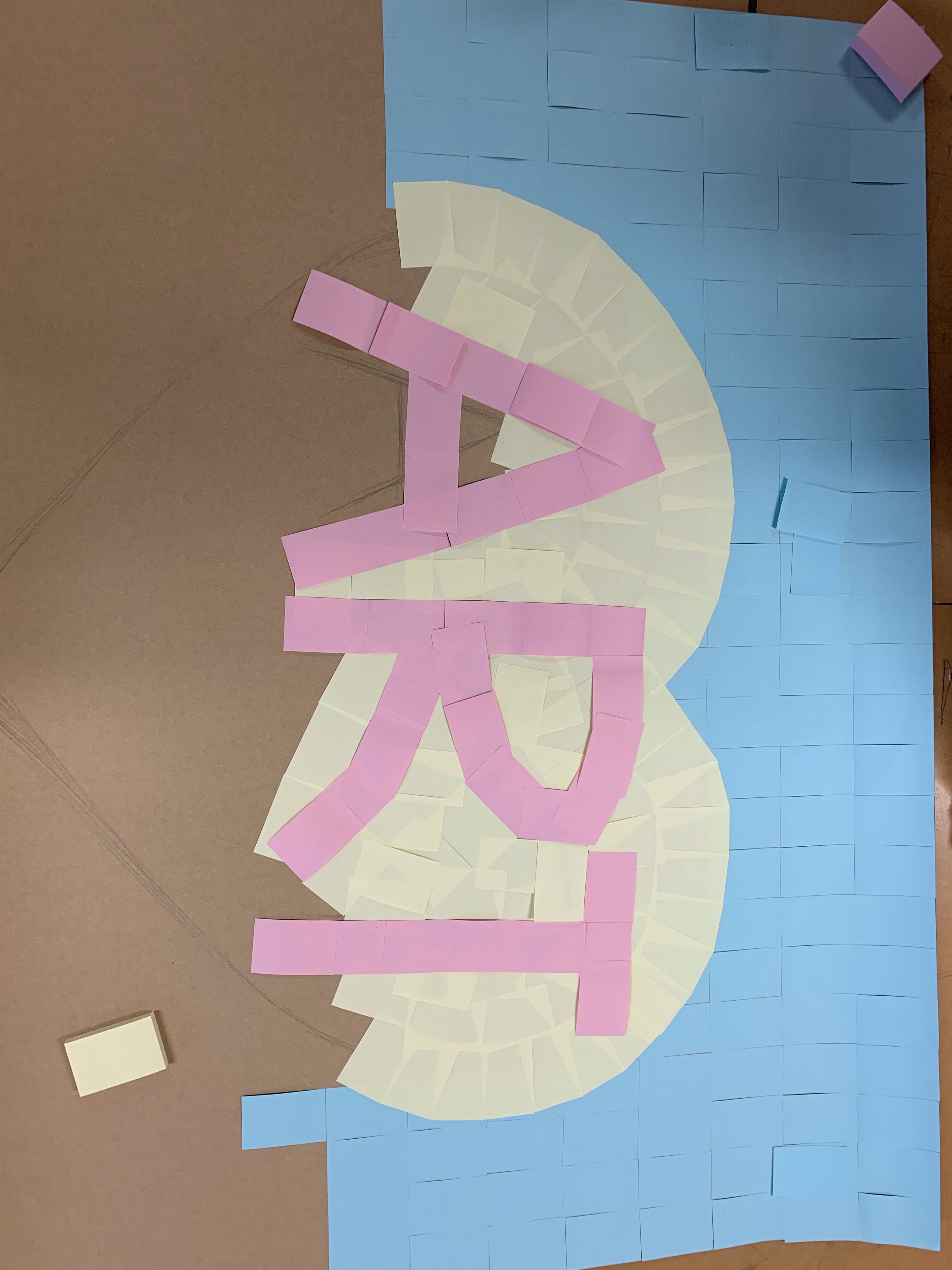
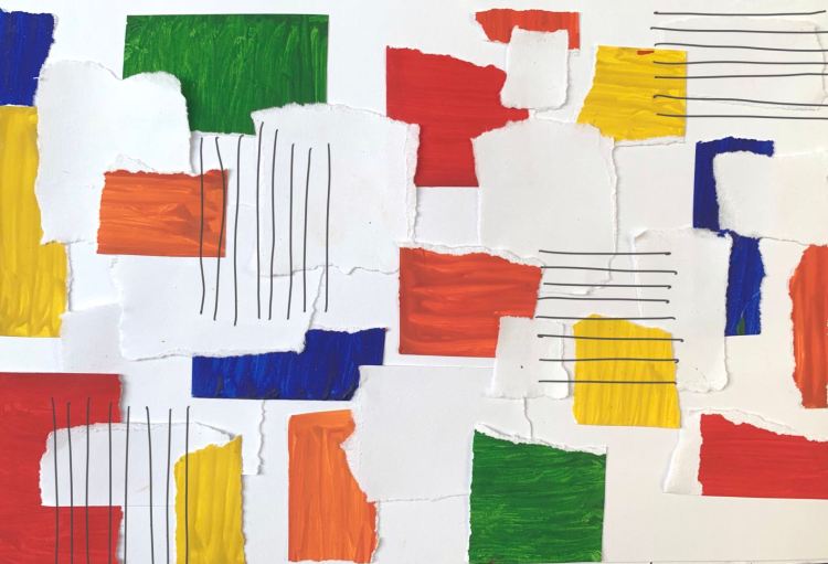
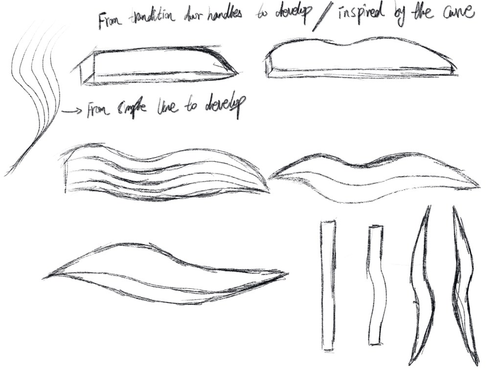
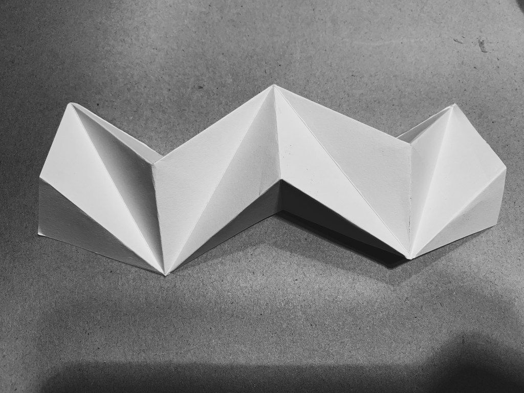
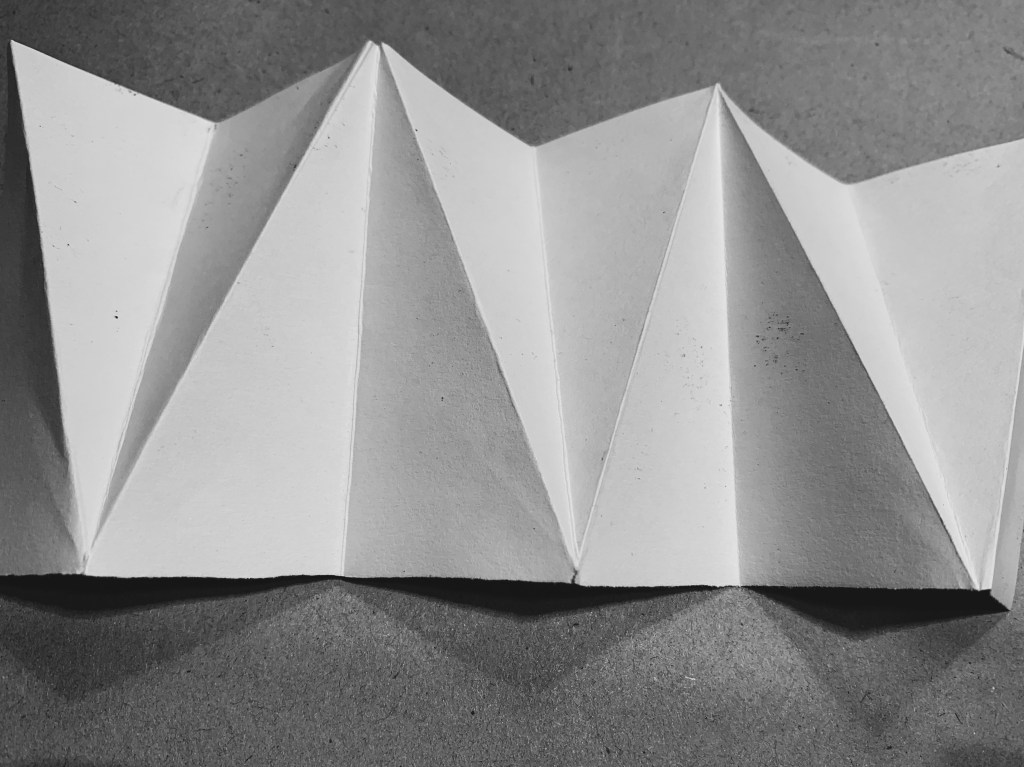
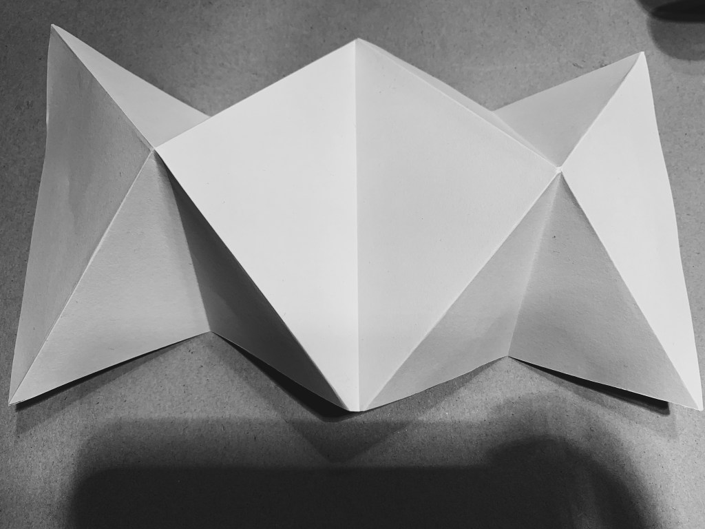
In this scipt, I mainly want people to notice the lines, I think it is very interesting to create with simple lines. Feel the feeling that different lines bring to people.
5 Key conceptual terms
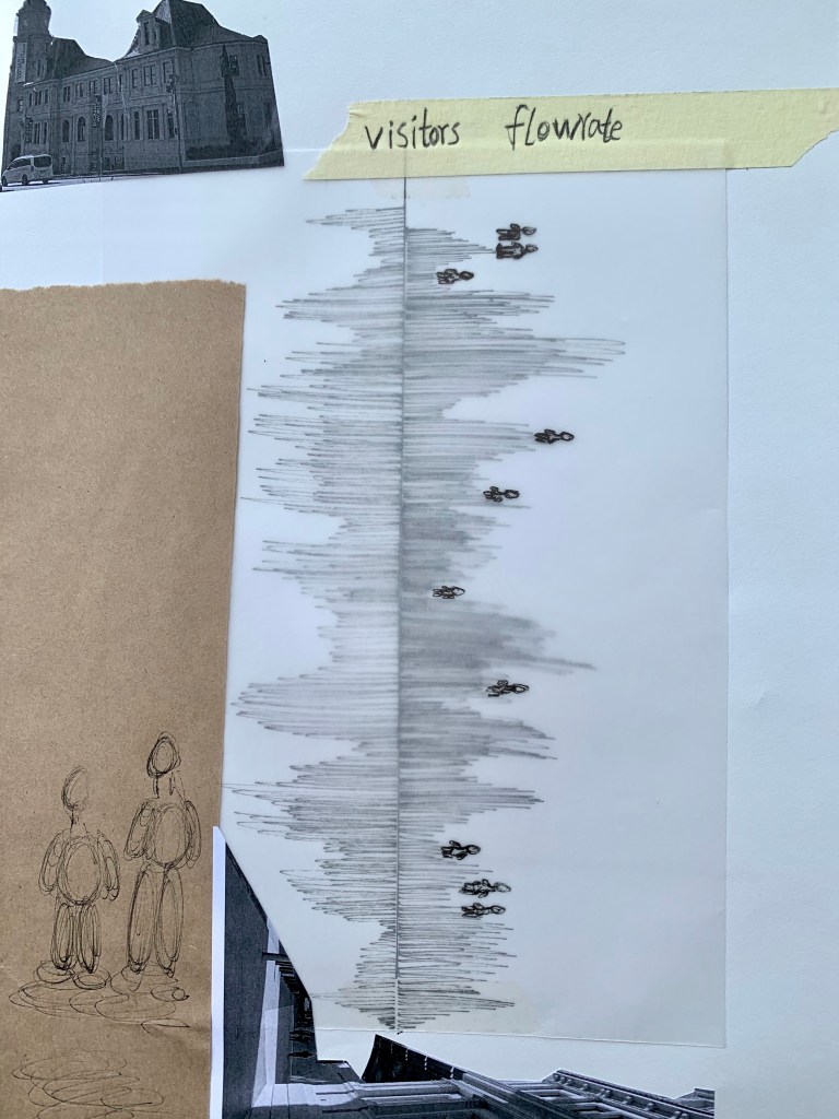
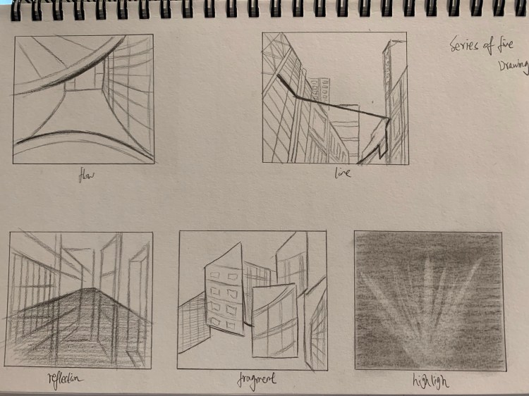
Flow
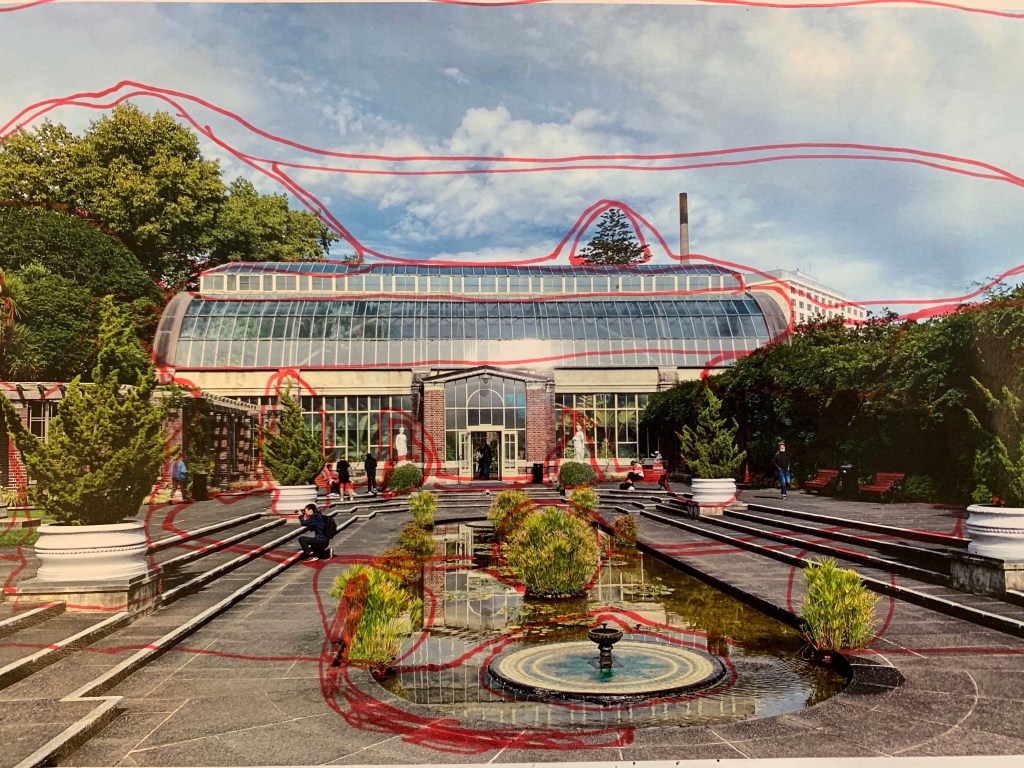
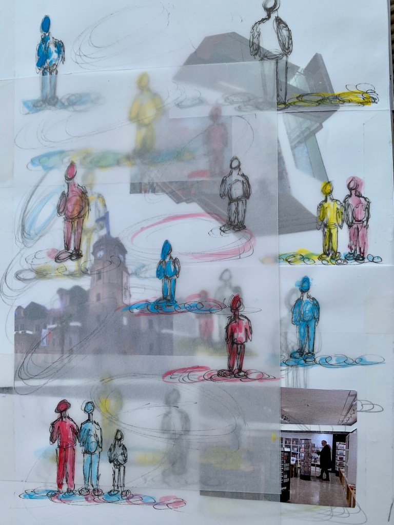
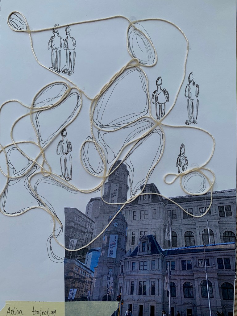
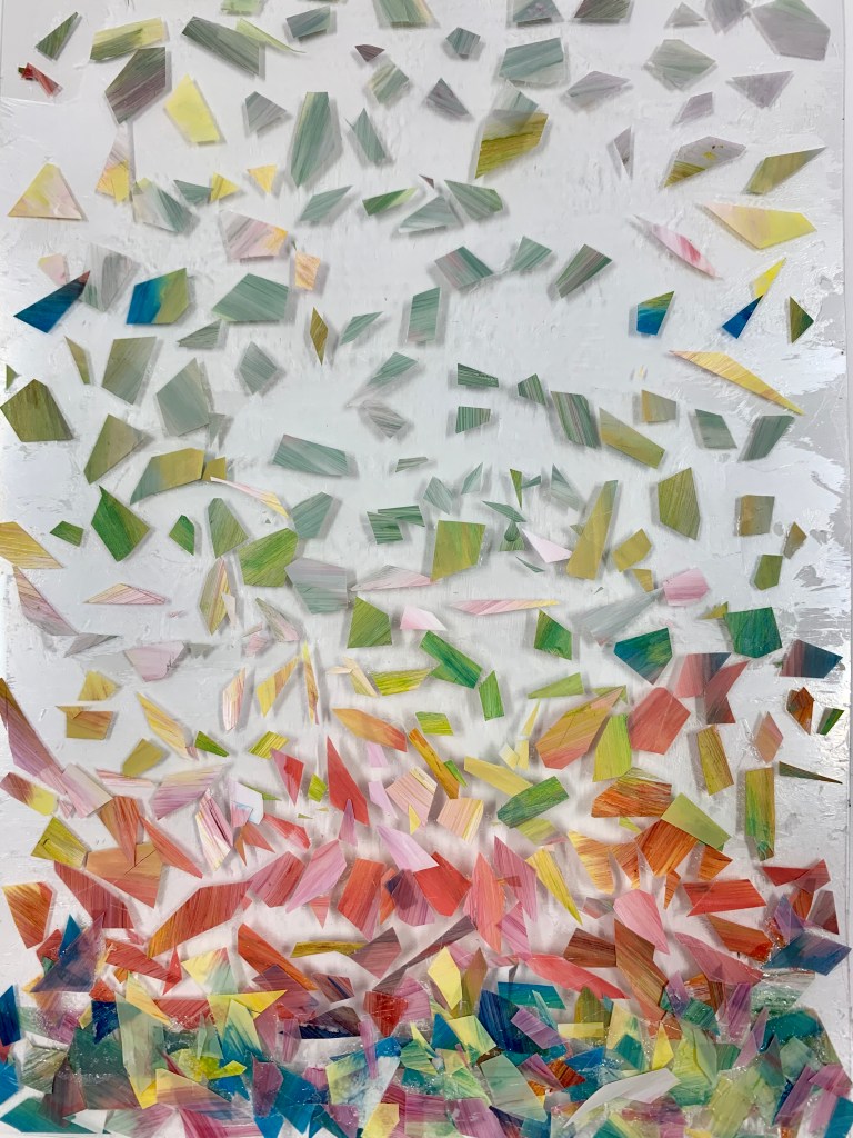
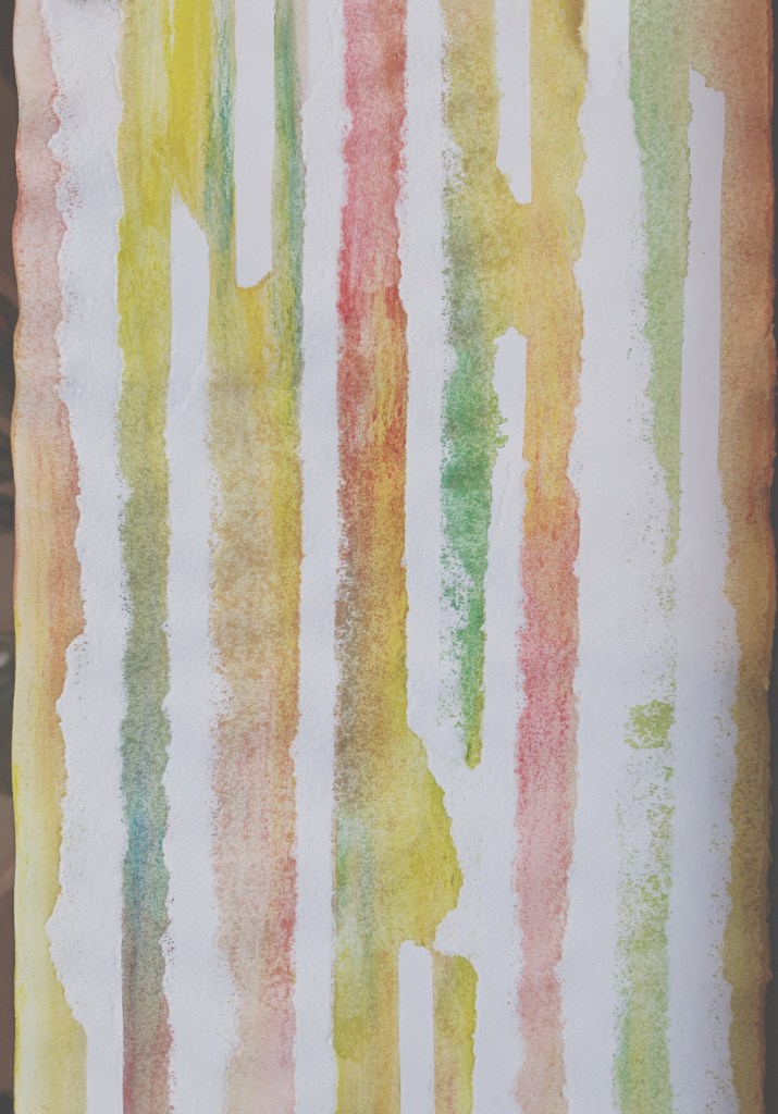
Flow not only refers to the mobility of the crowd, but what impression me is that I feel the undulating lines on this street. The lines on the ground are soft, not only in the external streets, but also in the interior spaces. This reminds me if sea level combined with the historical, I think flow can express this space very well. Whether it is the crowd or the lines in the space, there is a sense of flow.
Line
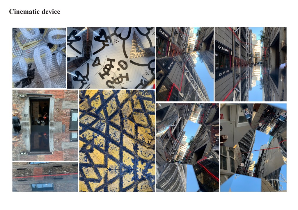
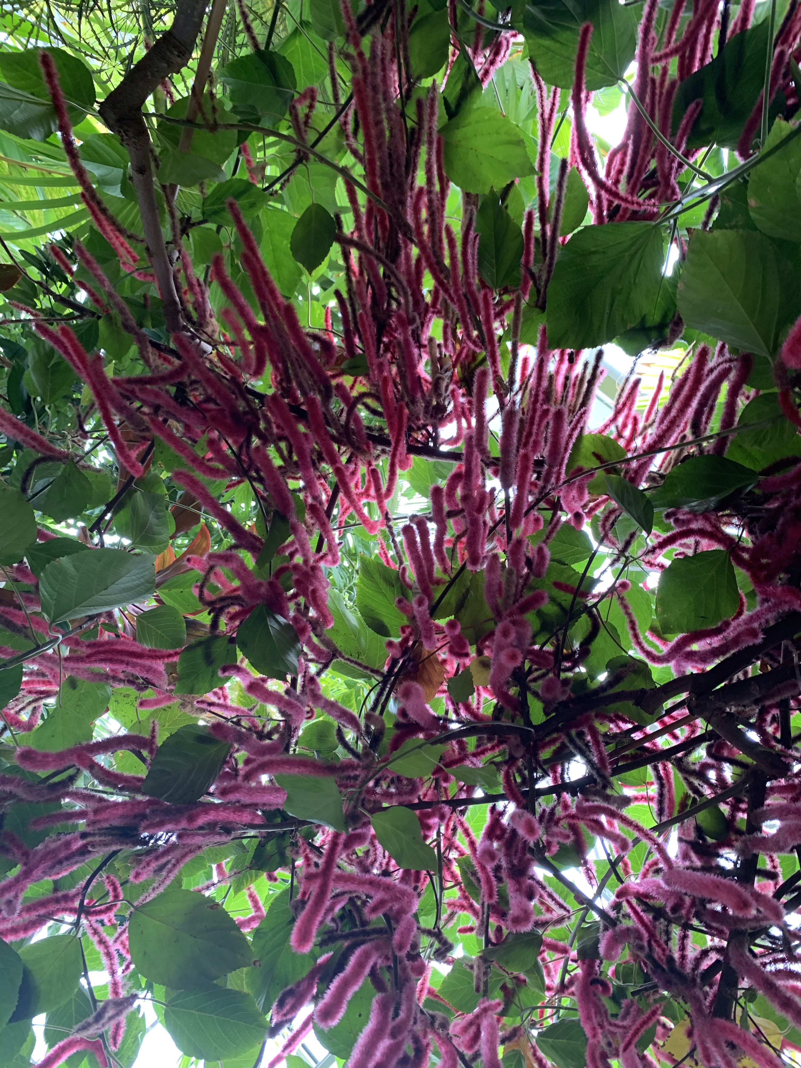
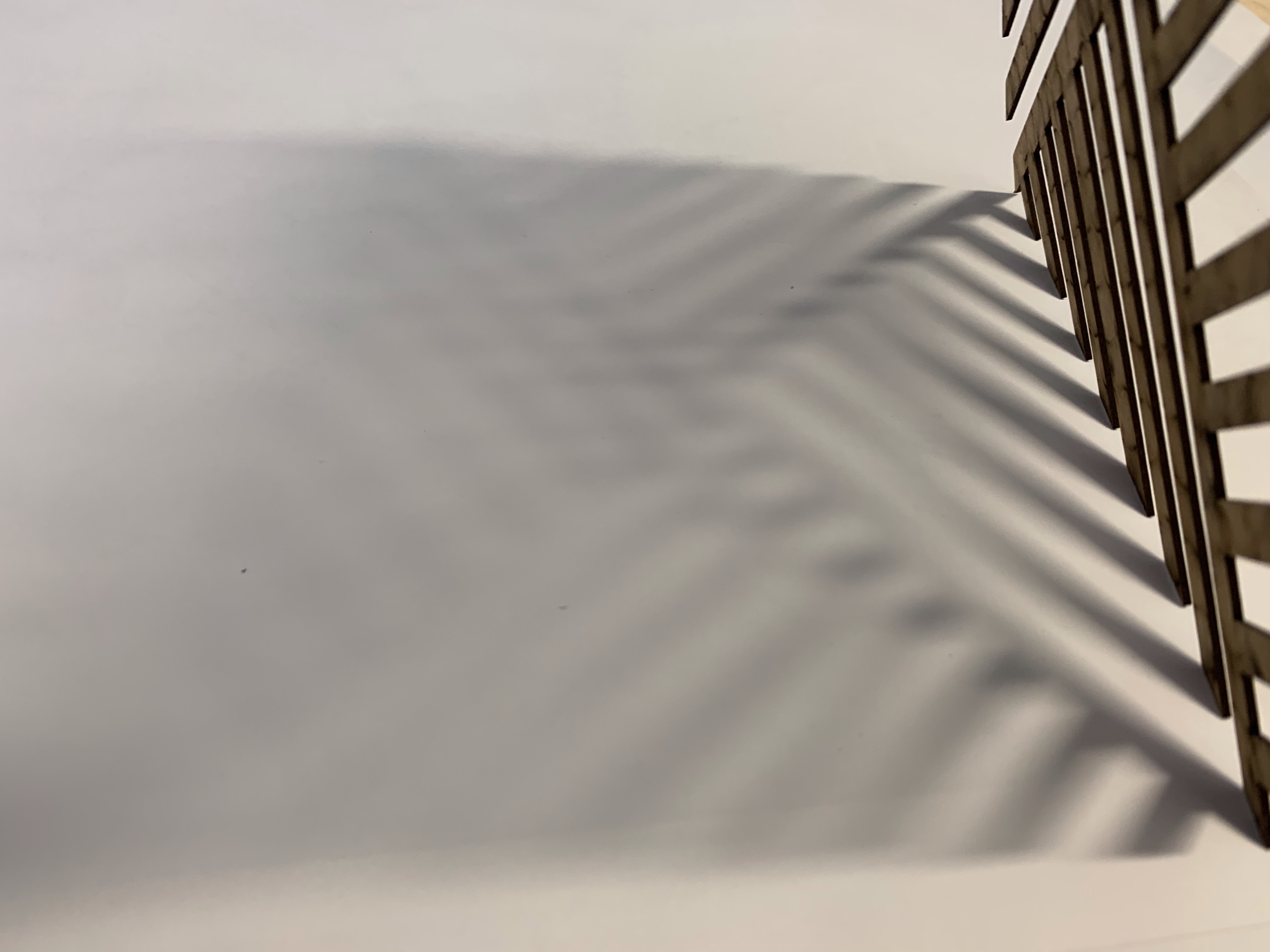
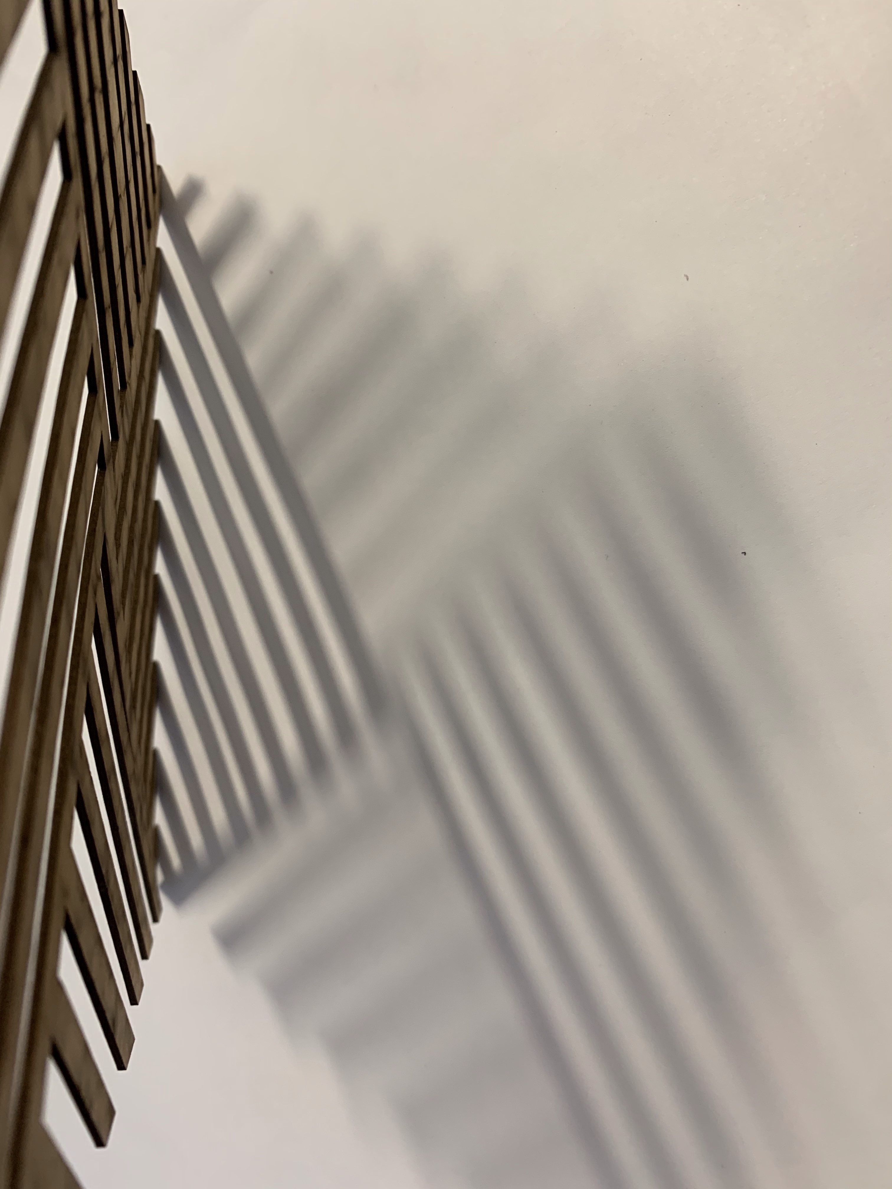
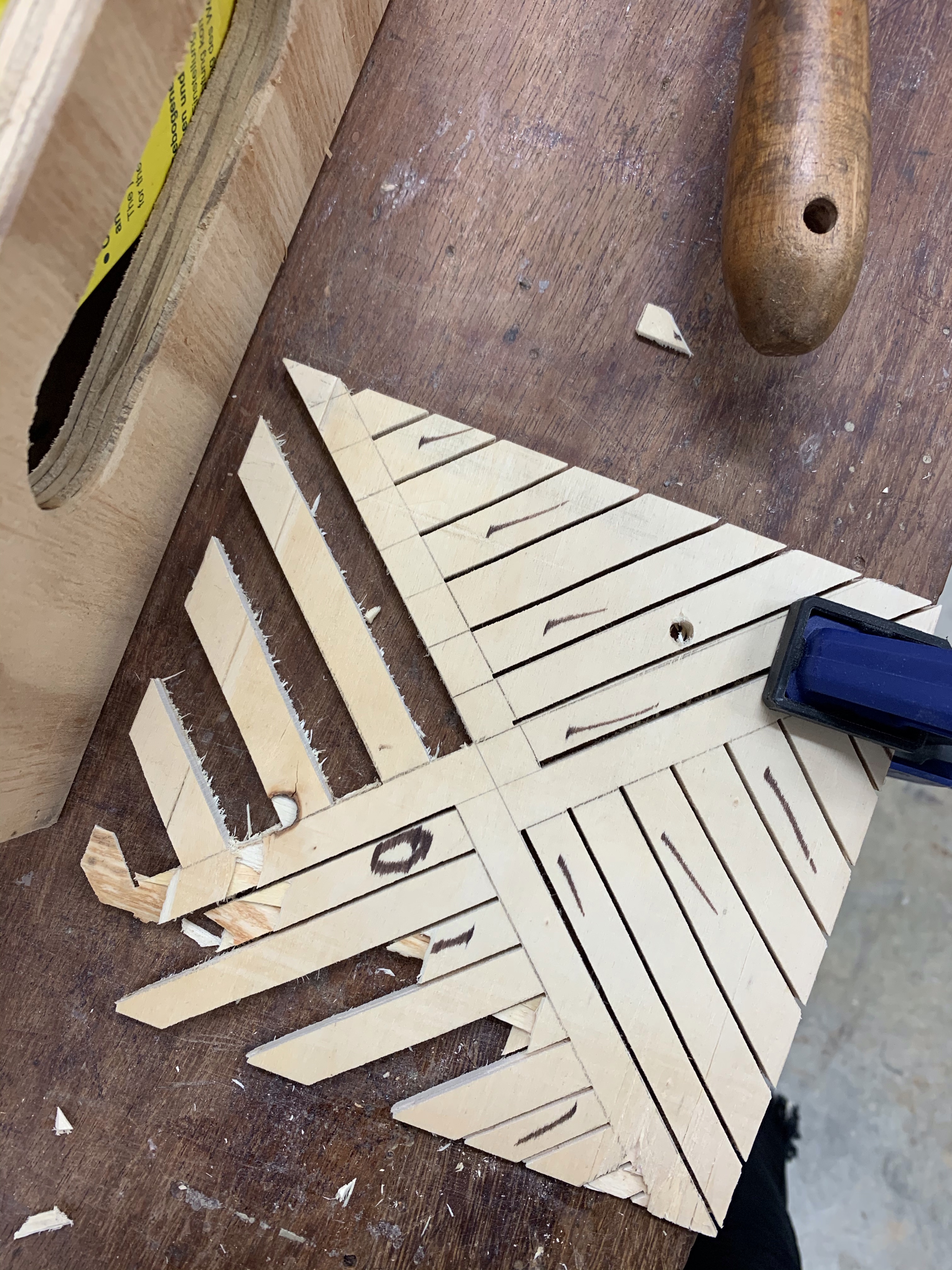
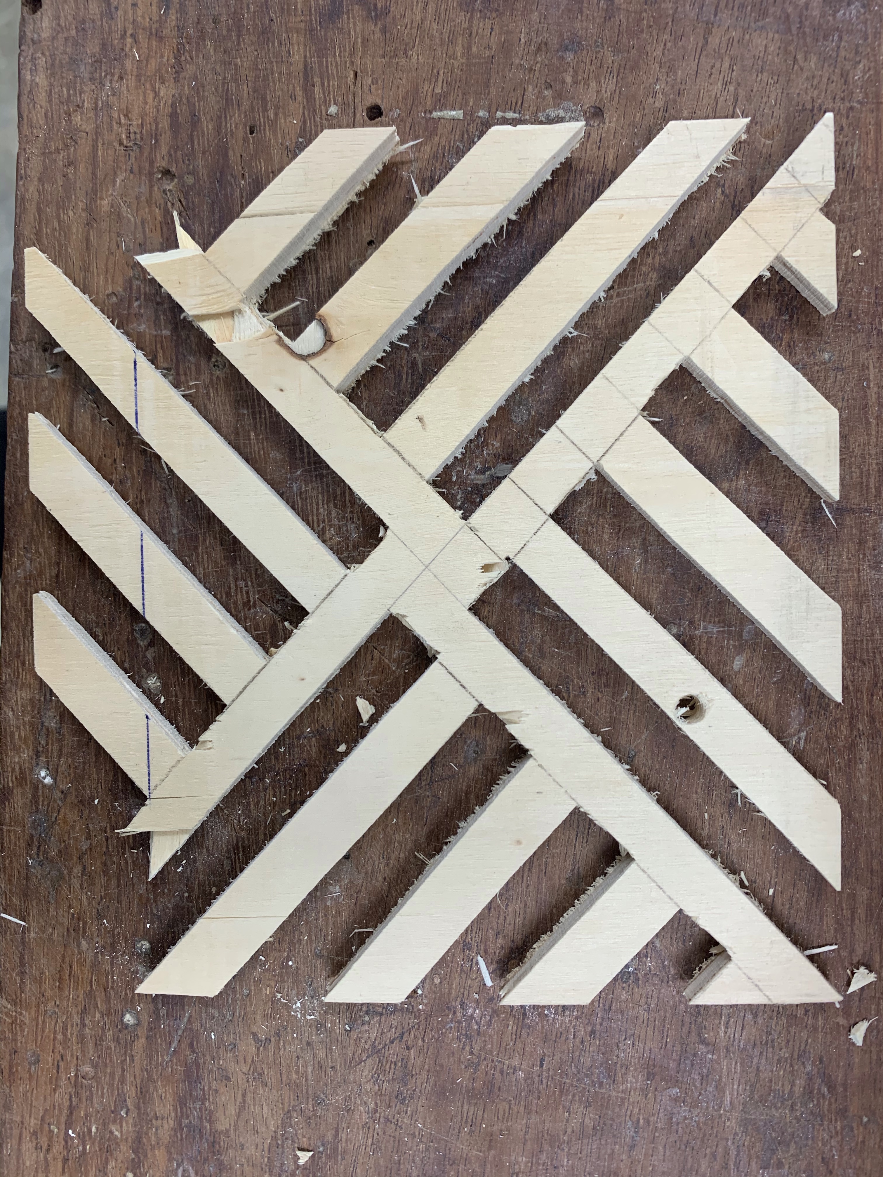
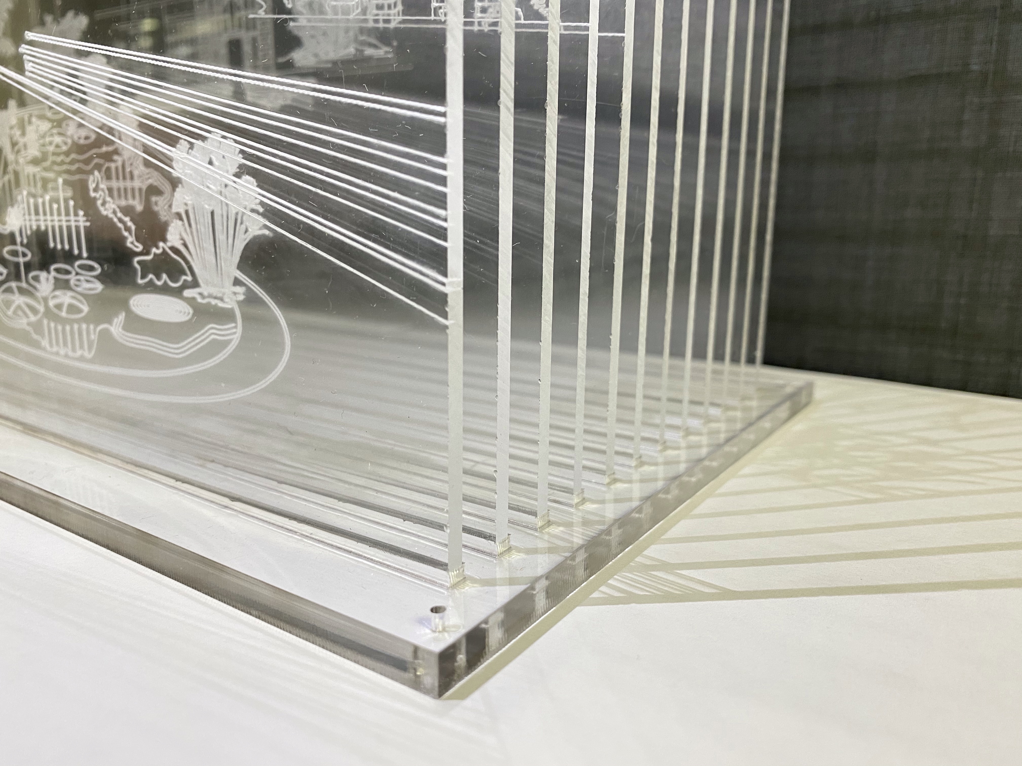
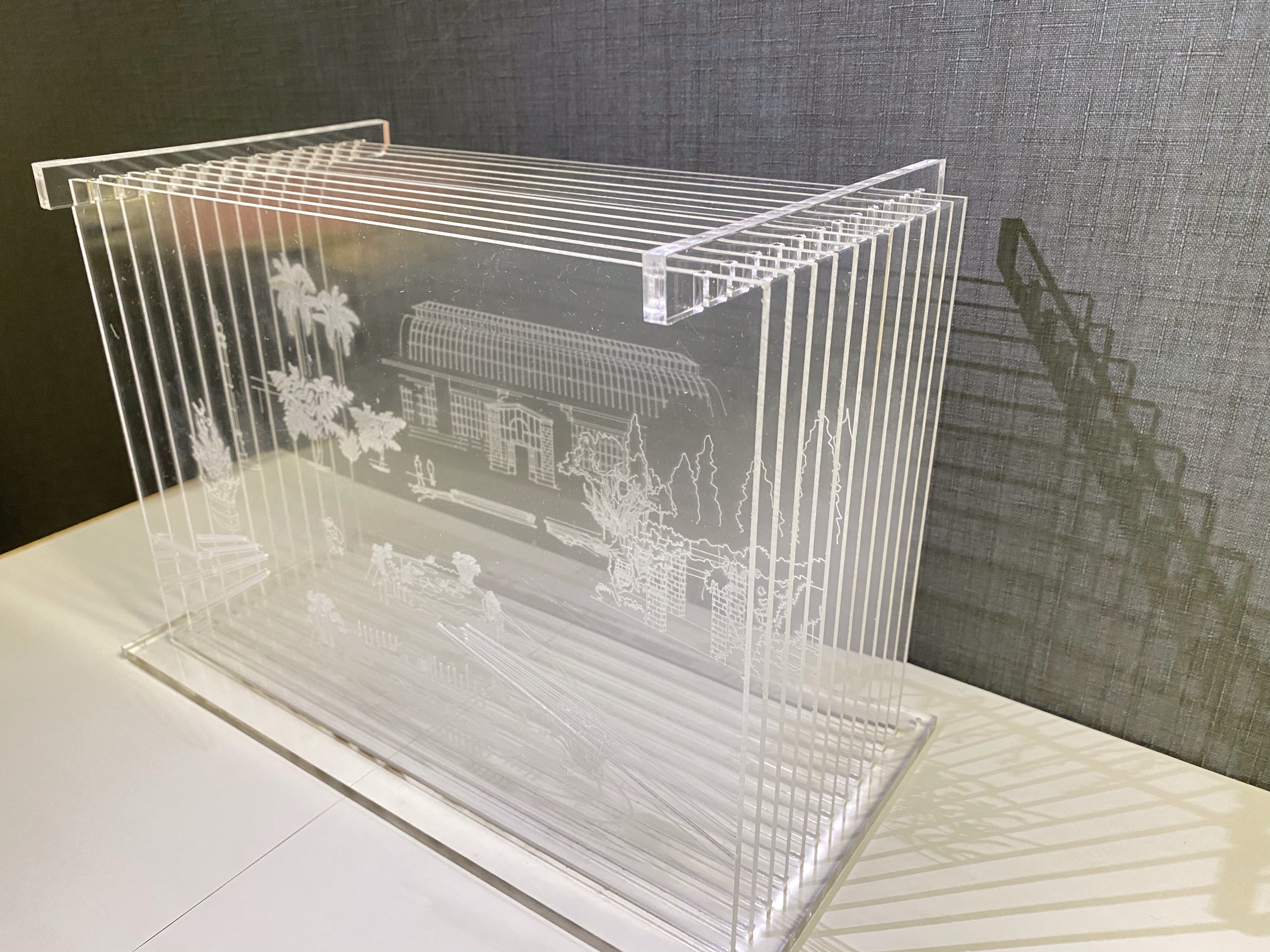
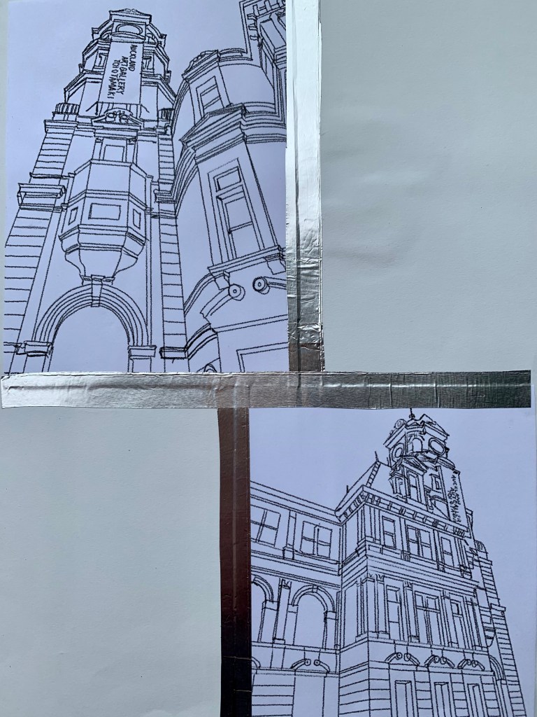
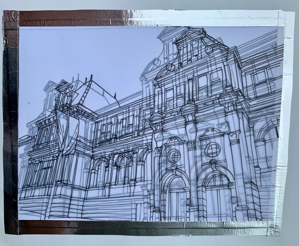
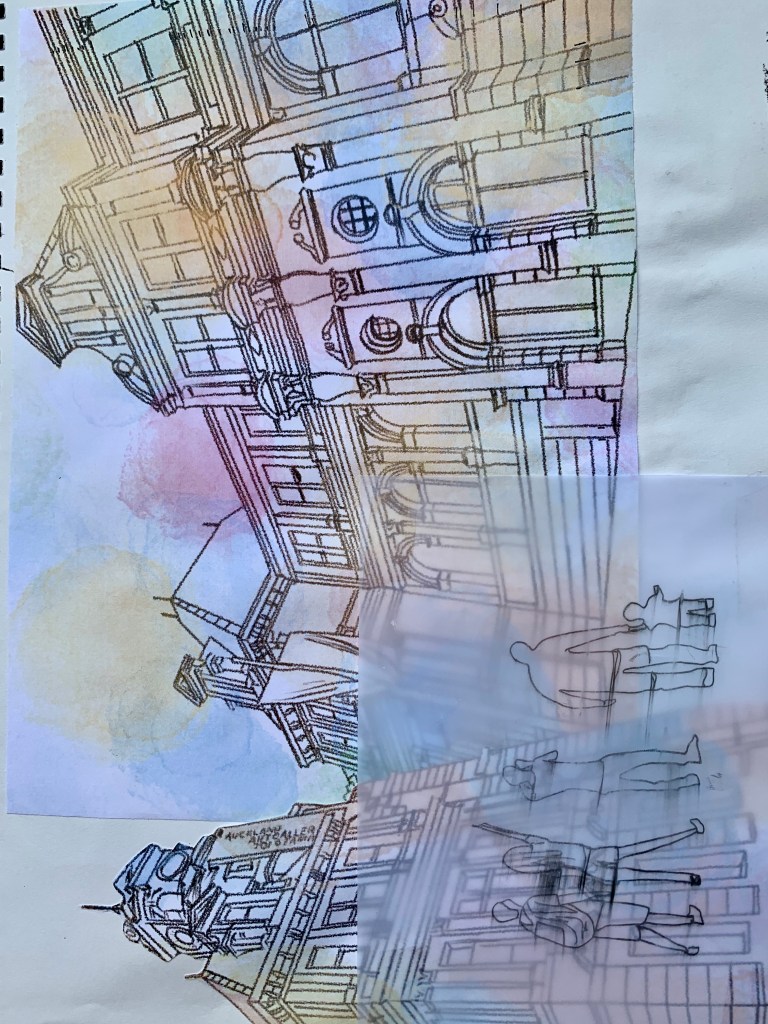
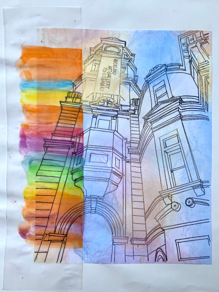
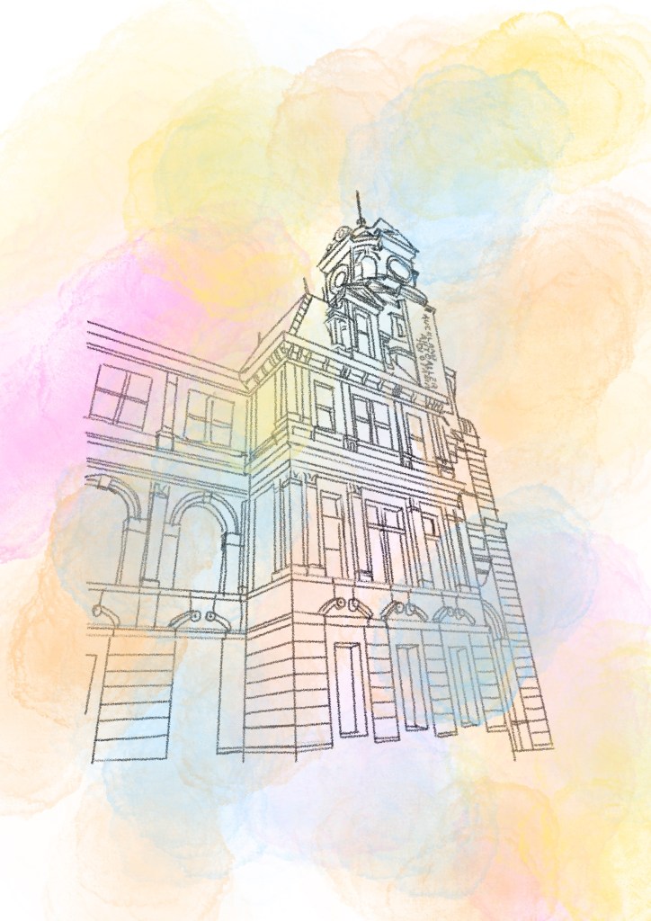
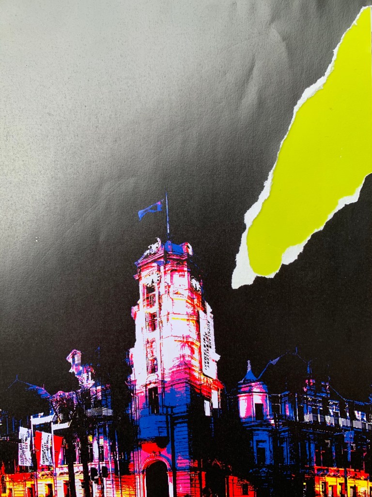
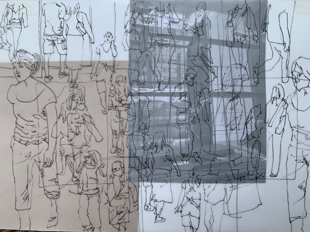
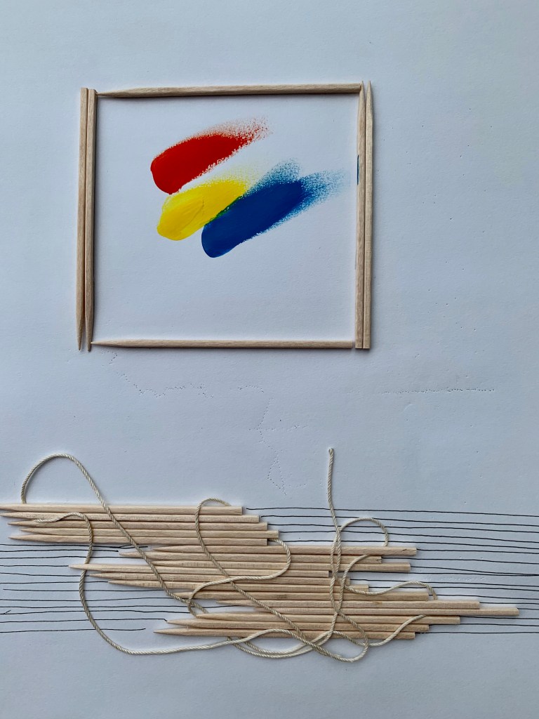
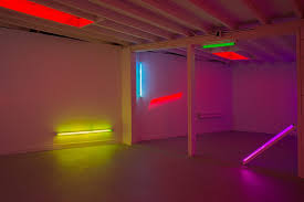
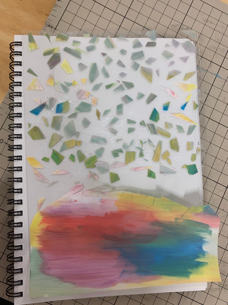
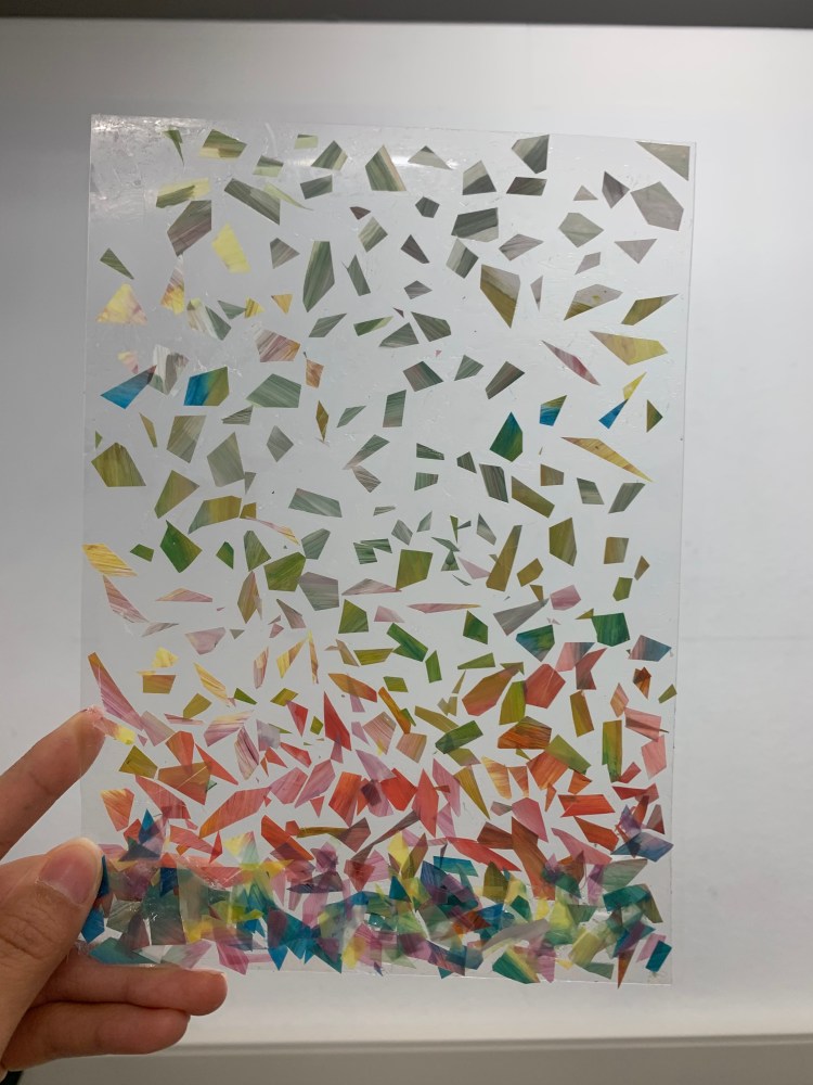
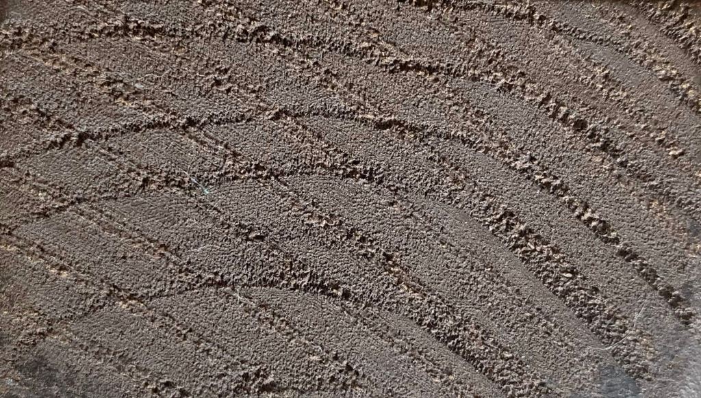
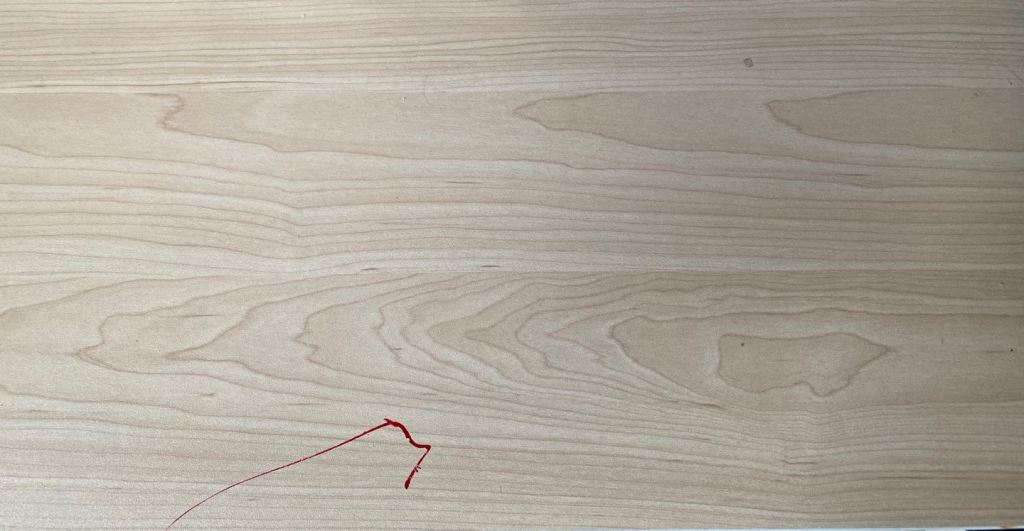
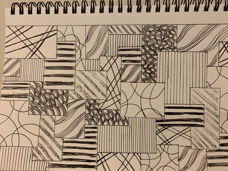
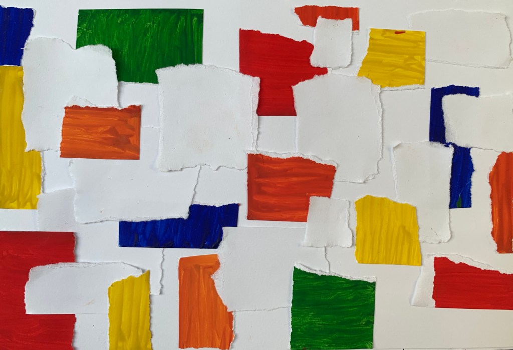
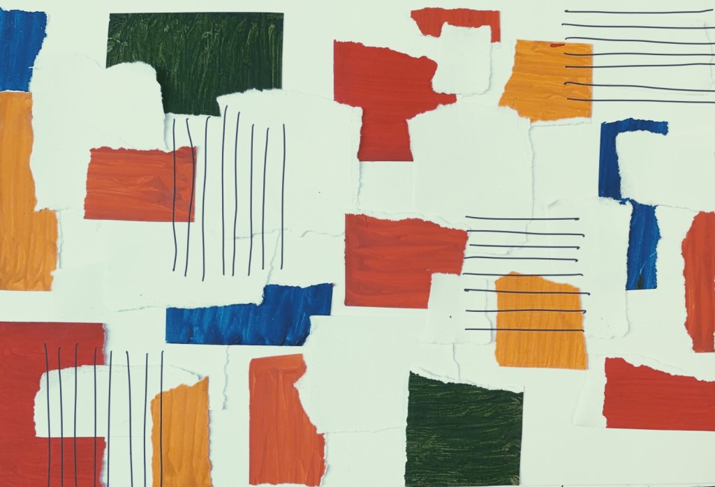
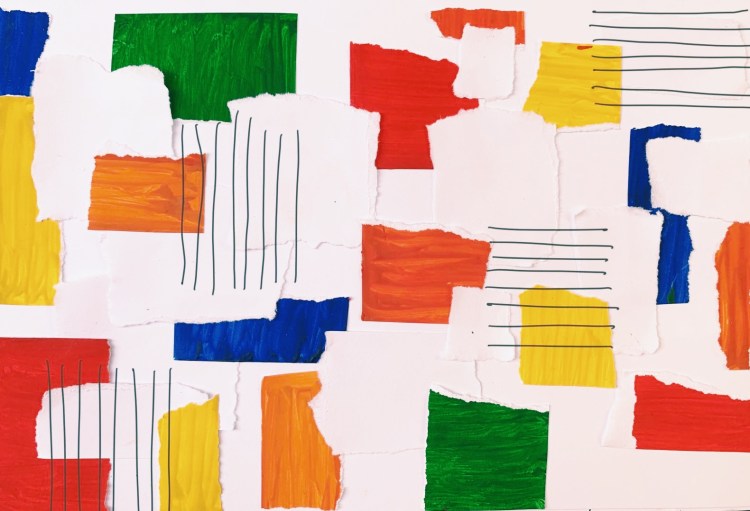
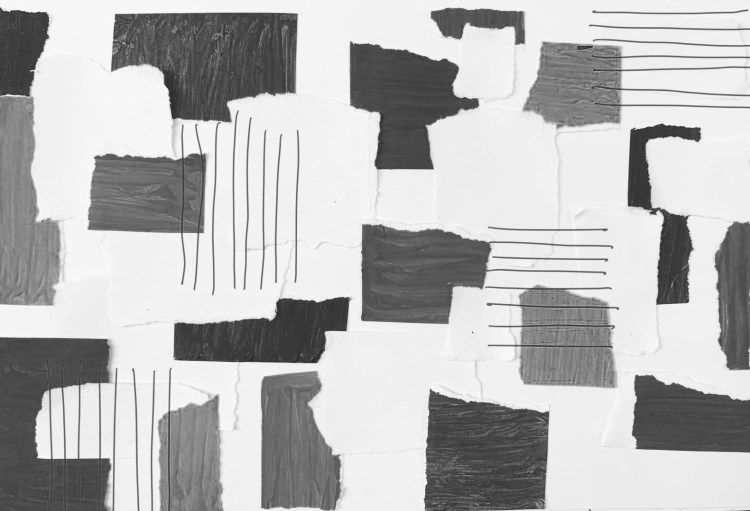
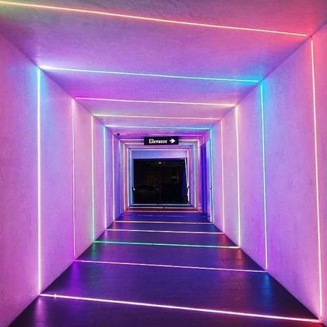
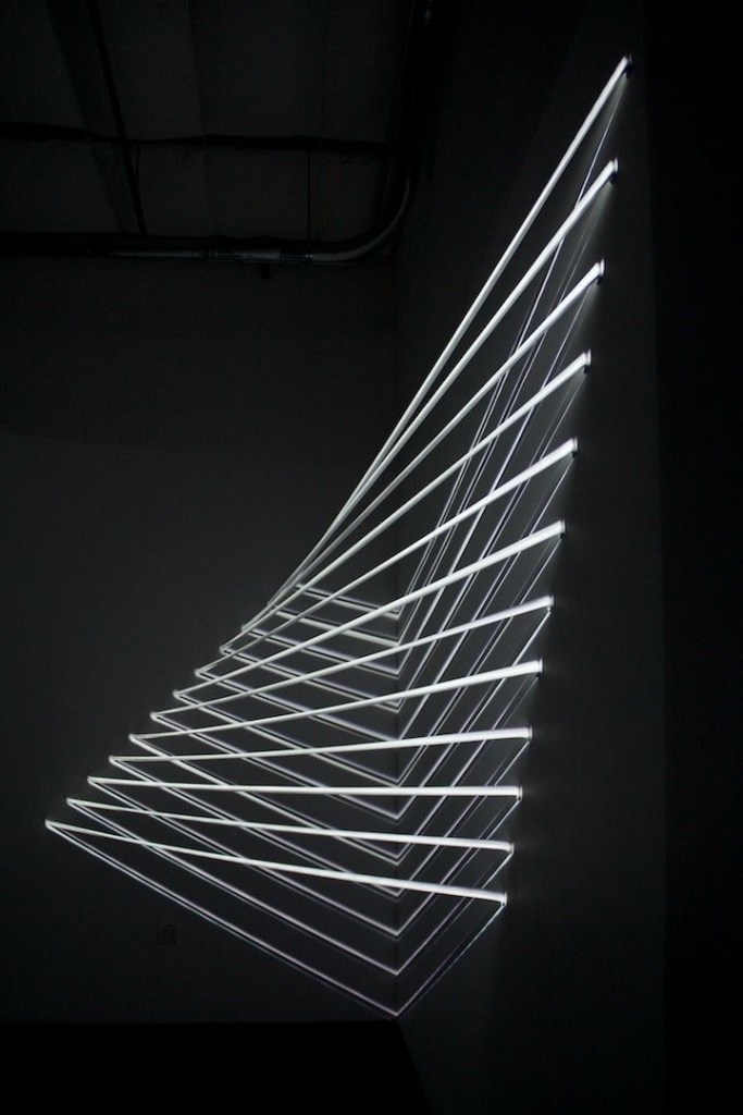
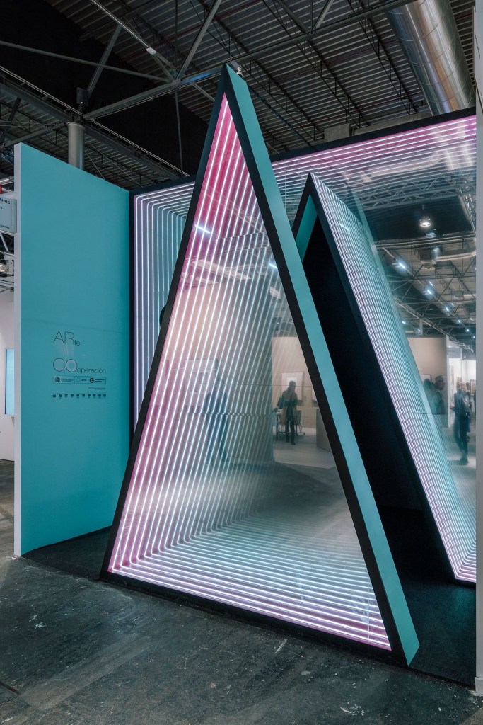
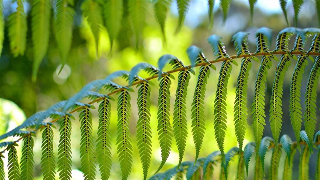
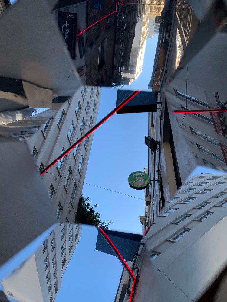
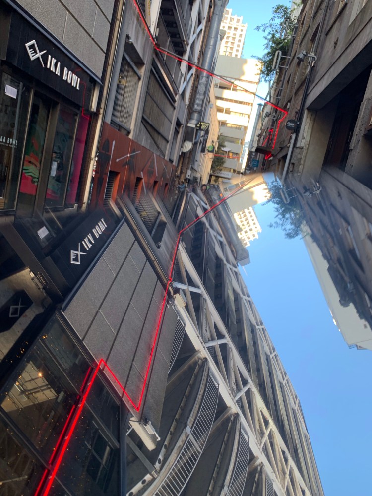
Observing the architecture lines and connecting them together. I found that these lines are very tough. Including the most eye-catching red neon lights in the middle of the street. I like to look at buildings in a fuzzy way. I think these lines are characteristic of this street,so I used a lot of lines in my model. What kind of effect will the combination of the same lines produce?
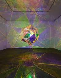
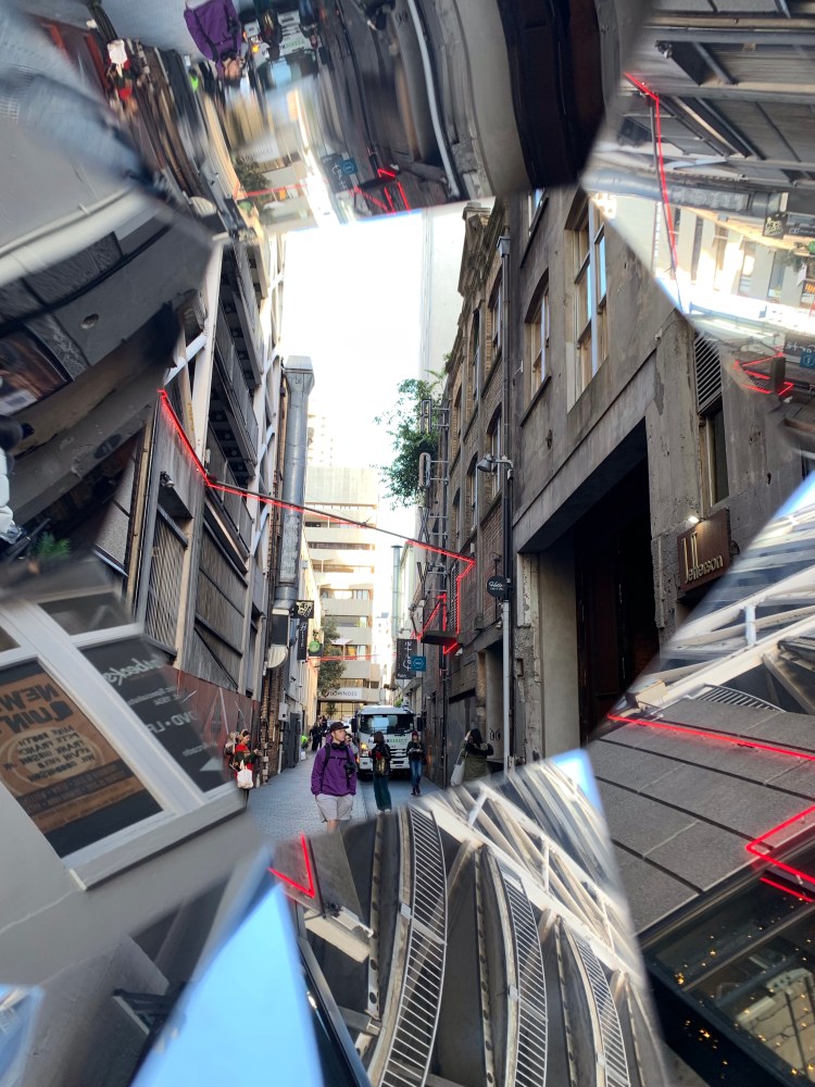
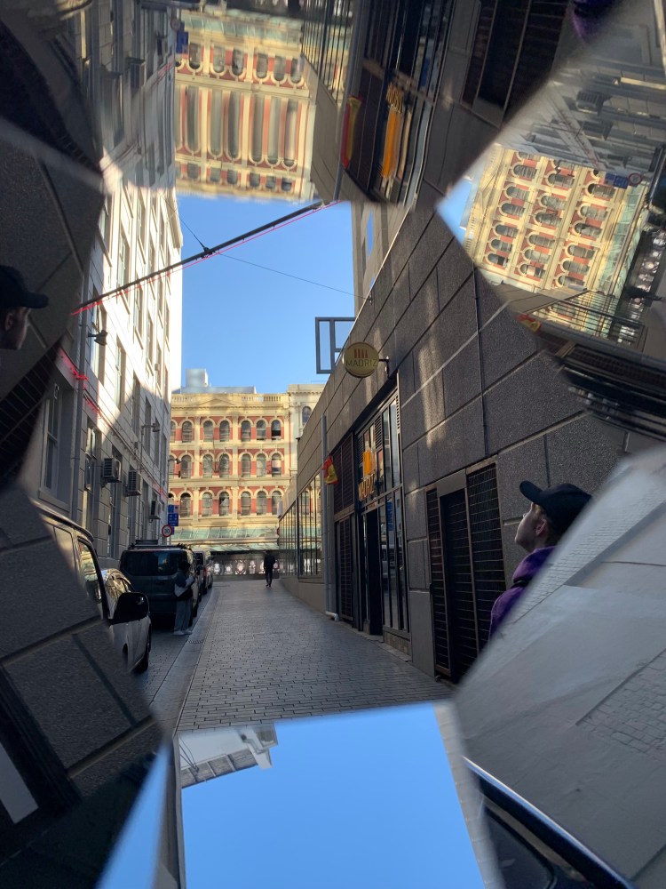
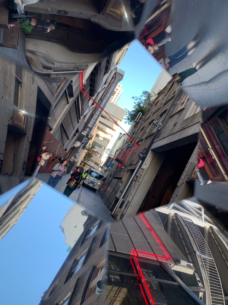
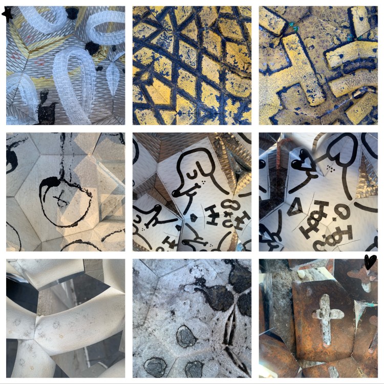
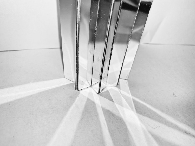
Reflection
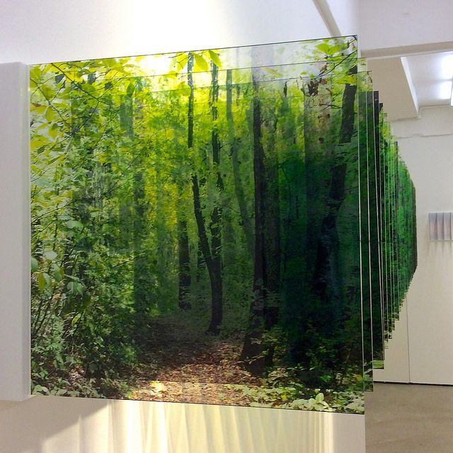
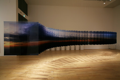
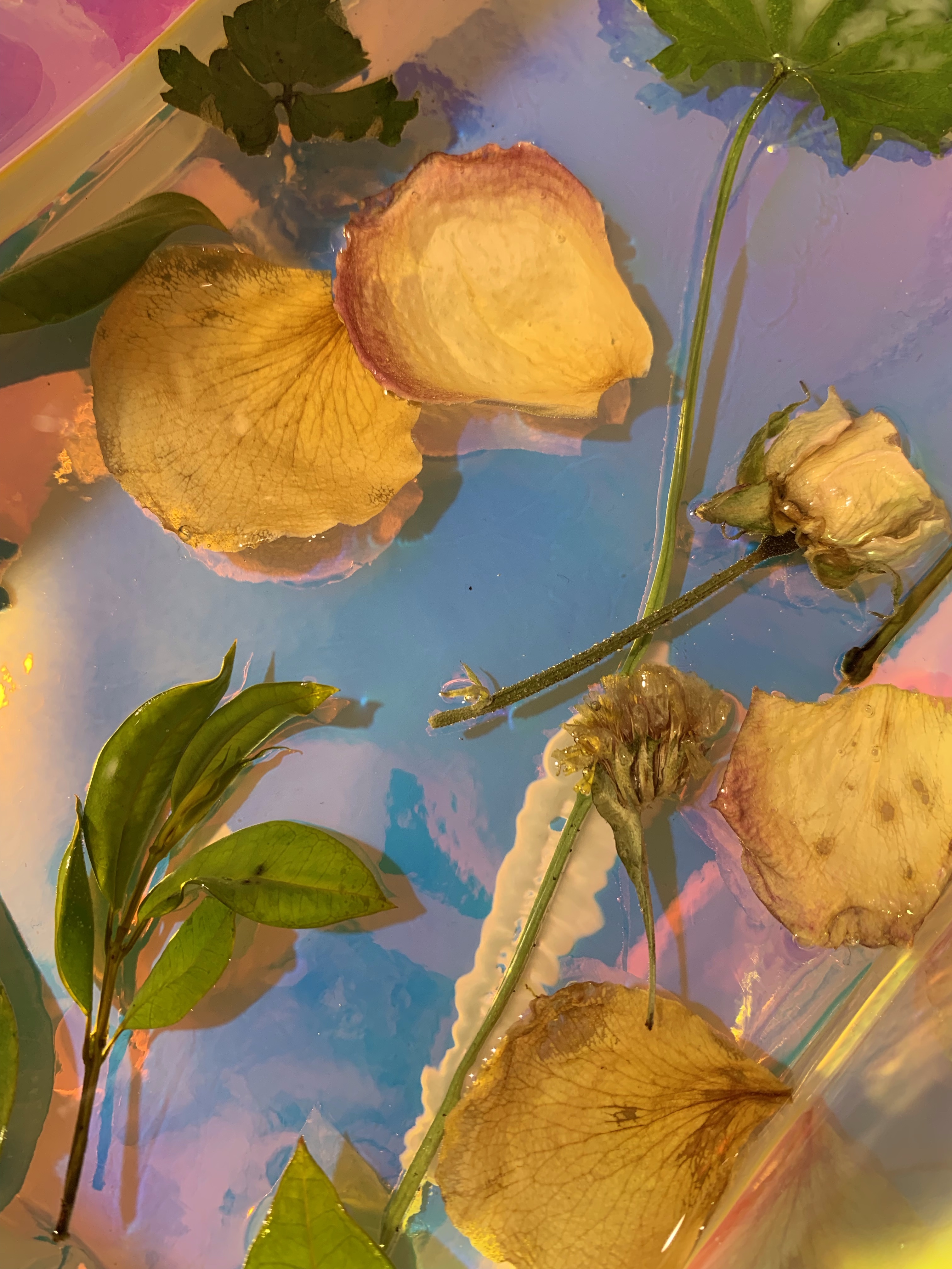
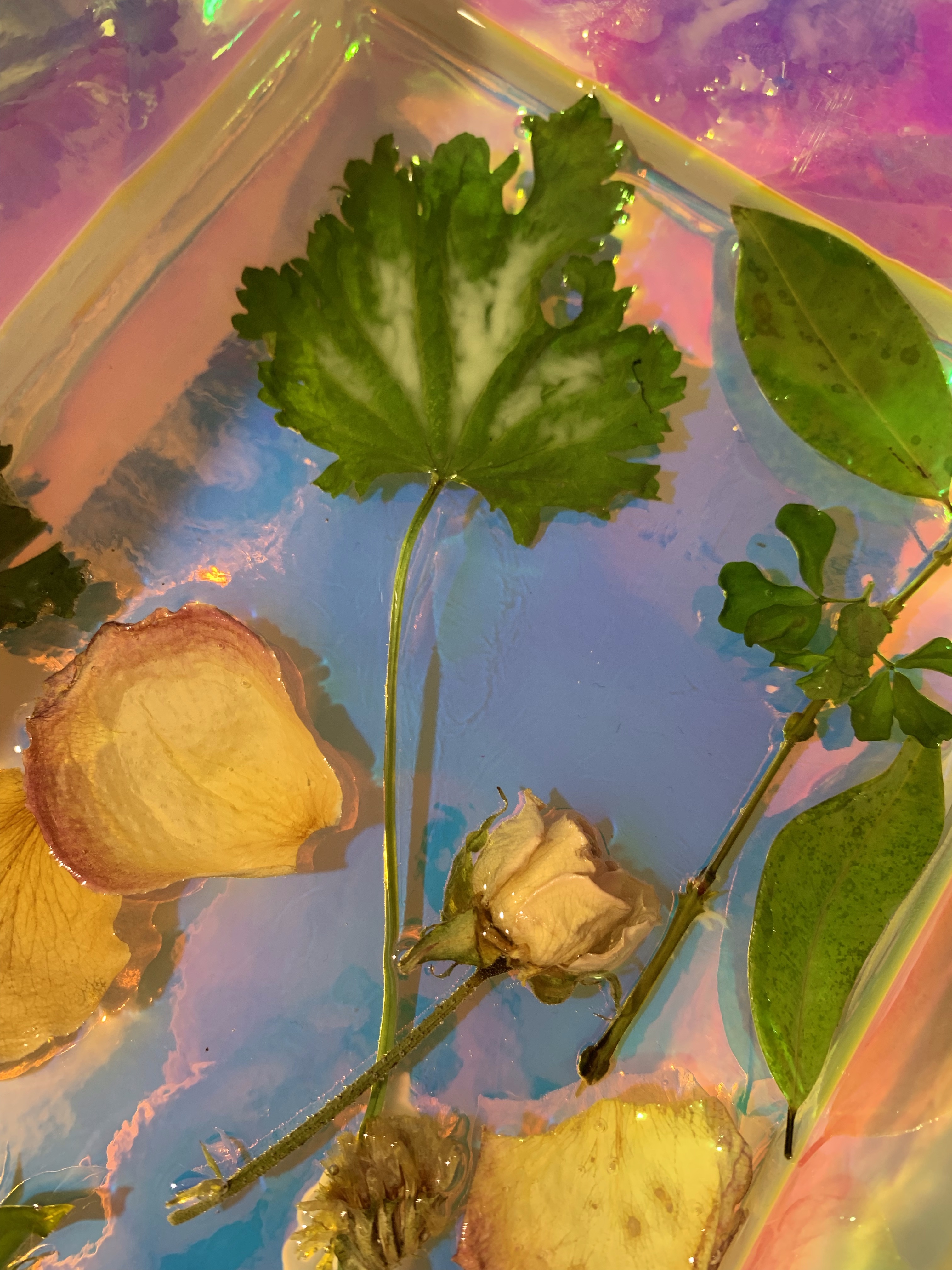
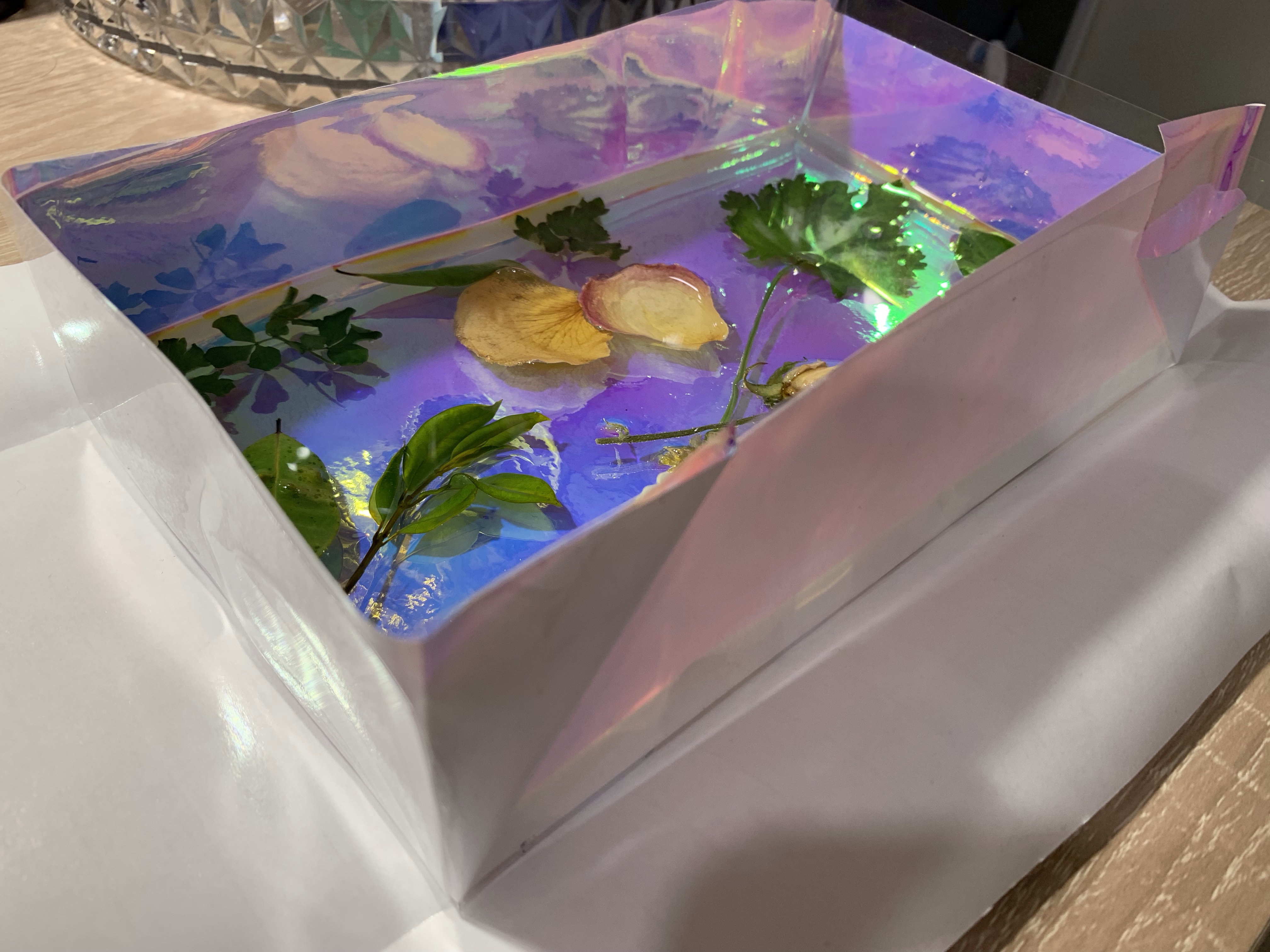
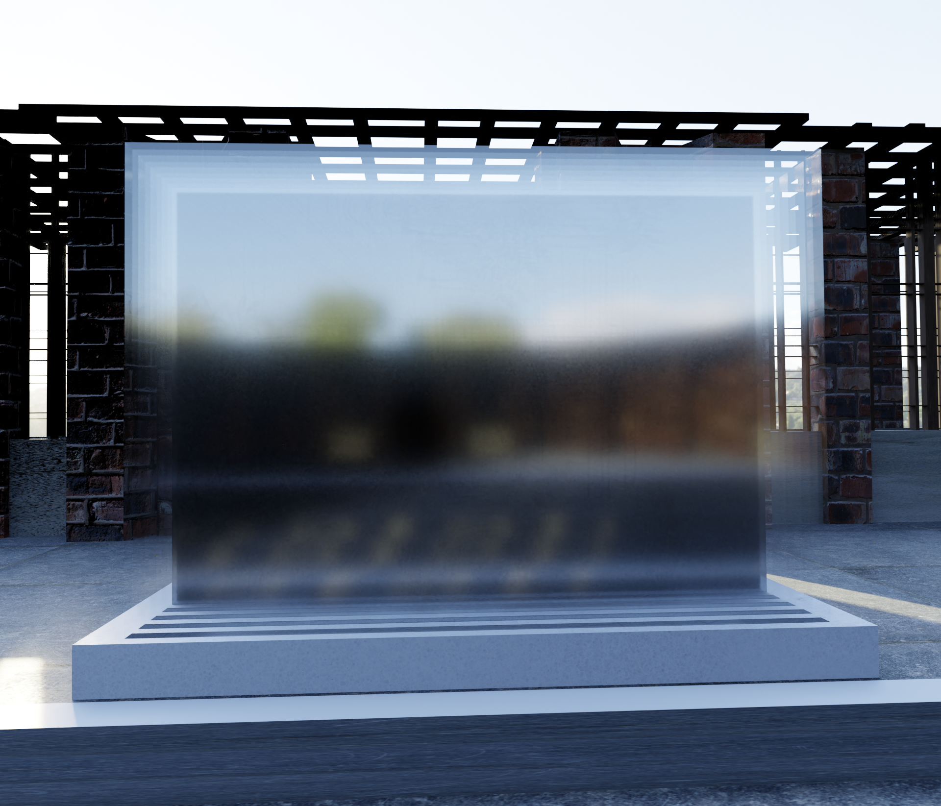
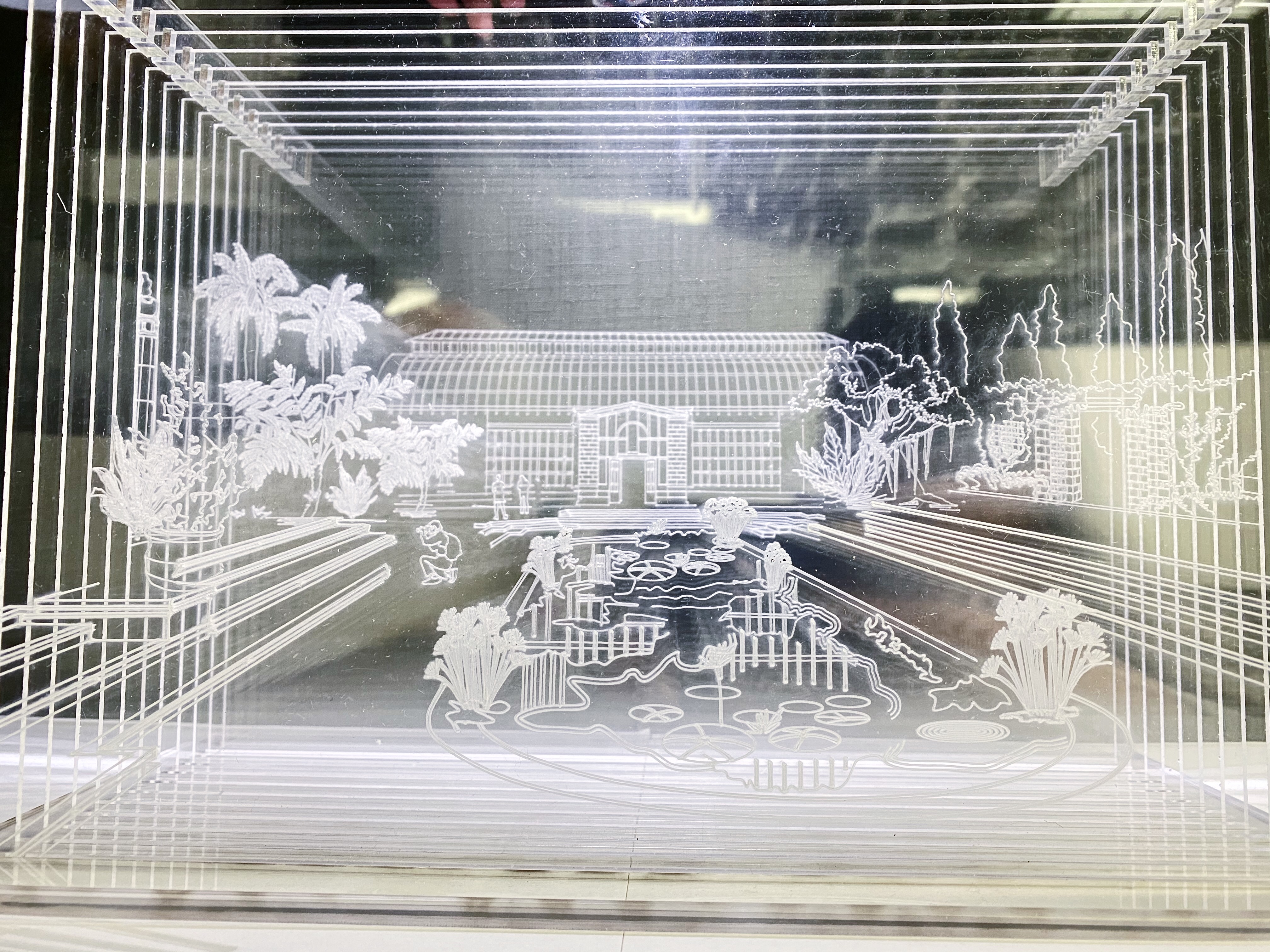
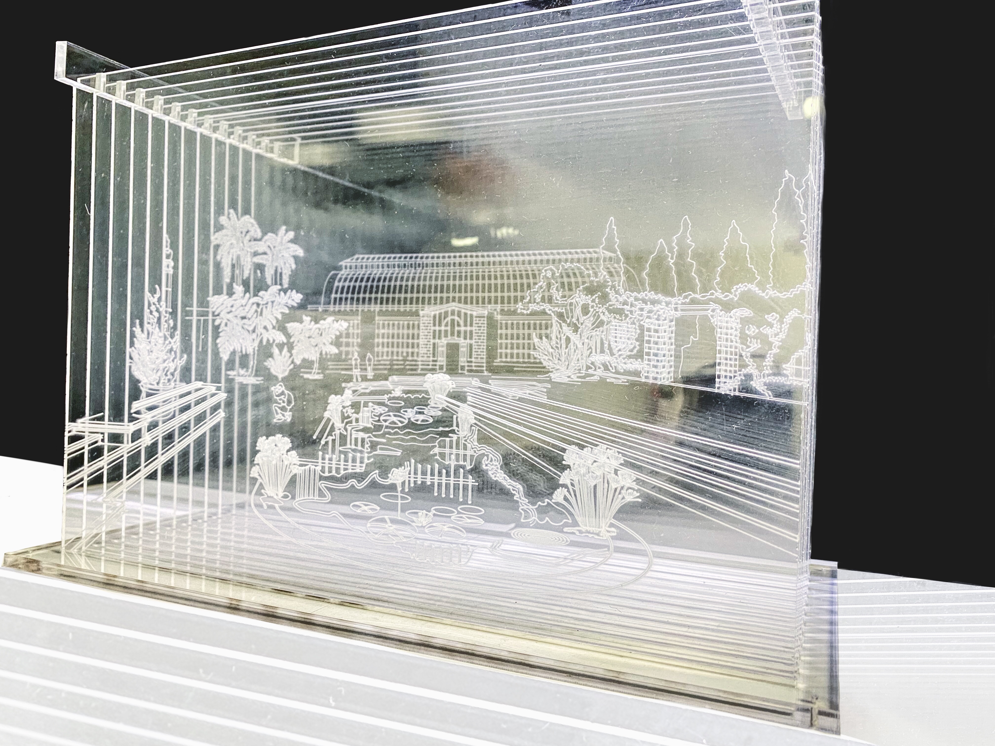
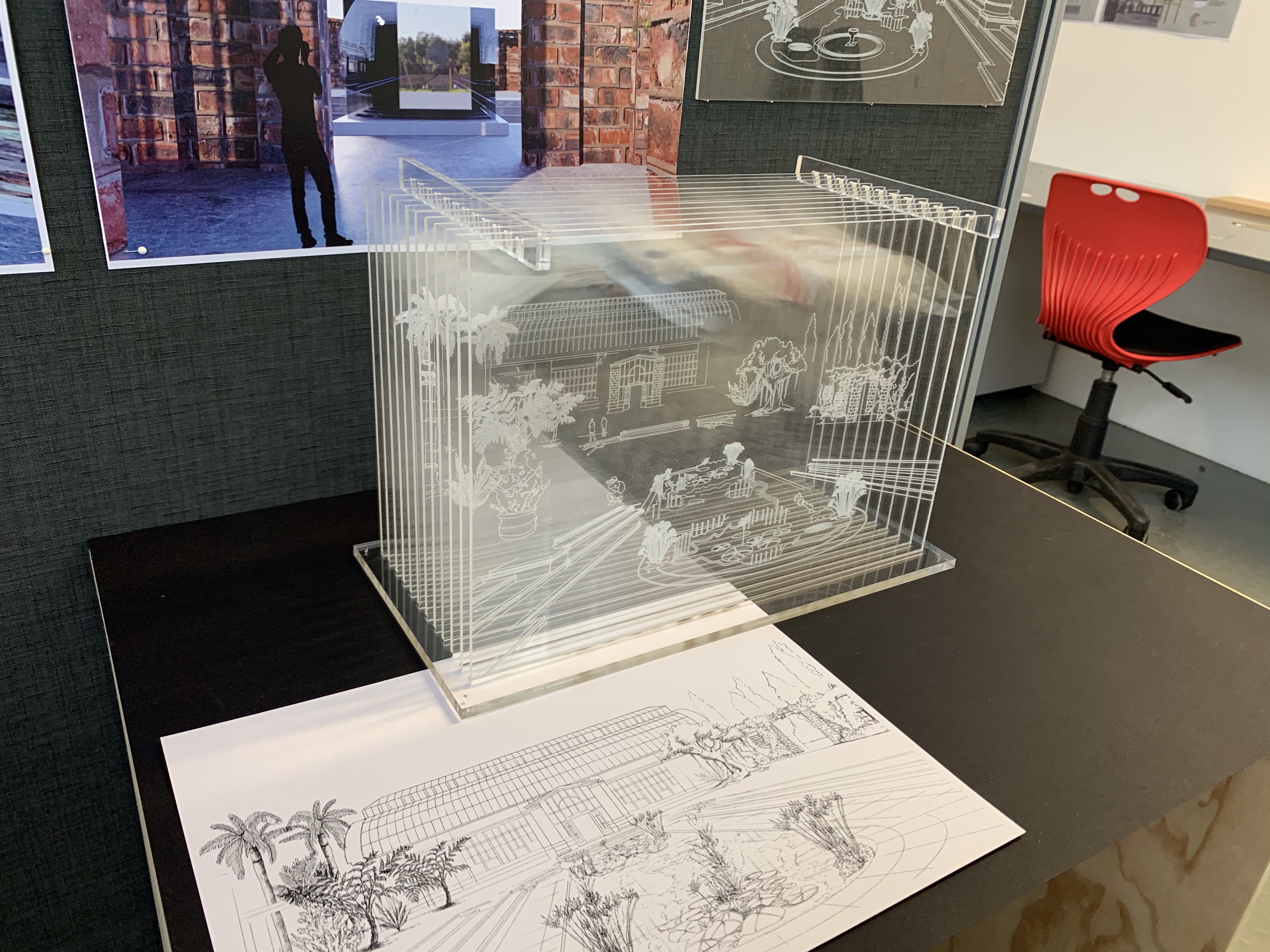
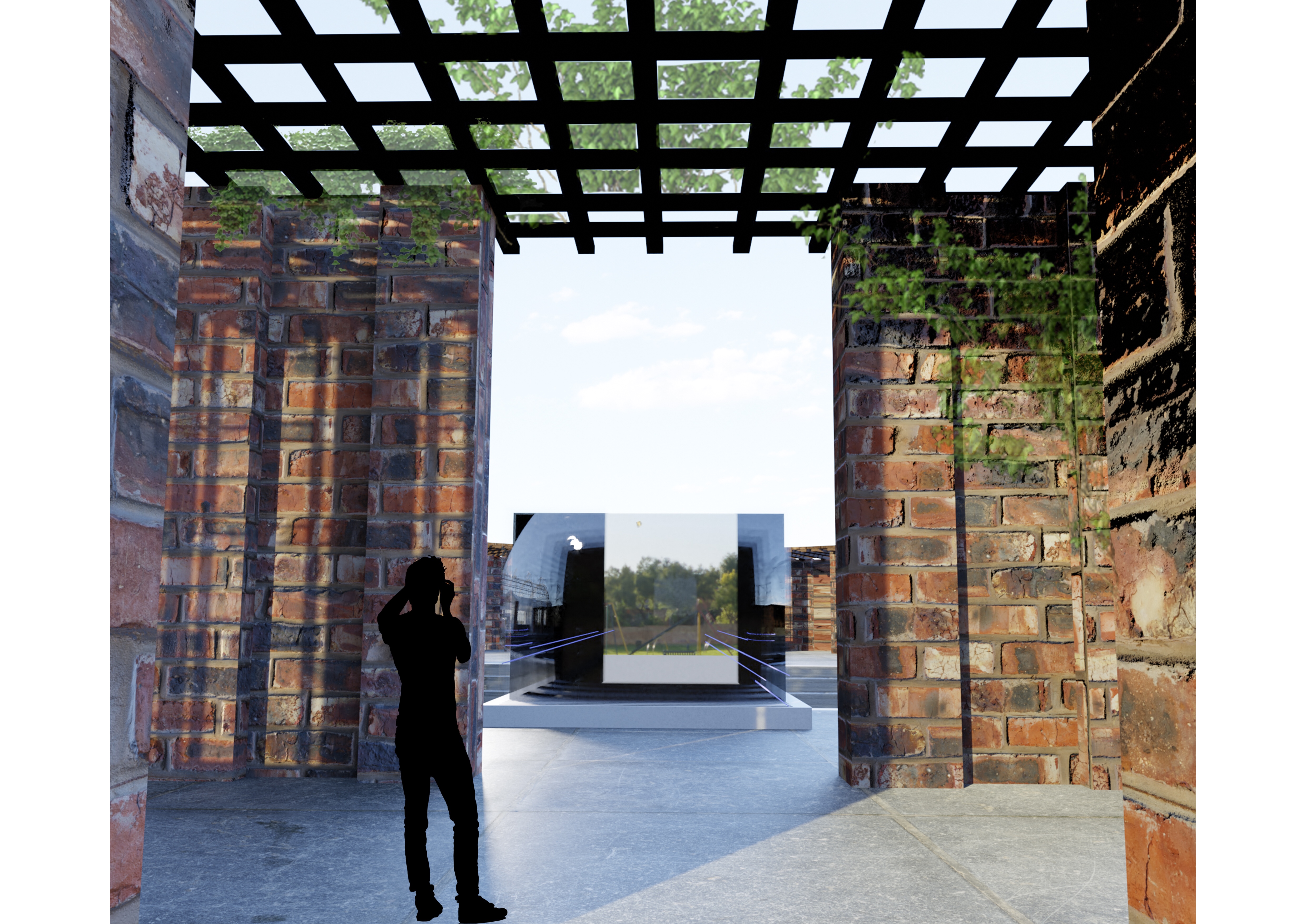
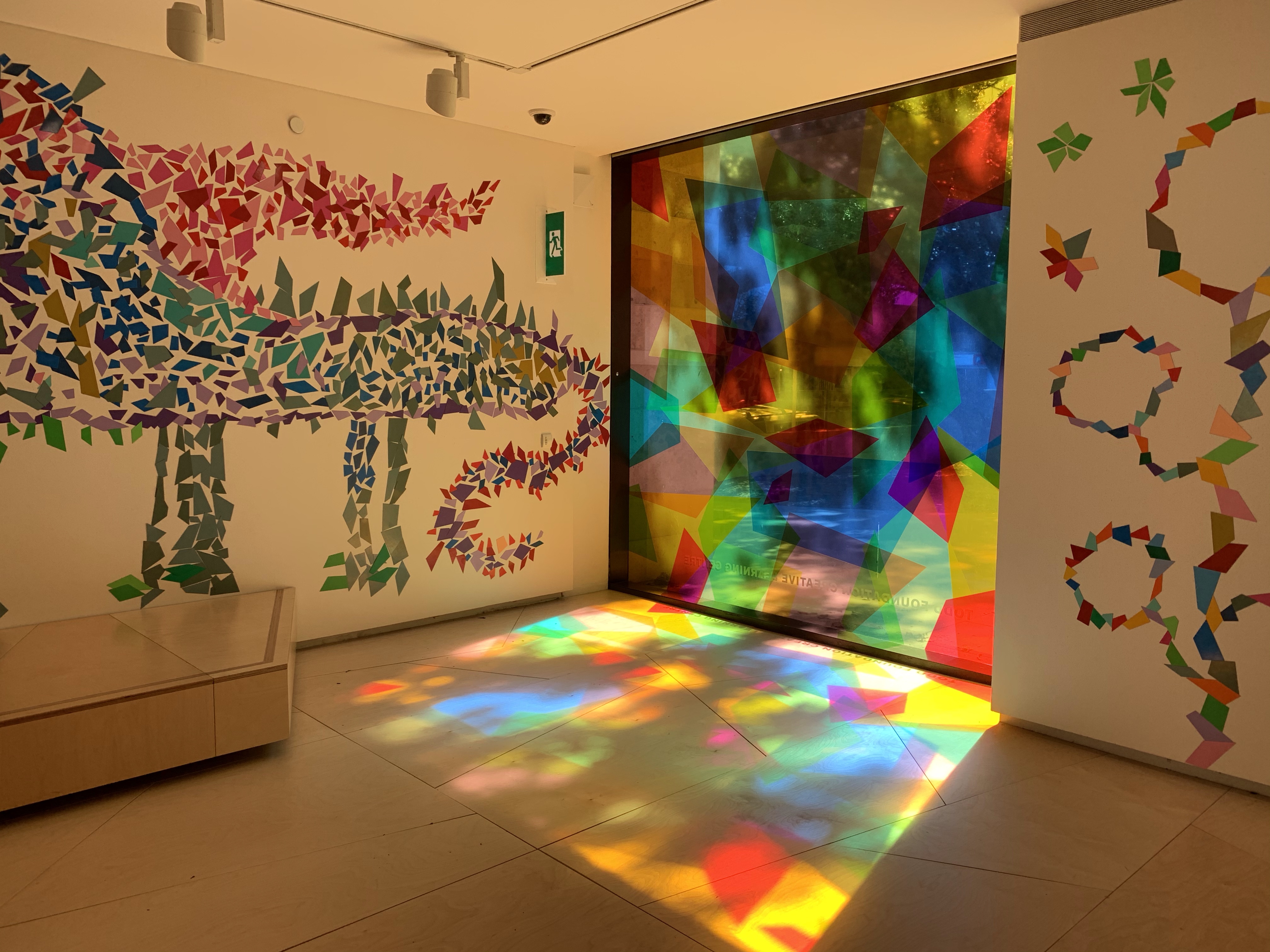
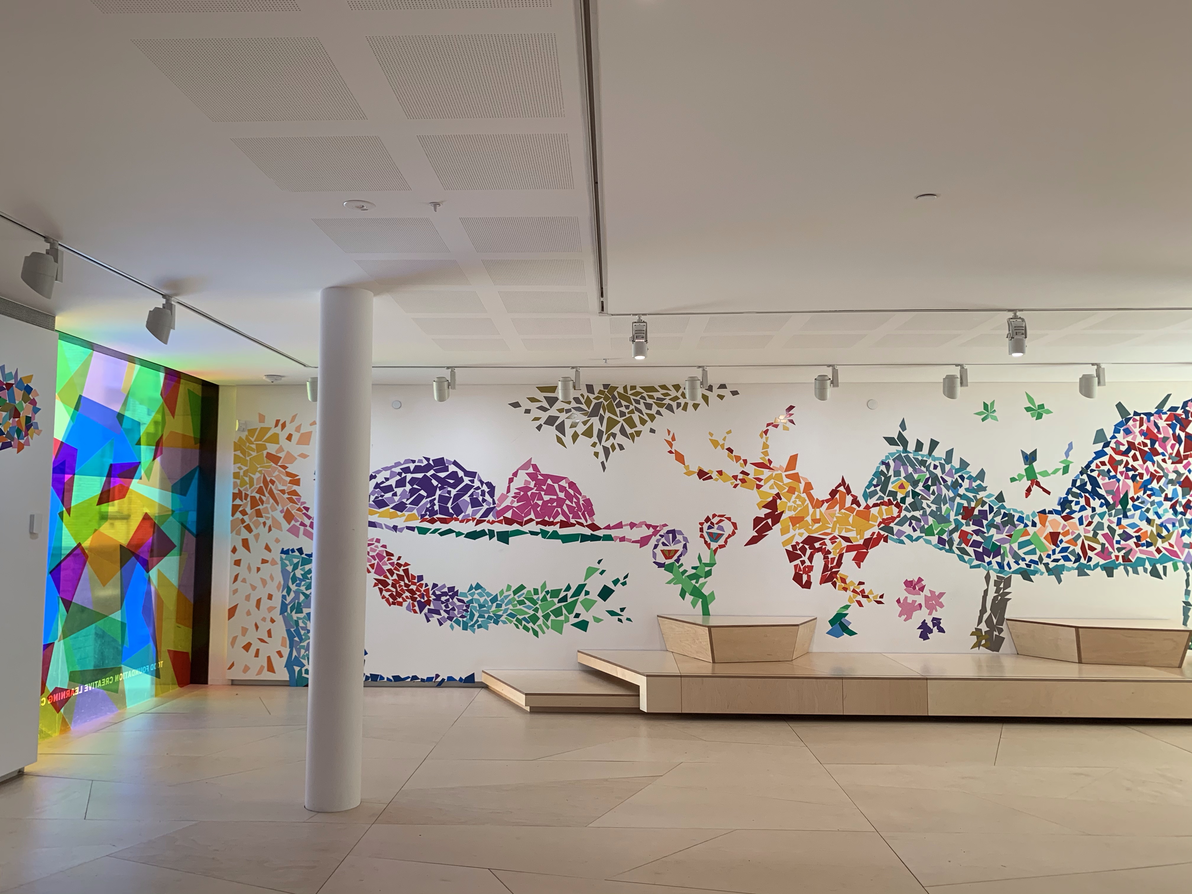
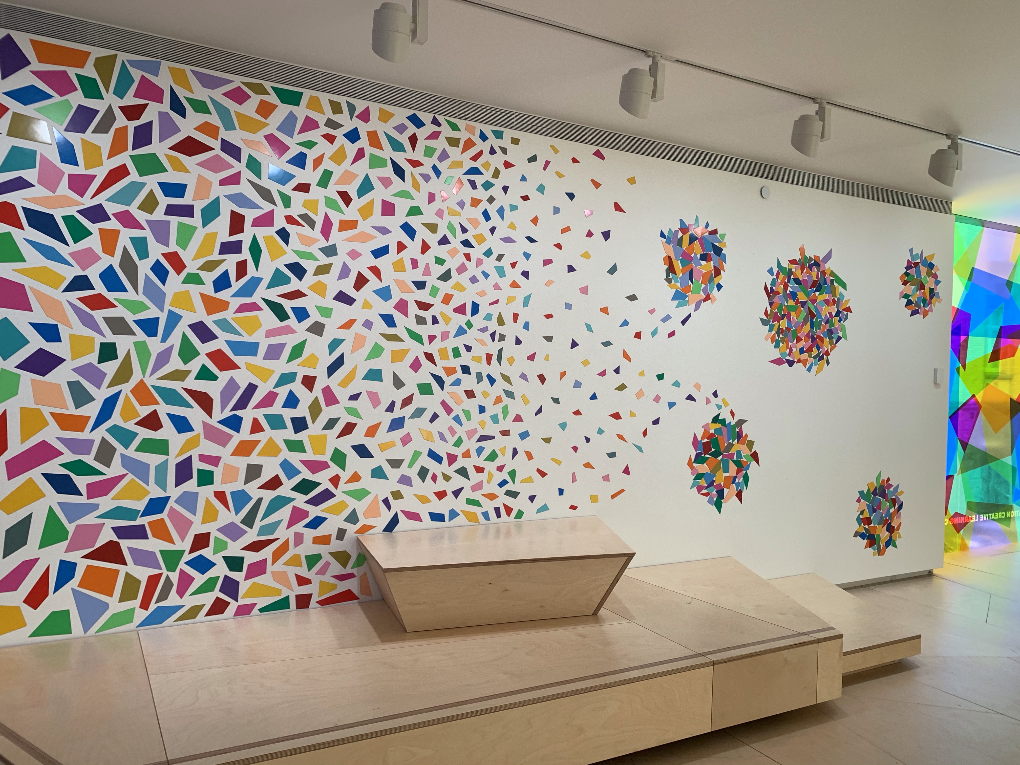
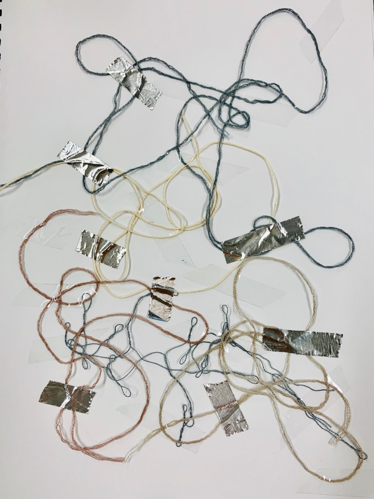
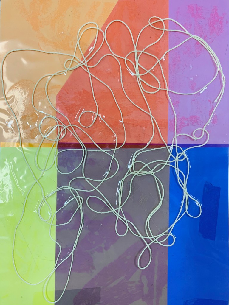
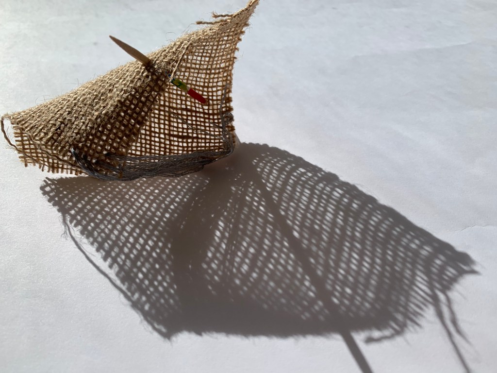
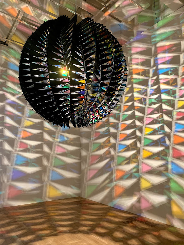
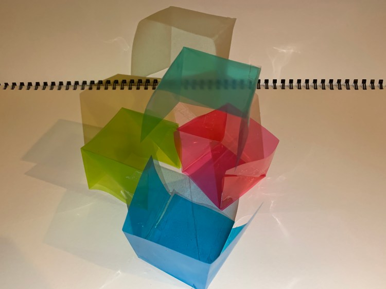
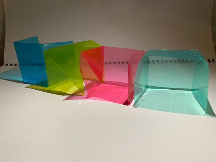
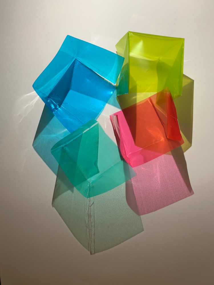
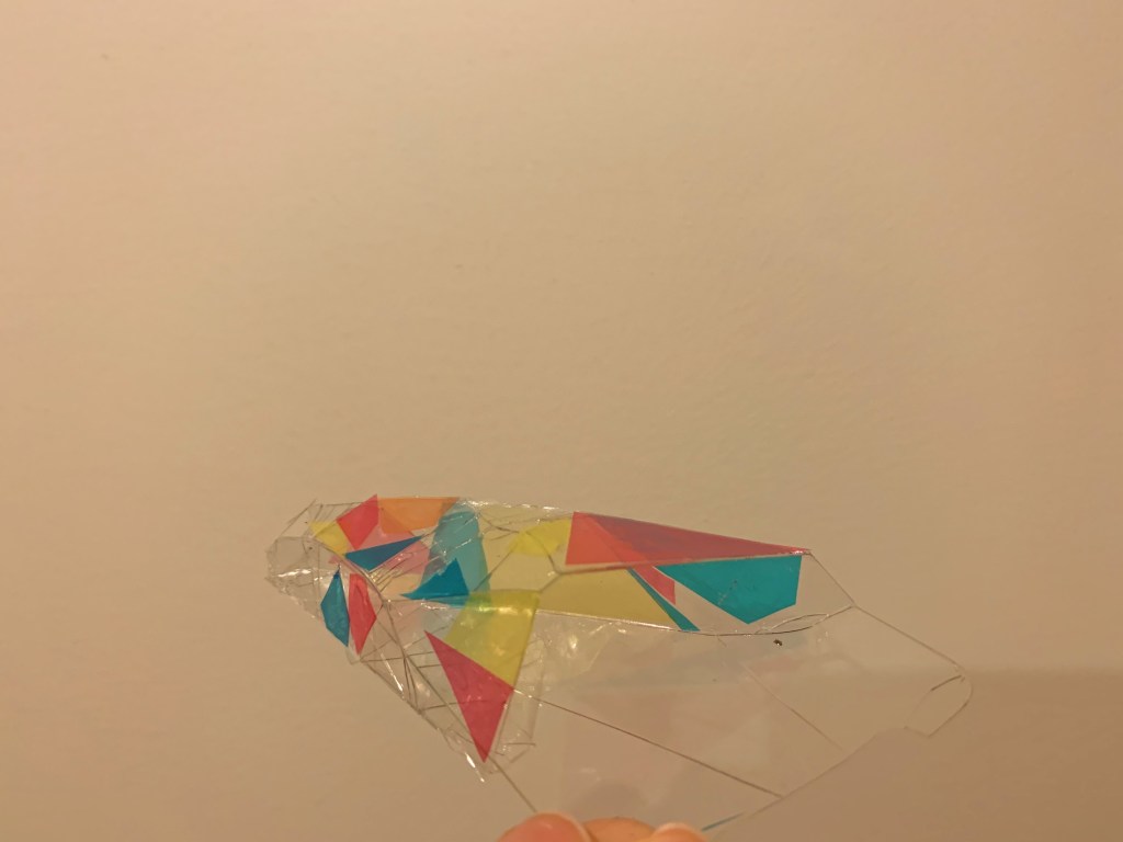
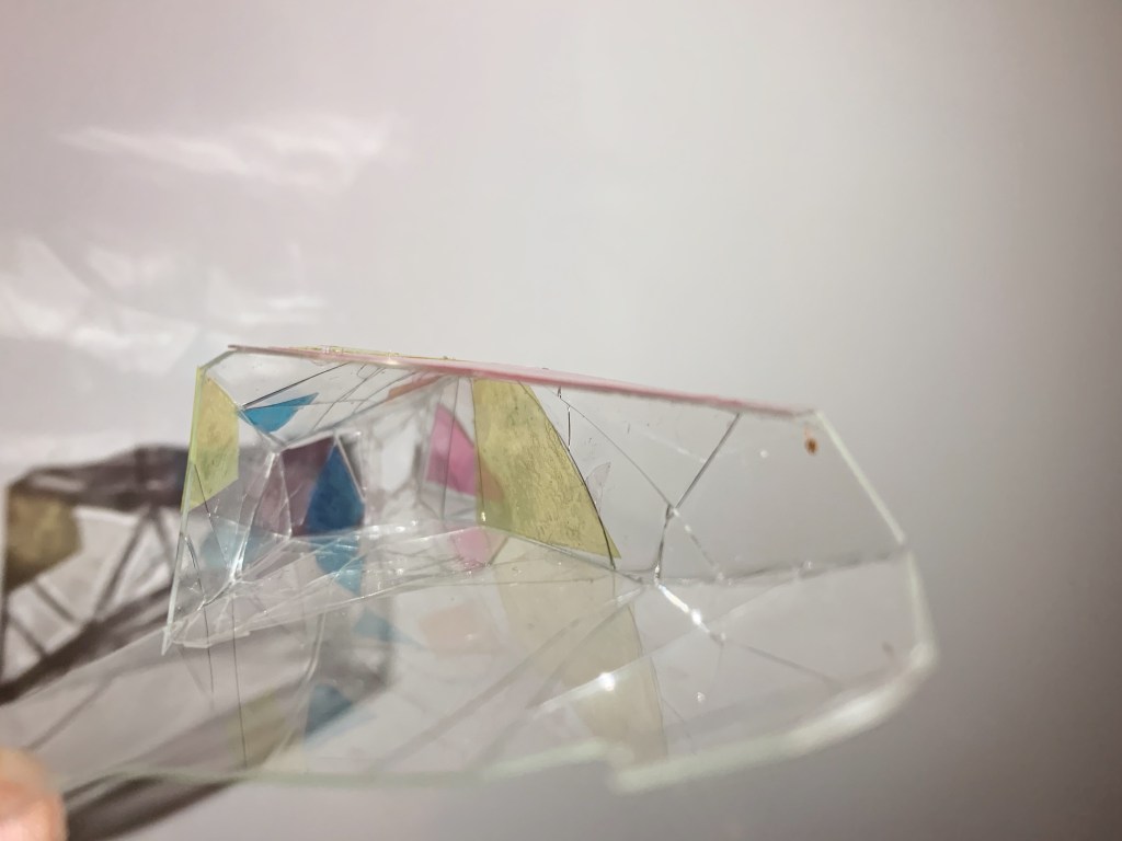
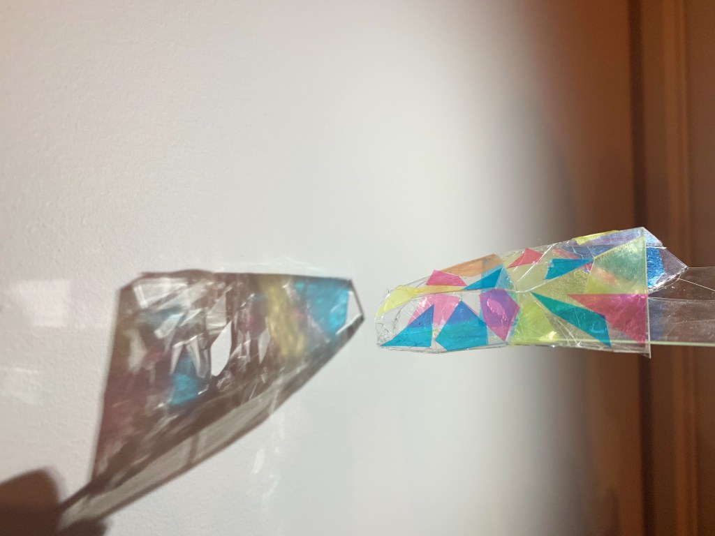
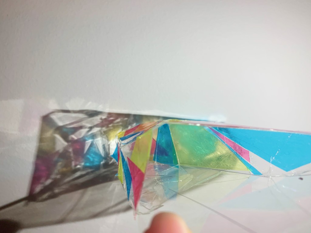
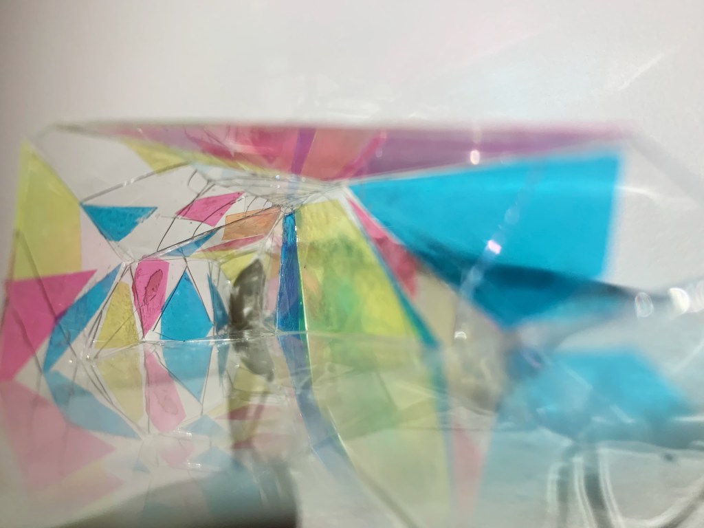
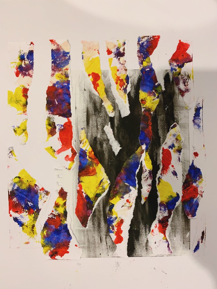
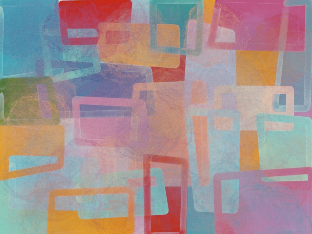
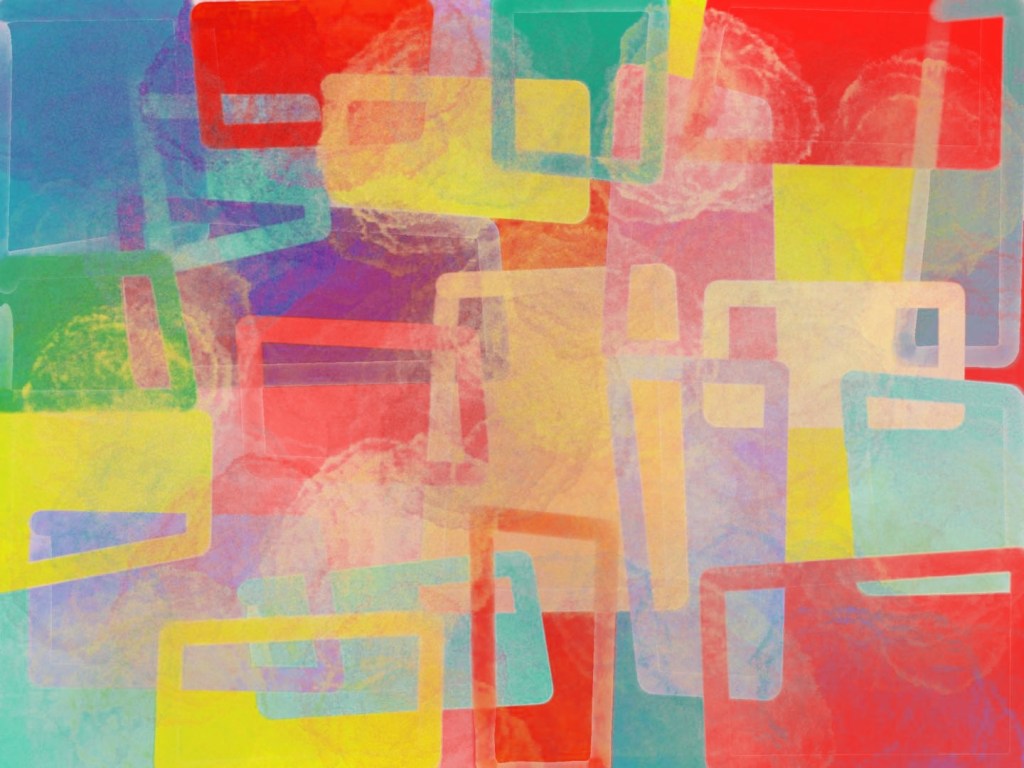
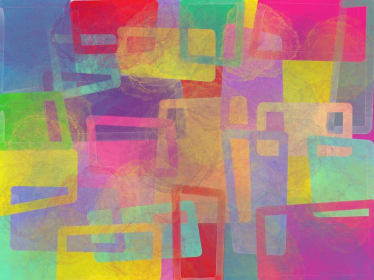
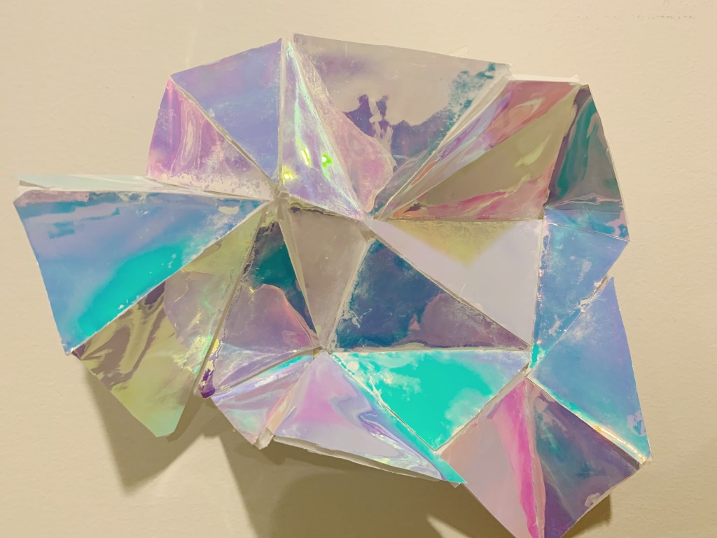
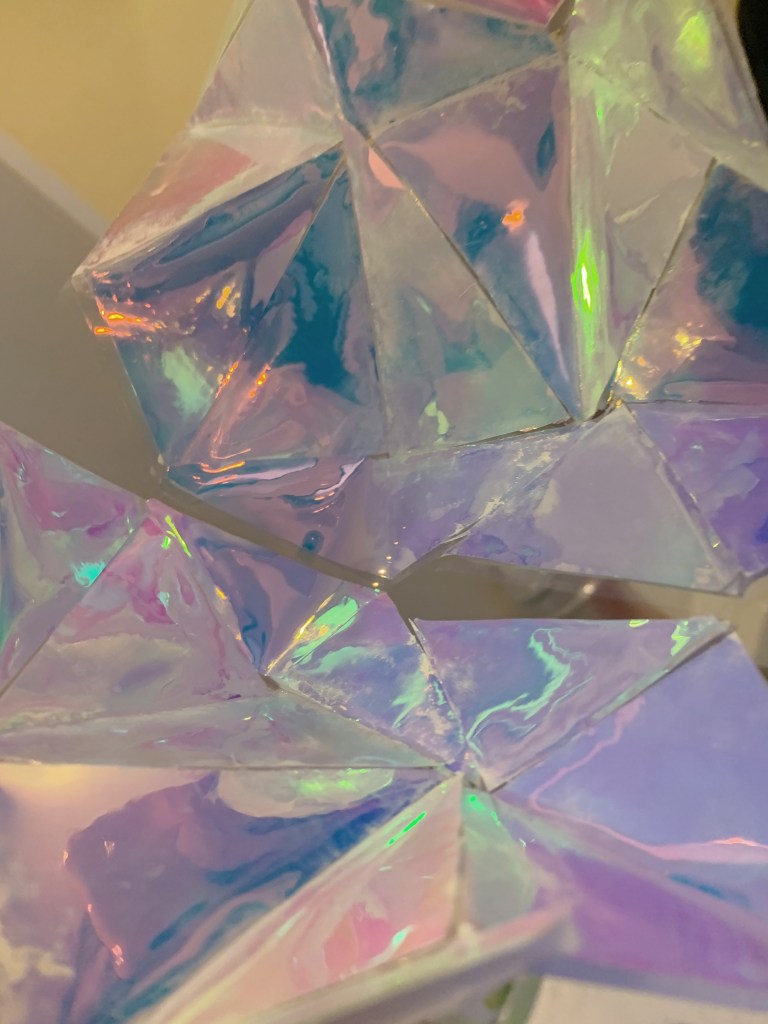
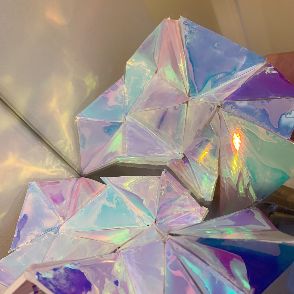
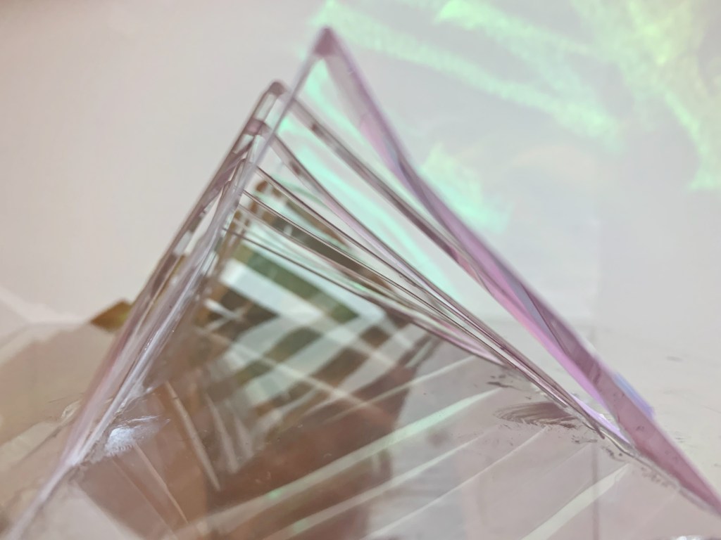
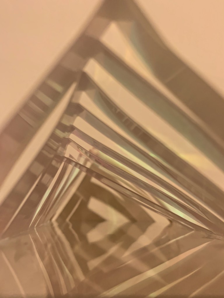
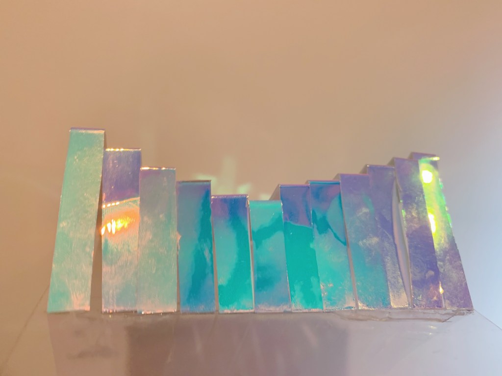
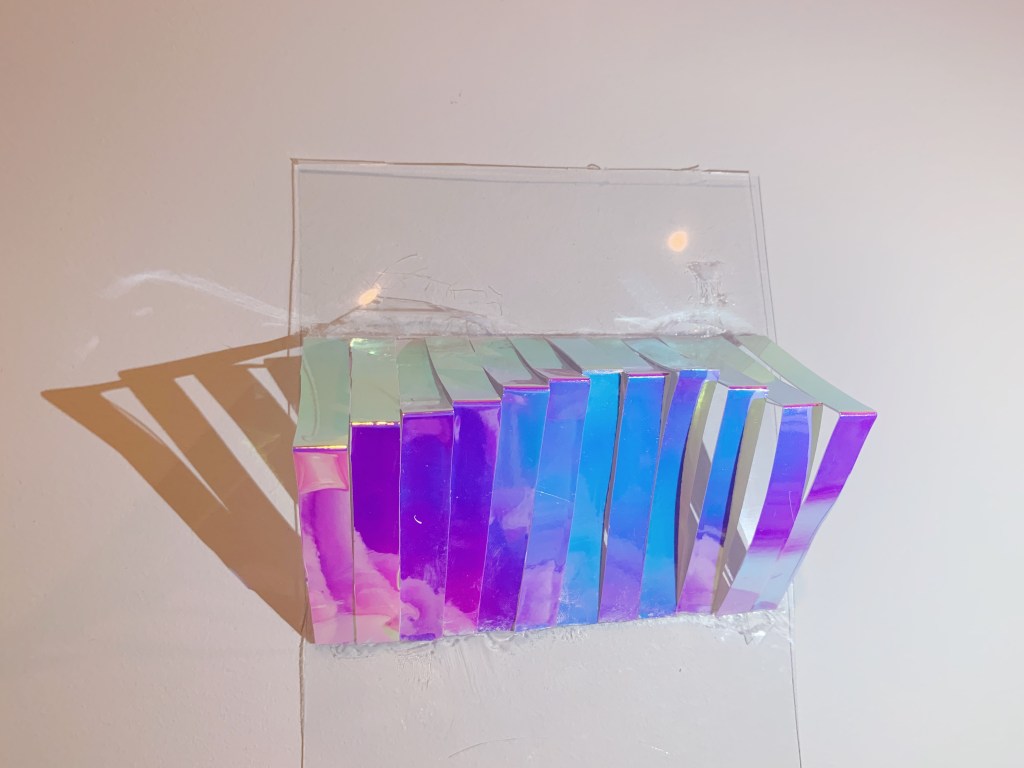
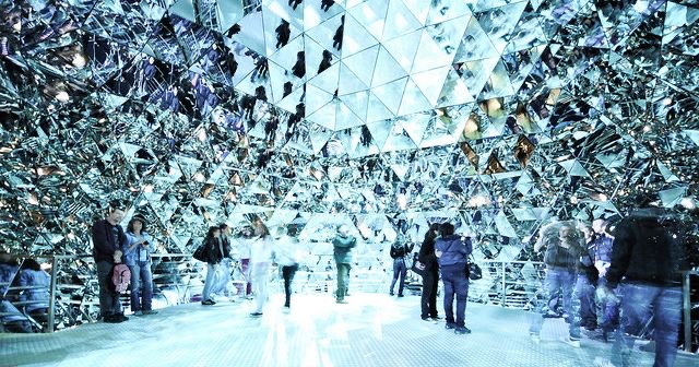
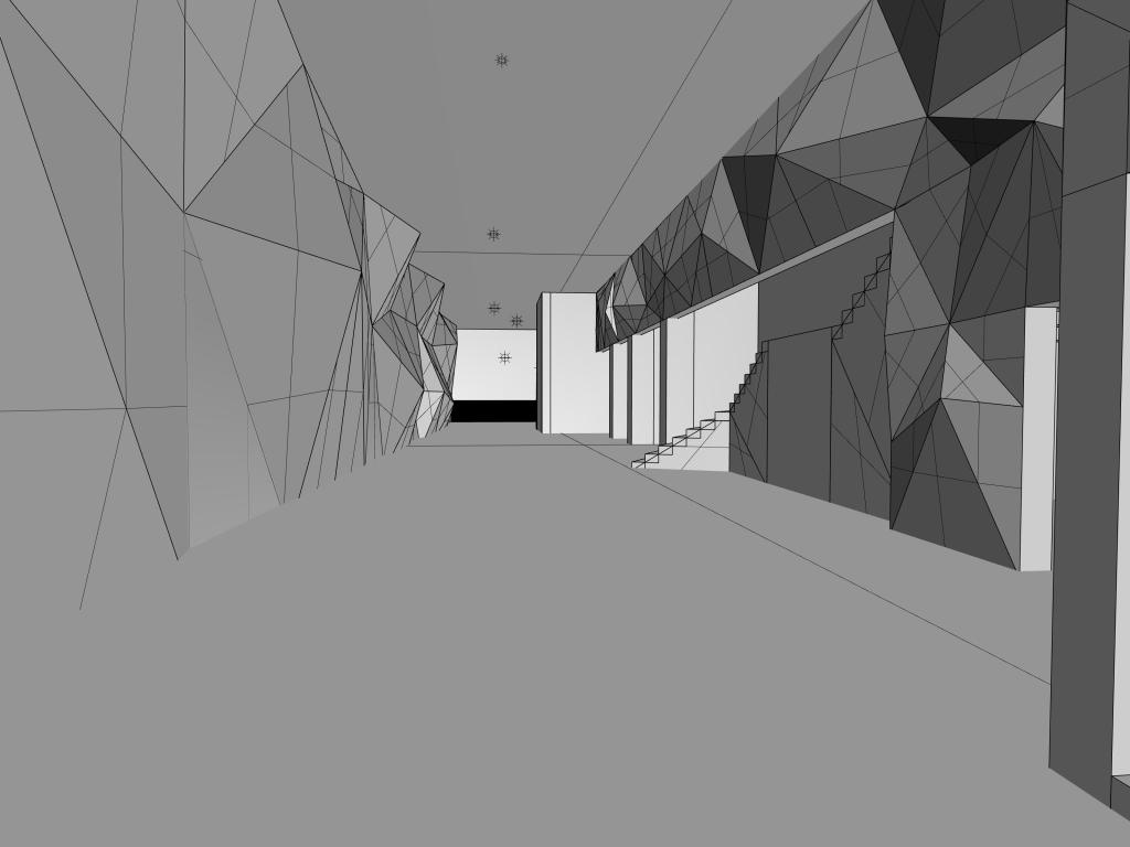
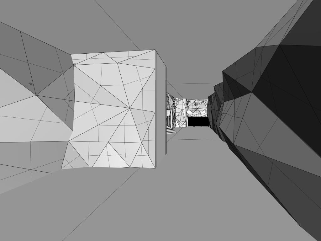
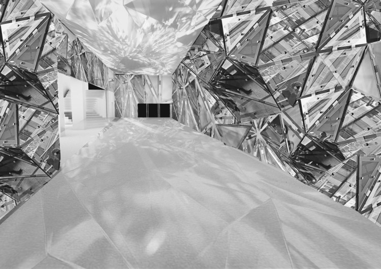
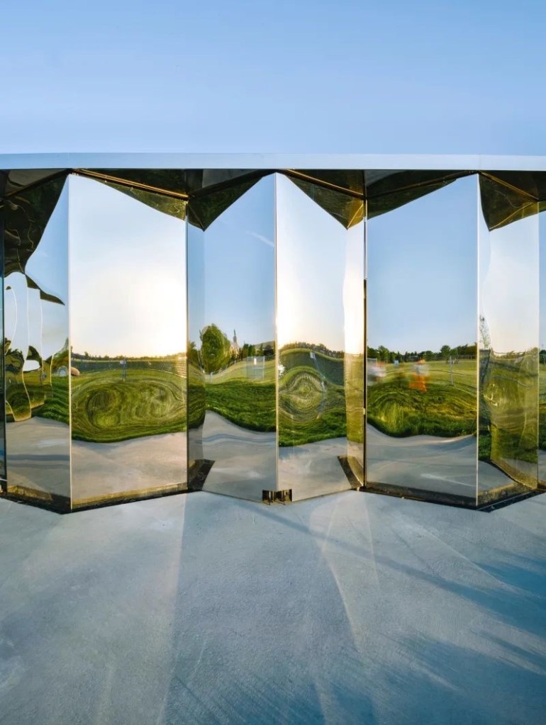
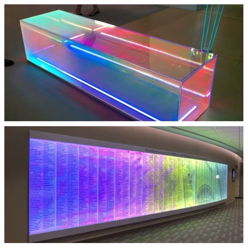
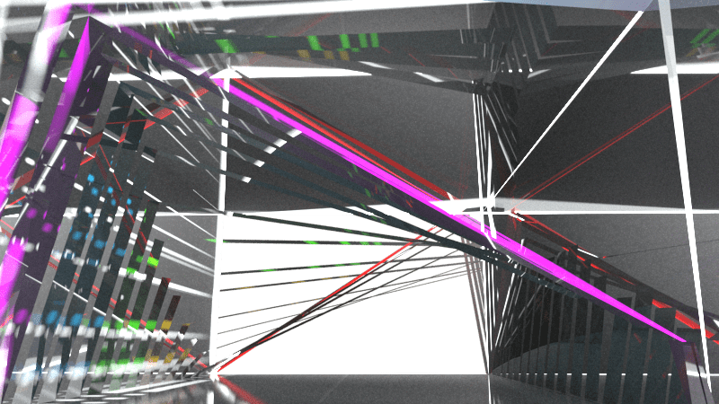
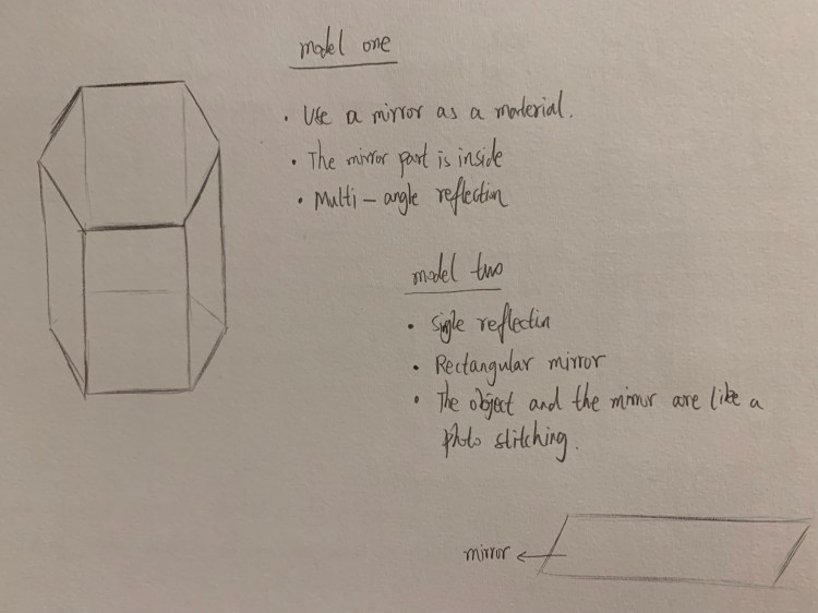
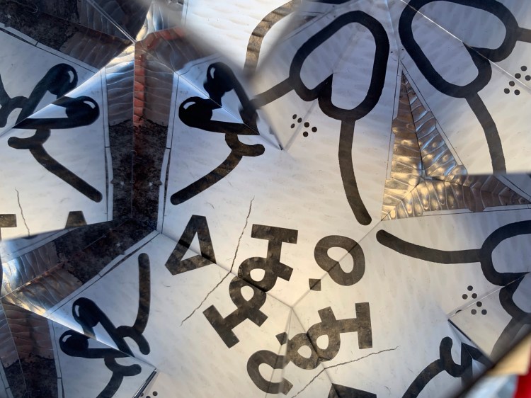
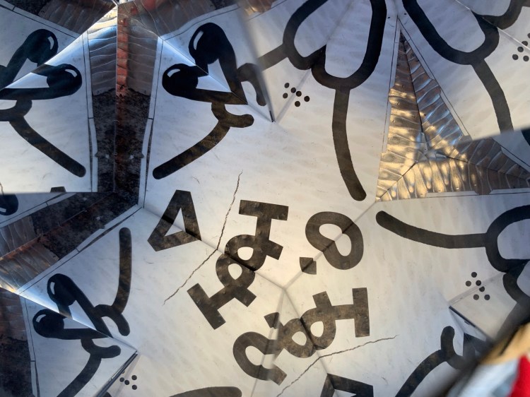
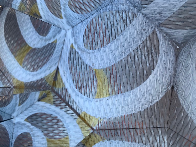
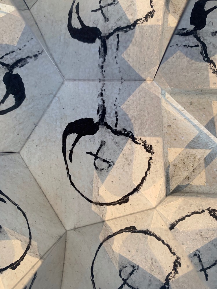
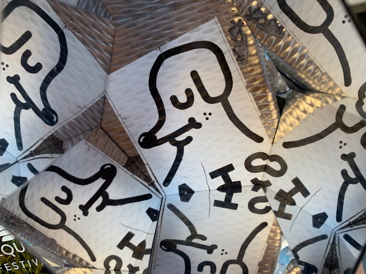
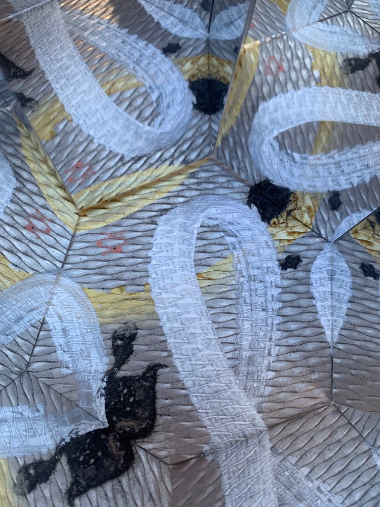
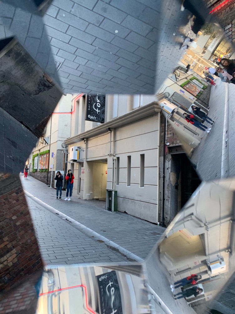
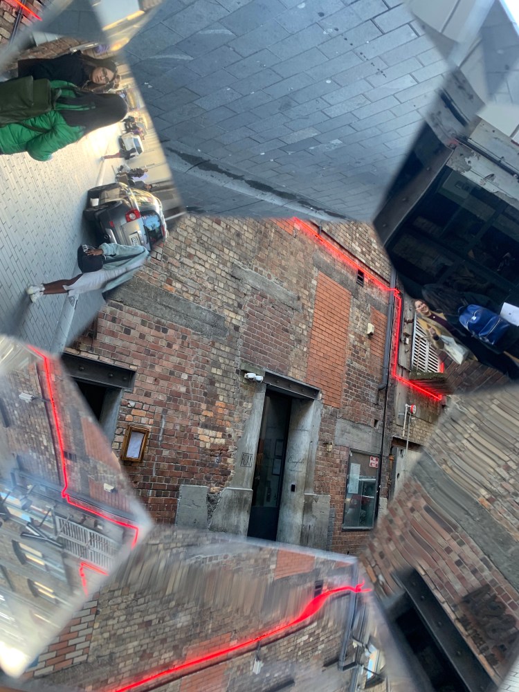
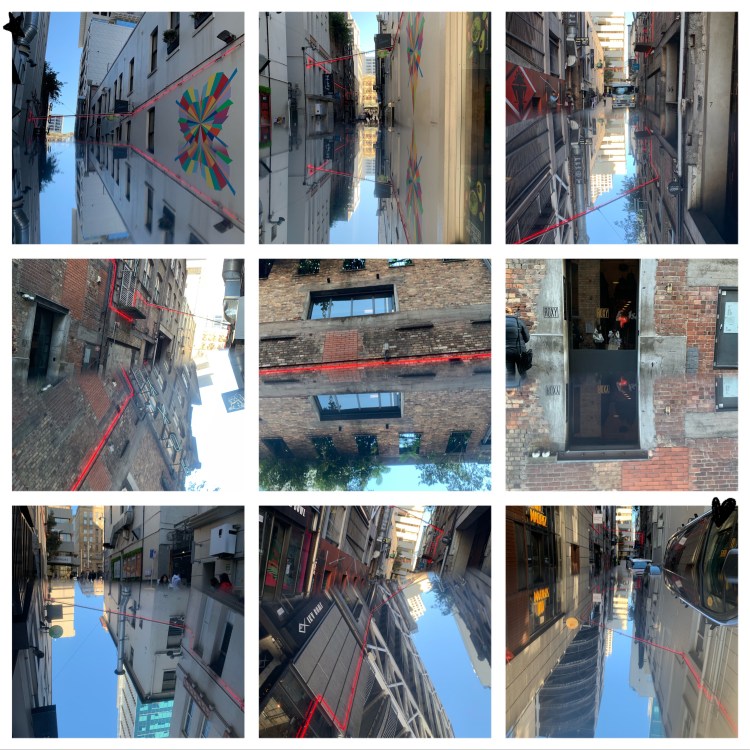
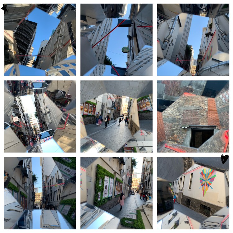
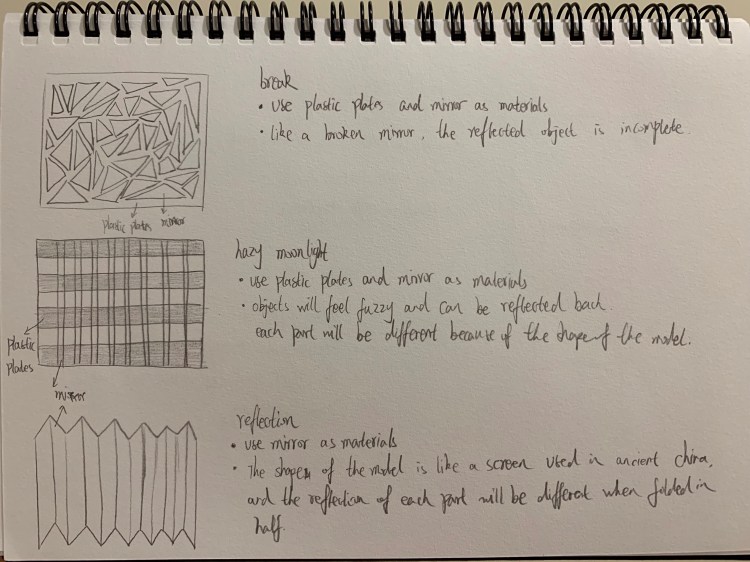
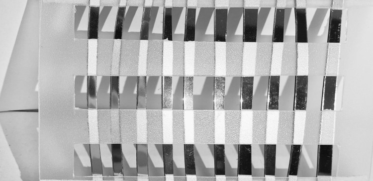
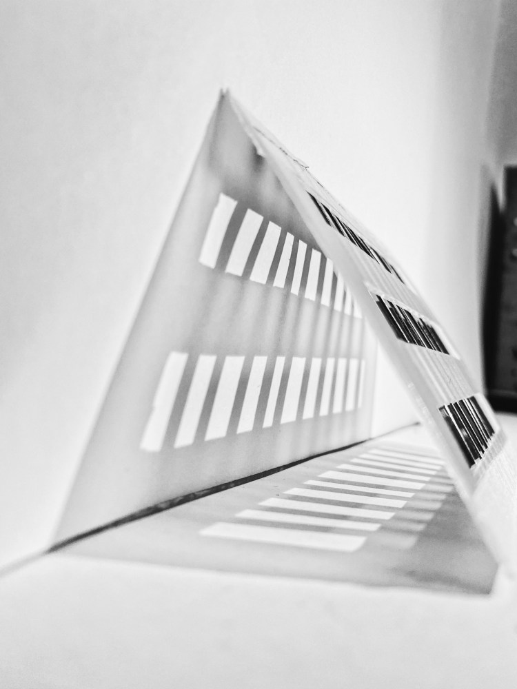
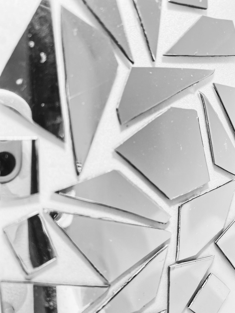
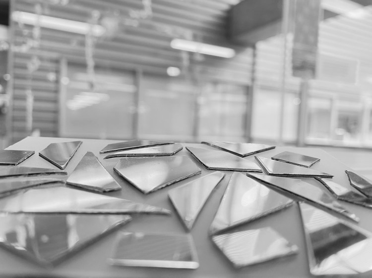
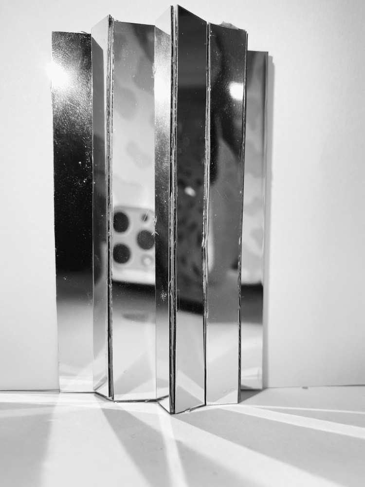
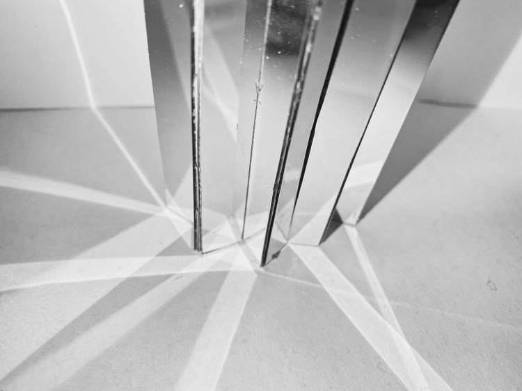
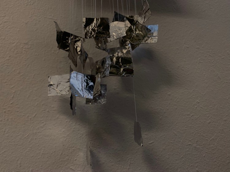
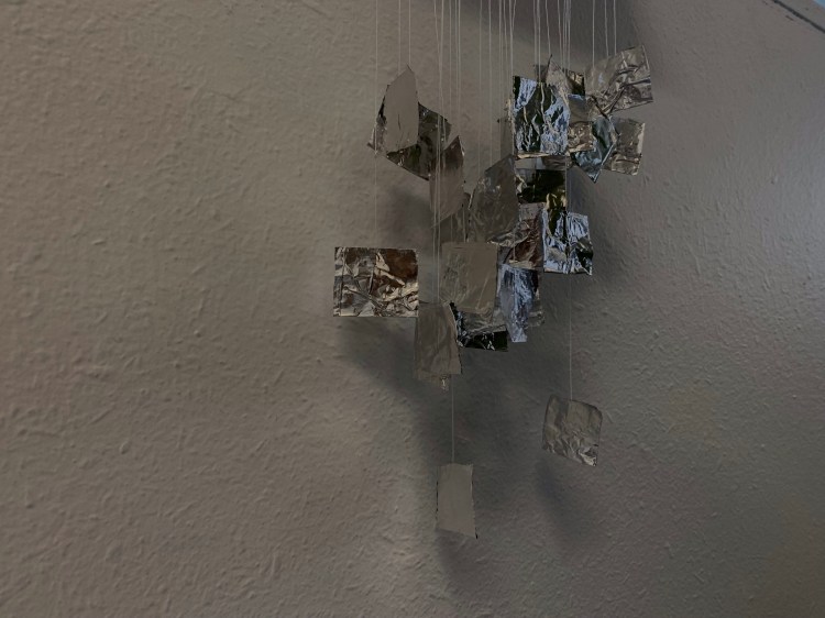
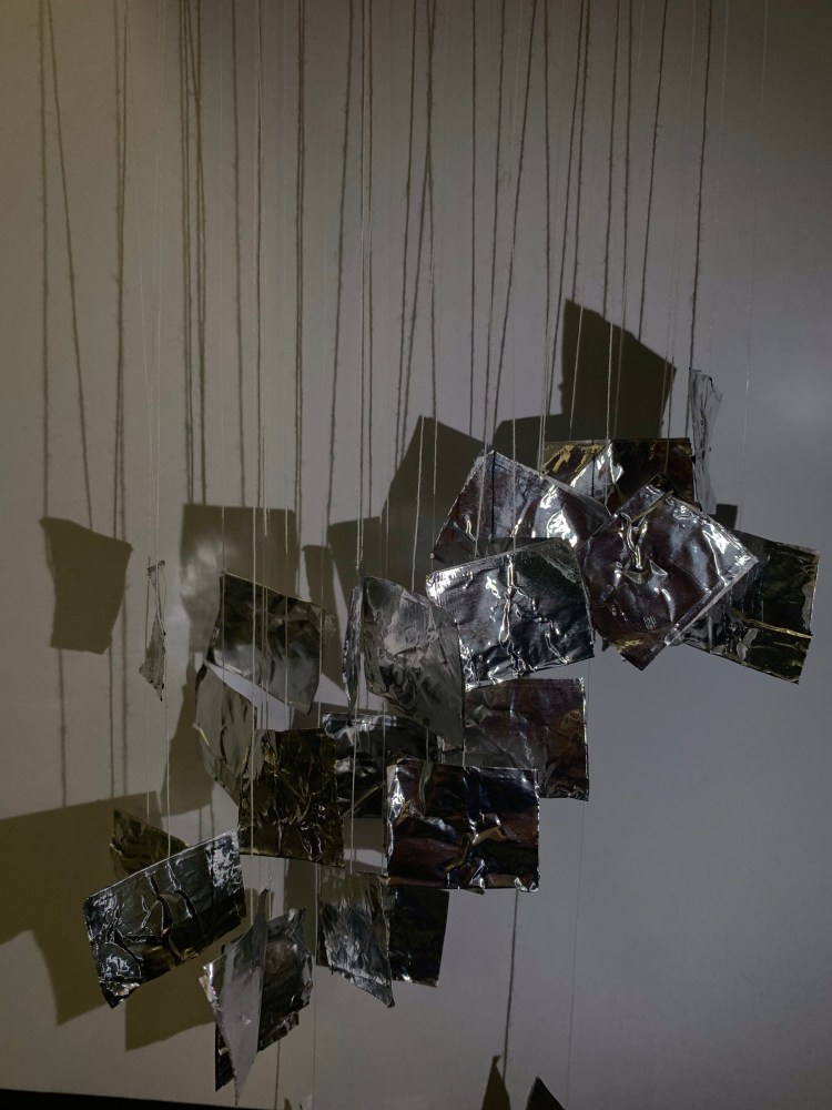
In my first model, I used a mirror as a materials. I made two different models, one is single reflection and the other one is multi-sided reflection. Second is more interesting, although it looks messy and you never know what part of the other sides are reflected. This kind of unknownness is very attractive to me.
Fragment
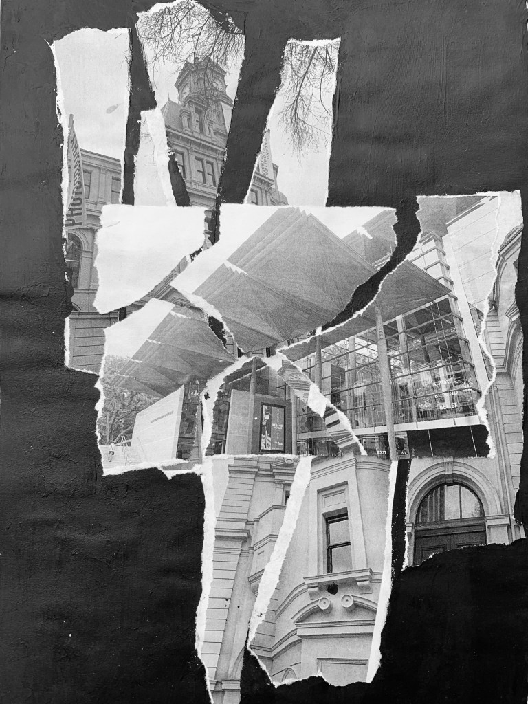
This words comes from the second model. Observing the site from my model, I found that every picture is fragmented. Because I broke the mirror and put it together, so every part is incomplete and the reflected object has only one part. Maybe a window, a door, a line, etc. Just like human memory, the memory of a place maybe food, history, humanities, experience,etc.
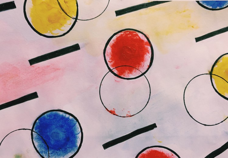
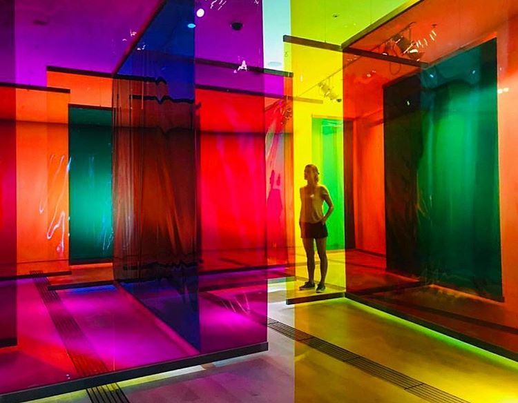
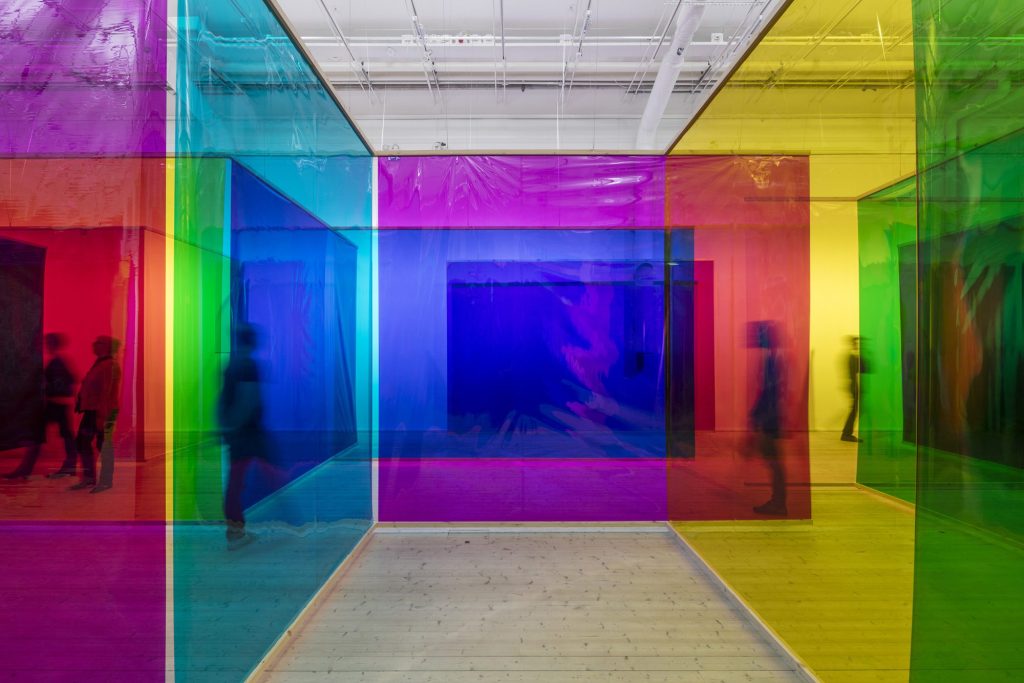
Highlight
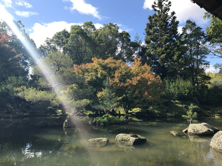
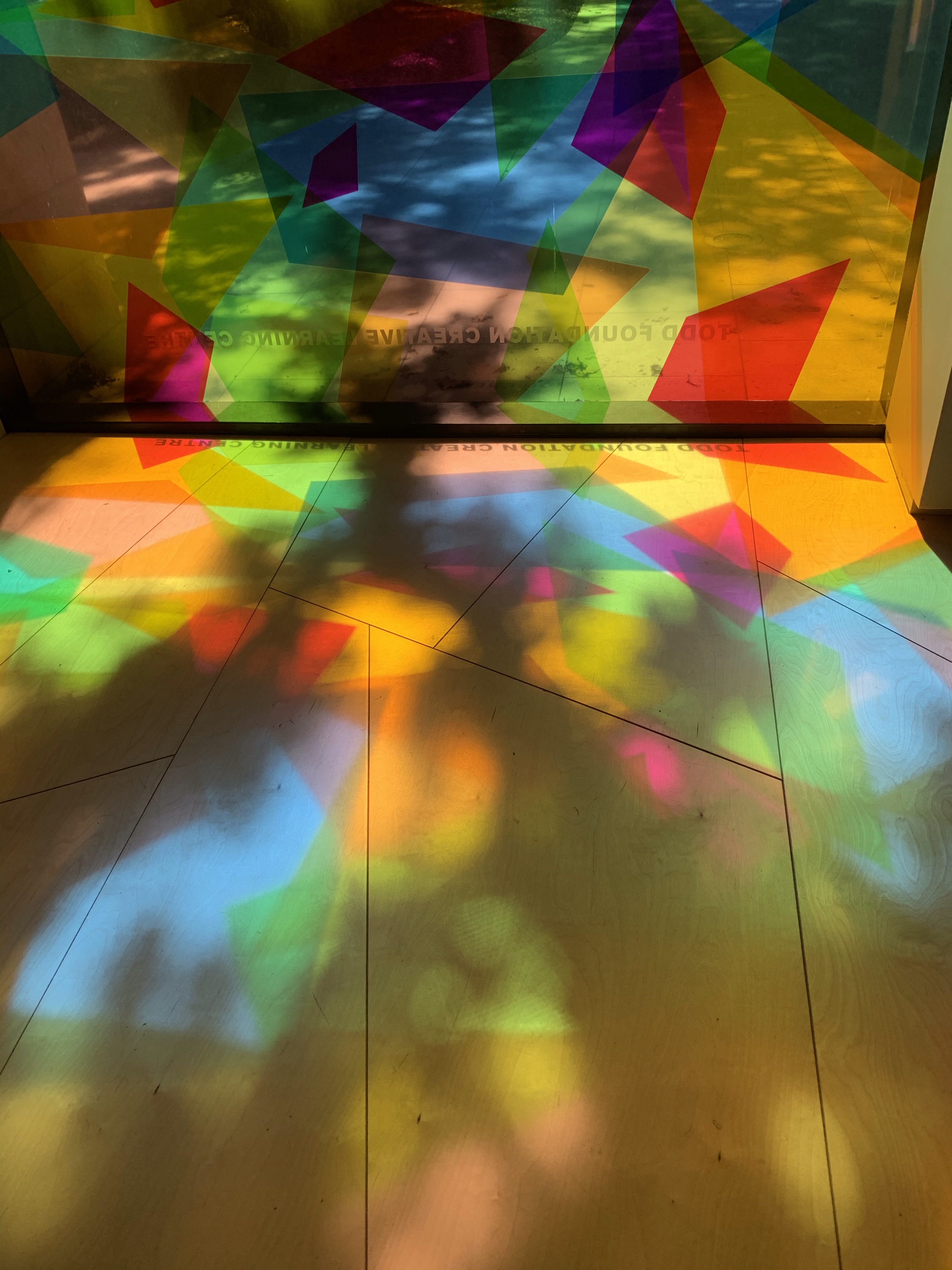
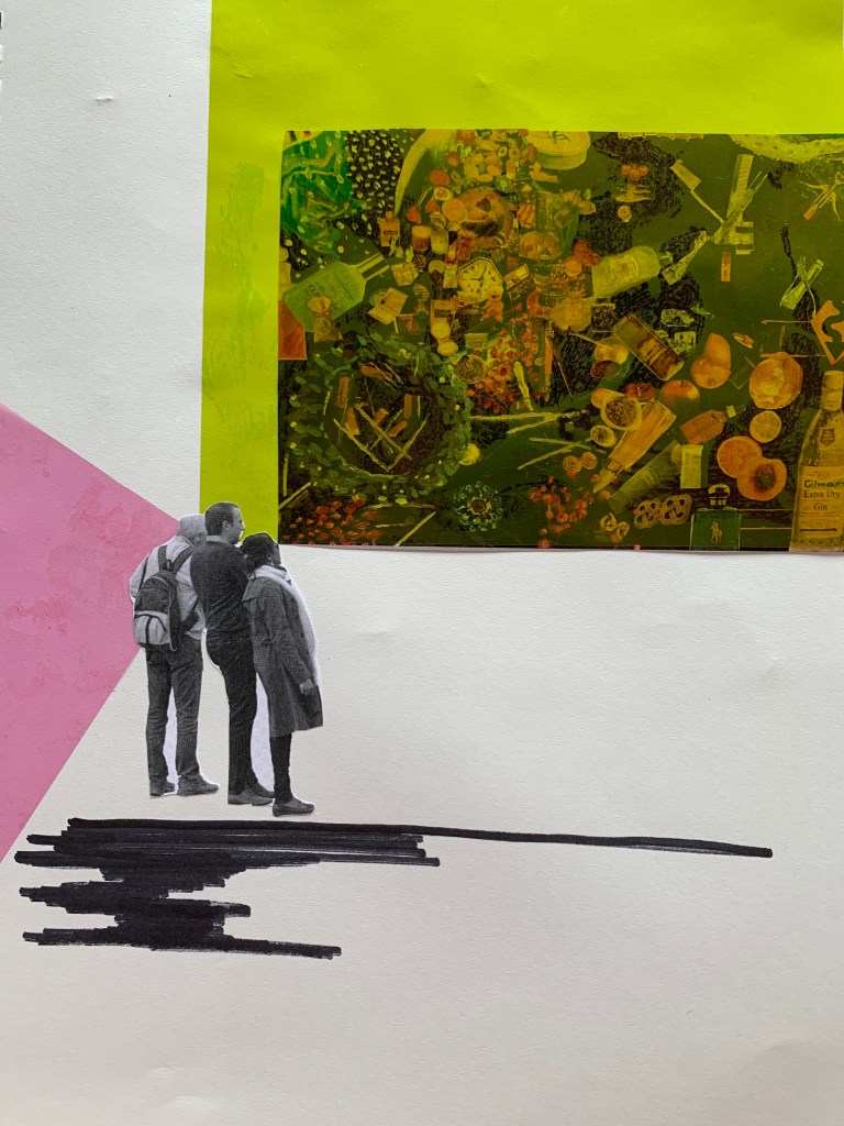
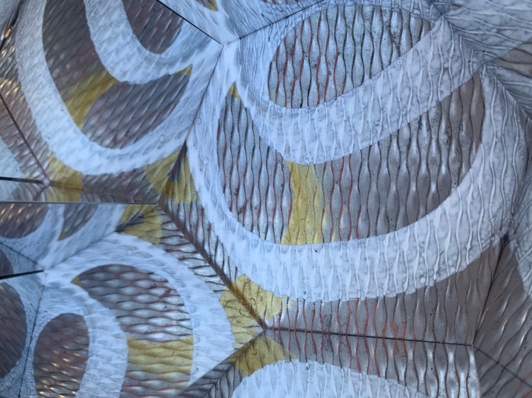
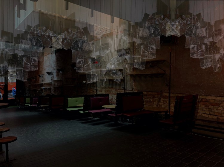
Sometimes highlight an important, conspicuous, memorable, or enjoyable event, scene, part. It’s easy to find highlight in my models and photos. It’s like the sun shining on the surface of the sea, shining things always attract people’s attention.
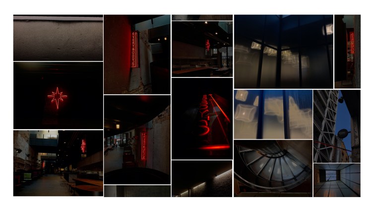
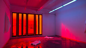
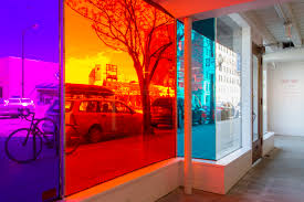
This is a photo taken after retuning to the site again. Carefully observe that each of this group of photos has its own highlight part. The hue is very dark. This is the feeling that this street brings to me, because it is different from the noise of the main street, so it looks particularly dull. So I think the highlight is very important. I want to design the highlight that belongs to this street with its history and story.
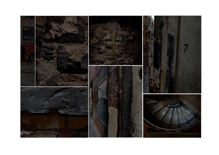
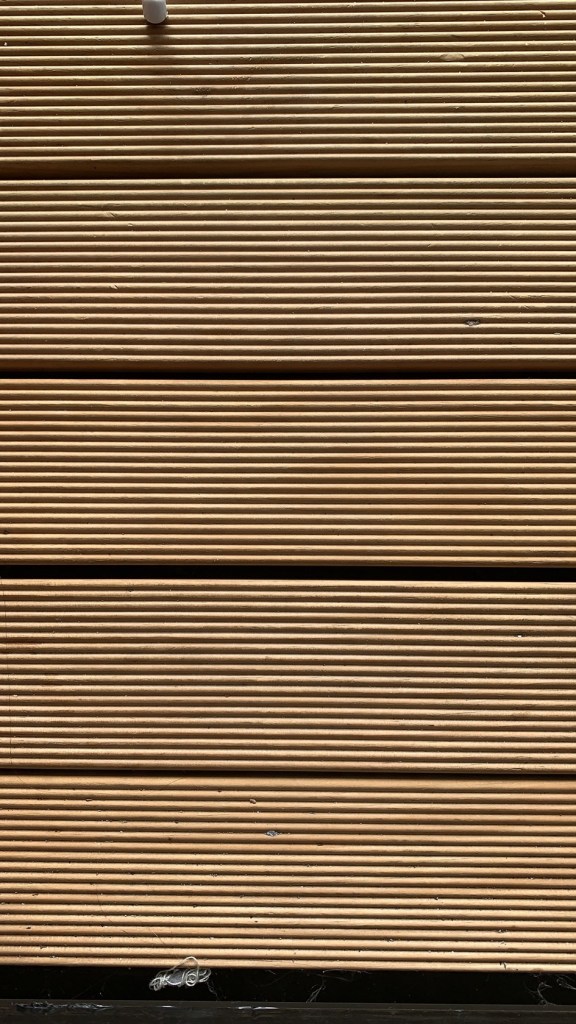
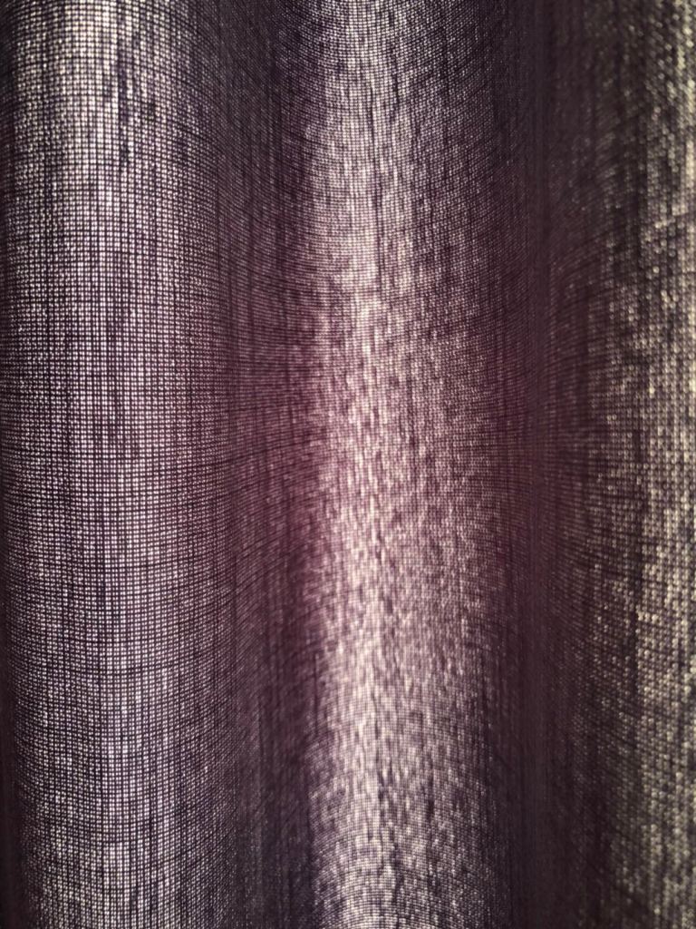
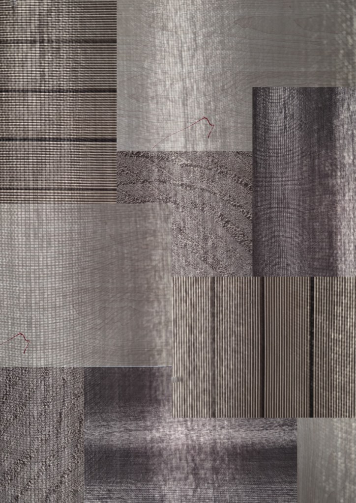
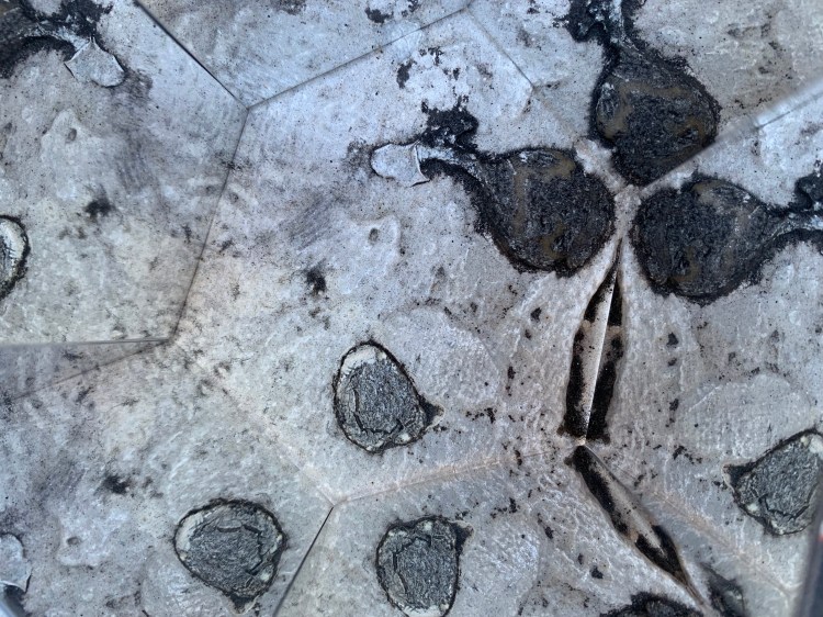
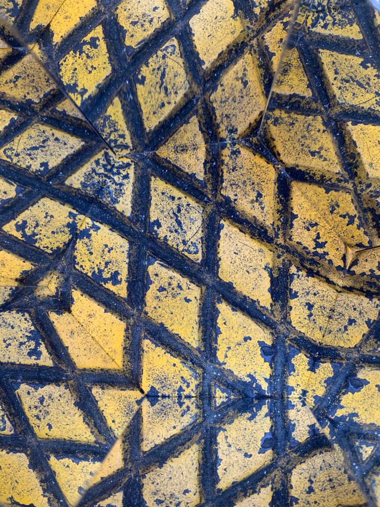
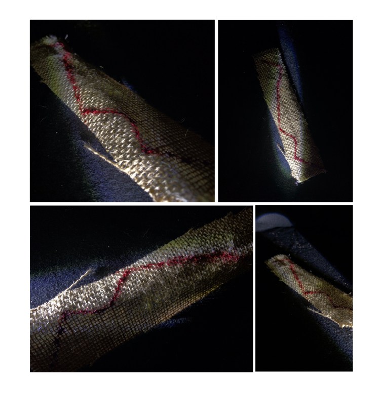
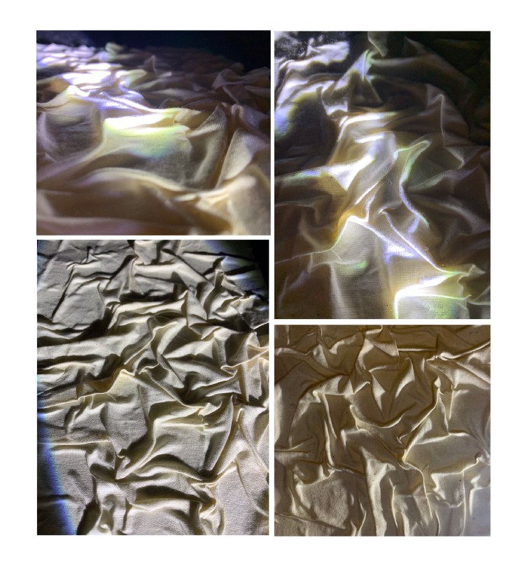
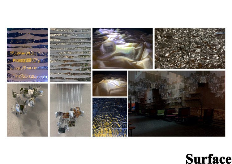
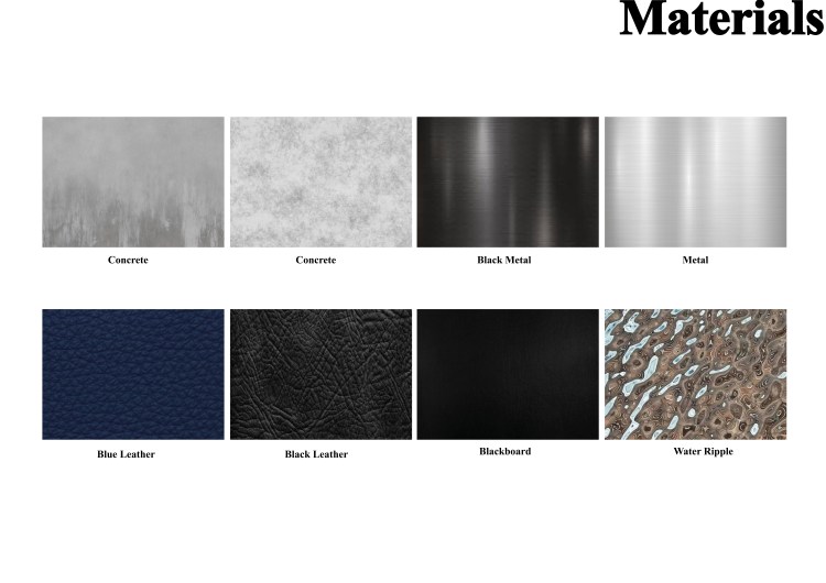
This is a set of pictures about materials. What fascinates me is their surface. The texture is different, the material is different, but the combination is also very suitable.
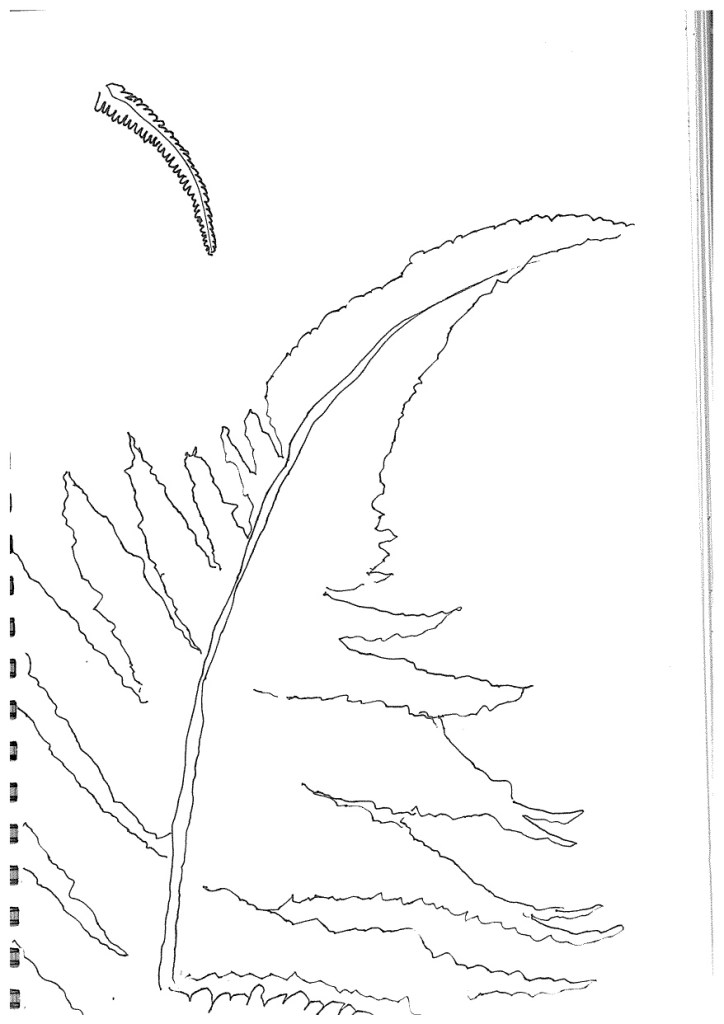
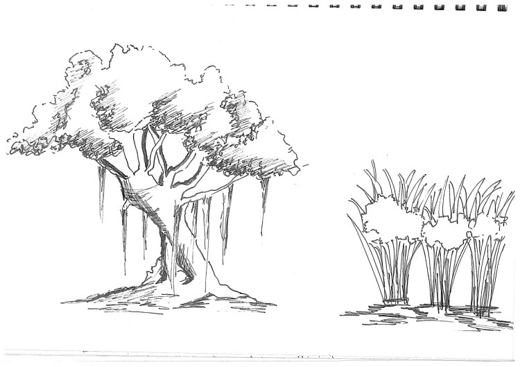
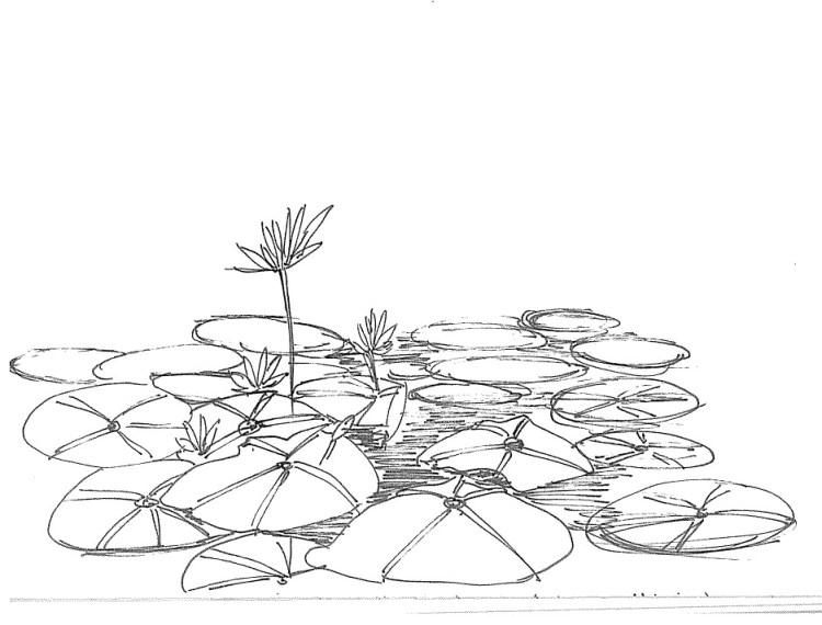
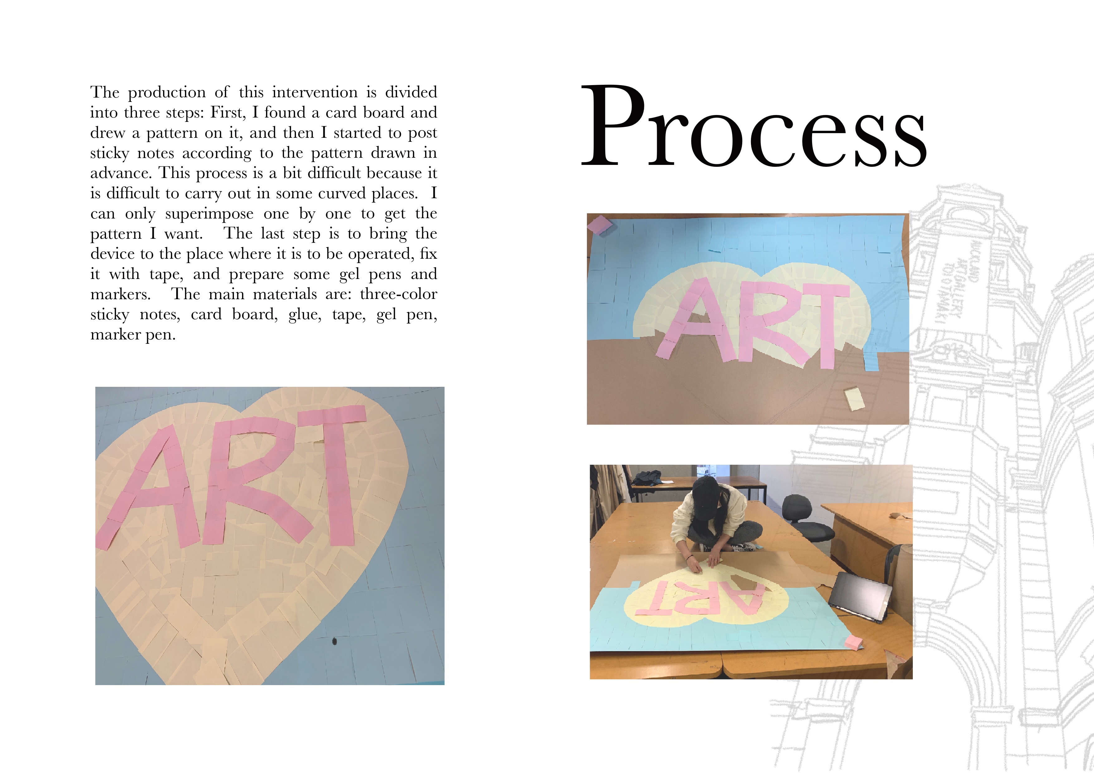
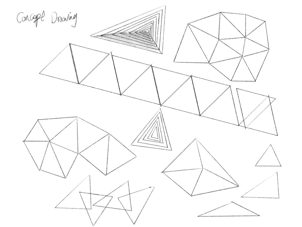
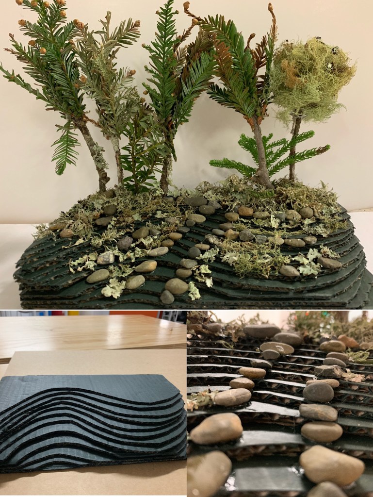
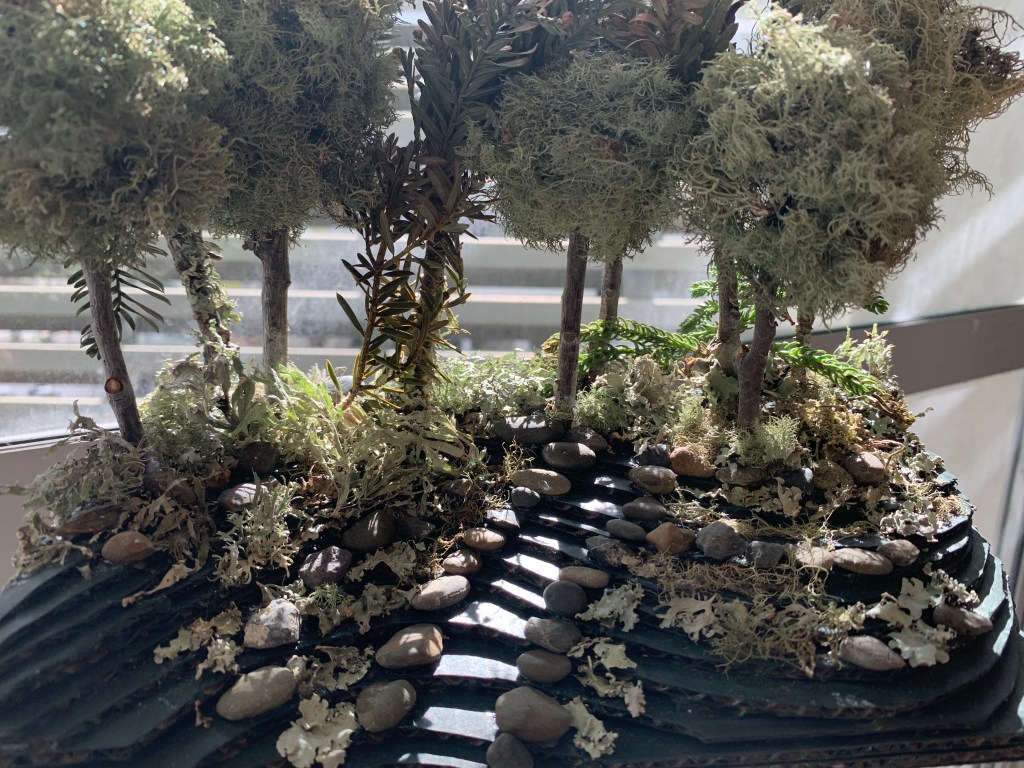
Series of Five Drawings
Week 4: Material Narrative+Surface
Artist research
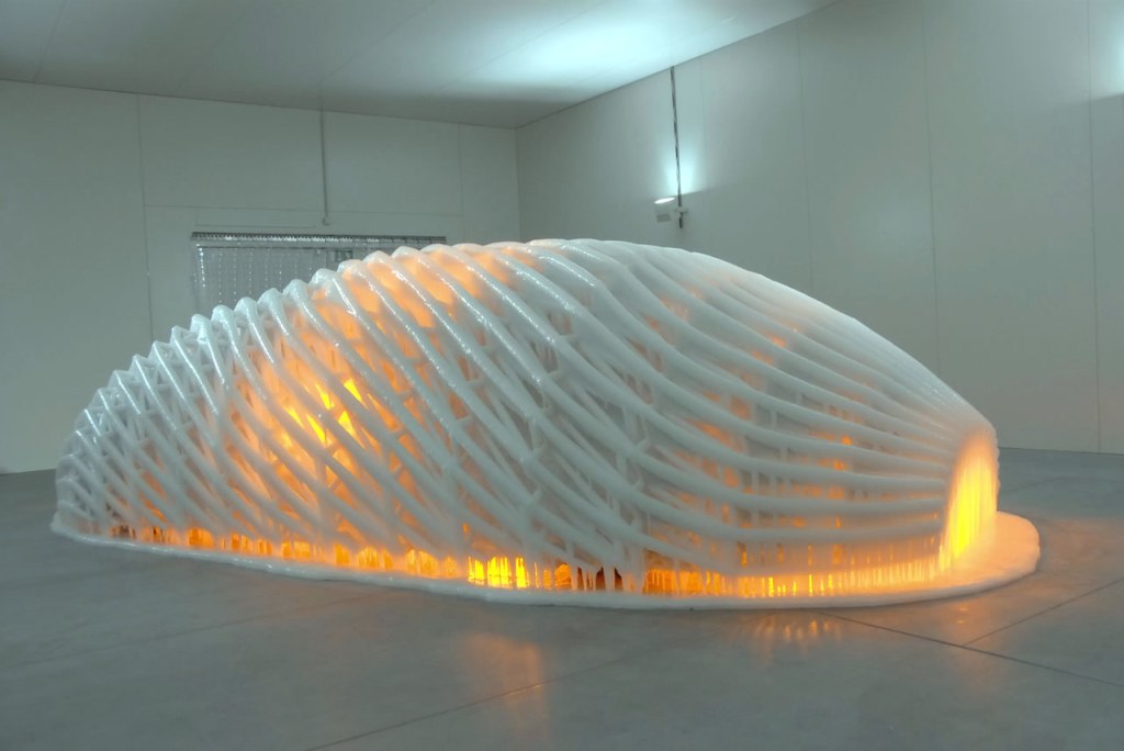
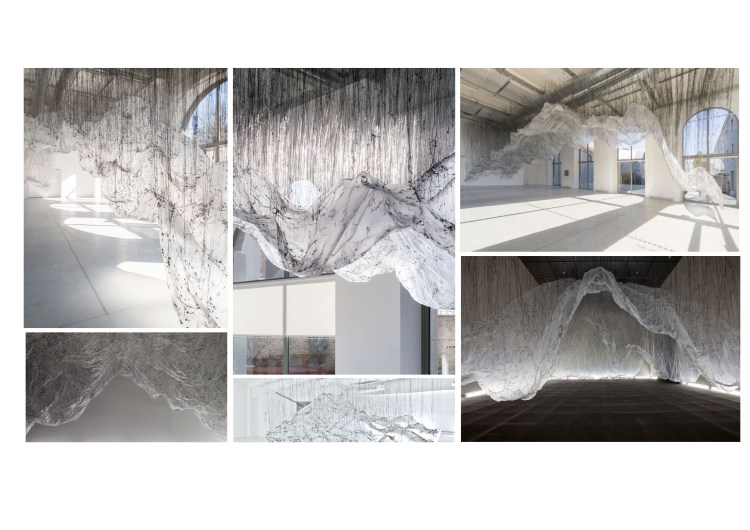
Yasuaki Onishi studied sculpture at University of Tsukuba and Kyoto City University of Arts. He has had solo exhibitions throughout Japan and internationally, and his work was included in Ways of Worldmaking (2011), at the National Museum of Art, Osaka (NMAO). His most recent solo exhibition in the United States was in 2012 at the The Marlin and Regina Miller Gallery at Kutztown University in Kutztown, Pennsylvania. In 2010, Onishi was the recipient of a United States-Japan Foundation Fellowship that included a residency at the Vermont Studio Center, as well as a grant from The Pollock-Krasner Foundation Inc., New York.
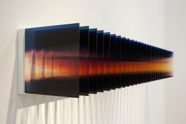
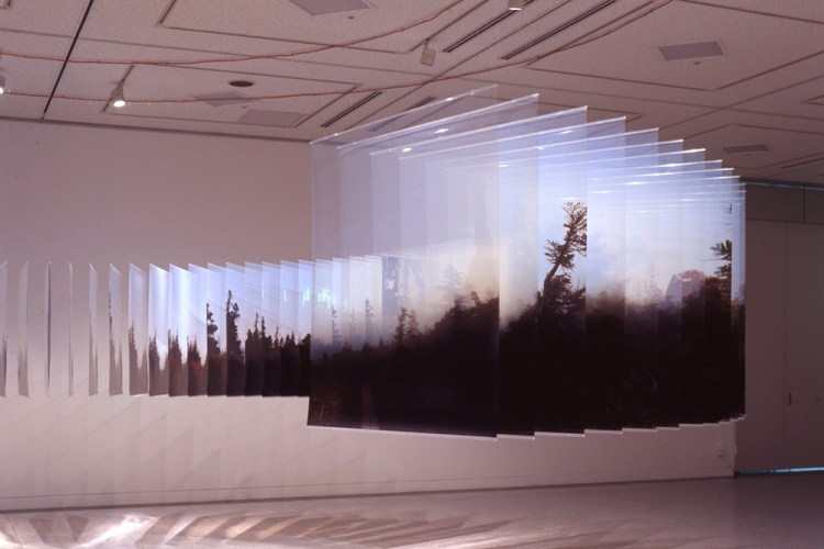
In his installation, reverse of volume RG, Yasuaki Onishi uses the simplest materials — plastic sheeting and black hot glue — to create a monumental, mountainous form that appears to float in space. The process that he calls casting the invisible involves draping the plastic sheeting over stacked cardboard boxes, which are then removed to leave only their impressions. This process of reversing sculpture is Onishi’s meditation on the nature of the negative space, or void, left behind.
Onishi wanted to create an installation that would change as visitors approached and viewed it from outside of the glass wall to inside the gallery space. Seen through the glass, the undulating, exterior surface and dense layers of vertical black strands are primarily visible. At first glance, standing in the center of the gallery’s foyer, it appears to be a suspended, glowing mass whose exact depth is difficult to perceive. Upon entering the gallery and walking along the left or the right side, the installation transforms into an airy opening that can be entered. Almost like stepping into an inner sanctum or cave-like chamber, the semi-translucent plastic sheeting and wispy strands of hot glue envelop the viewer in a fragile, tent-like enclosure speckled with inky black marks. Visitors can walk in and out of the contemplative space, observing how the simplest qualities of light, shape, and line change.
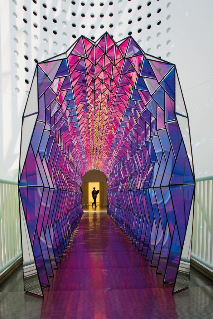
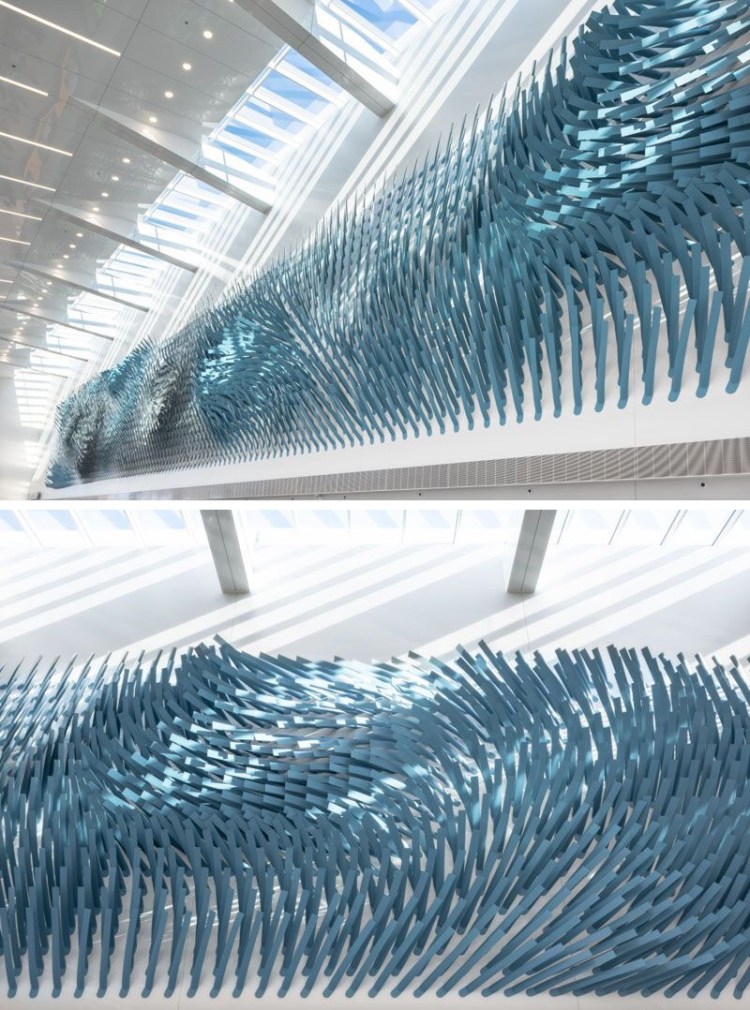
Rob Ley is the founder of Rob Ley Studio. His studio’s history of experimental work includes installations at the Storefront for Art and Architecture (New York), the Taubman Museum of Art, the Materials & Applications Gallery (Los Angeles), as well as commissions for many public and private organizations including the Martin Luther King Hospital (Los Angeles), the Eskenazi Hospital (Indianapolis), the O’Hare Airport (Chicago), the Oregon Zoo (Portland), and the Seattle Fire Department.
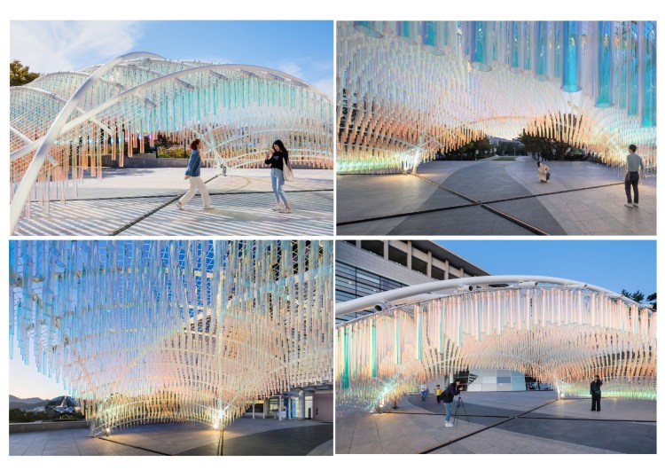
Ripple Pavilion is the annual outdoor pavilion project at Gyeongnam Art Museum in South Korea. Thousands of pixels – acrylic tubes with mechanical joints – span across a waving canopy while scattering light and colour in constantly changing expression.
It is an interactive installation where people’s movements transform the appearance of the pavilion at different moments in time. The overall effect of the pavilion begins from a small contact with a tube, which swings other pixels in the vicinity to create rippling phenomenon. Then the physical movement translates into refracted colours transforming whole installation into a moving iridescent field.
The concept of the pavilion was conceived as a responsive environment. A small initial input, such as a child’s touch, could propagate into unexpected patterns on the whole array of pixels like a butterfly effect. The playfulness of pavilion invites people at all ages to participate and to create their own moments. The geometry of the pavilion paid special attention to maximizing interaction. The waving double curvature optimizes contact point at different heights for different users. To fine-tune the interactive points in the 3d geometry, several iterations of parametric model was shared with other consultants. Then collaborative feedbacks helped reaching the final form. As a result, there are moments of pavilion suitable for standing users while crawling is the best way to experience in other areas. The mix of concave and convex spaces also allow diverse array of colours to be perceived at any view point.
Week 5: Formative Presentation
Pitch
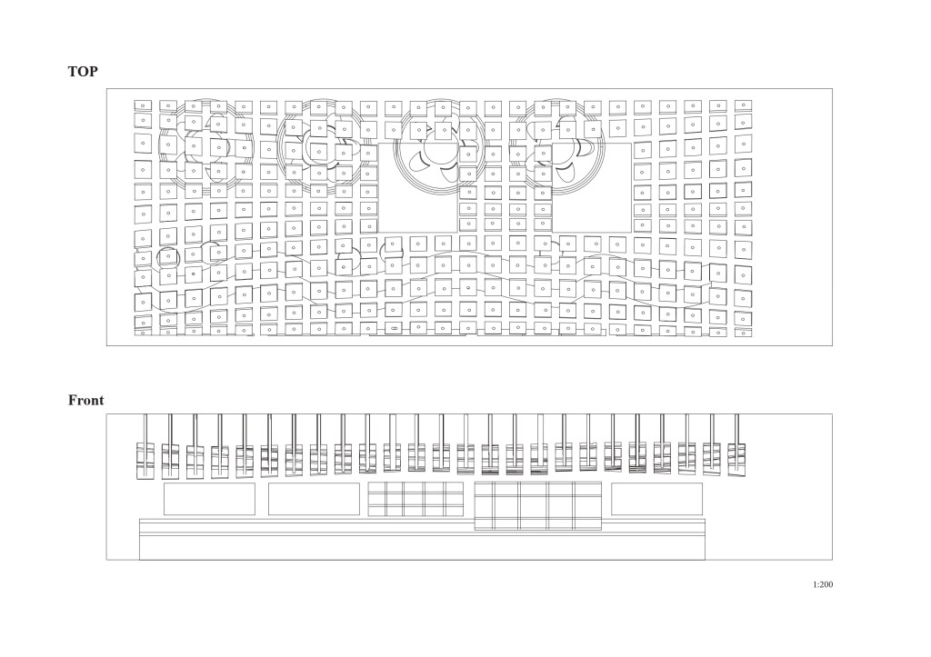
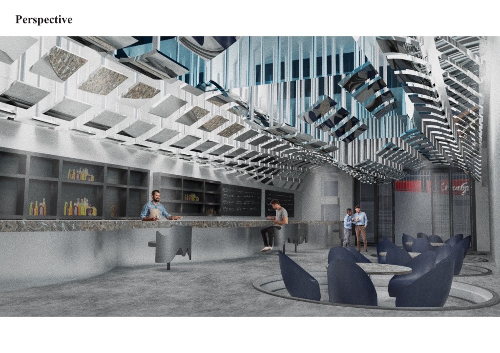
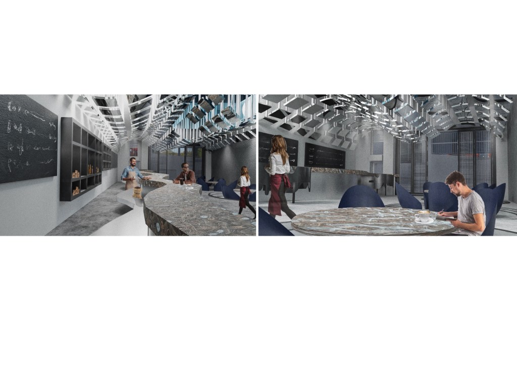
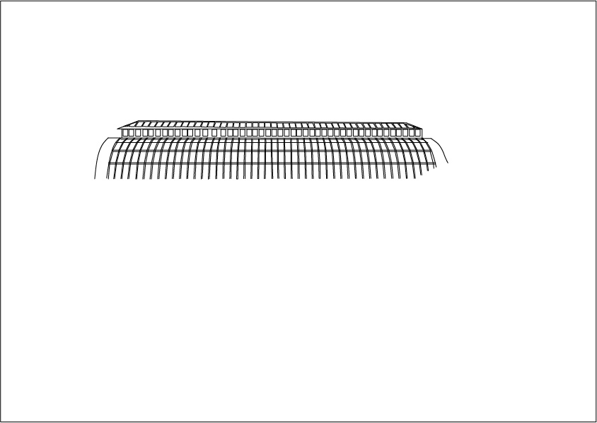
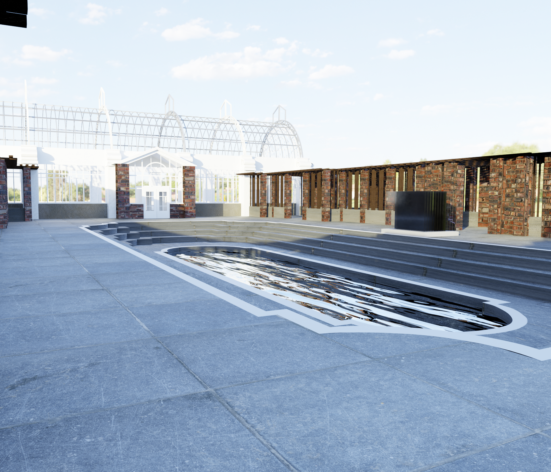
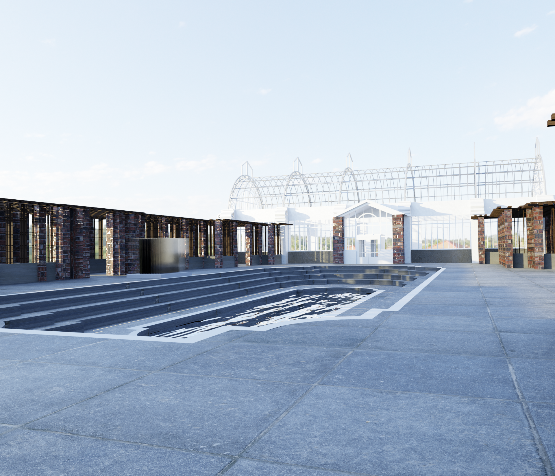
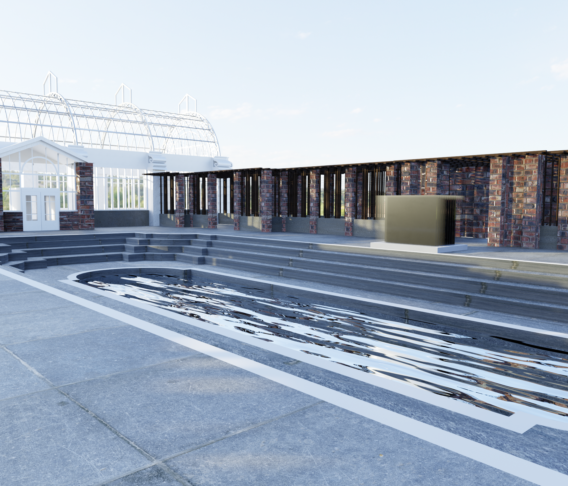
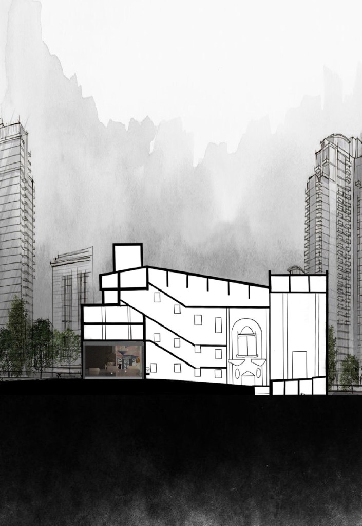
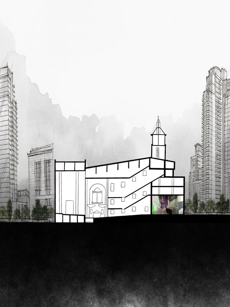
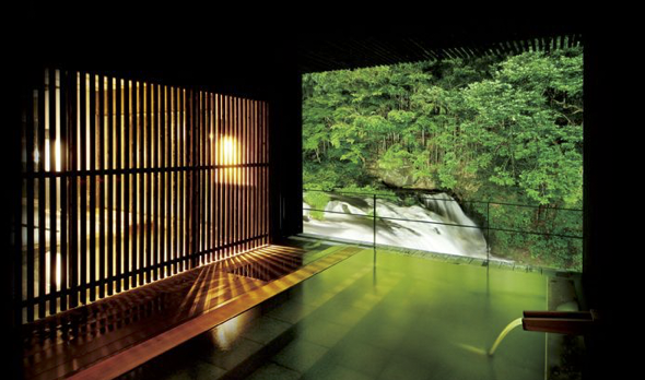
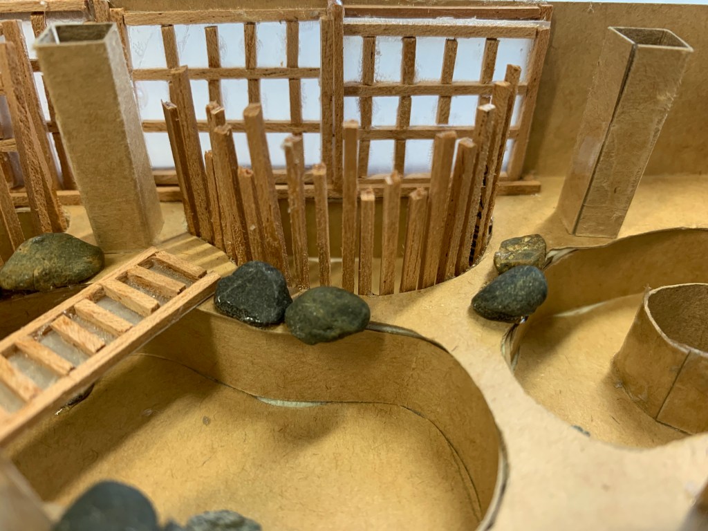
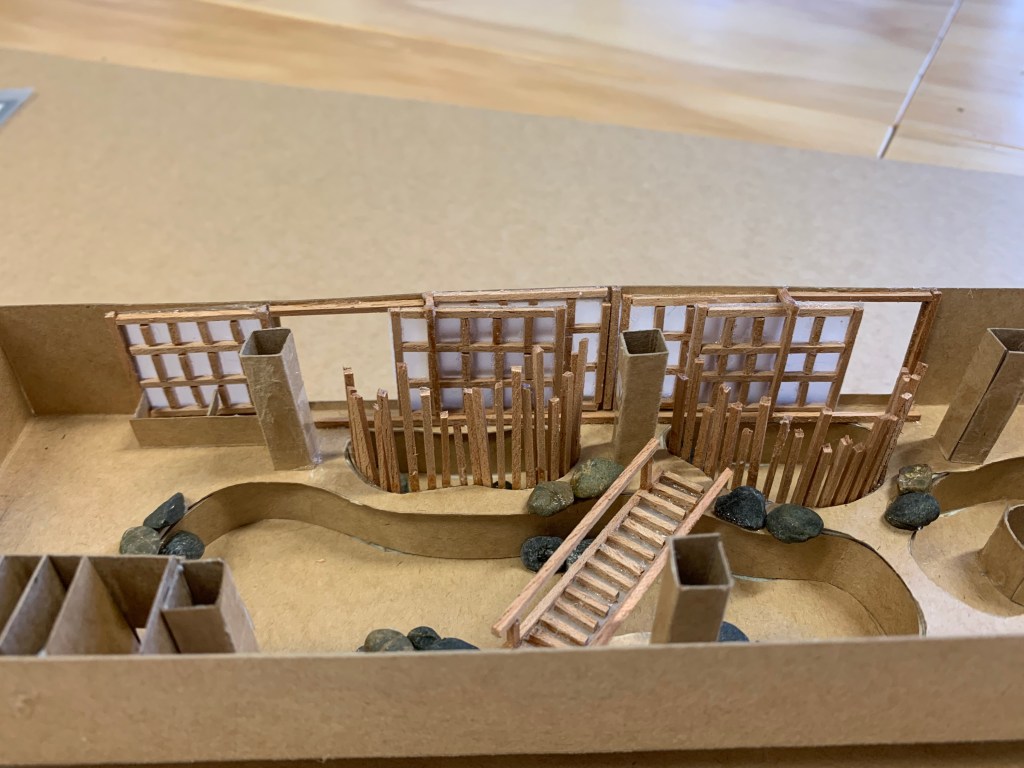
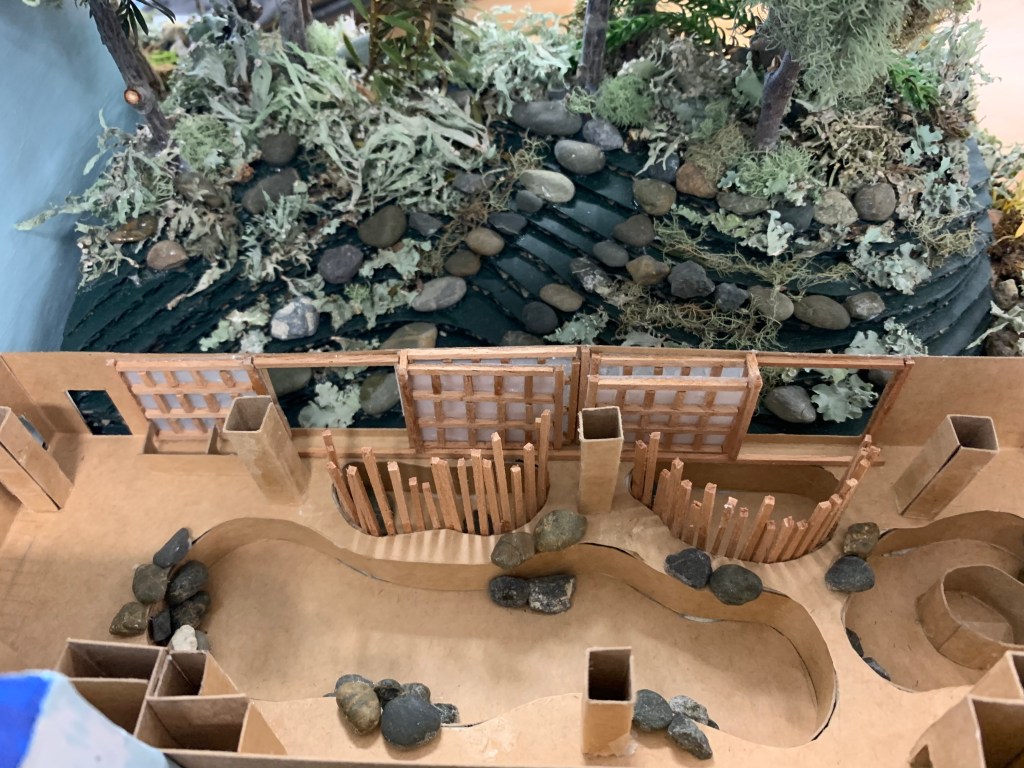
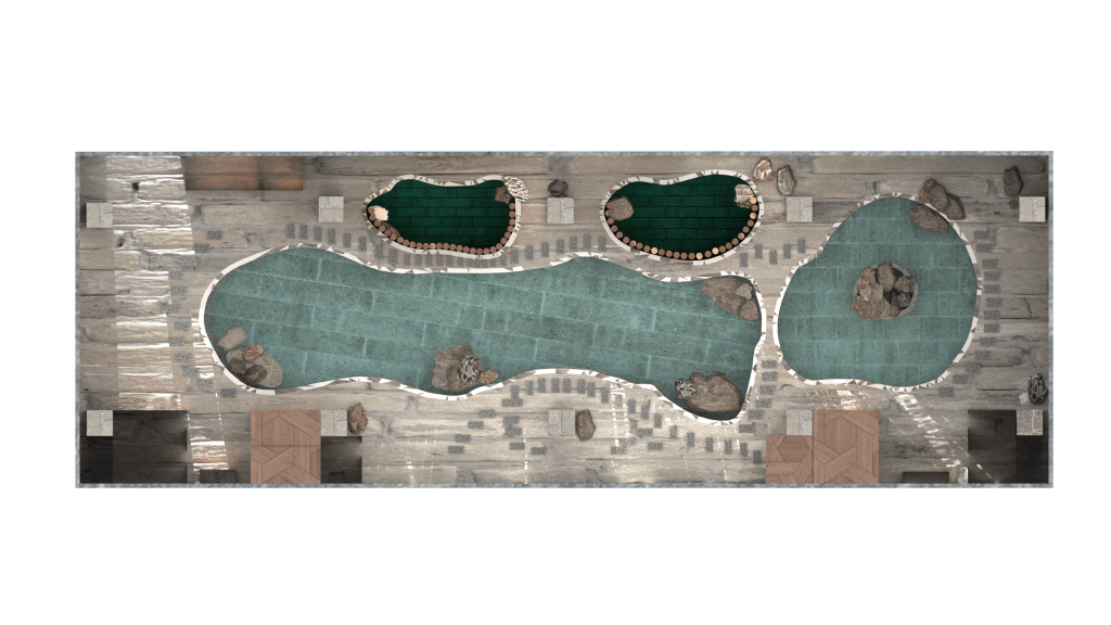
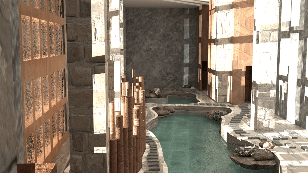
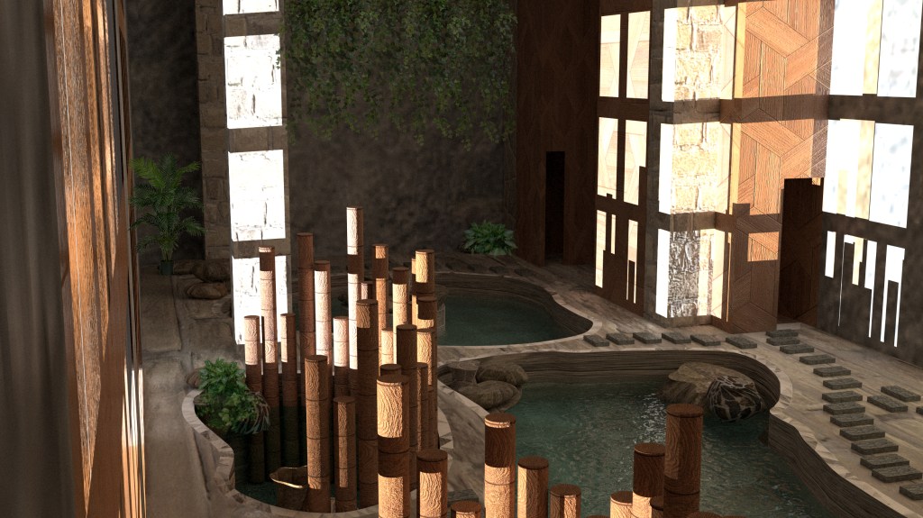
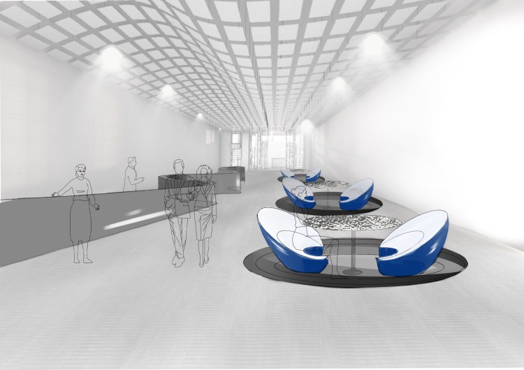
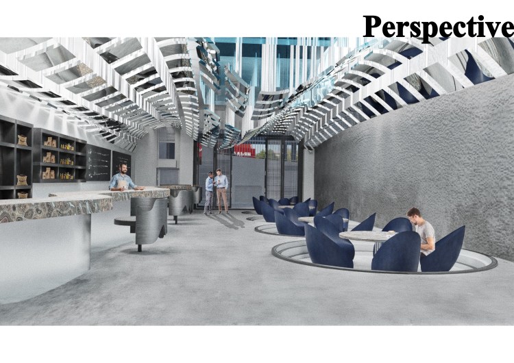
The space I chose was a cafe, and my concept is creative a highlight of the street . When I visited this street for the first time, I felt very dull. This is different from the noise and prosperity of the main street. So I want to bring sparkling things into this street and change the atmosphere of the street through color and light. The main part of the design is the roof inside the cafe. The entire plane will be undulating and there will be many lines with different heights. My inspiration comes from the sea level, which is related to the history of the street, and I will focus on various water ripples. Through these texture to design, I will use some reflective materials, the refraction of light will produce highlights, when a lot of light gathers together, it will shine. The line part is still inspired by the sea. When the sun crosses the sea level and enters the sea, you will see beams of light. It will still be a quiet space and neighborhood, but there are more interesting stories or spaces waiting for people to discover and explore in this neighborhood. I hope this space will attract more people.
Script
The space I chose is a cafe, which will be a space open to the public all day long. This is a quiet neighborhood and not noticeable. I will install some devices on the roof and use some materials that reflect light. Let this neighborhood quietly exude its own highlights.
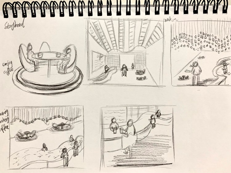
Week 6 :Storyboard
Suspended/Hanging
The technique of hanging an artwork, typically sculptural, from the ceiling, or suspending a series of objects in space, giving the effect of them floating in air. The development of the technique is linked with a number of different modernist avant-garde practices: Marcel Duchamp hung readymades such as a shovel and hat rack from the ceiling, while Alexander Calder’s iconic mobiles were delicate “drawings in space” susceptible to subtle movements of air. Playing with concepts of visual perception and interactivity, Jesús Rafael Soto’s Penetrables consist of thin hanging tubes that permit viewers to enter the space of the sculpture itself. The hanging of objects from above has become common in contemporary installations, especially in works that seek to create an immersive or engineered effect.
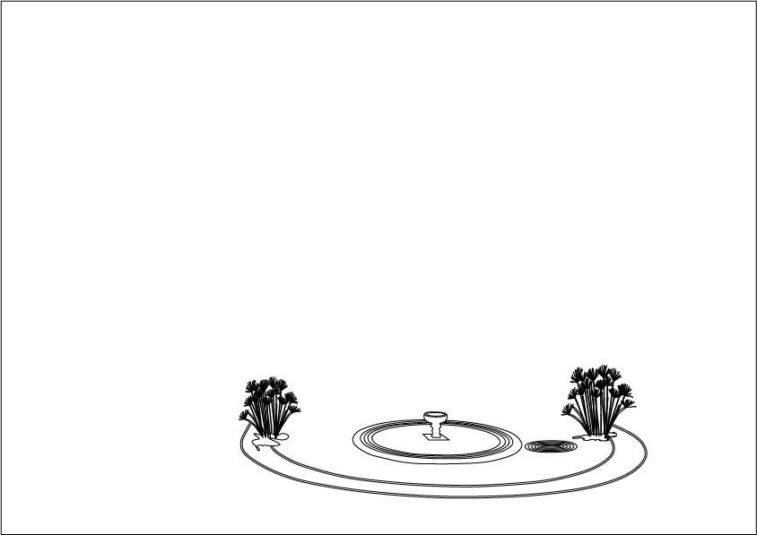
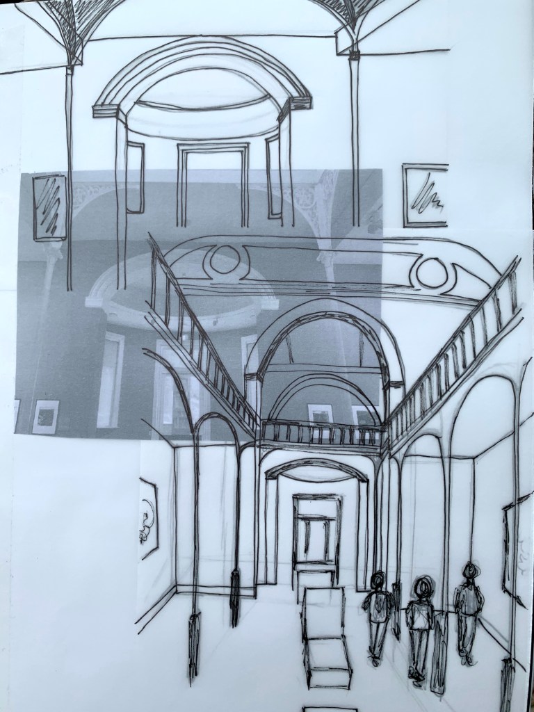
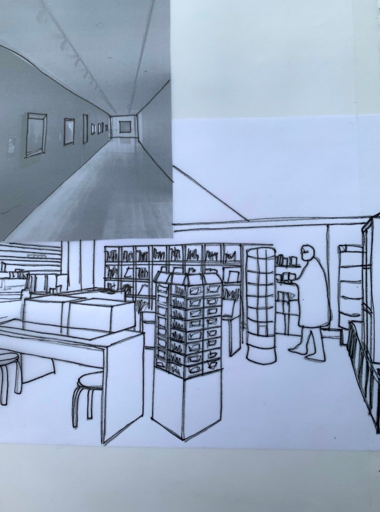
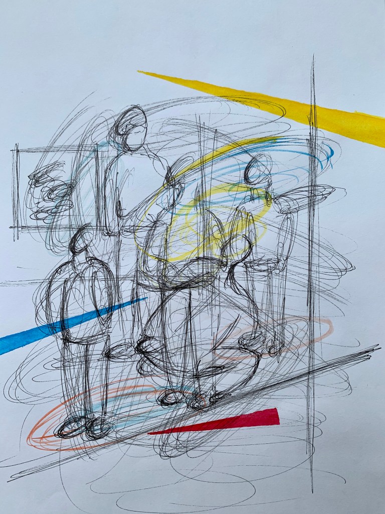
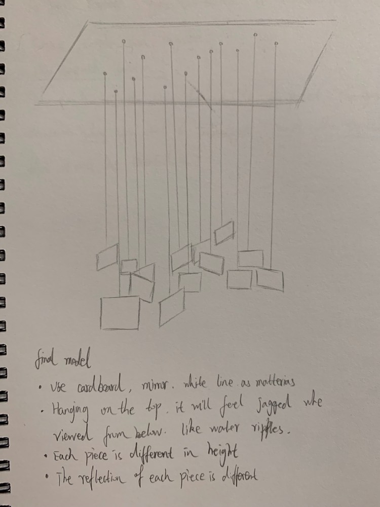
This is the first sketch I drew after lockdown. In the picture I marked the function of each area. This is just a process of starting an idea, it still has many problems. After I talked to Chris for the first time, he made a lot of suggestions to me, and I tried to make improvements. But I always think this draft lacks some important things, and it is messy in short. I didn’t want to understand where did these things come from? Why is it designed like this? I think I should calmly think about this space.
Week 7:Communicating Your Design Narrative
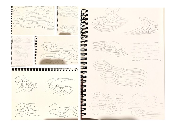
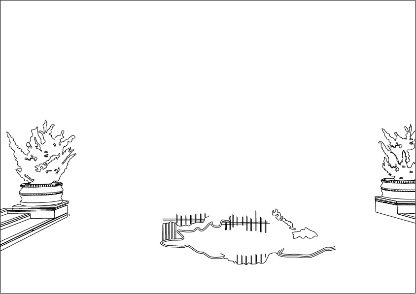
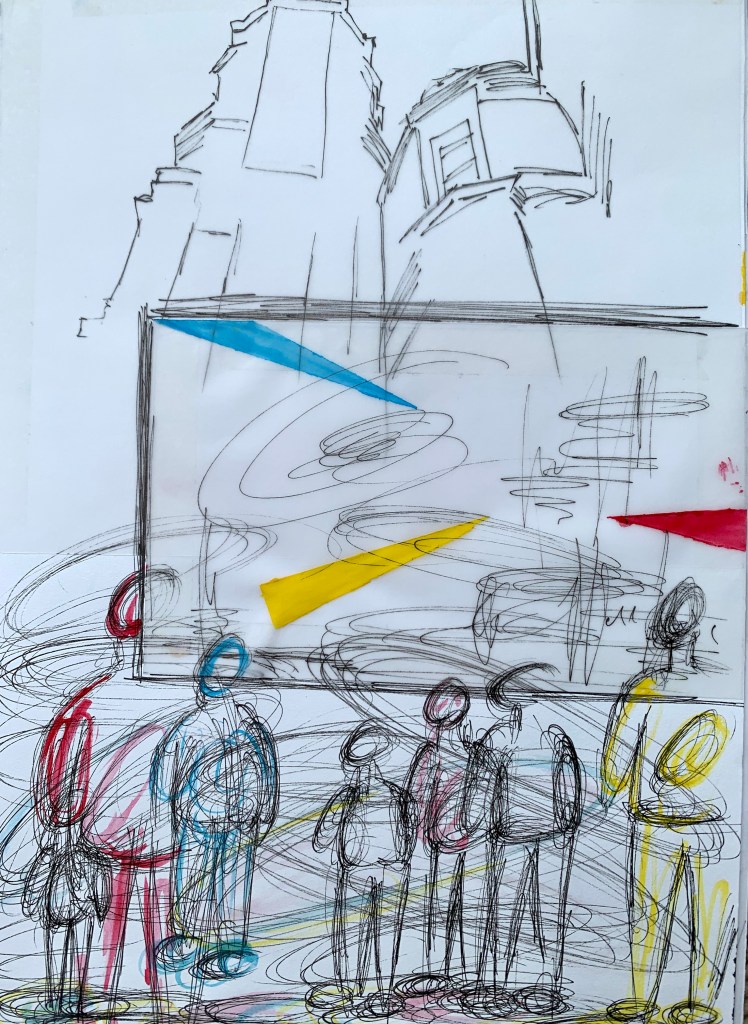
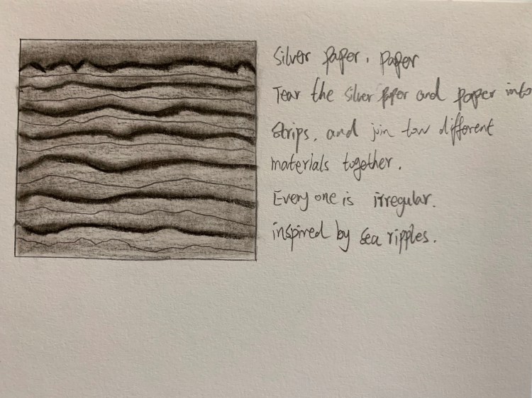
After the lockdown, I gradually became confused because I could not be sure why my space existed? For whom? What kind of space is this? I still have no answers to many questions. Chris provided me with some ideas. To find these answers, I decided to start again from the original idea. Water is my source of inspiration. I relied on water to design four surface. This is a good start. So I drew various water ripples to try to find answers through them. Carefully observe the texture, direction, line, etc. of each water ripple that’s provided me with new ideas.
This is my second hand-drawn draft, which is completely different from the first one. I think all the design of my space should be related to water, because water gave me more inspiration when I investigated the historical background. In this draft, I tried to express several different forms of water. Various water ripples, the shape of the water droplets, the waves generated by the gathering of water, and so on. I think this is a good start, but there are still many details that I need to study in depth. Unfortunately, I cannot start modeling because of lockdown, and I am applying for a laptop. Hope to start working soon.
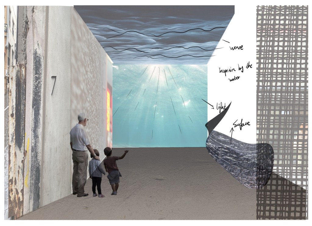
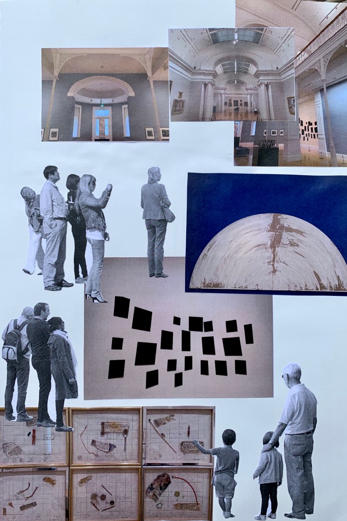
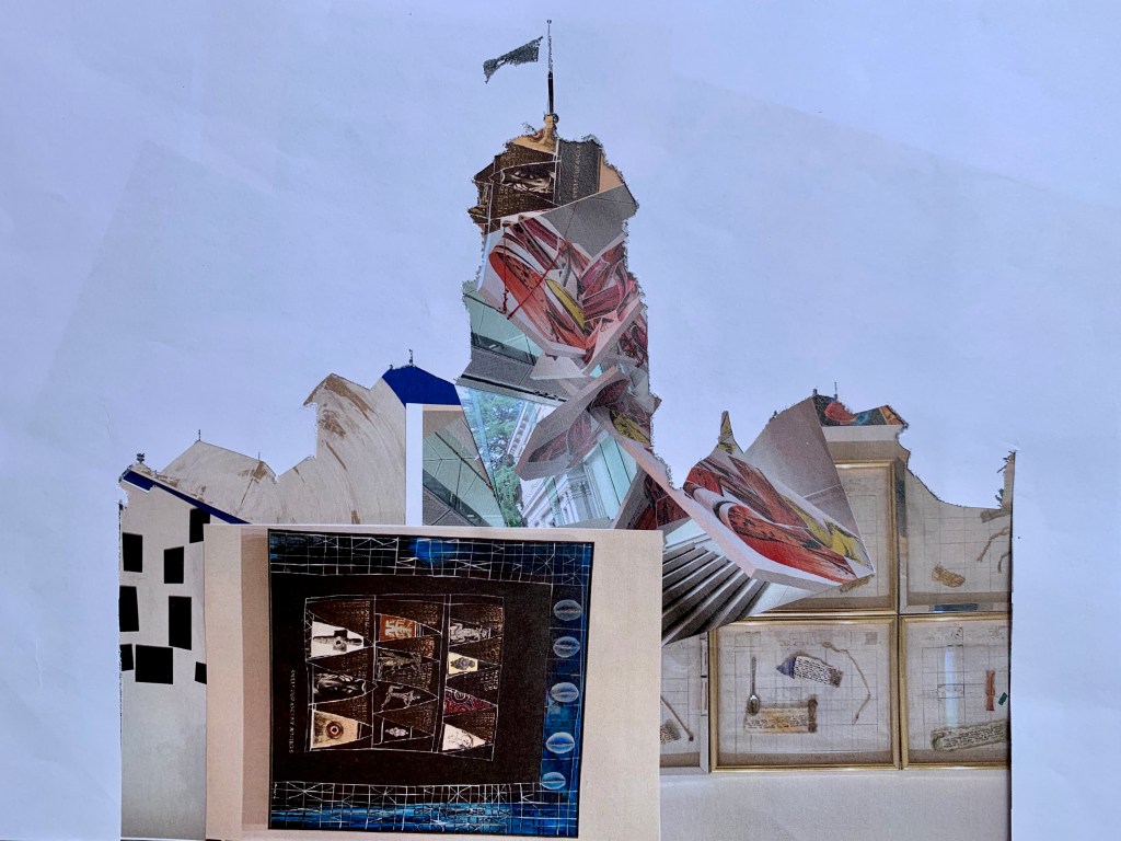
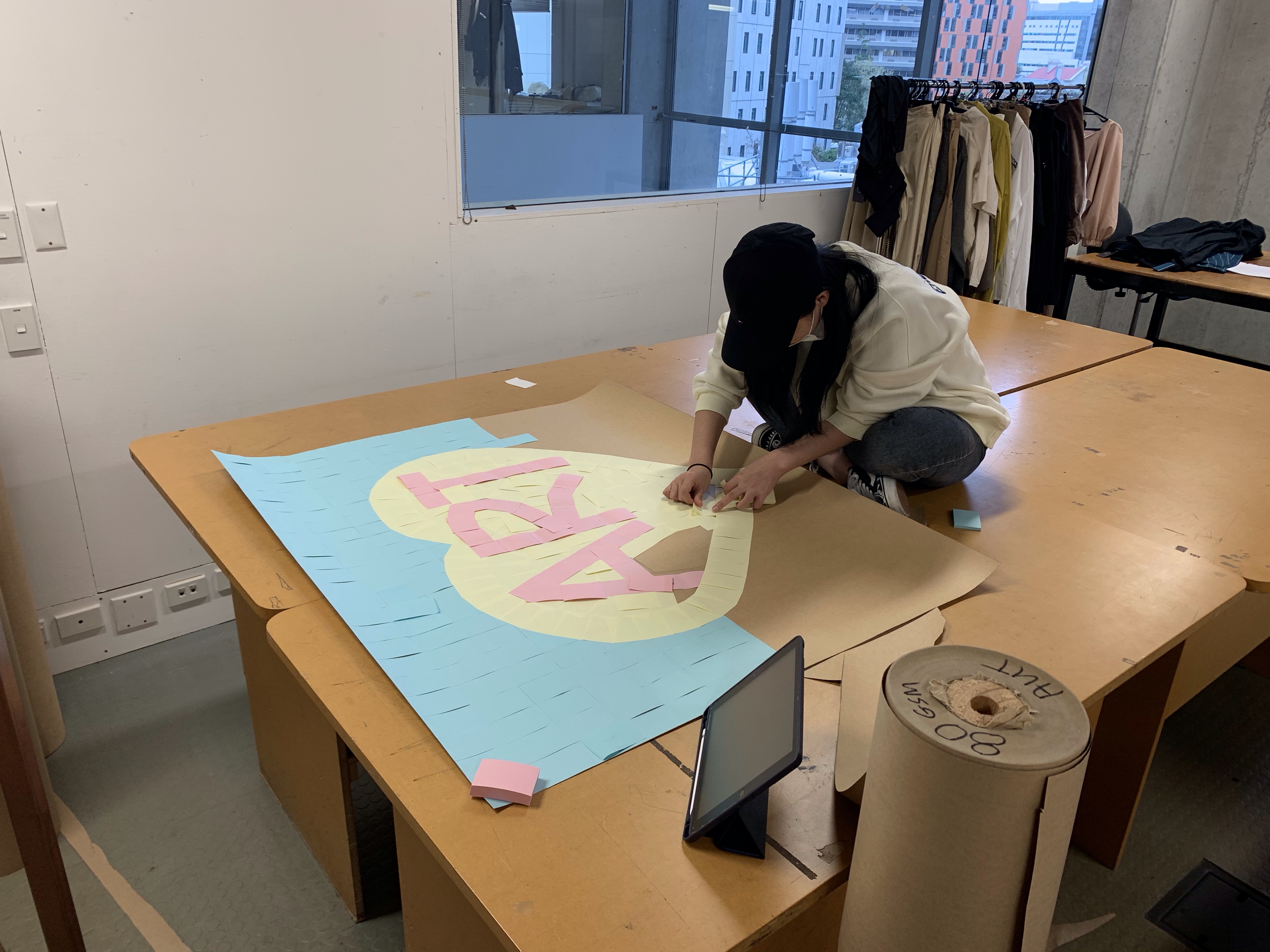
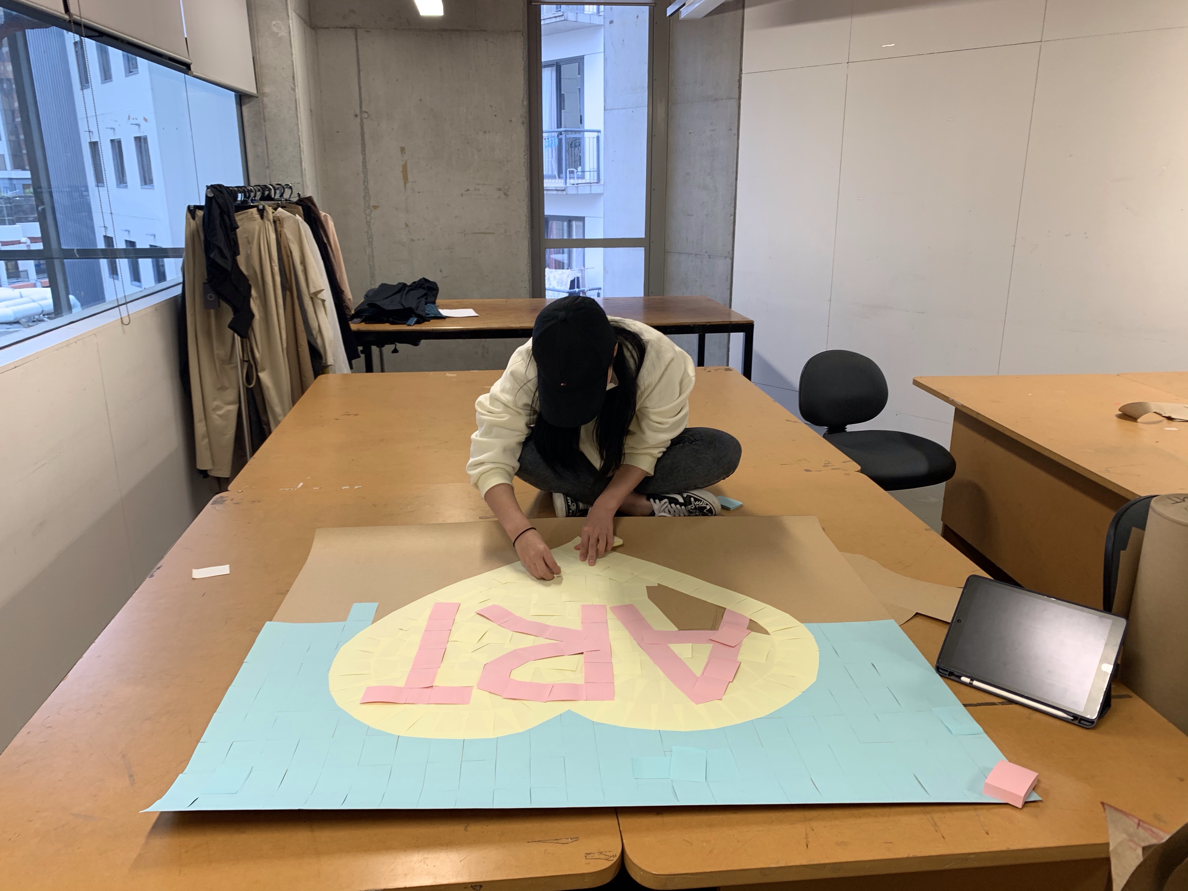
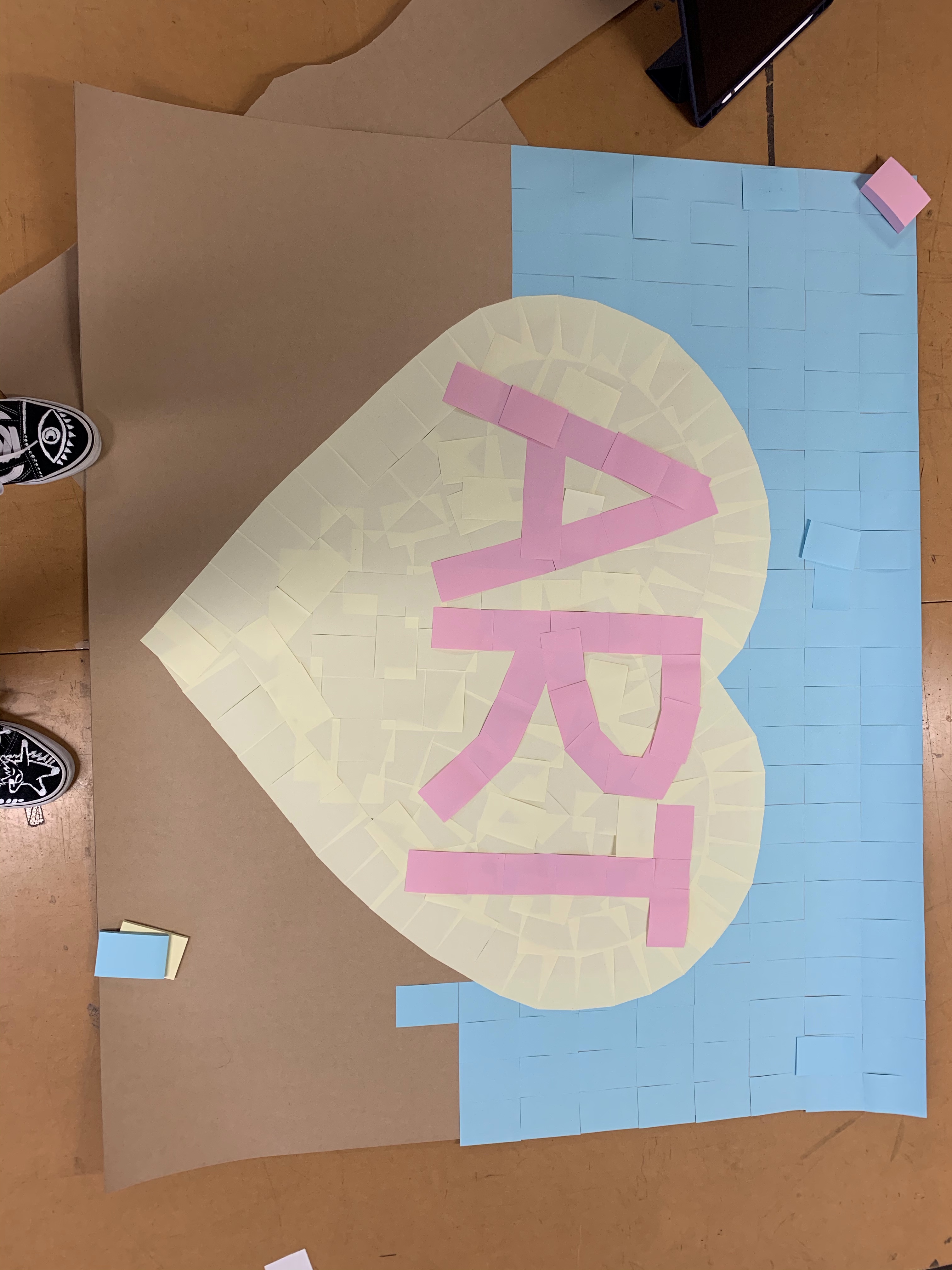
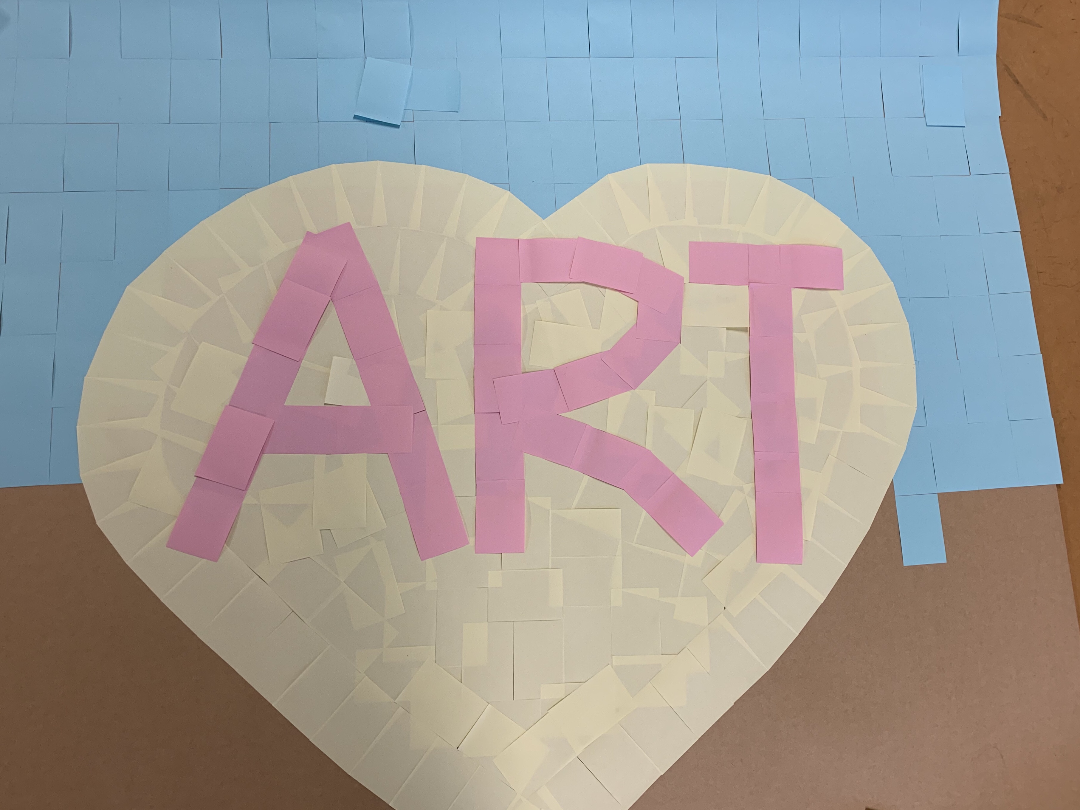
This is a mosaic of inspiration. I try to create my space through these mosaics. Sea-level roofs, concrete walls, stainless steel bars, etc. I want to use pictures to show the situation in the house and feel the atmosphere I want. This is a new perspective. I can express my ideas in different ways. I think this is a success. I will continue to develop my design.
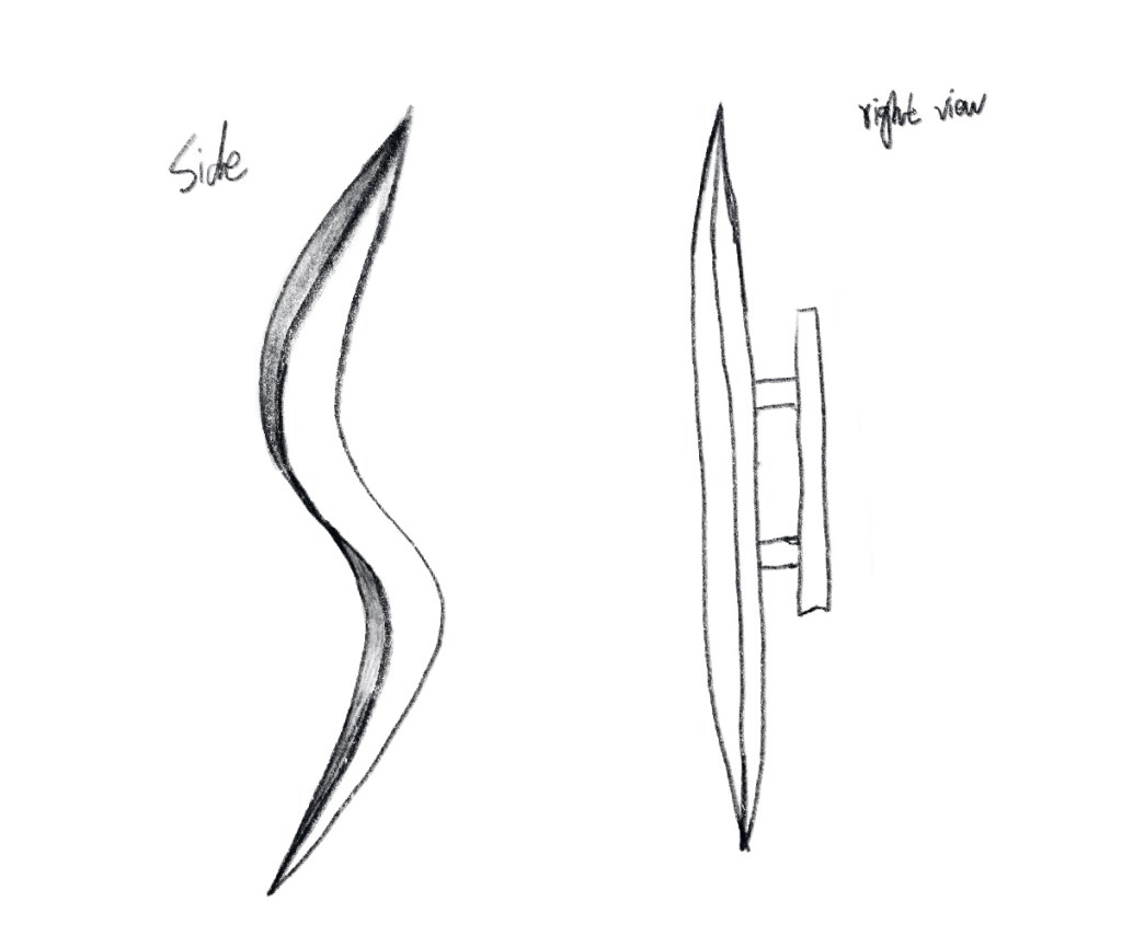
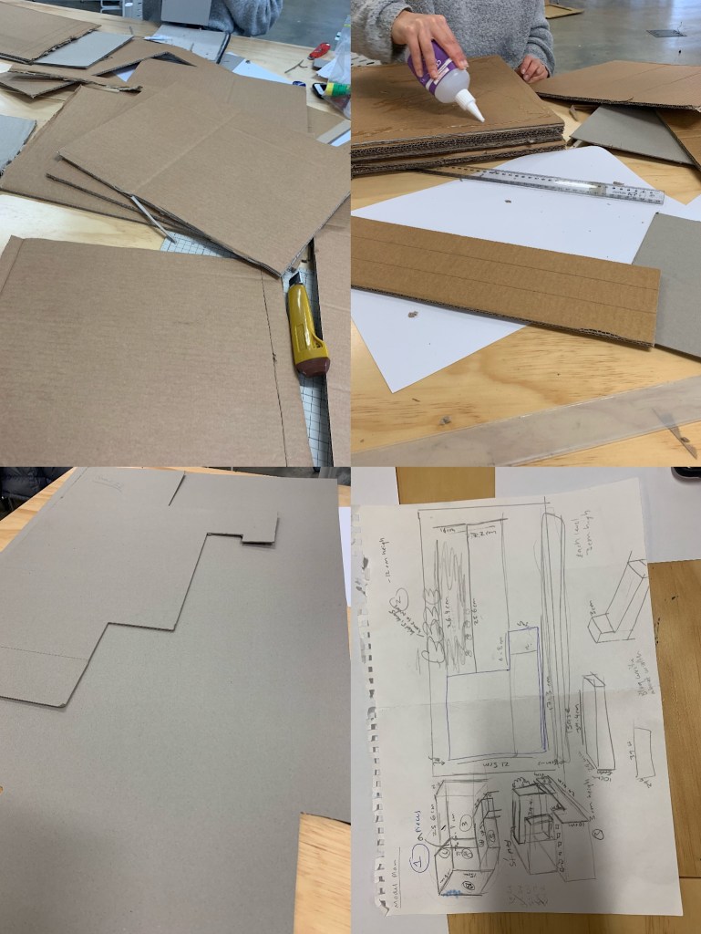
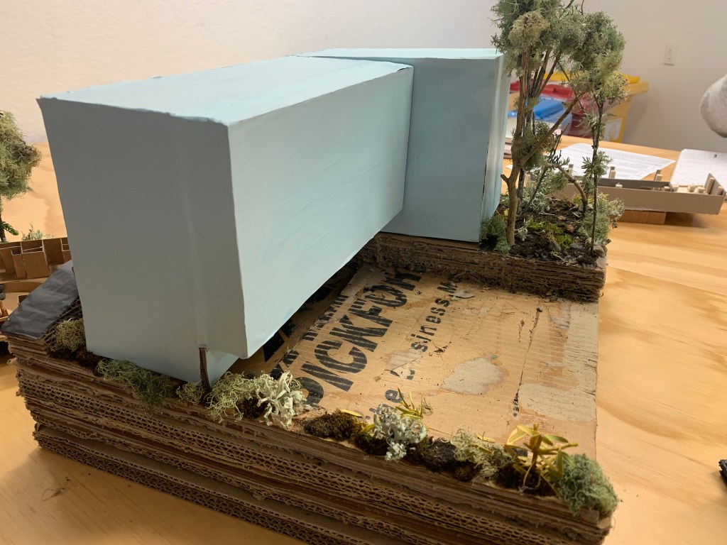
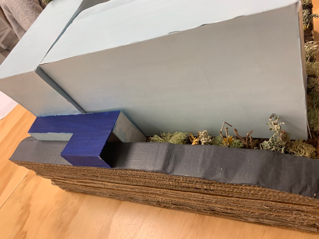
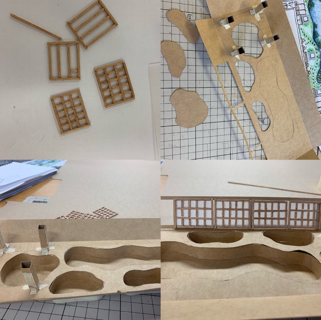
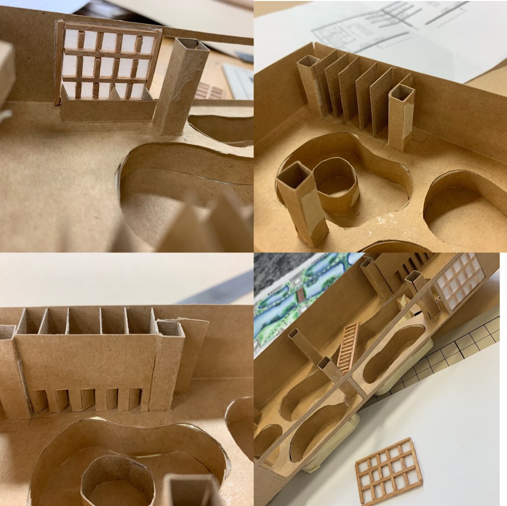
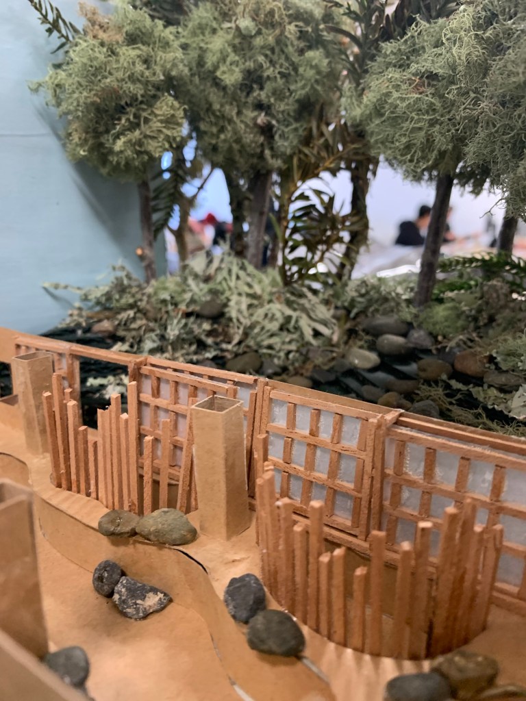
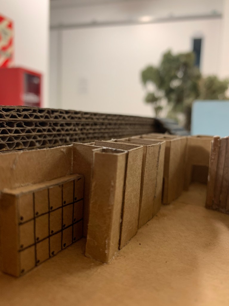
Model Making
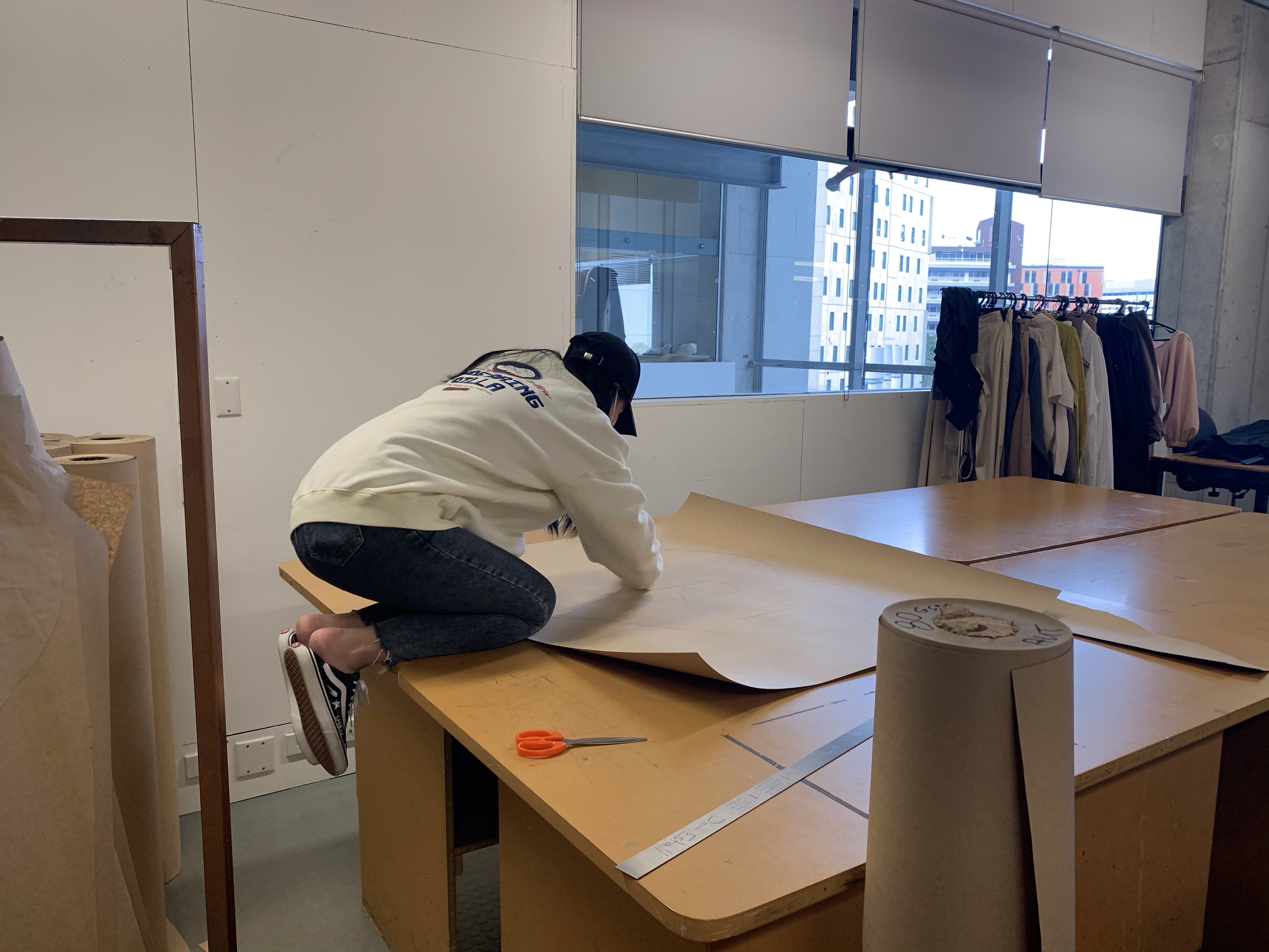
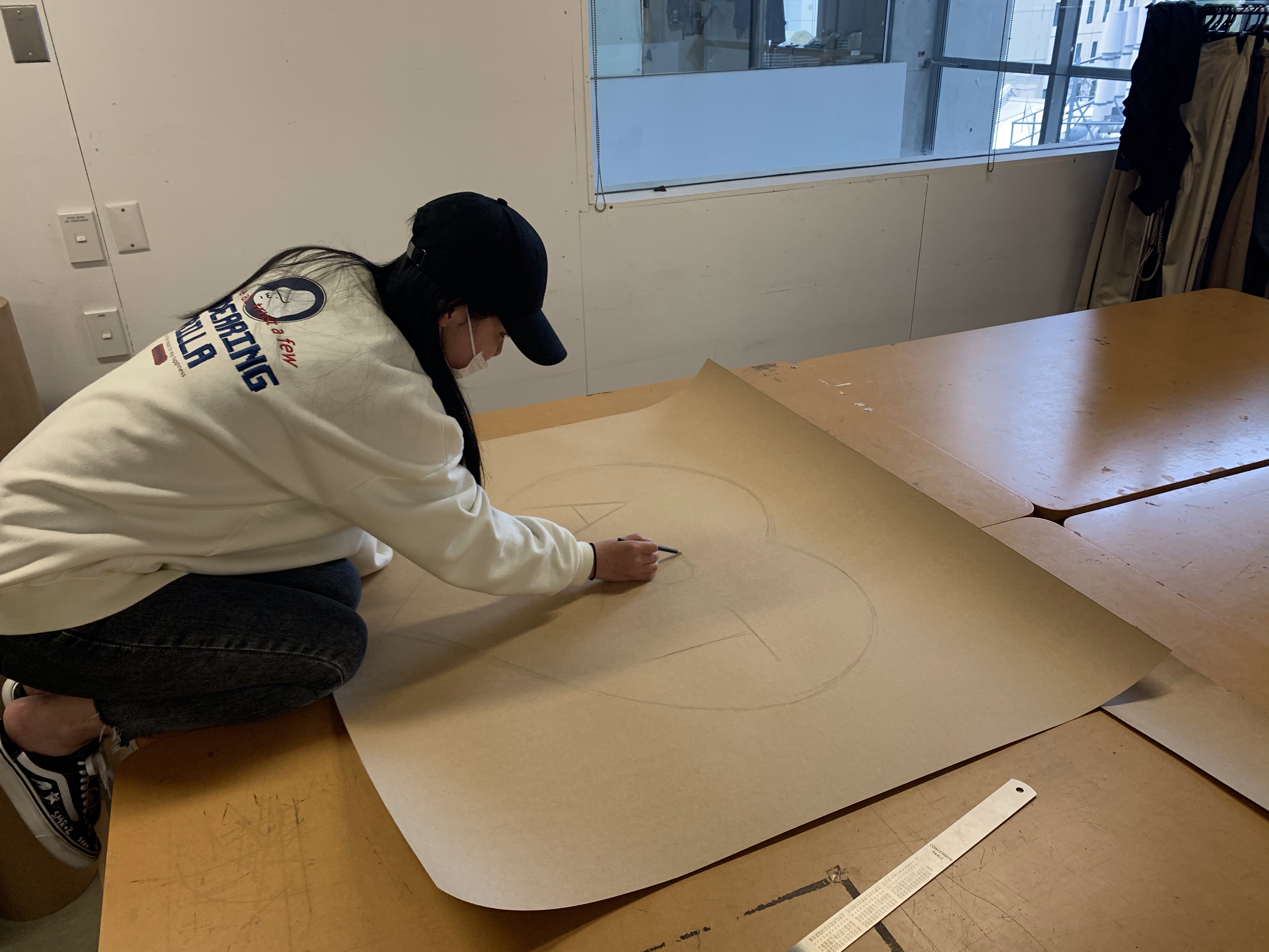
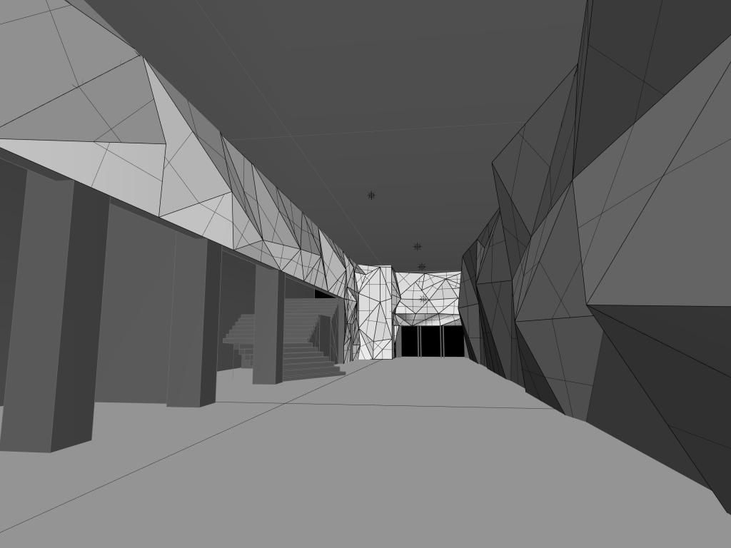
I started to use rhino to make models. This is just the beginning. There are still many details that need to be explored and learned.
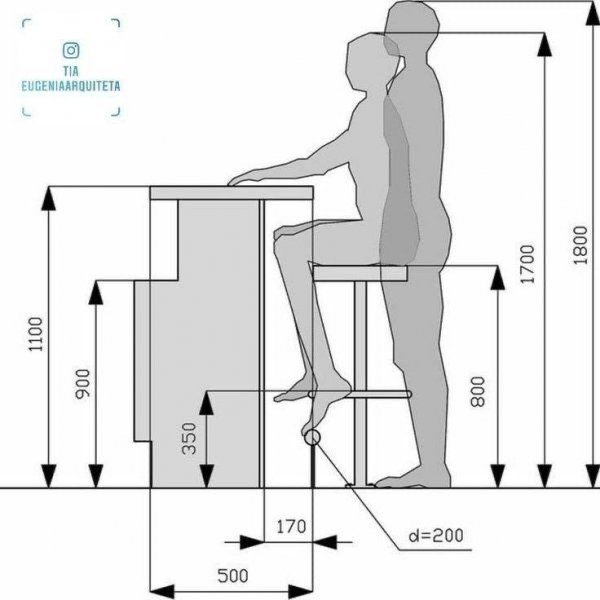
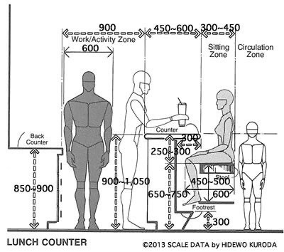
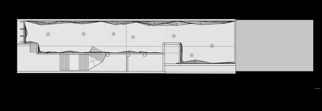
Week 8: Detailing
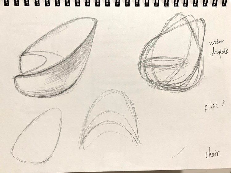
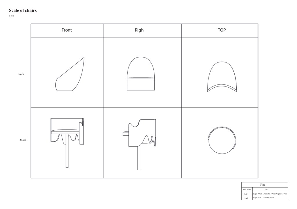
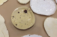
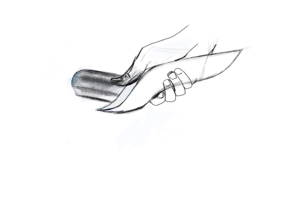
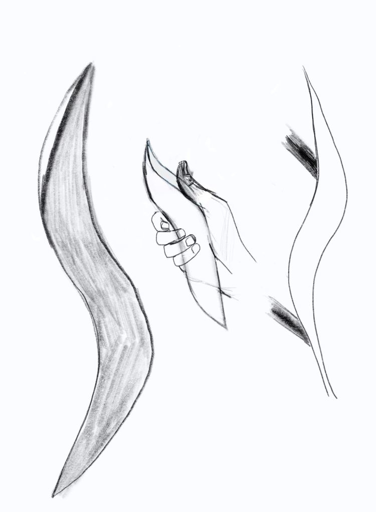
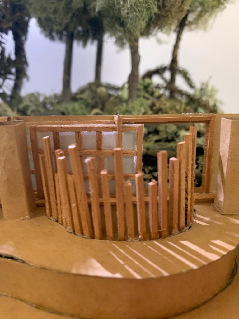
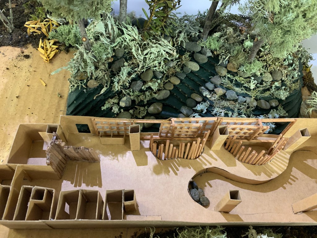
I designed the seat in the shape of water droplets. At the beginning, I just arranged the water droplets in different directions. This is a whimsical design, when I was conceiving the space. I suddenly had this design in my mind, so I immediately drew it down.
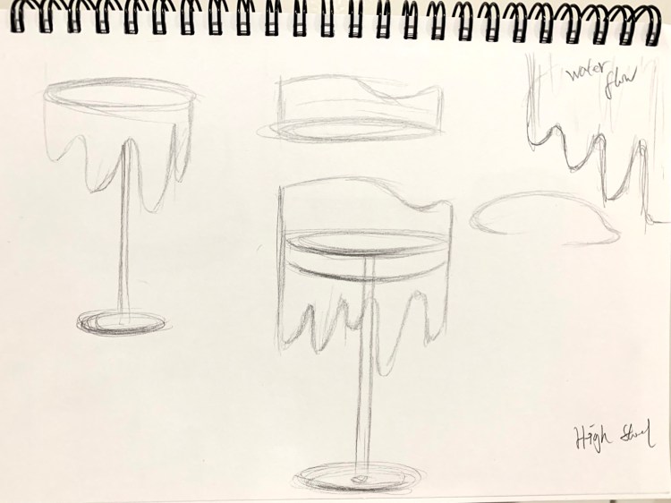
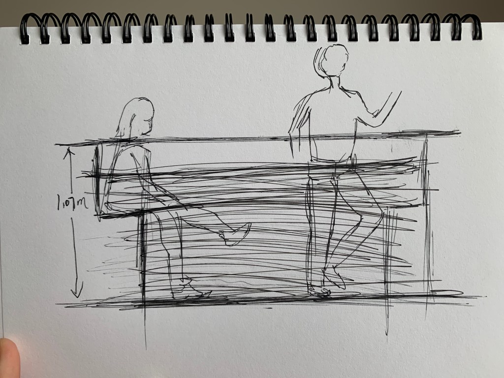
This is a high stool designed in accordance with the pattern of the water flow. It will be recessed in the left hand direction for the convenience of placing the arm.
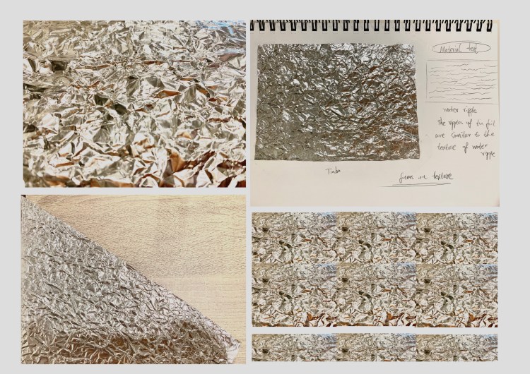
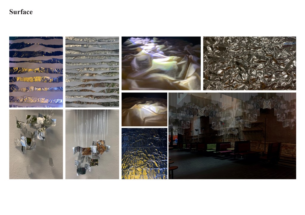
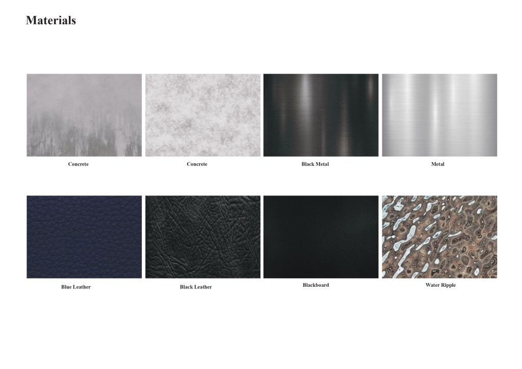
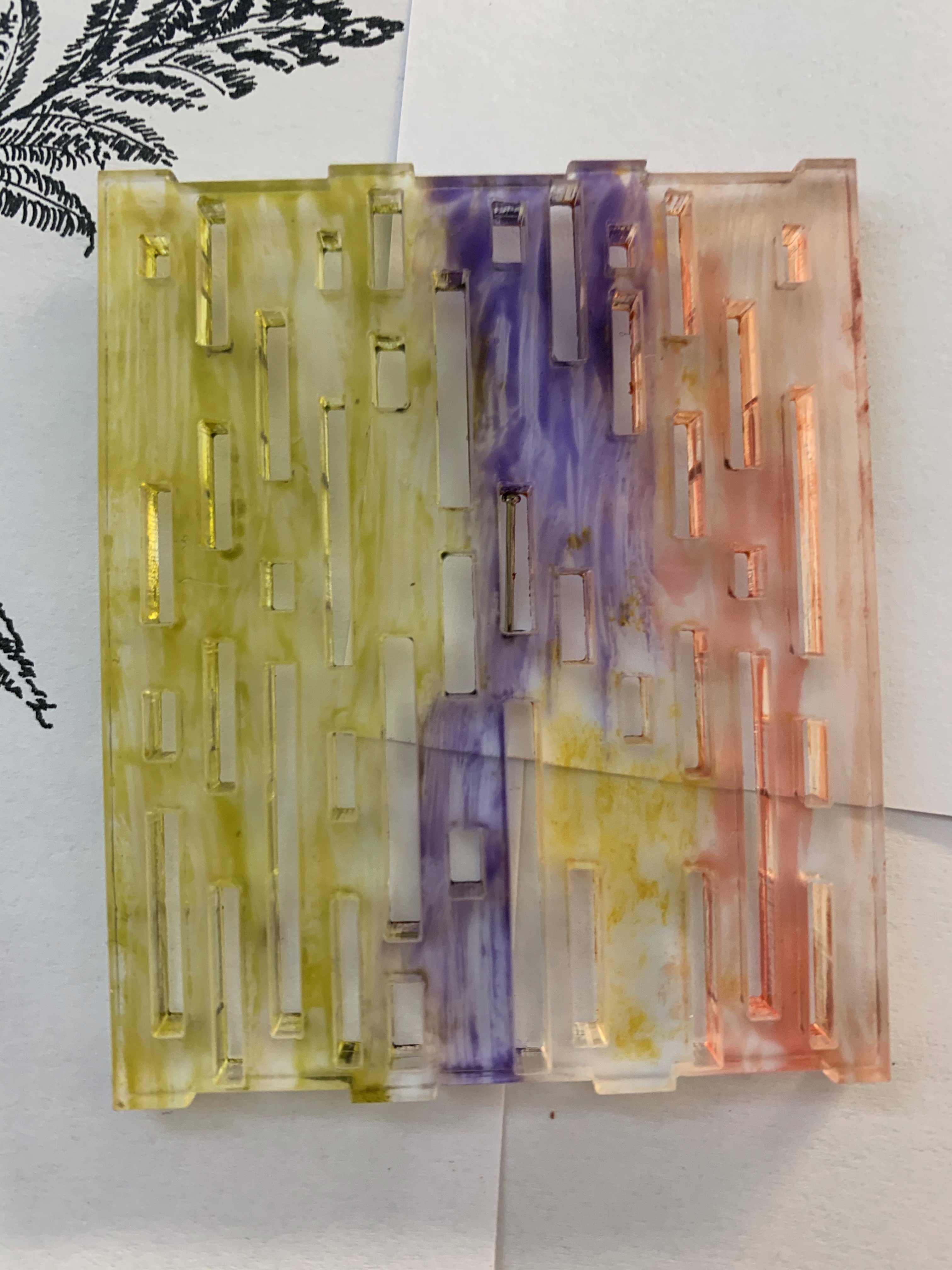
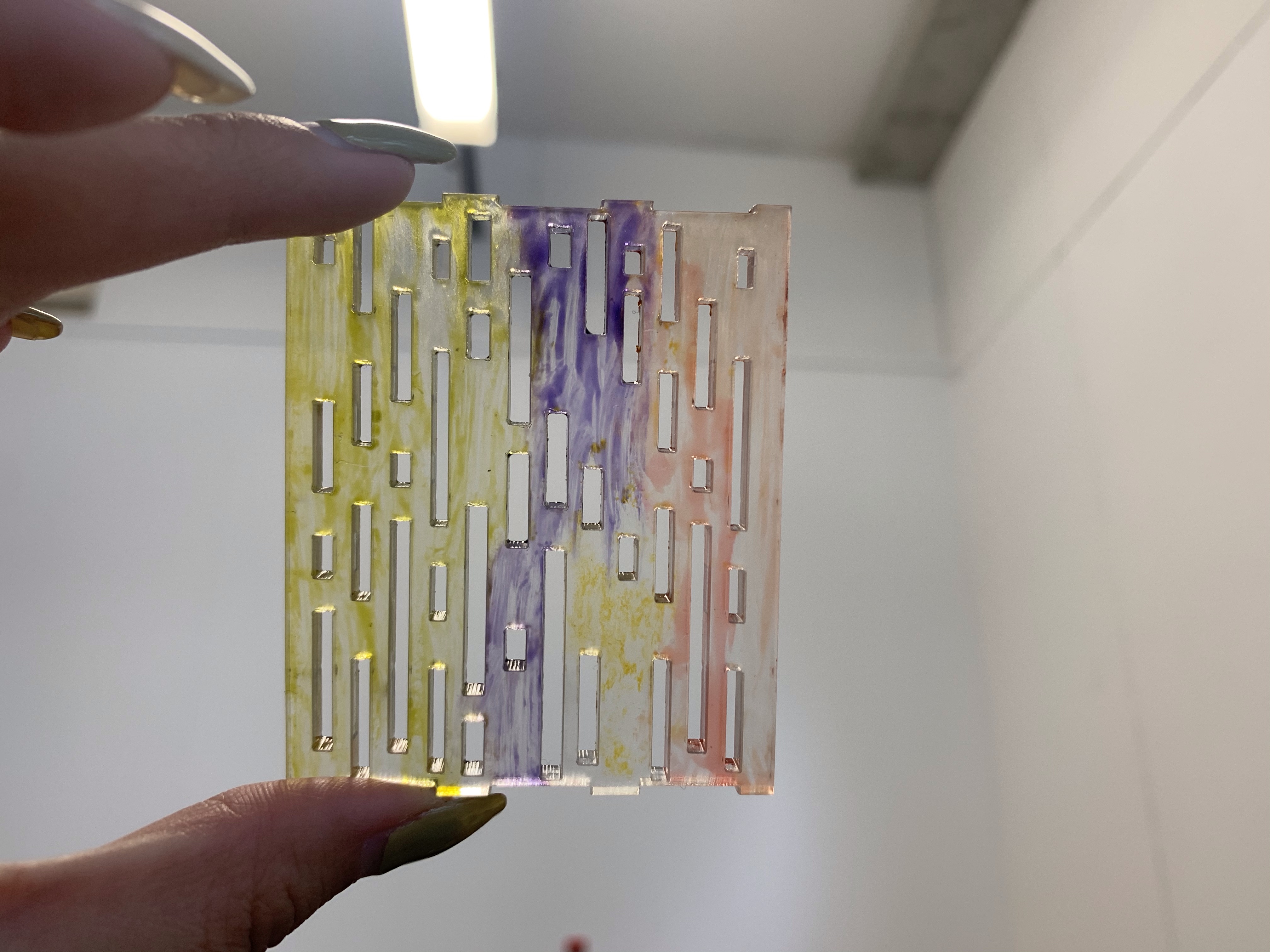
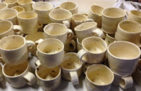
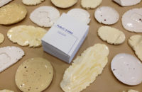
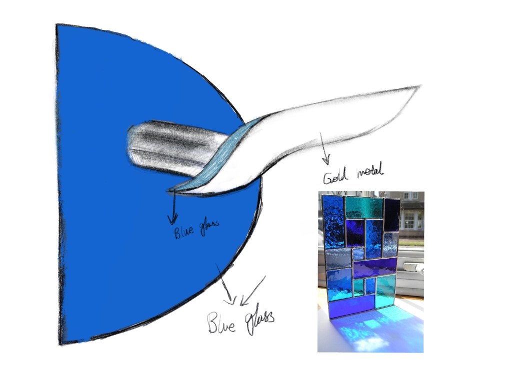
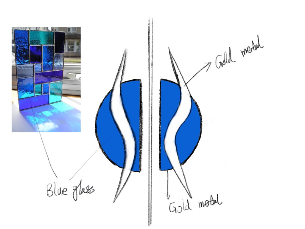
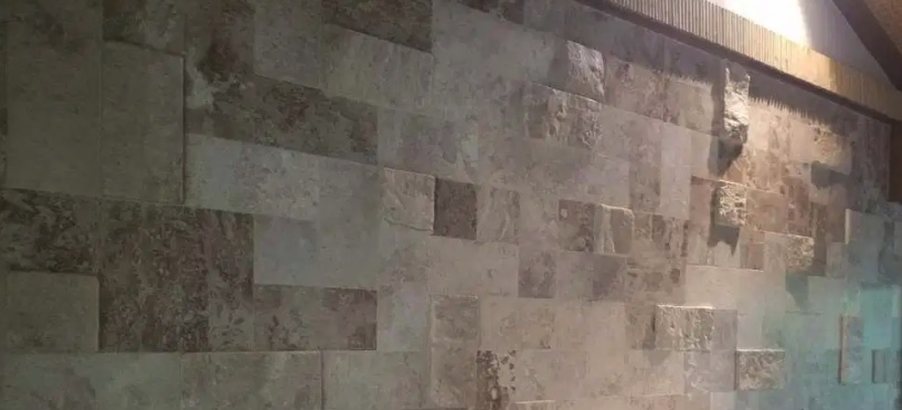
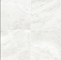
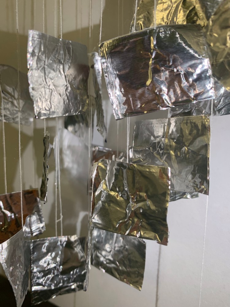
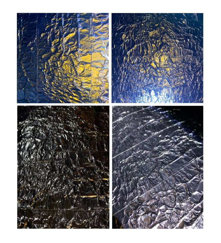
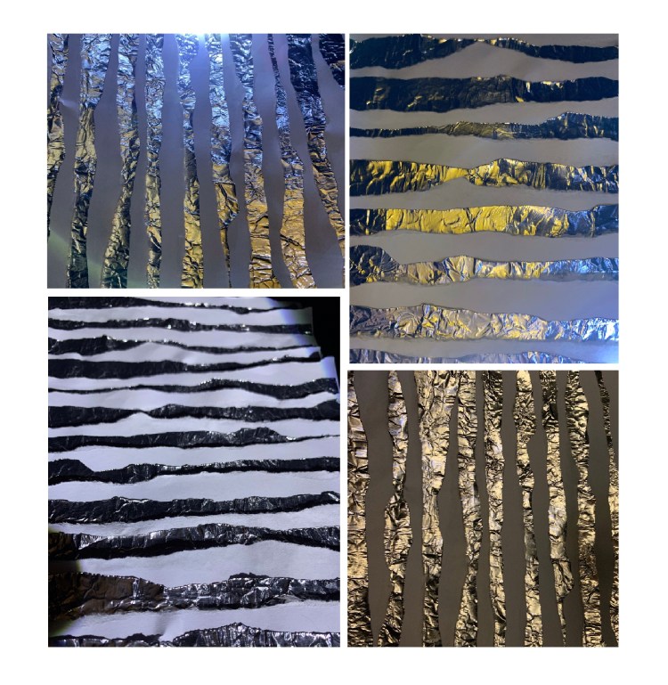
This is a material test. I use tin foil as a material and stick it on the table to observe its texture. I like this material very much, it will make my space brighter. The table in my space will have this texture, and I will look for similar materials.
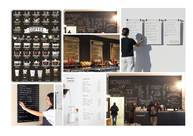
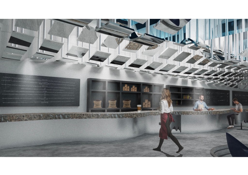
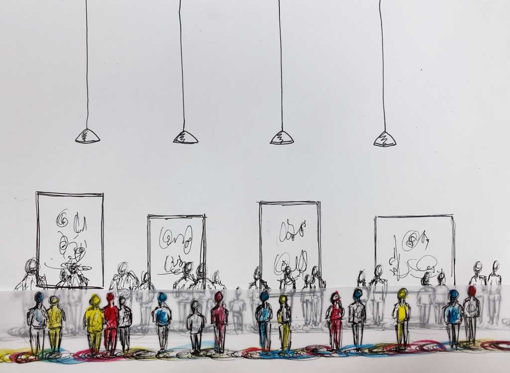
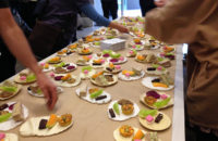
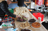
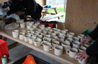
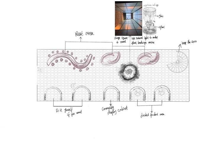
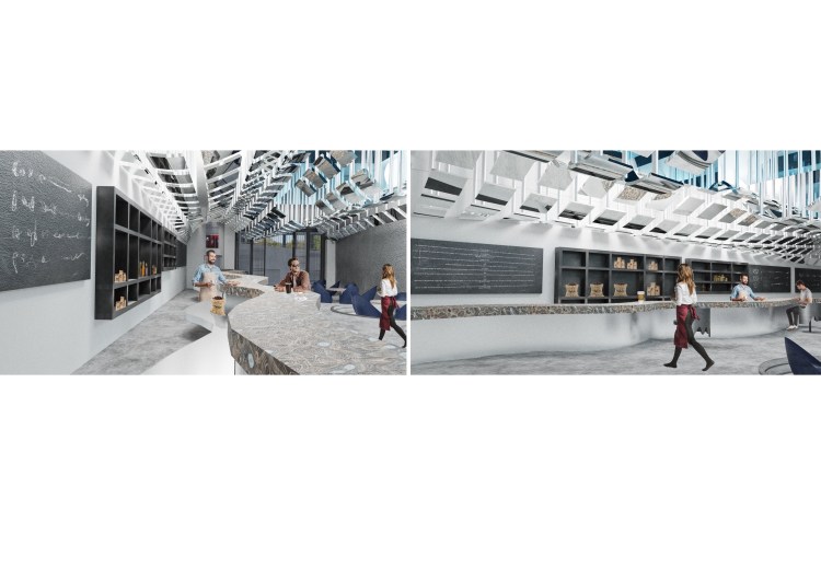
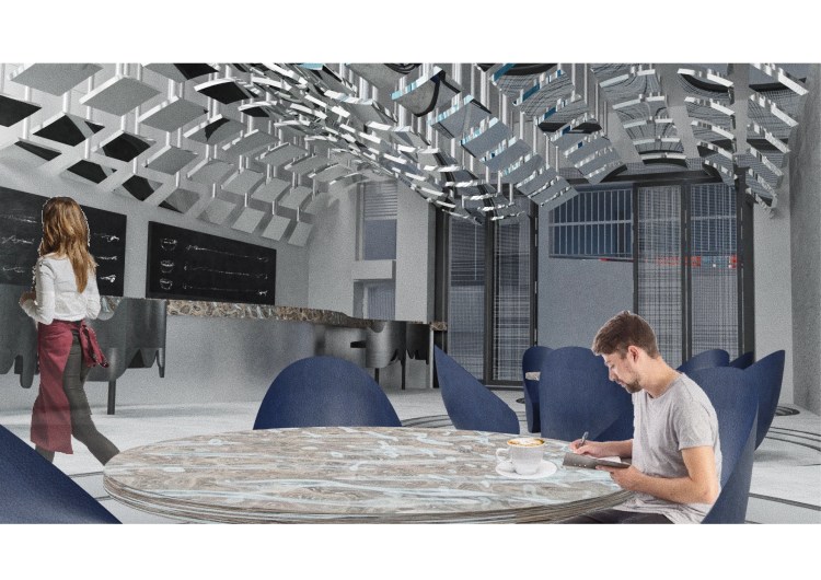
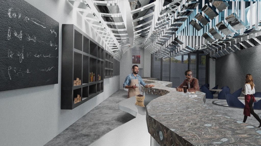
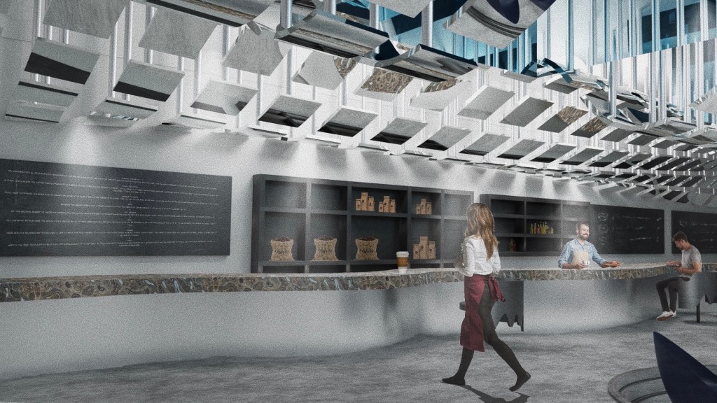
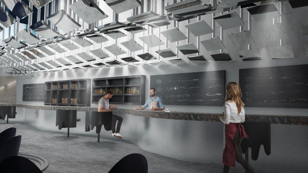
I checked various menus in different styles and finally decided to use the blackboard as the background. The first blackboard will be the cafe menu. The second blackboard will introduce a variety of different coffees for guests to understand. The third blackboard at the end will introduce the coffee making process, and consumers can learn how to make coffee in this area.
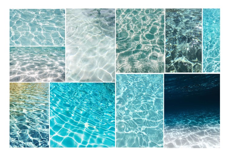
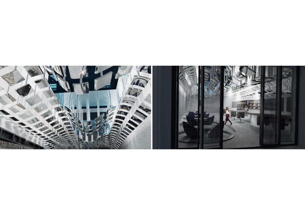
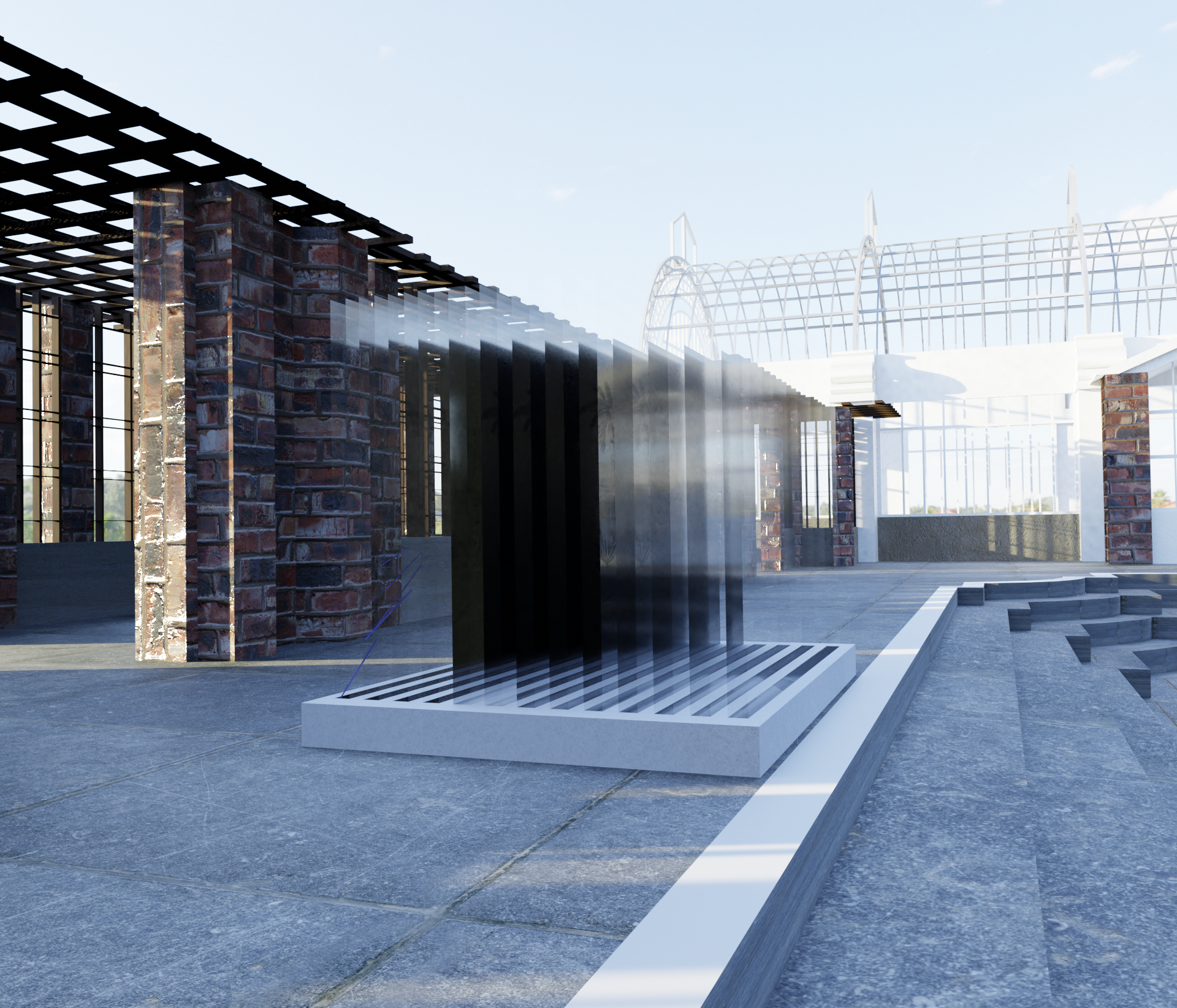
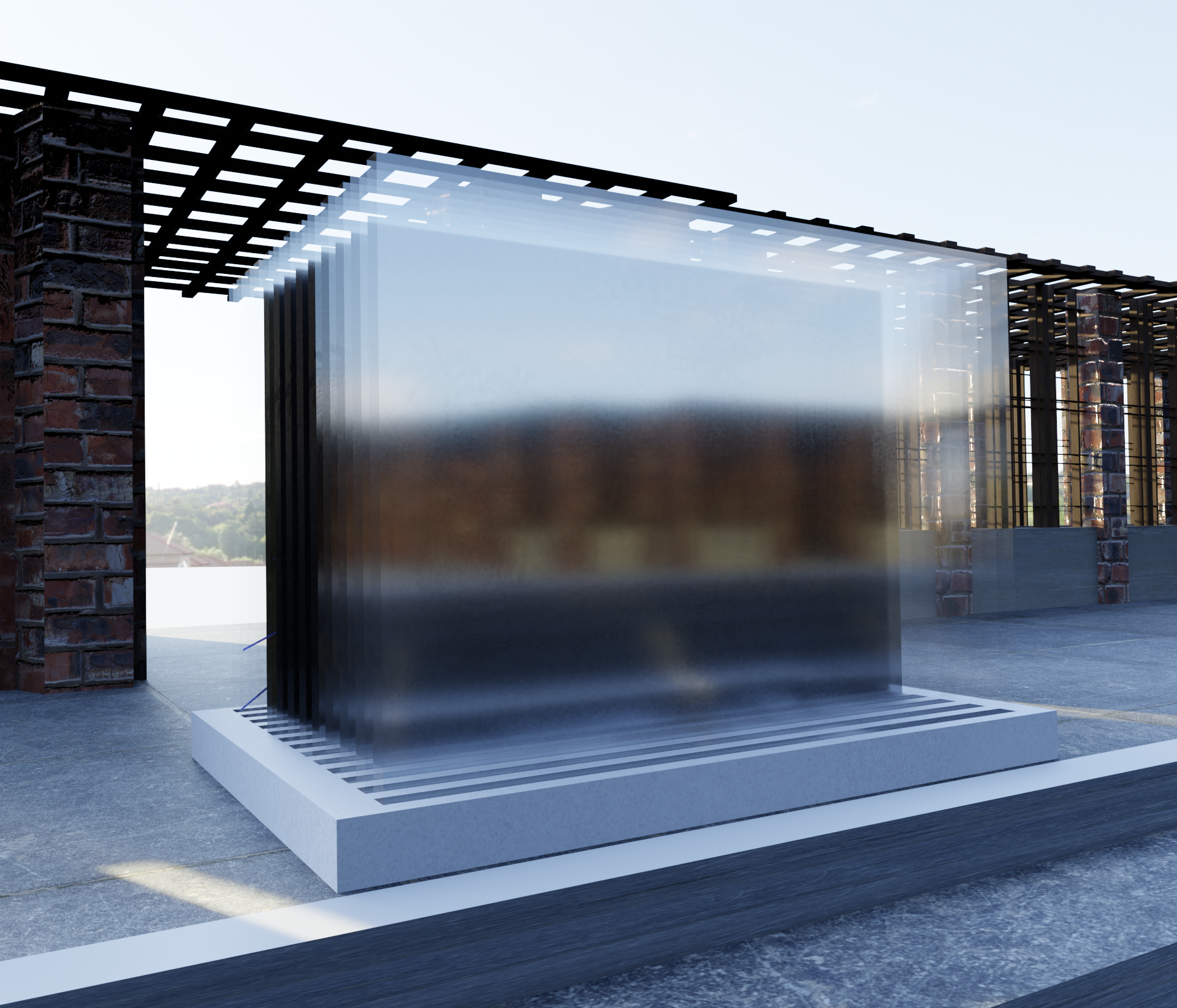
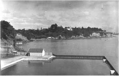
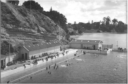
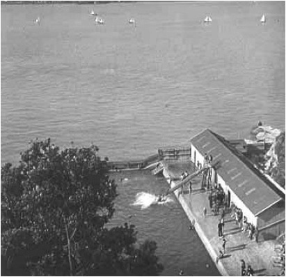
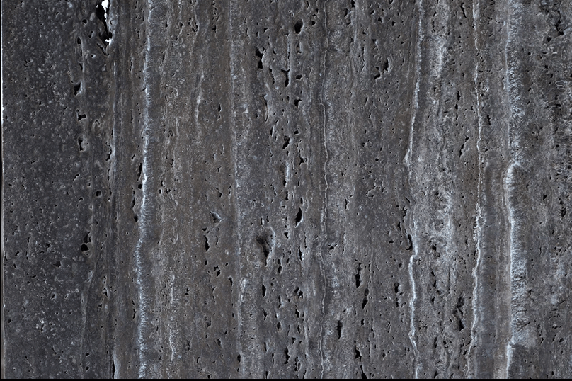
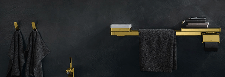
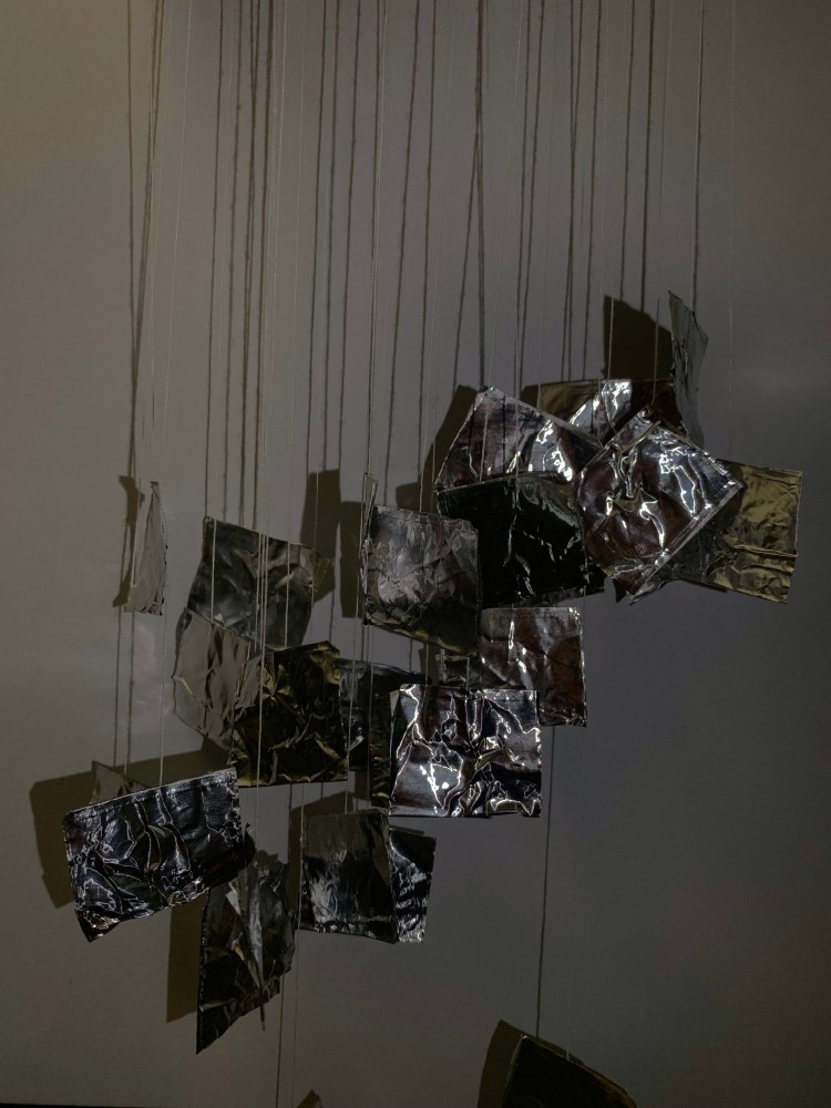
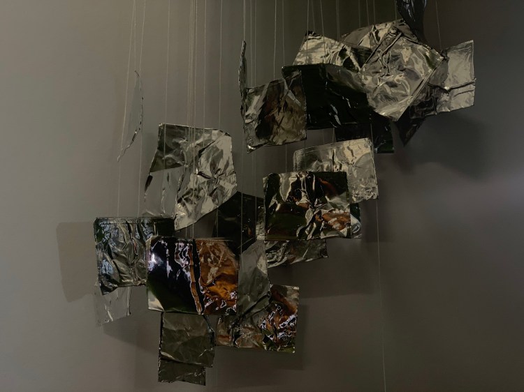
The material of the installation on the roof is similar to a mirror, and it also emits a shining light, just as dazzling as the sea level. So I collected a variety of different sea level photos to compare their differences in different environments.
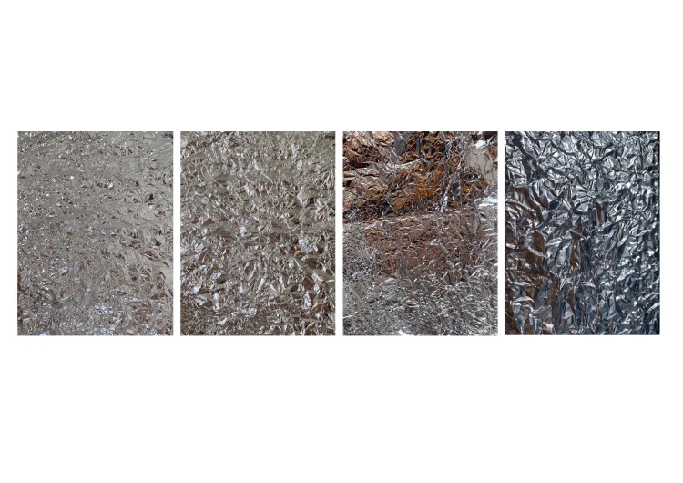
This is still a test to see how the tin foil reacts under different light. Because this is similar to the tabletop material in the cafe, I am thinking about whether the tabletop will change with the change of light. The conclusions reached are subject to change. When the light is brighter, the desktop will be brighter, and when the light is dark, the desktop will also become darker. This is a very interesting change.
Week 10: Design Workshop
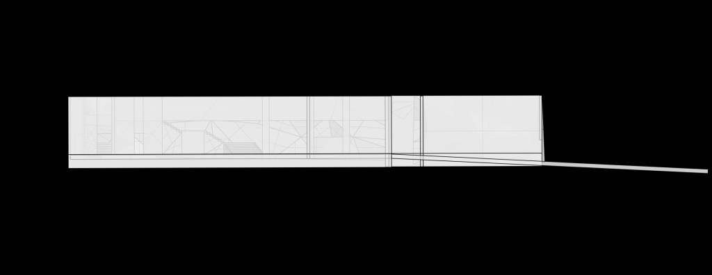
This is an informal presentation, and I prepared my work very carefully. But because time is limited, it is not very complete. I am very happy that I got some feedback. 1. The picture is not clear enough, I should try to use blender and other software to make my work look more complete. 2. The section lines are too messy and should be adjusted. 3. The color contrast is not clear enough. 4. The possibility of continuing to try other materials. 5. The overall atmosphere is too dark.
I am very happy to get your feedback, and I will continue to improve my work. I will use blender to complete the rendering, which I think will make my design clearer. At the same time, I will continue to try to use other materials and use Photoshop and other software to improve my design.
Week 12: Final Design Presentation
In this presentation, I got some very important feedback. 1. The room is too bright and the original environment is very dark, which is difficult to change. 2. Some materials still need to be improved and explored. 3. The pictures of the interior should be displayed only when the exterior is seen. 4. The roof device would be better if it can shake. 5. Keep the typesetting font size consistent. 6. Clear the size.
Develop
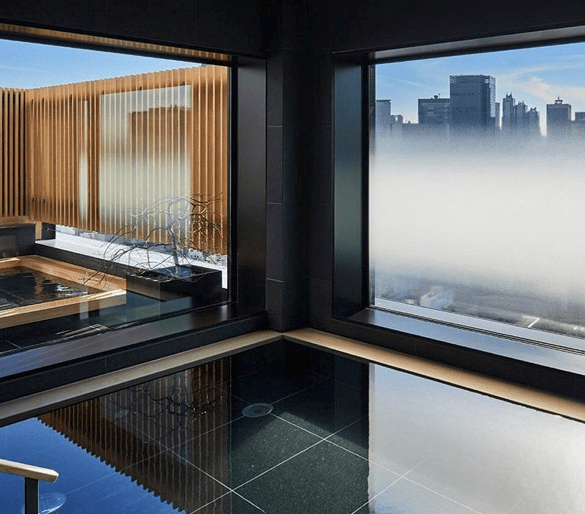
The bouni beach bar
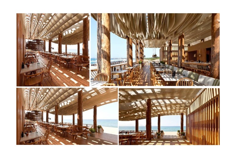
“It is echoing exactly the landscape. So when there’s loads of waves this is quite an animated ceiling and other times it’s quite slow so it’s quite fun,” says Karampatakis. “[The architects] wanted to allow the wind to animate and play with the building in the same way that it animates and plays with the water surface, so that the building and the sea are in tune with each other and connected by the movement of the wind from moment to moment,” says Sbokou-Constantakopoulou. “The architects took inspiration for the Barbouni roof from the dynamic and hypnotic movement of the waves of the sea in front of the restaurant,” Costantza Sbokou-Constantakopoulou, the Senior Architect at TEMES, the developers behind Costa Navarino, tells CNN Travel.
This is a very interesting design. The designer hangs the fabric on the roof to make the fabric sway through the wind. This is also a water-related design. A design that is unforgettable after a glance. Unfortunately I cannot upload the video.
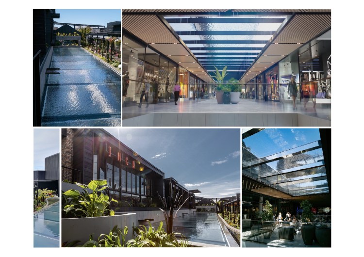
There is a flowing water design on the roof of the newly built westfiled newmarket. The glass roof is combined with the flowing water, and different water ripples and highlights can be seen under different light and shadow. This is a design worthy of my study and reference.
The second blackboard content
Different types of coffee
Black
Black coffee is as simple as it gets with ground coffee beans steeped in hot water, served warm. And if you want to sound fancy, you can call black coffee by its proper name: cafe noir. Since it isn’t doctored up with milk or sugar, the quality of coffee is especially important. Treat yourself to a coffee subscription box to find your favorite style.
Latte
As the most popular coffee drink out there, the latte is comprised of a shot of espresso and steamed milk with just a touch of foam. It can be ordered plain or with a flavor shot of anything from vanilla to pumpkin spice. (Here’s how to make a copycat Starbucks pumpkin spice latte.)
Cappuccino
Cappuccino is a latte made with more foam than steamed milk, often with a sprinkle of cocoa powder or cinnamon on top. Sometimes you can find variations that use cream instead of milk or ones that throw in flavor shot, as well.
Americano
With a similar flavor to black coffee, the americano consists of an espresso shot diluted in hot water. Pro tip: if you’re making your own, pour the espresso first, then add the hot water.
Espresso
An espresso shot can be served solo or used as the foundation of most coffee drinks, like lattes and macchiatos.
Doppio
A double shot of espresso, the doppio is perfect for putting extra pep in your step.
Cortado
Like yin and yang, a cortado is the perfect balance of espresso and warm steamed milk. The milk is used to cut back on the espresso’s acidity.
Red Eye
Named after those pesky midnight flights, a red eye can cure any tiresome morning. A full cup of hot coffee with an espresso shot mixed in, this will definitely get your heart racing.
Galão
Originating in Portugal, this hot coffee drink is closely related to the latte and cappuccino. Only difference is it contains about twice as much foamed milk, making it a lighter drink compared to the other two.
Lungo
A lungo is a long-pull espresso. The longer the pull, the more caffeine there is and the more ounces you can enjoy.
Macchiato
The macchiato is another espresso-based drink that has a small amount of foam on top. It’s the happy medium between a cappuccino and a doppio.
Mocha
For all you chocolate lovers out there, you’ll fall in love with a mocha (or maybe you already have). The mocha is a chocolate espresso drink with steamed milk and foam.
Ristretto
Ristretto is an espresso shot. It uses less hot water which creates a sweeter flavor compared to the bitter taste of a traditional shot of espresso or a doppio.
Flat White
This Aussie-born drink is basically a cappuccino without the foam or chocolate sprinkle. It’s an espresso drink with steamed milk.
Affogato
The affogato is an excuse to enjoy a scoop of ice cream any time of day (and any time of year in my opinion). Served with a scoop of ice cream and a shot of espresso, or two. The affogato is extra delish served over a brownie.
Café au Lait
Café au lait is perfect for the coffee minimalist who wants a bit more flavor. Just add a splash of warm milk to your coffee and you’re all set!
Irish
Irish coffee consists of black coffee, whiskey and sugar, topped with whipped cream. Here’s an Irish coffee recipe that will warm you right up.
The third blackboard content
HOW TO MAKE THE PERFECT CUP OF COFFEE
Measure your coffee.
The standard ratio is approximately 2 tablespoons of coffee per 6 ounces of water. Don’t be afraid to add a few extra beans to be on the safe side – you can more approximately measure out your coffee using a scale after it’s ground.
Grind your coffee.
Alright, this is where the coffee-making process really begins. Go for a finer roast if you want a sweeter cup of coffee, or a coarser grind if you’re aiming for a satisfying, weighty bitter. Make sure the grinder is clean before using, then feel free to press the magic button.
Prepare the water.
You’ll want to prepare the water last, to ensure the water is the temperature you’re aiming for. Pour from the filter, and let the water sit off from the boil for about 30 seconds before immersing your coffee grounds in the French Press.
Pour.
Saturate the grounds evenly with a smooth, steady pour that will agitate the coffee grounds. Do not put the lid on top of the brewer just yet.
Soak and stir.
Let the grounds absorb the water for approximately 30 seconds before stirring – a few gentle motions using the back of a spoon around the top layer of the mixture and along the sides, to immerse any grounds that are stuck.
Brew.
Let the water extract from the grounds for 2 minutes and 30 seconds. Less than that, and you’ll find your coffee may be too sweet or even sour. Any longer, and your coffee will be over-extracted and unappetizingly bitter – so, set a timer.
Plunge.
There really is no wrong way to push here – just a simple, even push-through of the filter down to the bottom. However, it’s not a clogged toilet – don’t exert too much force or, of course, your coffee will splash. Or you may break the machine, if it’s glass.
Pour.
Word to the wise: The flavor notes of your coffee will change as the cup cools. If at first you’re not tasting what was intended, let it continue to setup. What you taste when it’s piping hot is not what you’ll taste when it’s cooled to a lukewarm temperature.
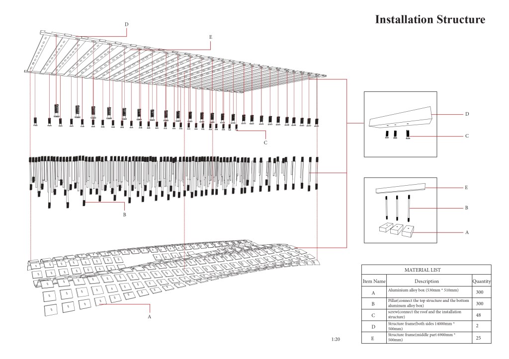
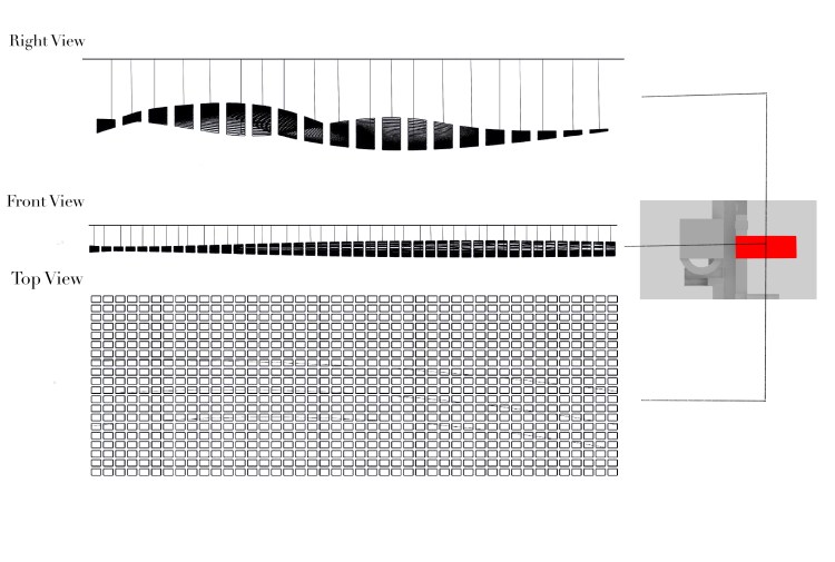
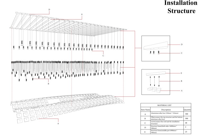
Installation can be move
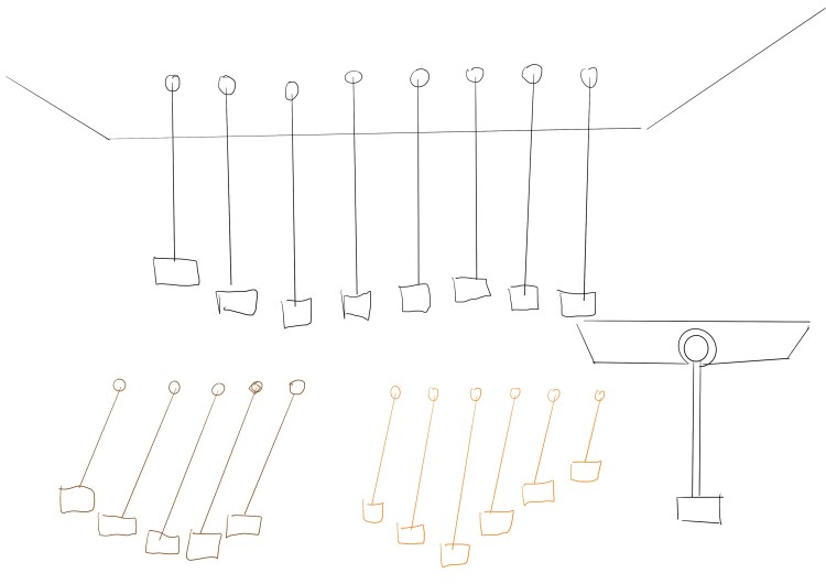
If the structure of the upper part of the device is changed, the device on the roof will shake with the wind, and the greater the wind, the greater the shaking. The circular structure can make the device shake.
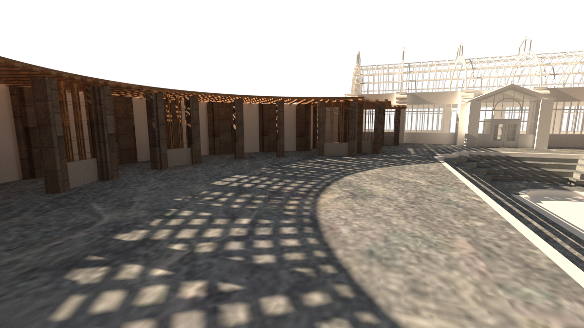
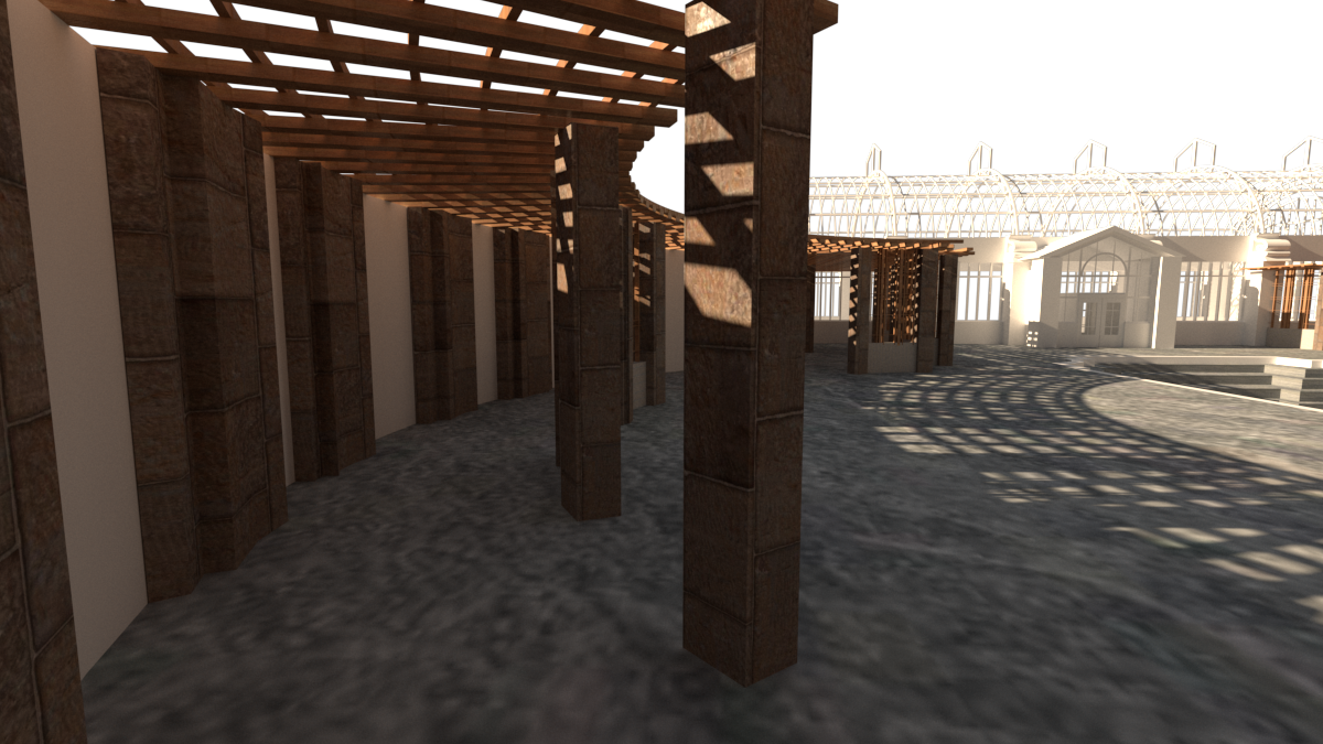
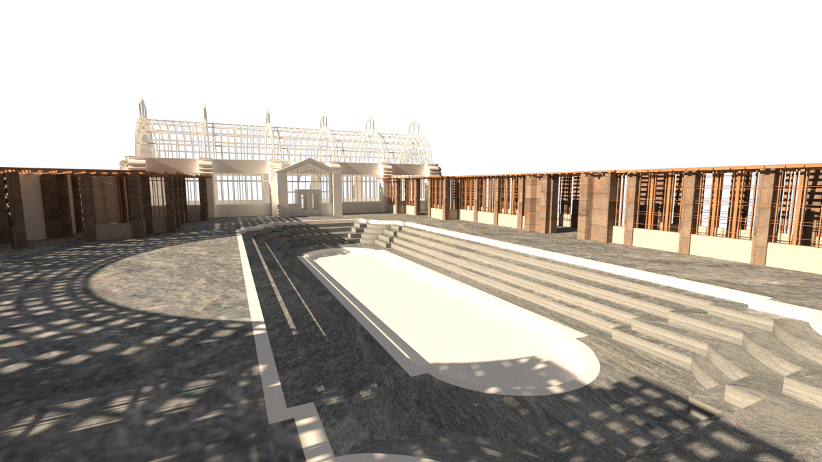
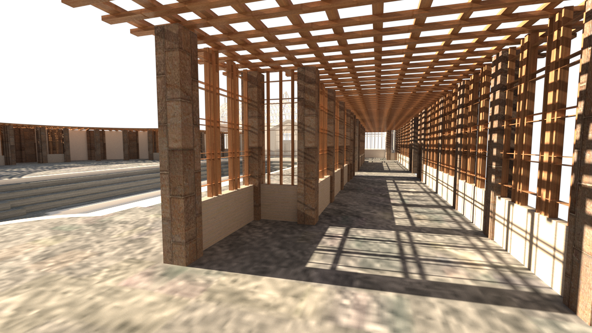
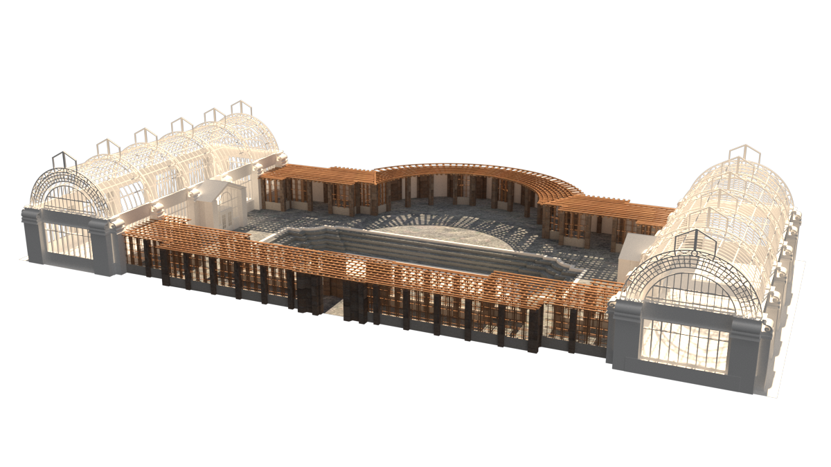
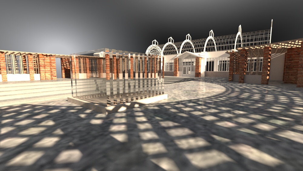
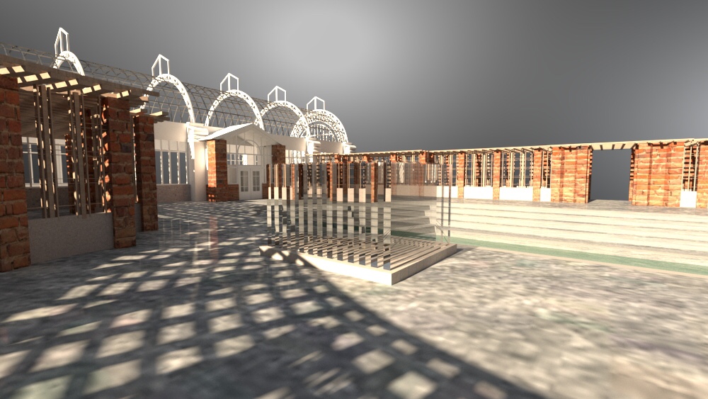
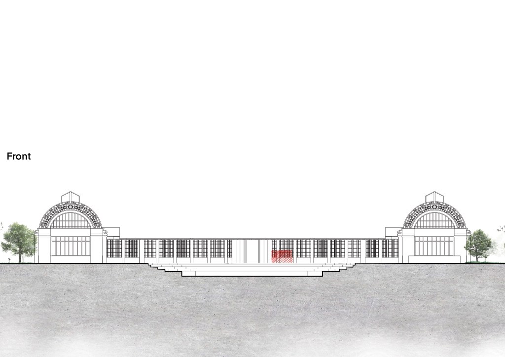
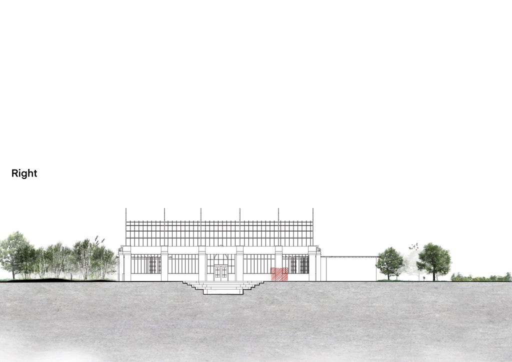
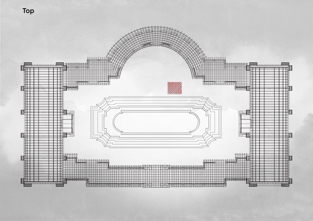
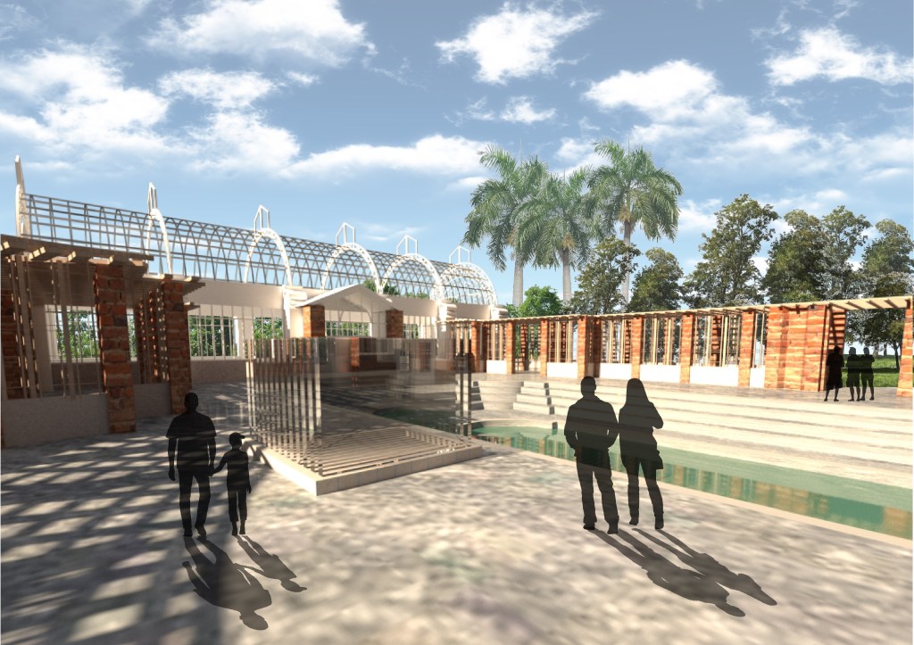
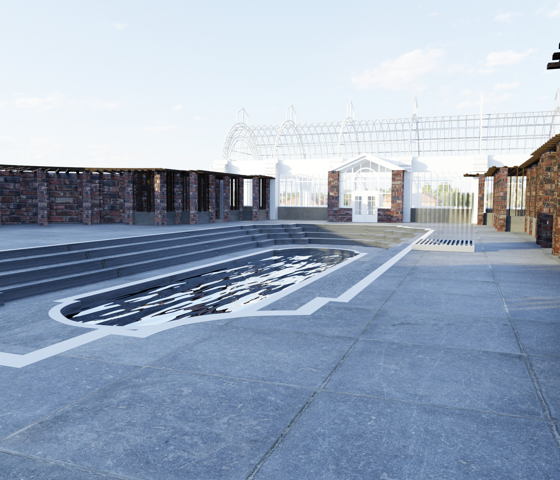
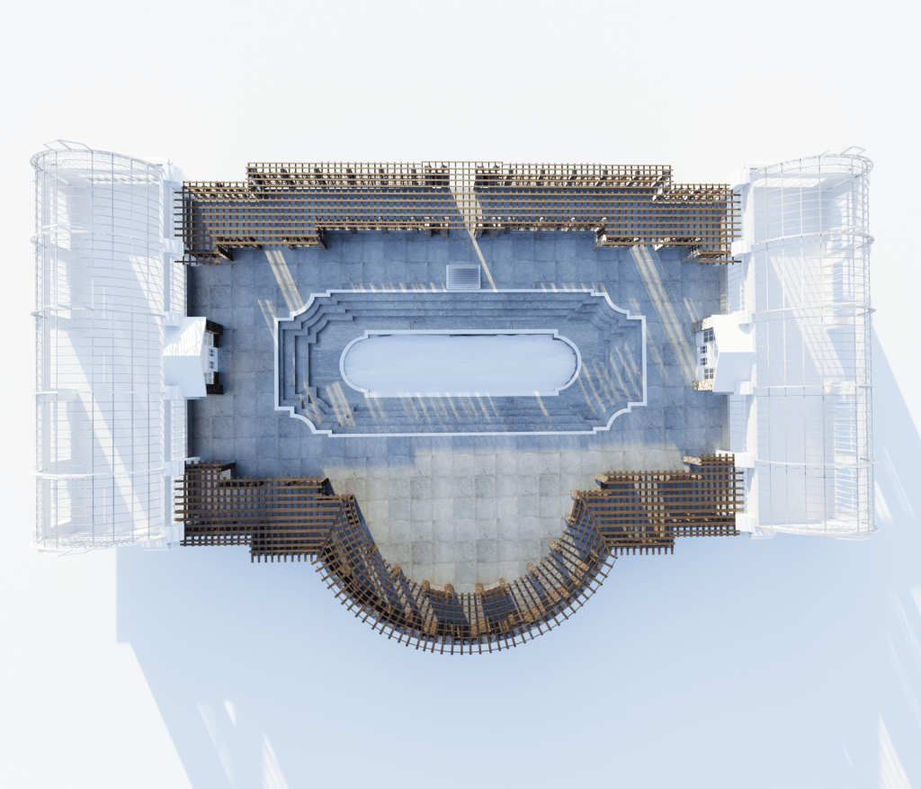
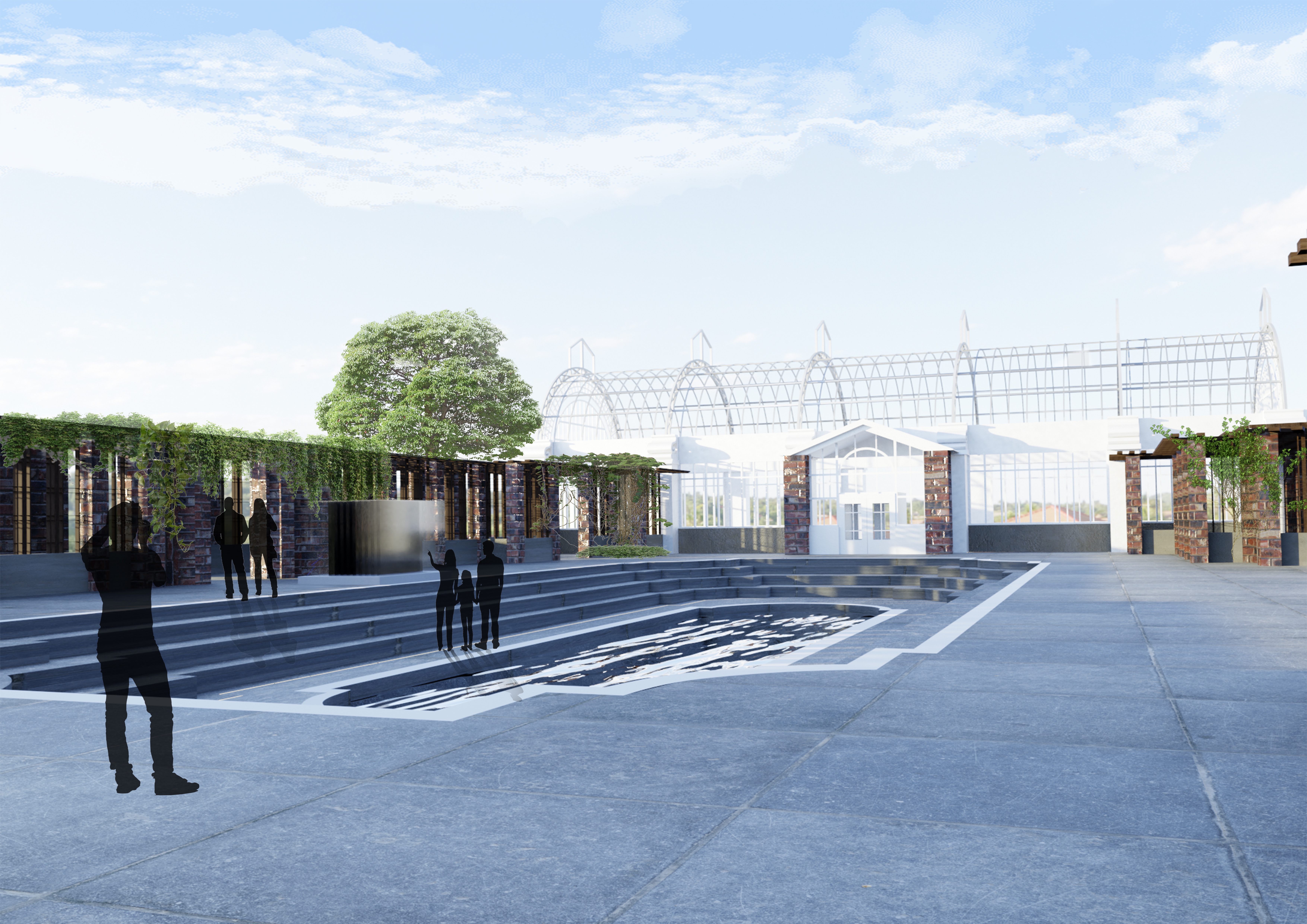
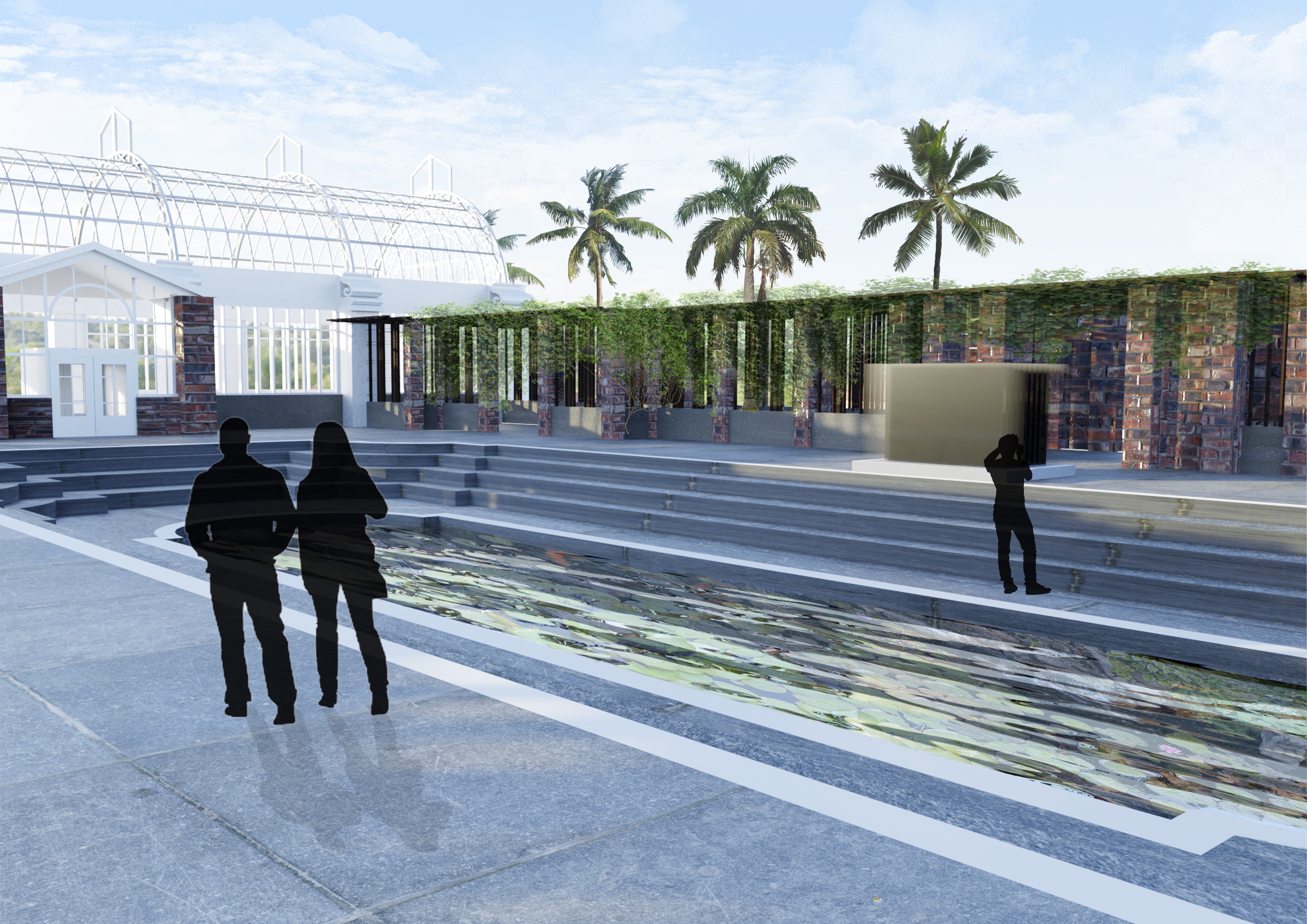
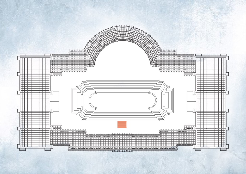
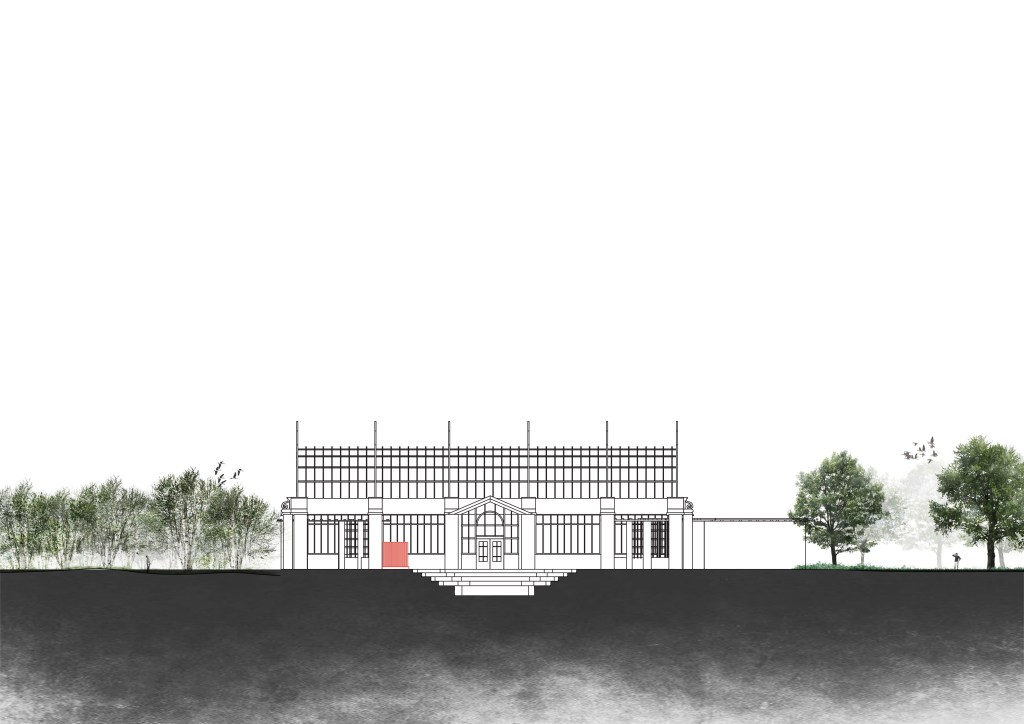
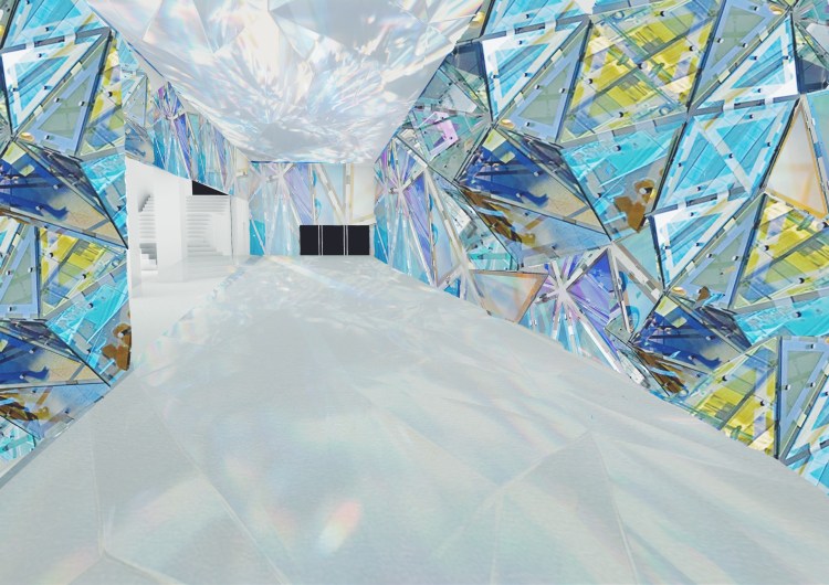
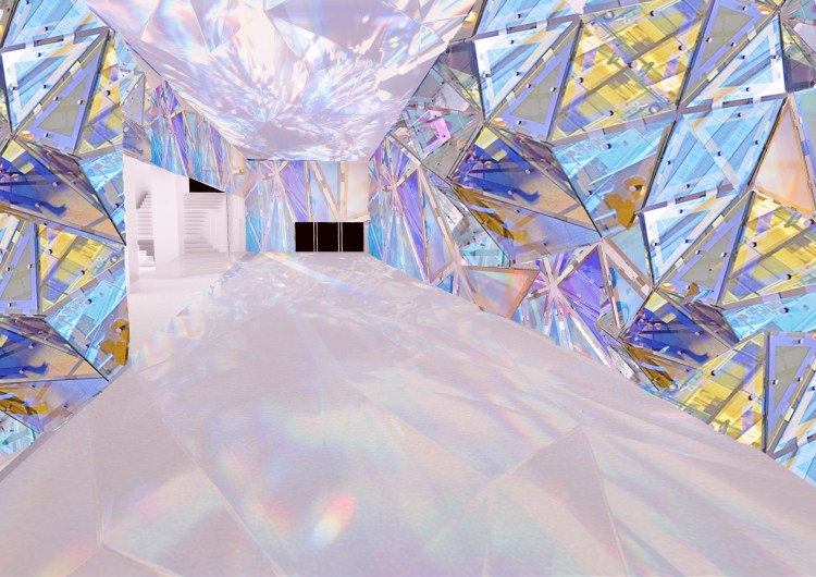
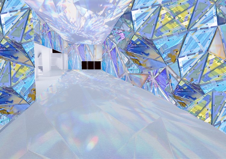
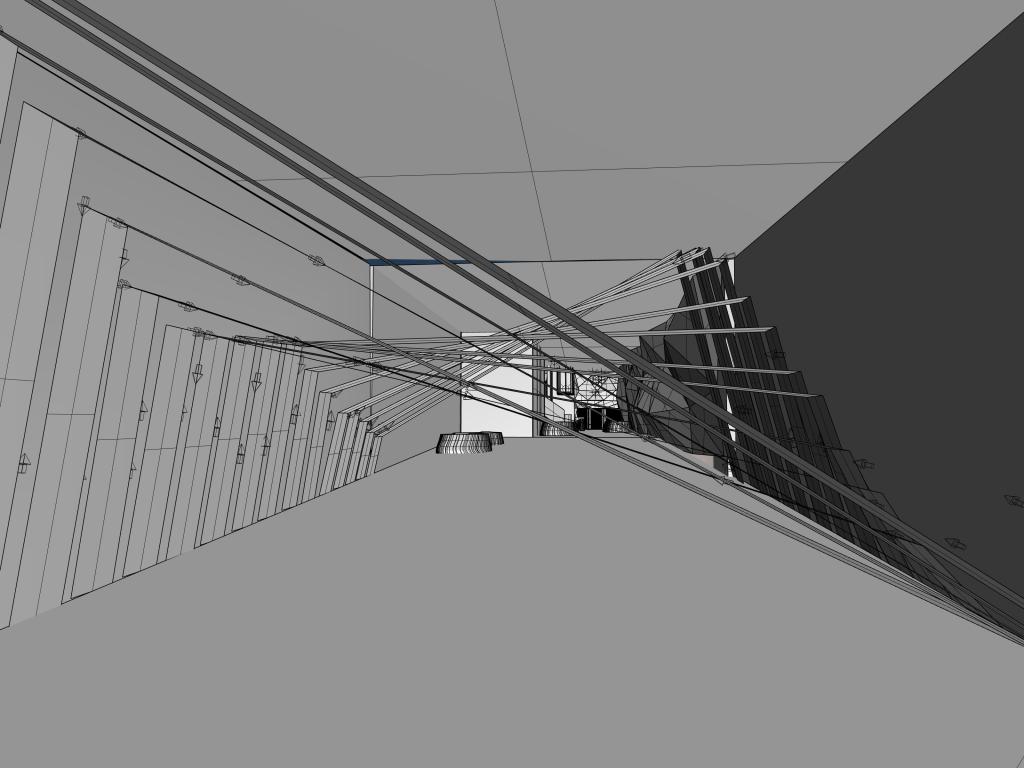
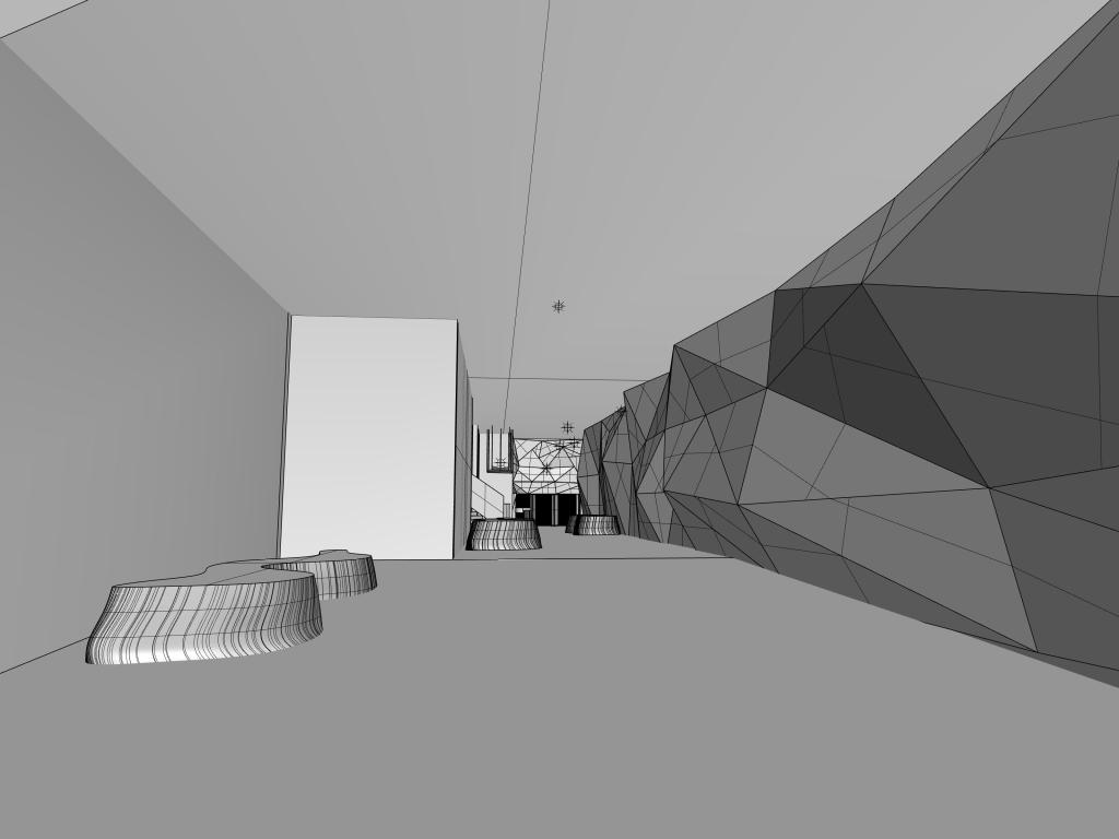
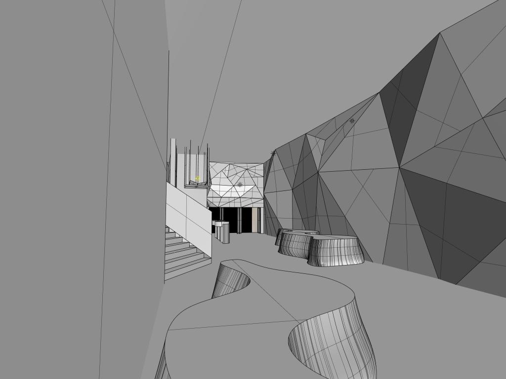
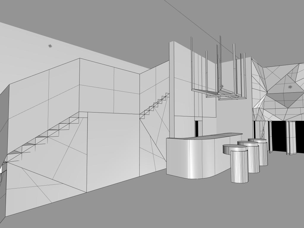
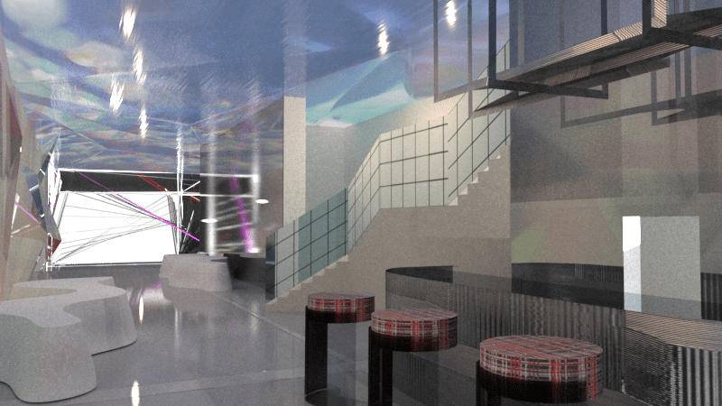
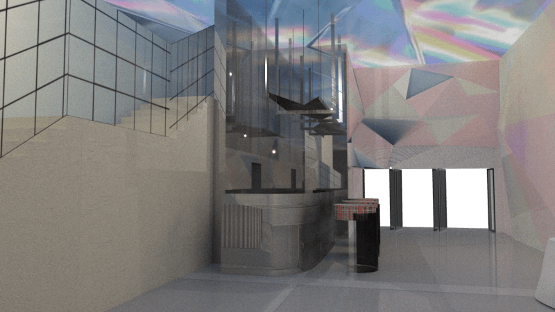
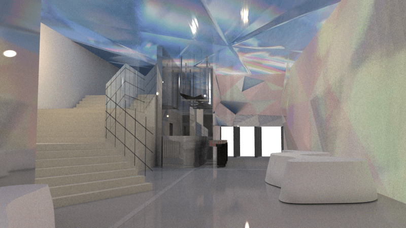
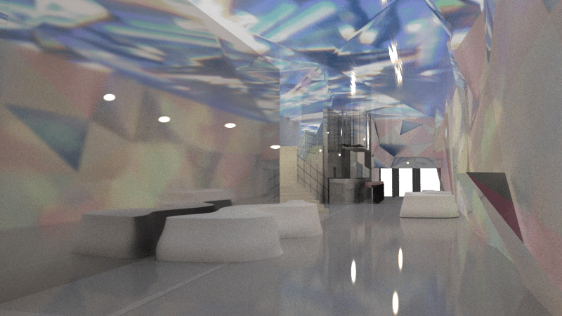
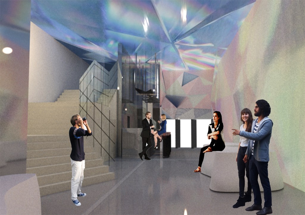
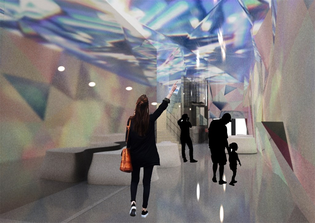
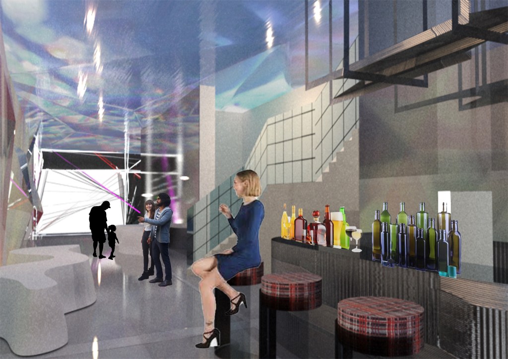
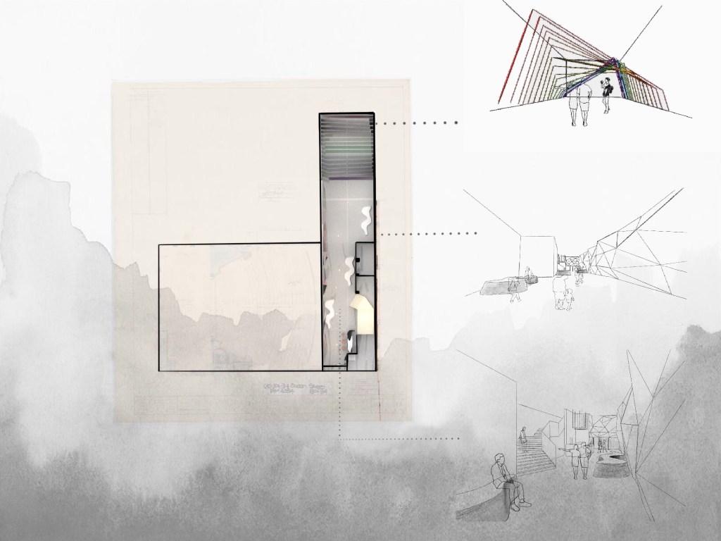
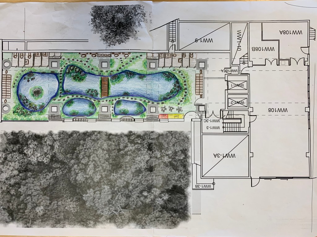
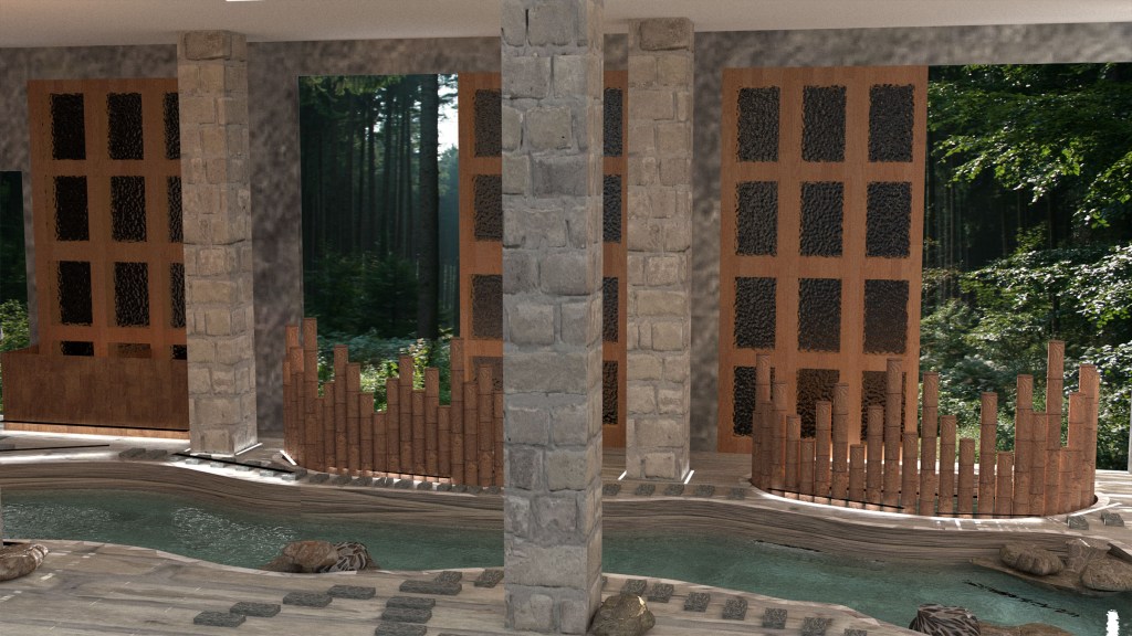
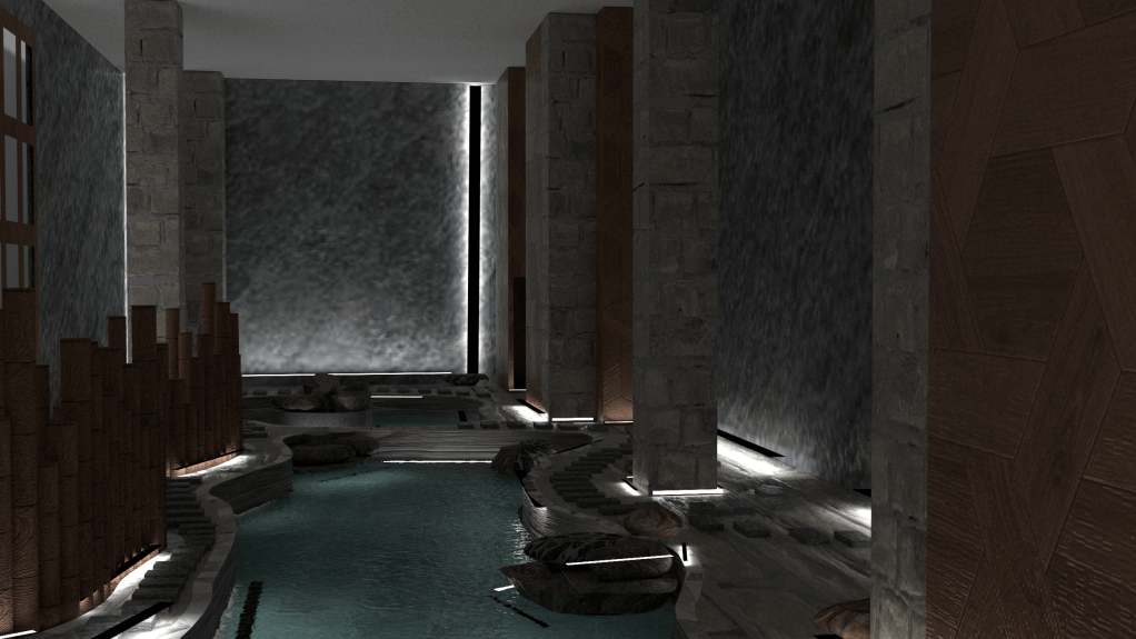
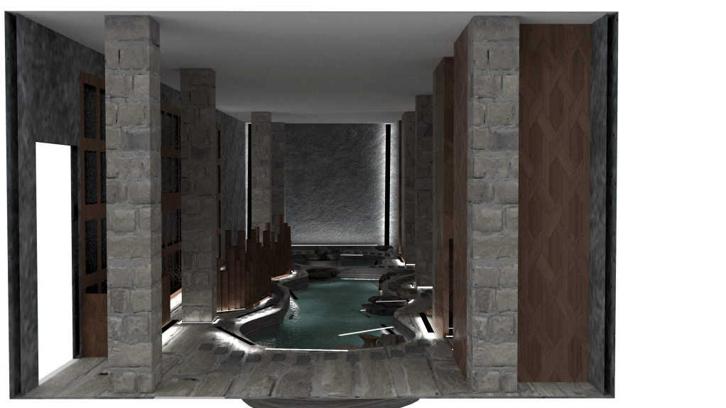
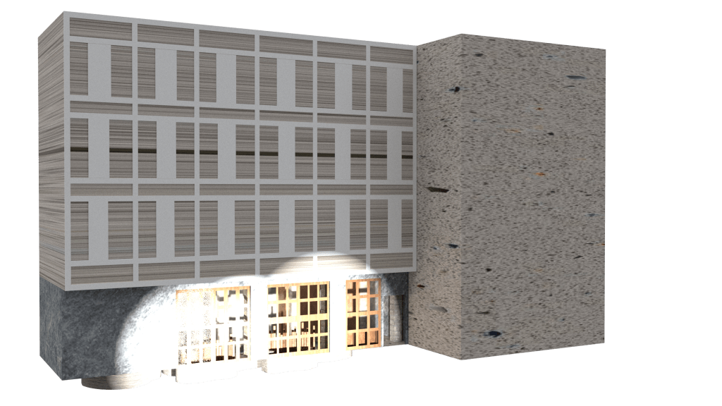
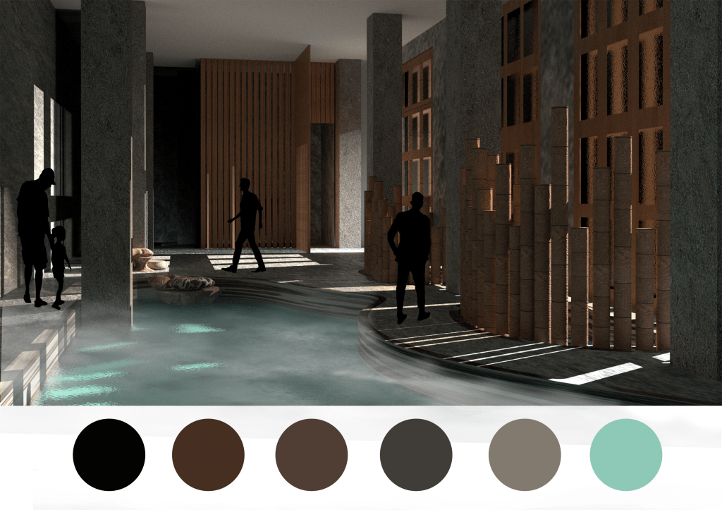
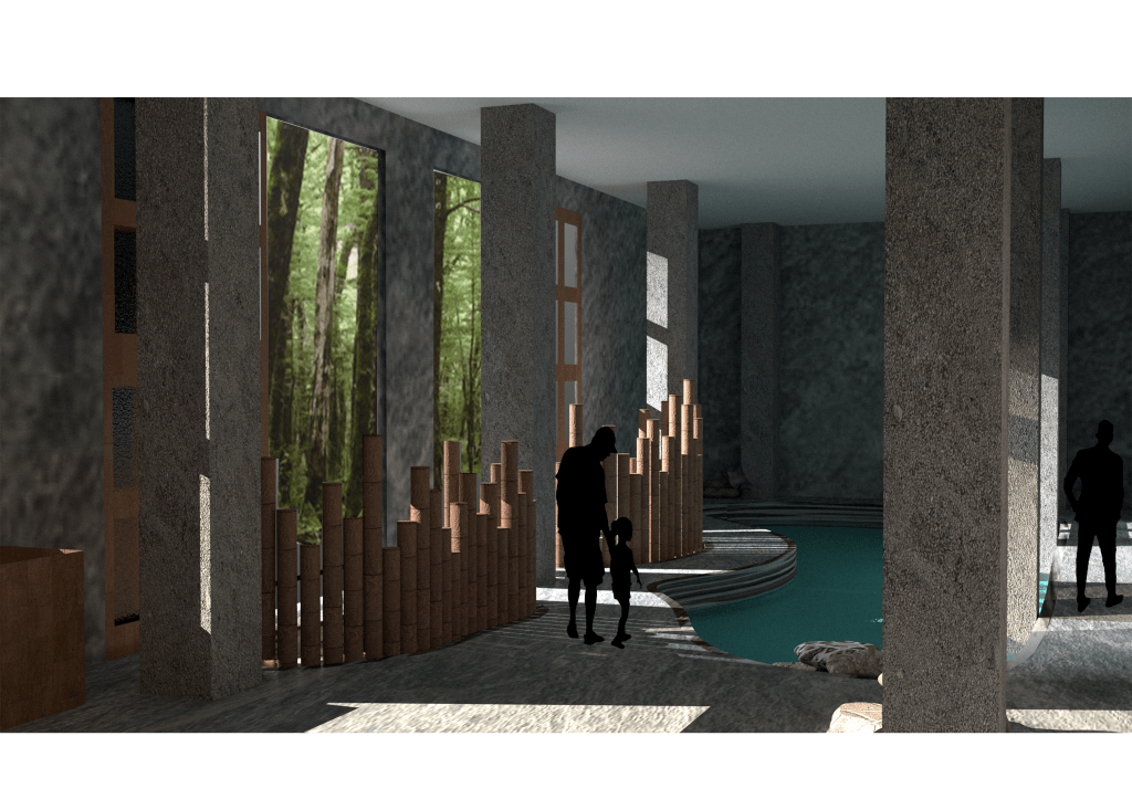
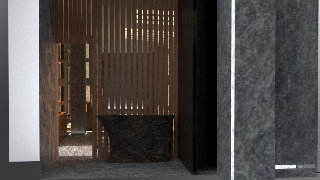
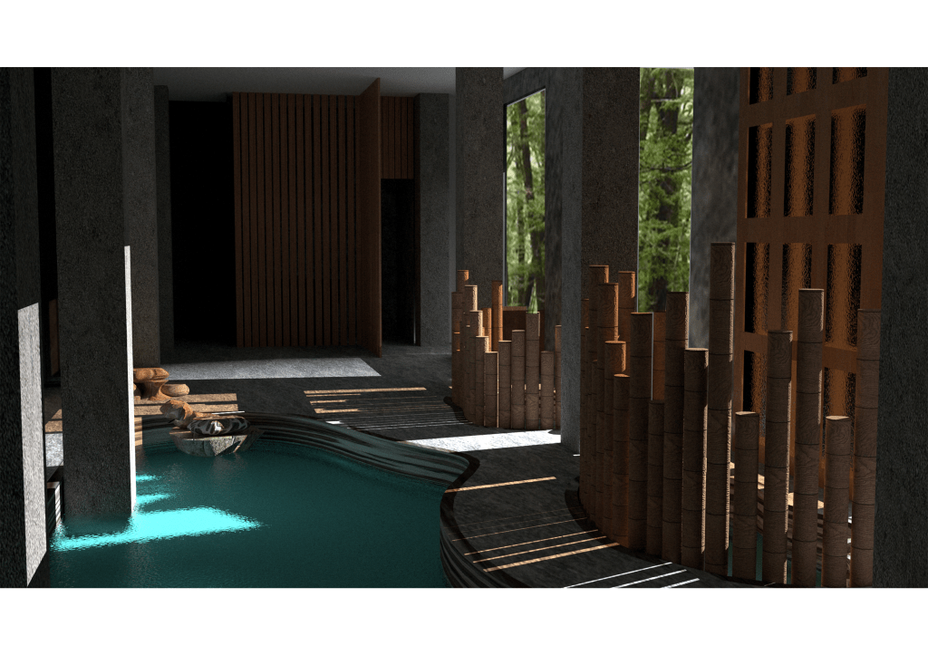
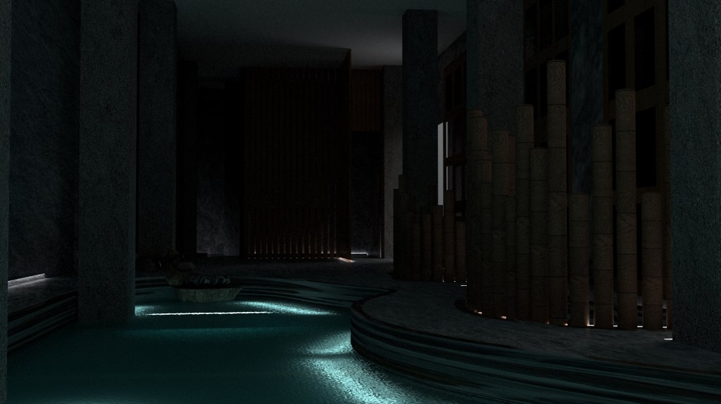
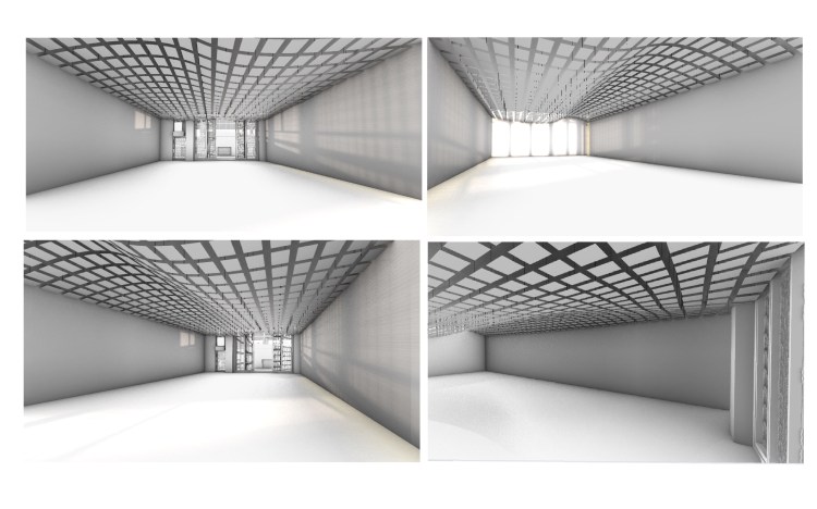
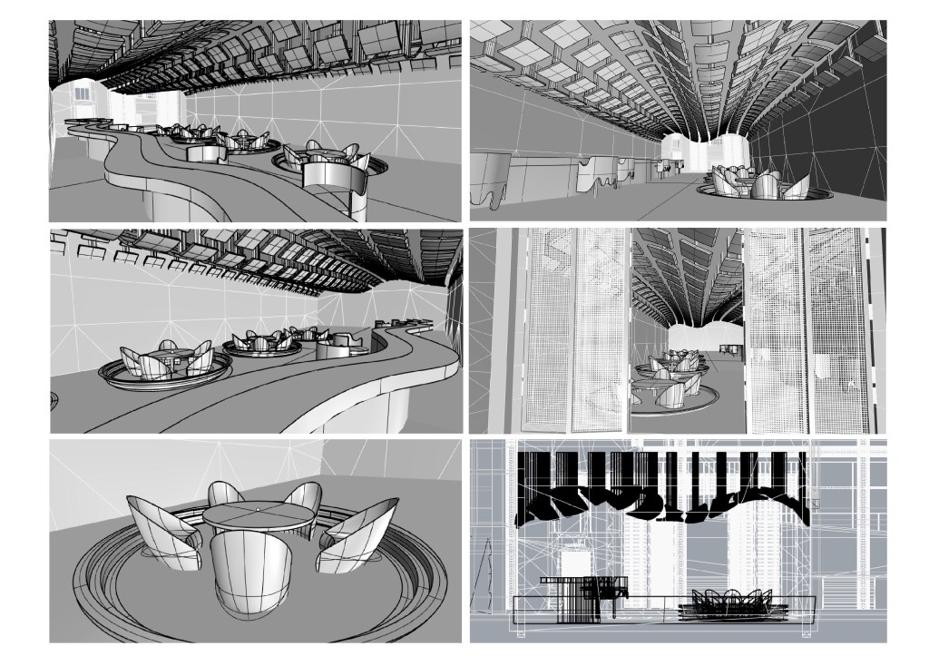
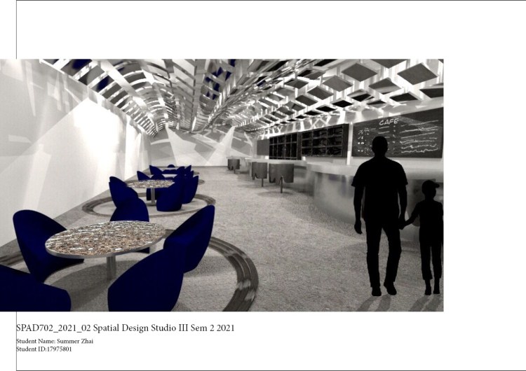
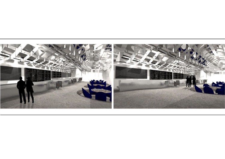
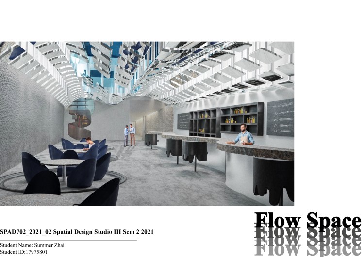
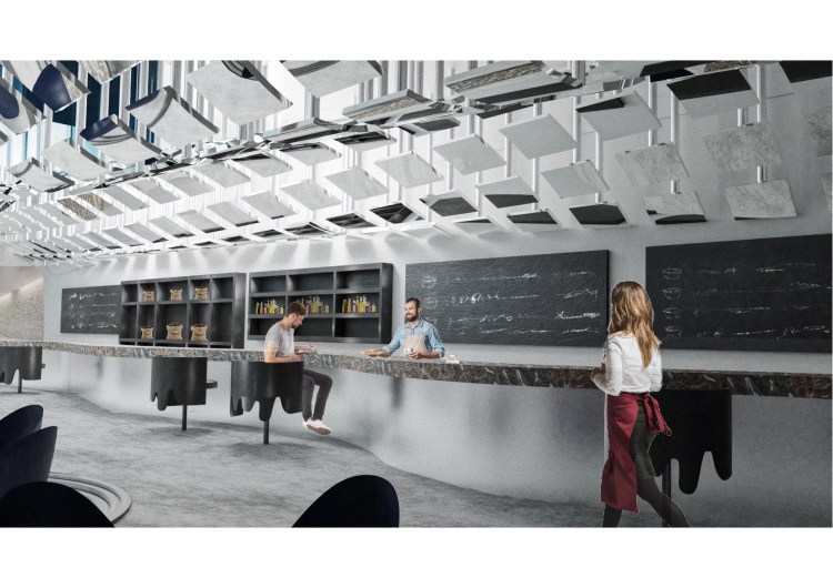
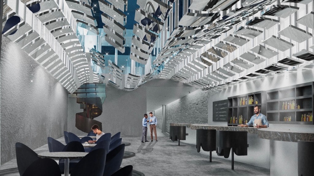
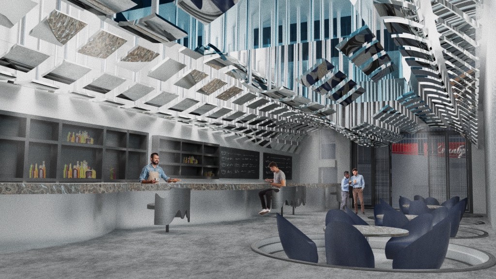
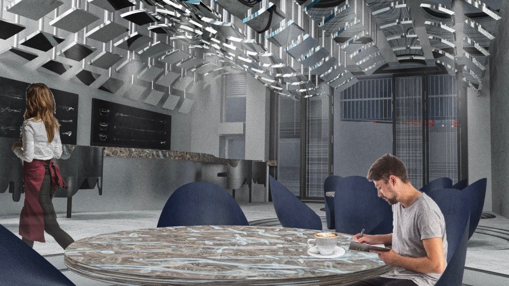
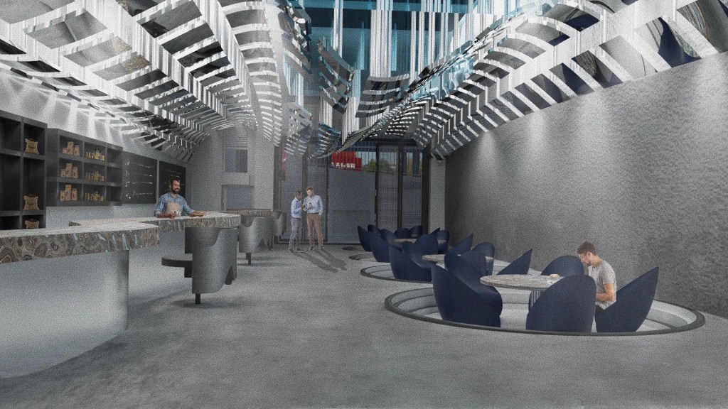
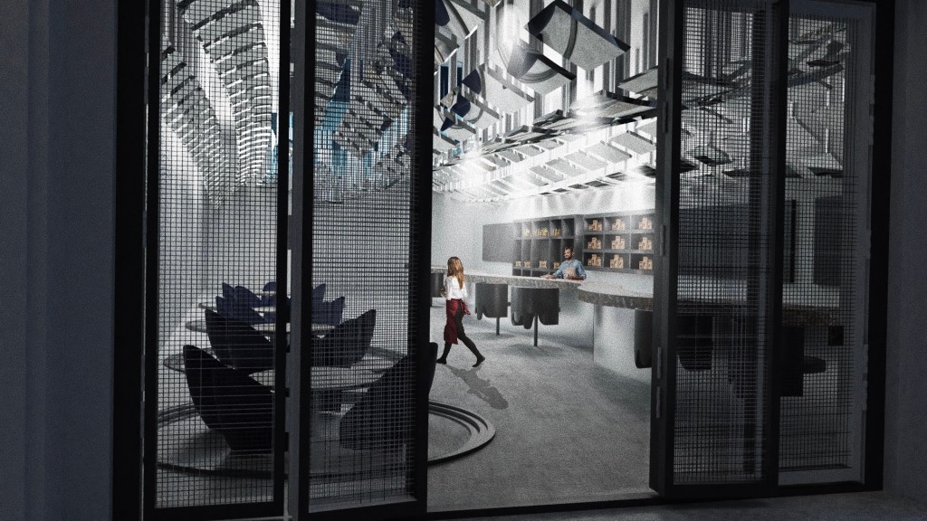
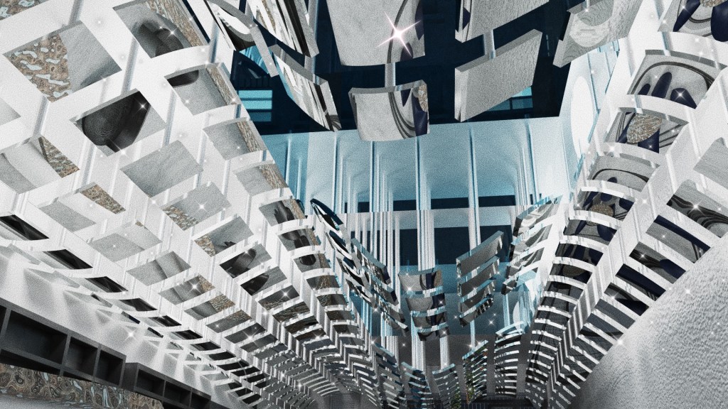
Render Image
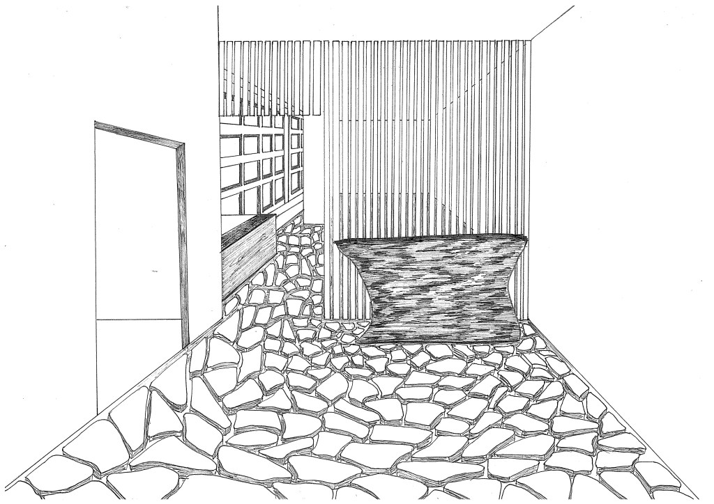
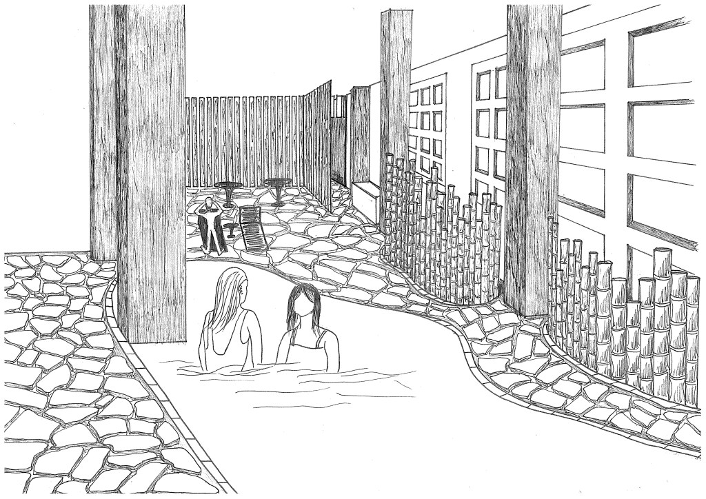
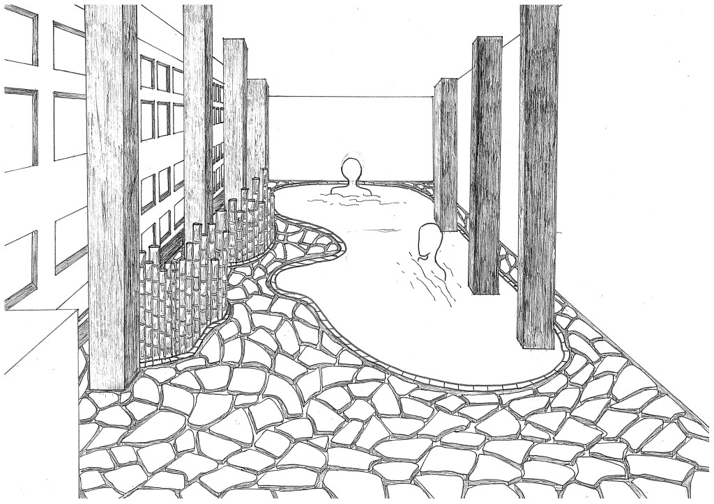
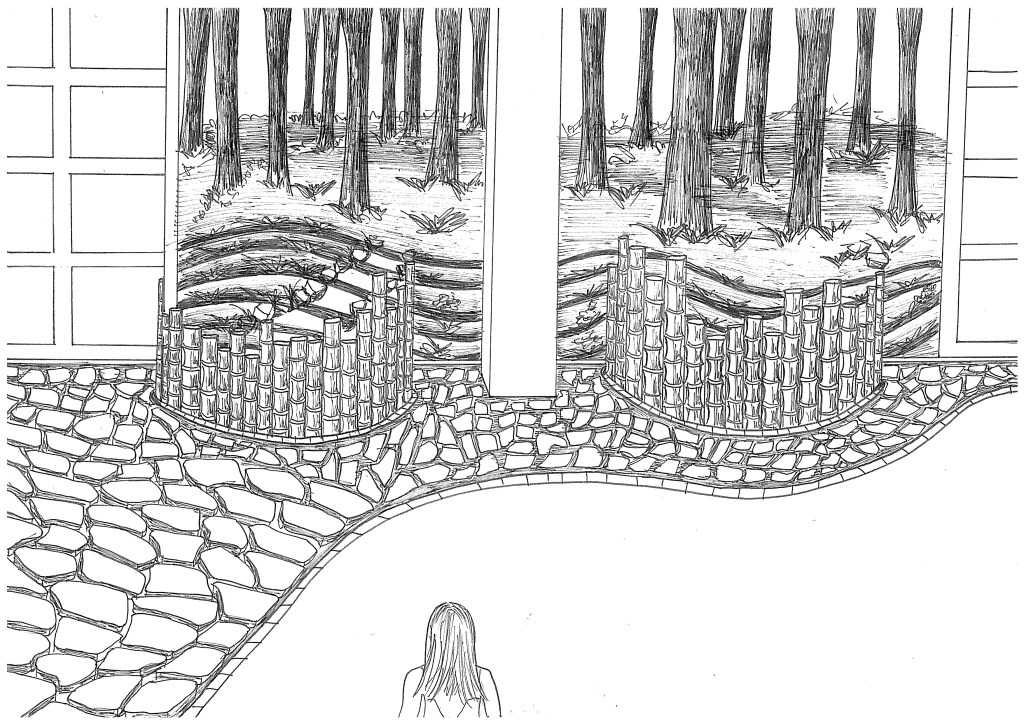
Final Portfolio
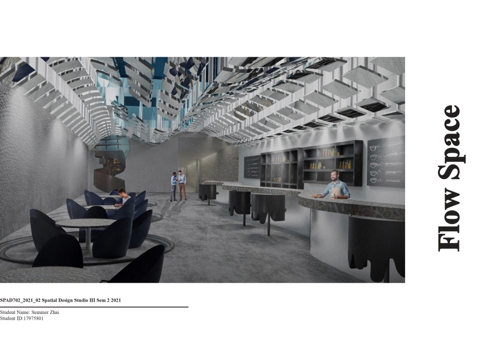
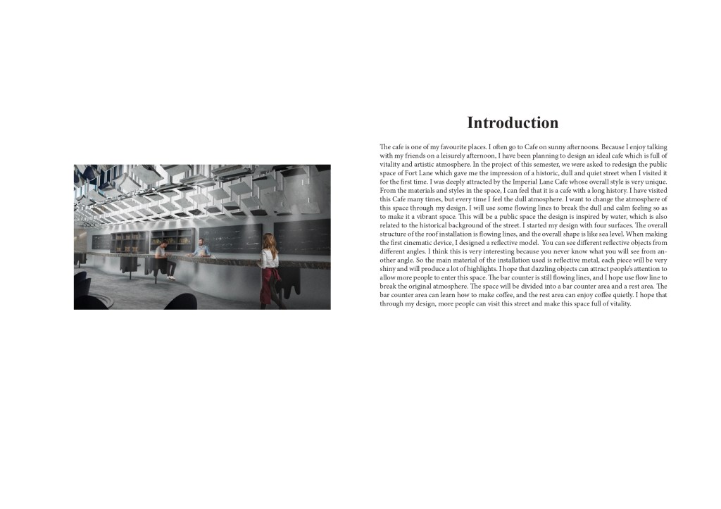
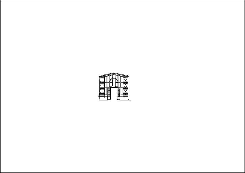
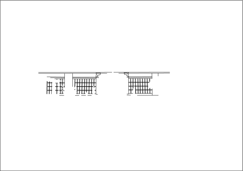
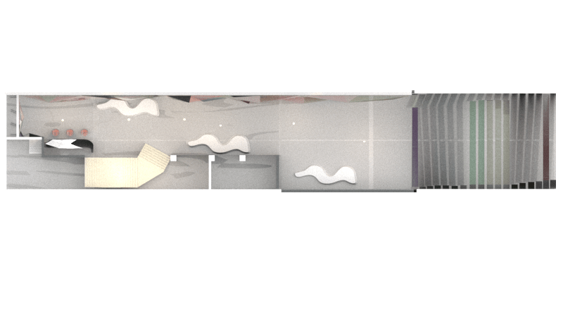
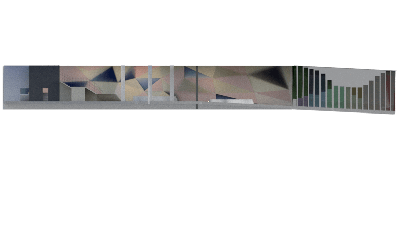
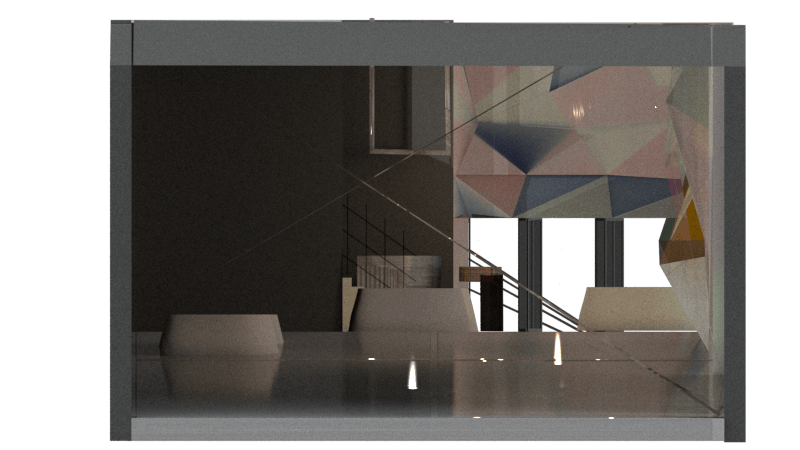
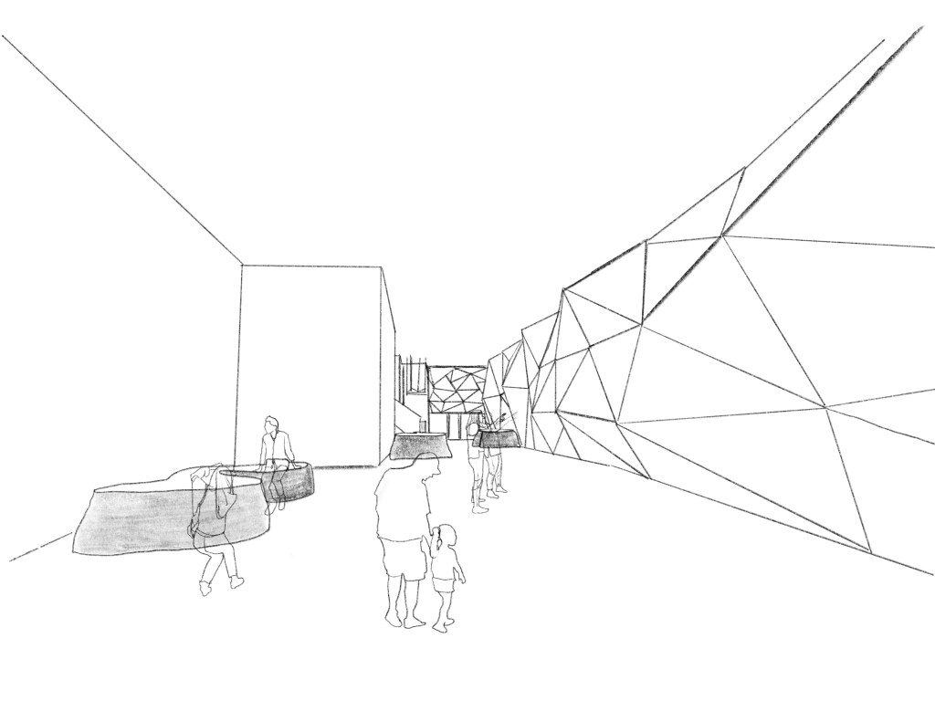
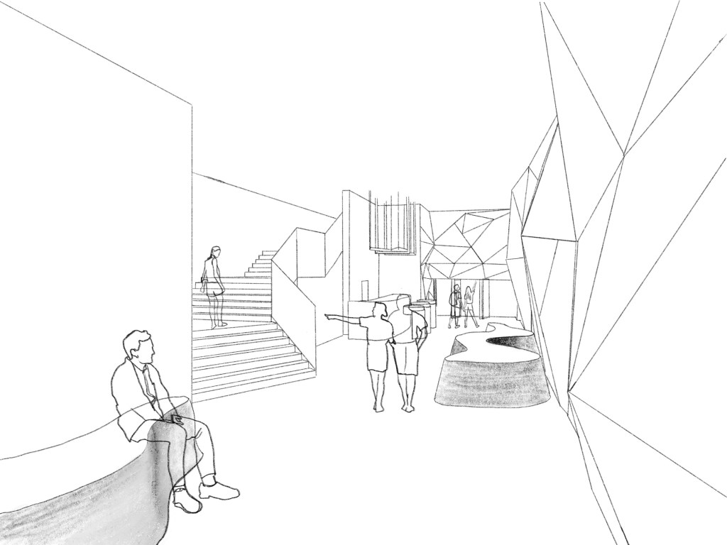
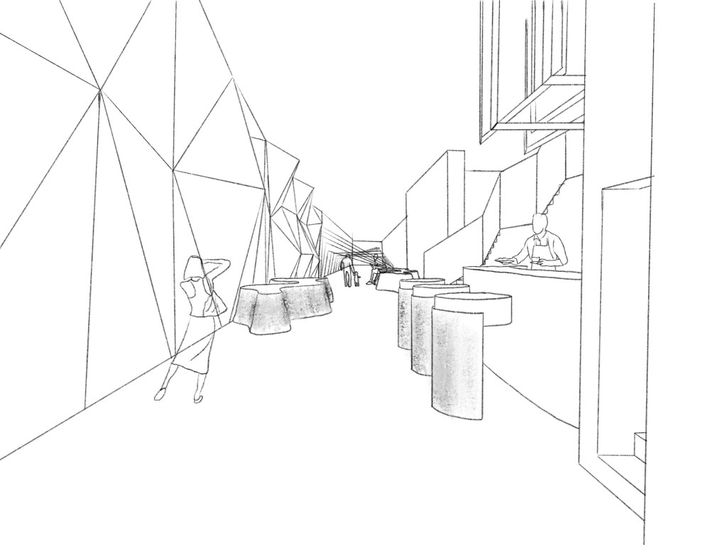
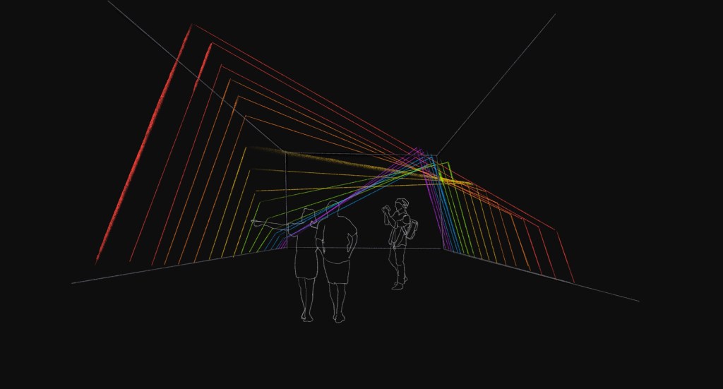
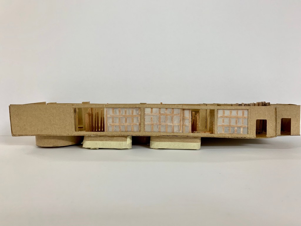
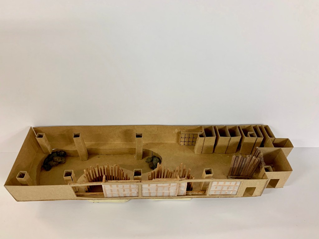
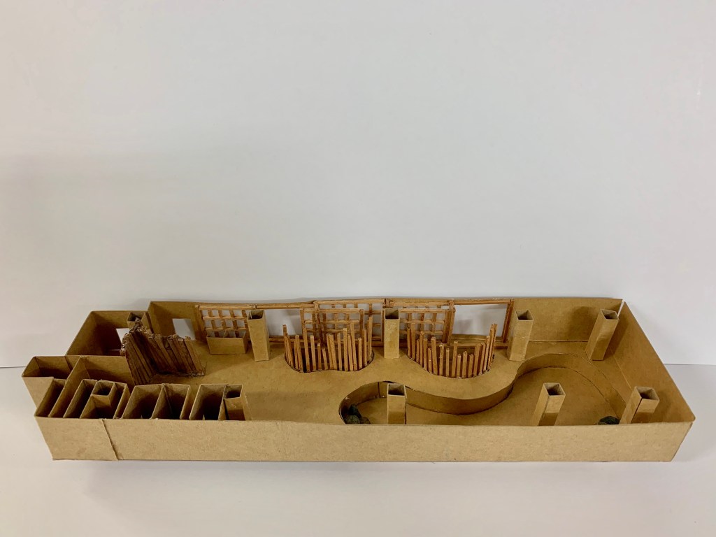
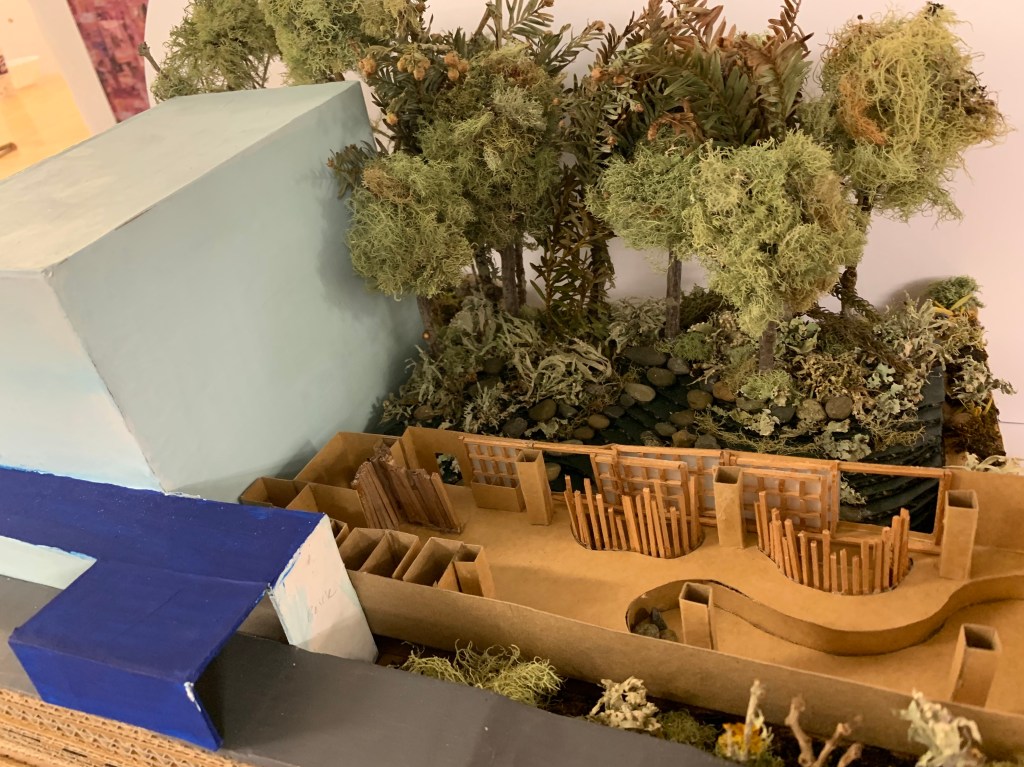
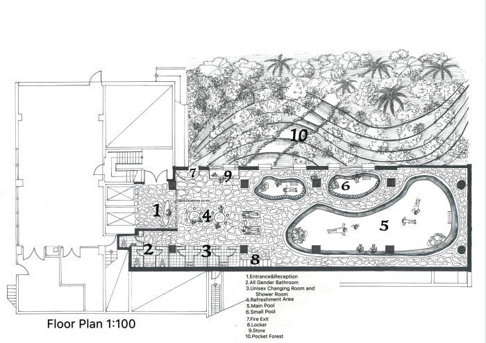
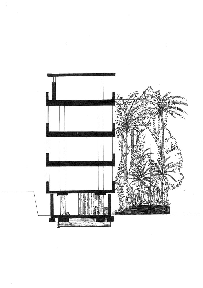
Introduction
The cafe is one of my favourite places. I often go to Cafe on sunny afternoons. Because I enjoy talking with my friends on a leisurely afternoon, I have been planning to design an ideal cafe which is full of vitality and artistic atmosphere. In the project of this semester, we were asked to redesign the public space of Fort Lane which gave me the impression of a historic, dull and quiet street when I visited it for the first time. I was deeply attracted by the Imperial Lane Cafe whose overall style is very unique. From the materials and styles in the space, I can feel that it is a cafe with a long history. I have visited this Cafe many times, but every time I feel the dull atmosphere. I want to change the atmosphere of this space through my design. I will use some flowing lines to break the dull and calm feeling so as to make it a vibrant space. This will be a public space,the design is inspired by water, which is also related to the historical background of the street. I started my design with four surfaces. The overall structure of the roof installation is flowing lines, and the overall shape is like sea level. When making the first cinematic device, I designed a reflective model. You can see different reflective objects from different angles. I think this is very interesting because you never know what you will see from another angle. So the main material of the installation used is reflective metal, each piece will be very shiny and will produce a lot of highlights. I hope that dazzling objects can attract people’s attention to allow more people to enter this space. The bar counter is still flowing lines, and I hope use flow line to break the original atmosphere. The space will be divided into a bar counter area and a rest area. The bar counter area can learn how to make coffee, and the rest area can enjoy coffee quietly. I hope that through my design, more people can visit this street and make this space full of vitality.