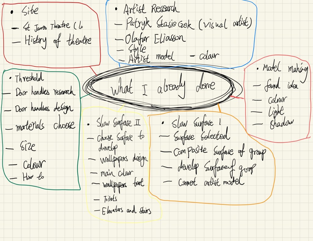
Week 3 – Site Visit
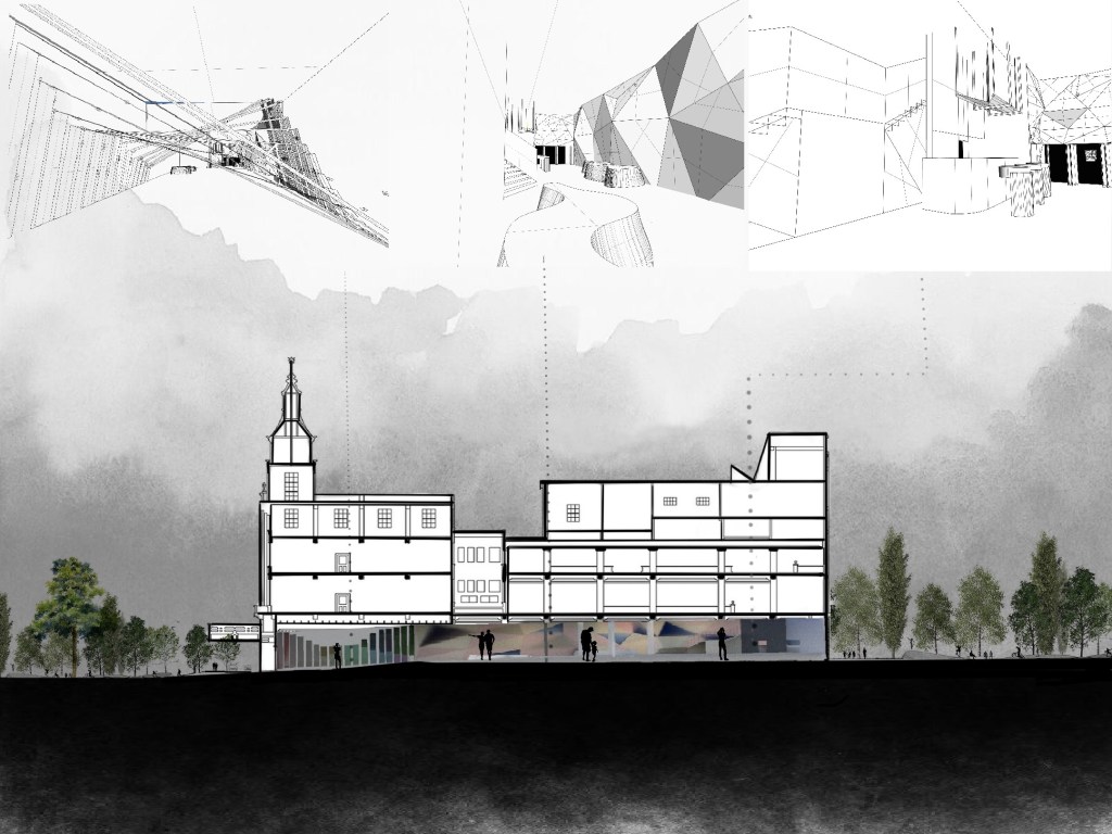
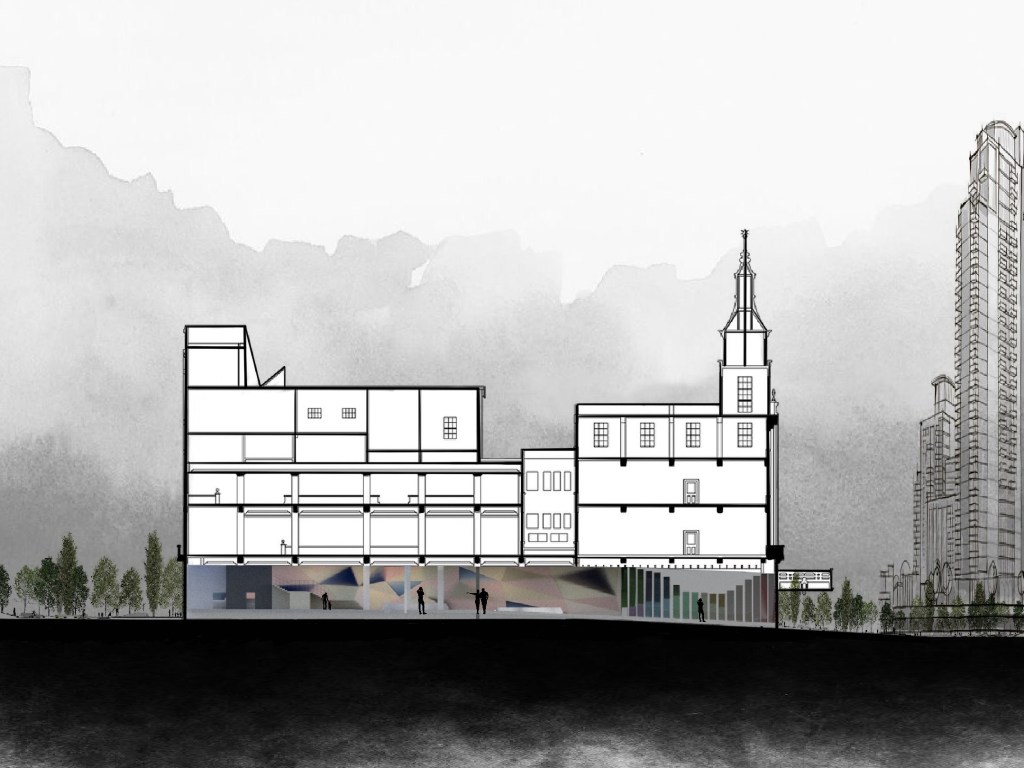
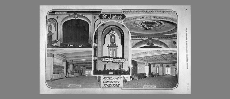
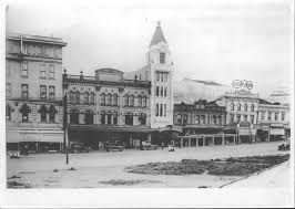
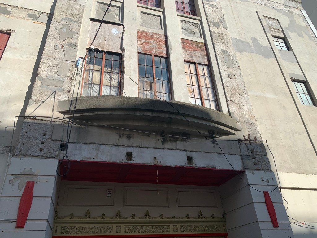
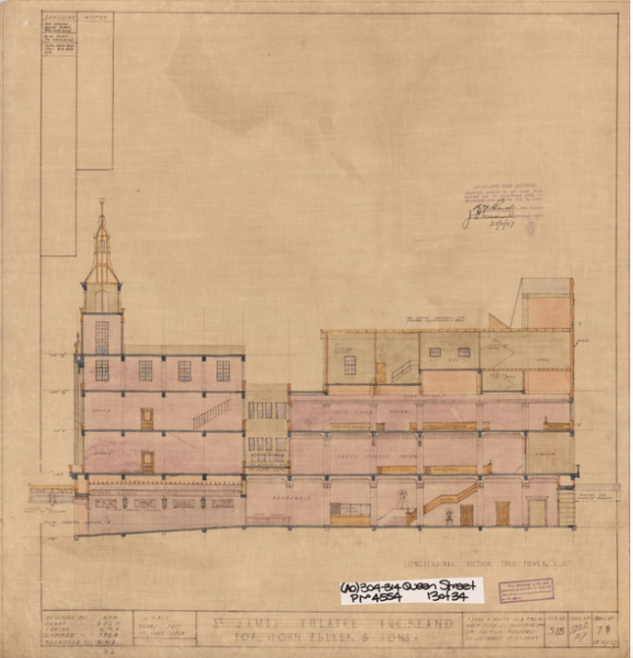
The St James Theatre is a heritage stage theatre and cinema located on Queen Street in Auckland, New Zealand. Built in 1928, it was a replacement for the older Fuller’s Opera House and was originally designed for vaudeville acts. Its architect Henry Eli White also designed many other famous theatres in Australia and New Zealand including the St James Theatre in Wellington and the State Theatre in Sydney.
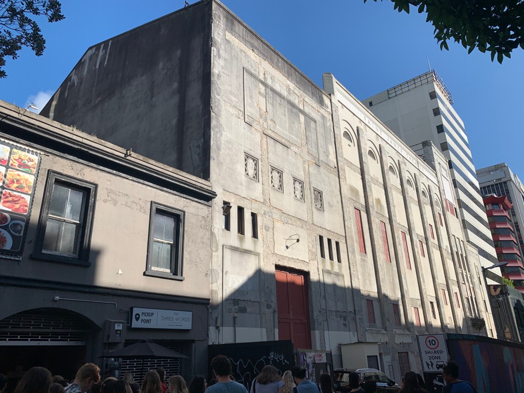
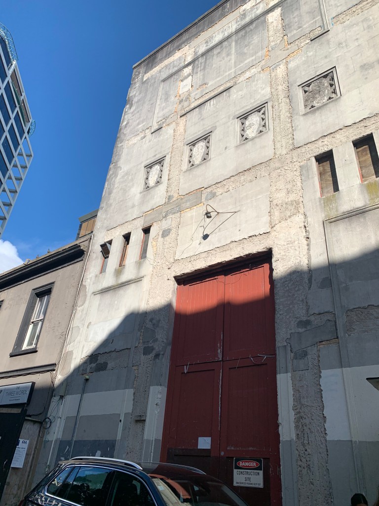
The theatre has been closed since 2007 after a fire raised concerns about safety and compliance. Purchased by Relianz Holdings in 2014, it is a restoration project with an Auckland Council contribution of $15 million. Buildings on the adjacent sites were demolished by late-2016 to make way for the St James Suites, a 39-level, 309-apartment project.However, in July 2019, no work had been done on the theatre since 2015 after funding for the apartment complex was lost.
The theatre is classified as a “Category I” (“places of special or outstanding historical or cultural heritage significance or value”) historic place by the New Zealand Historic Places Trust.
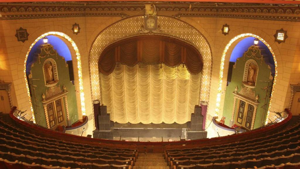
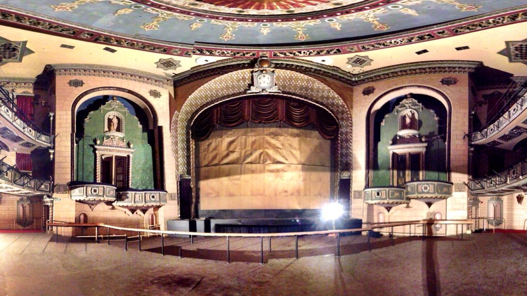
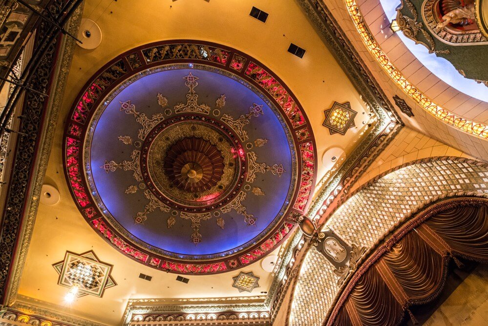
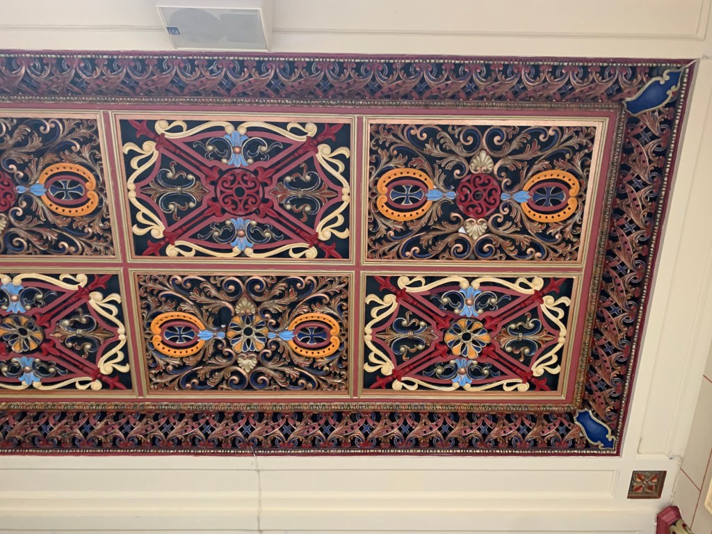
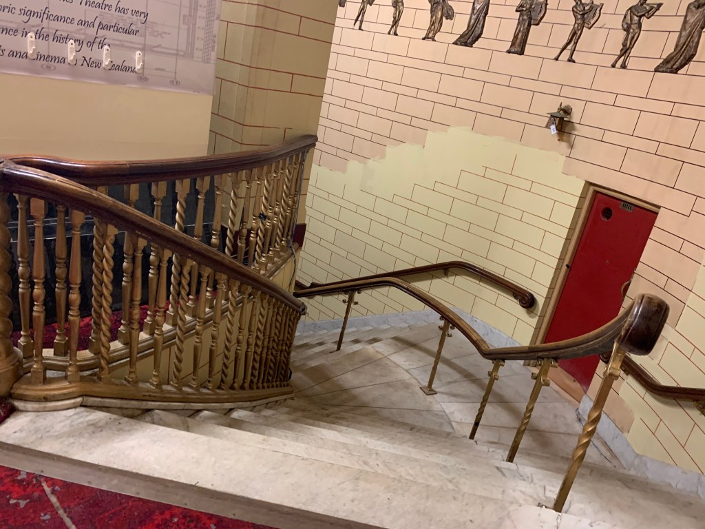
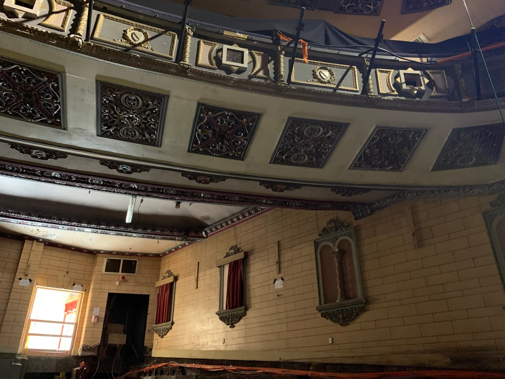
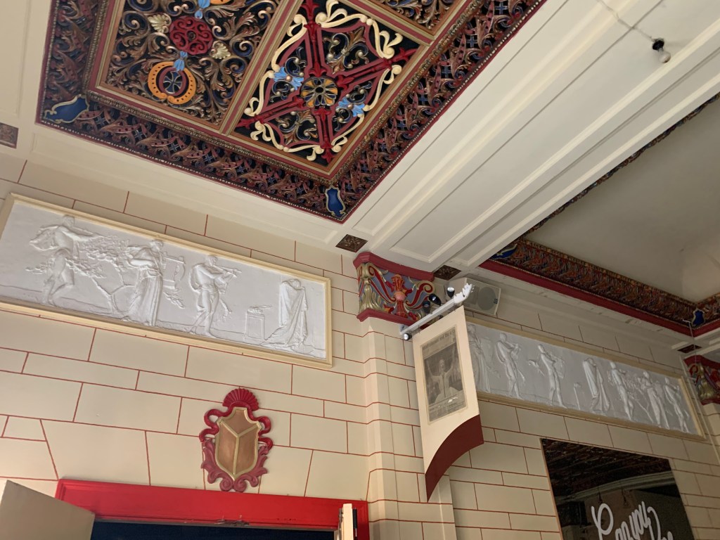
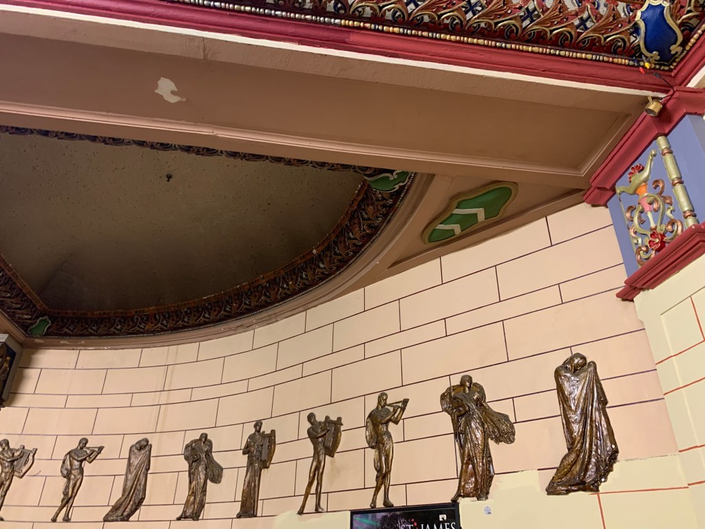
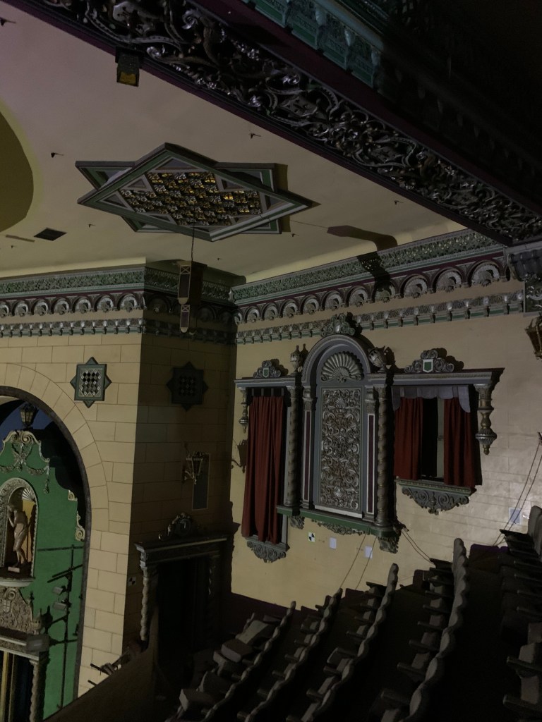
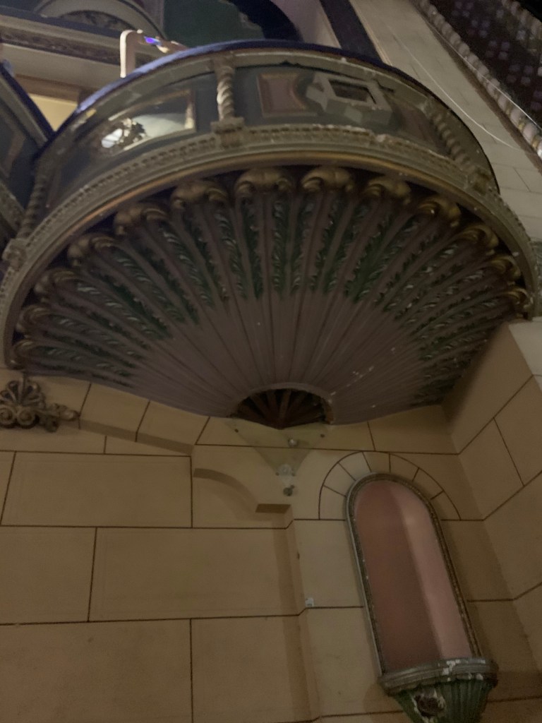
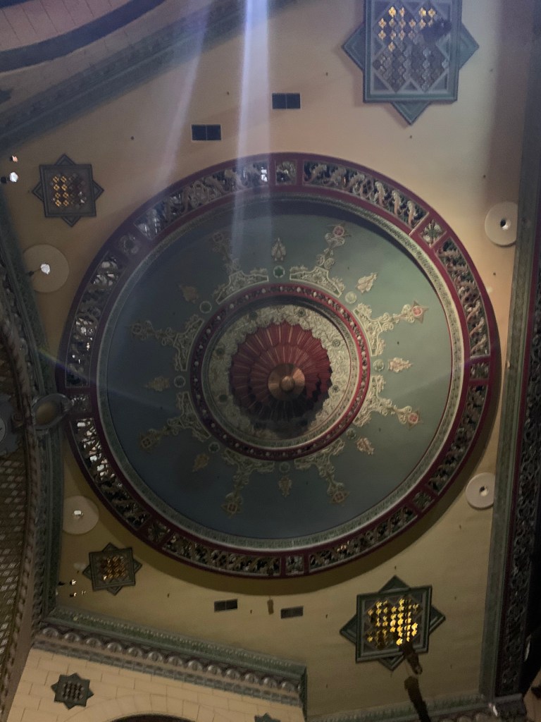
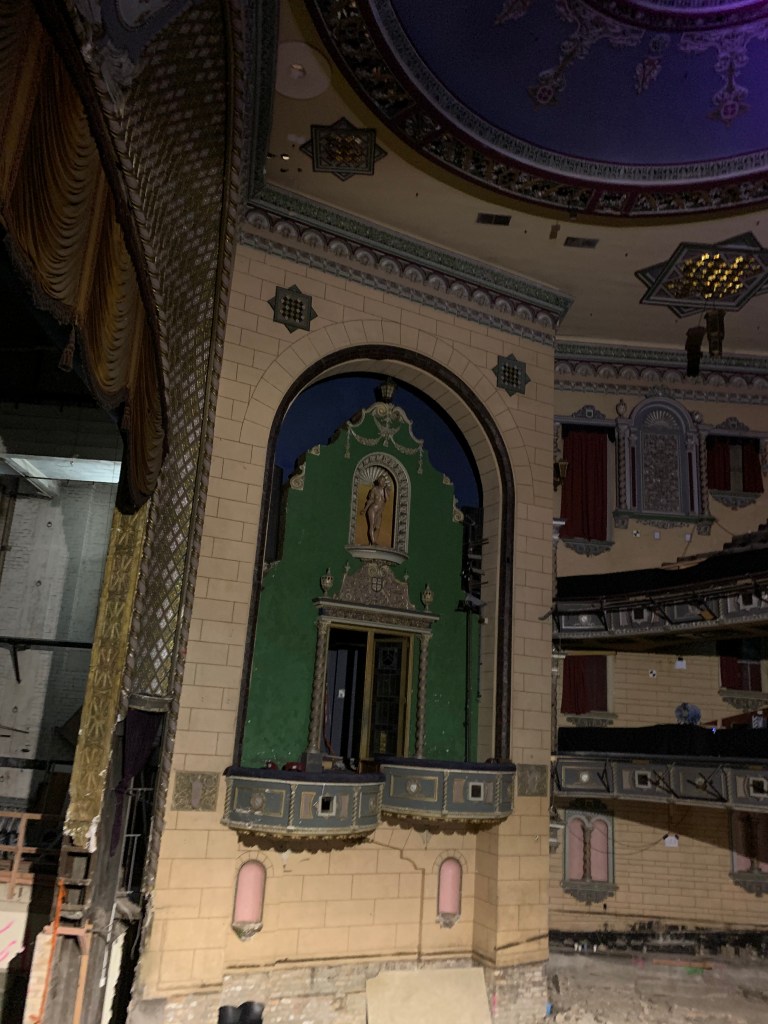
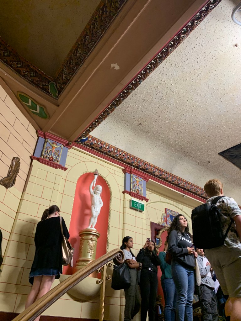
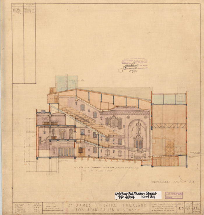
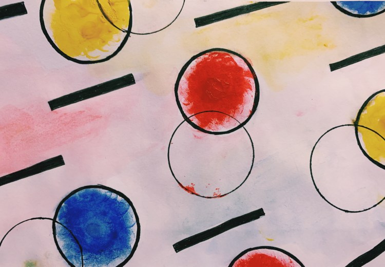
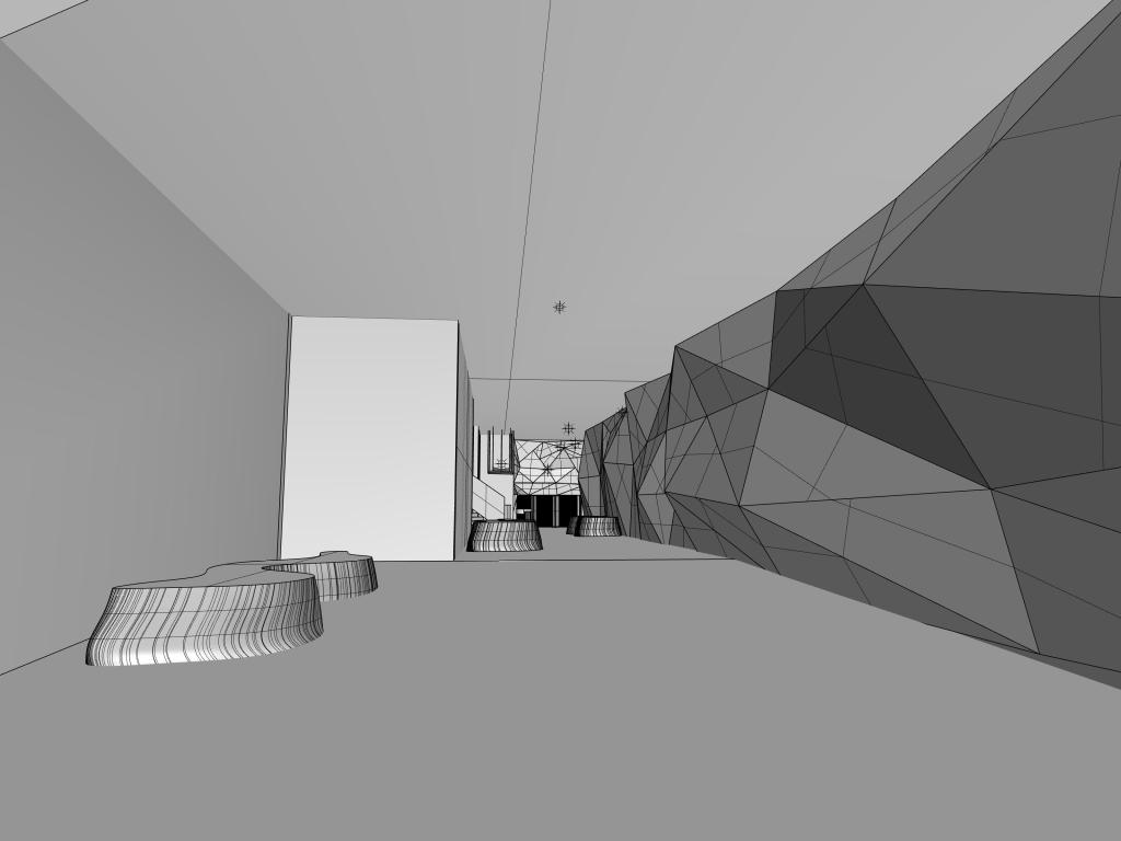
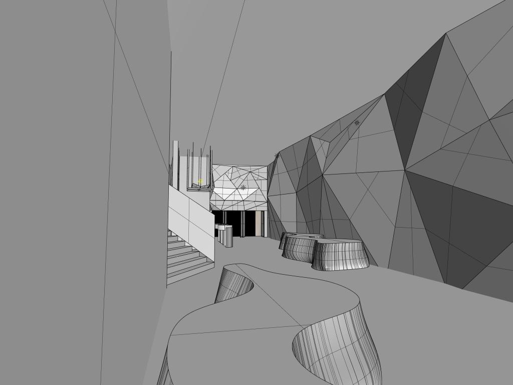
This week we visited the St James theatre. The first impression is that this is a very challenging project. Because this theatre has a long history and I entered the theatre immediately I felt its culture atmosphere. What impressed me was the frescoes on the roof and the decorations on the walls. The main colour is red, the colour is vivid and the pattern is clear. When I entered the grandstand, I was once again attracted by the design of the roof. The circular pattern enveloped the center of the grandstand. The bright colours on the interior walls intersect with the light to produce different effects.
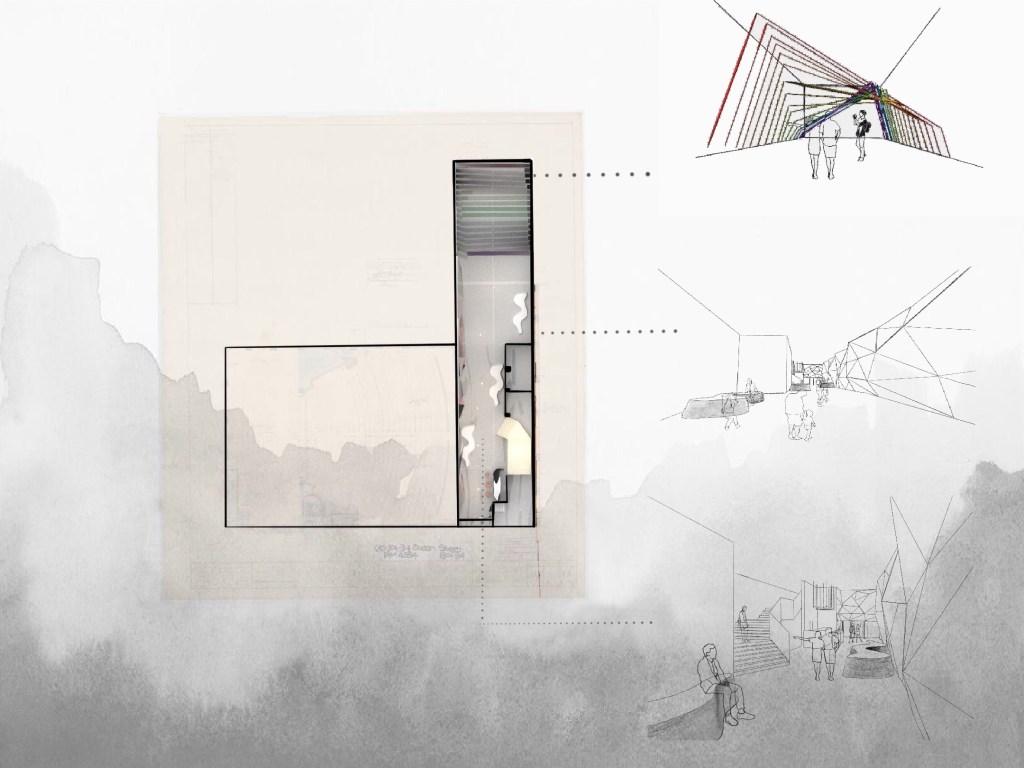
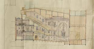
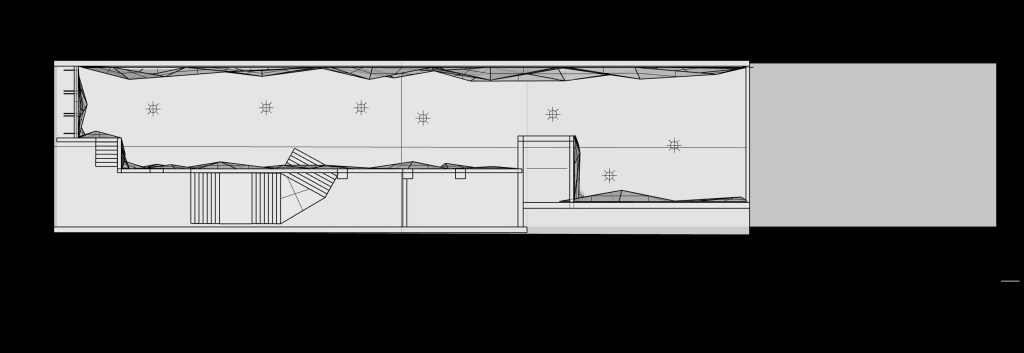
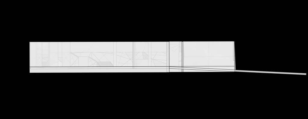
Original Plan & Section
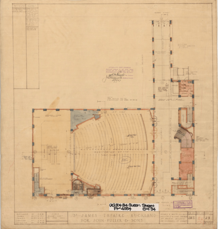
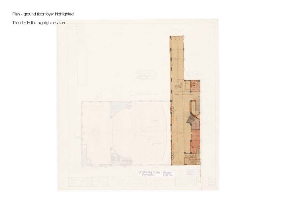
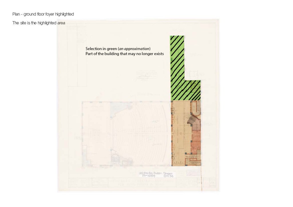
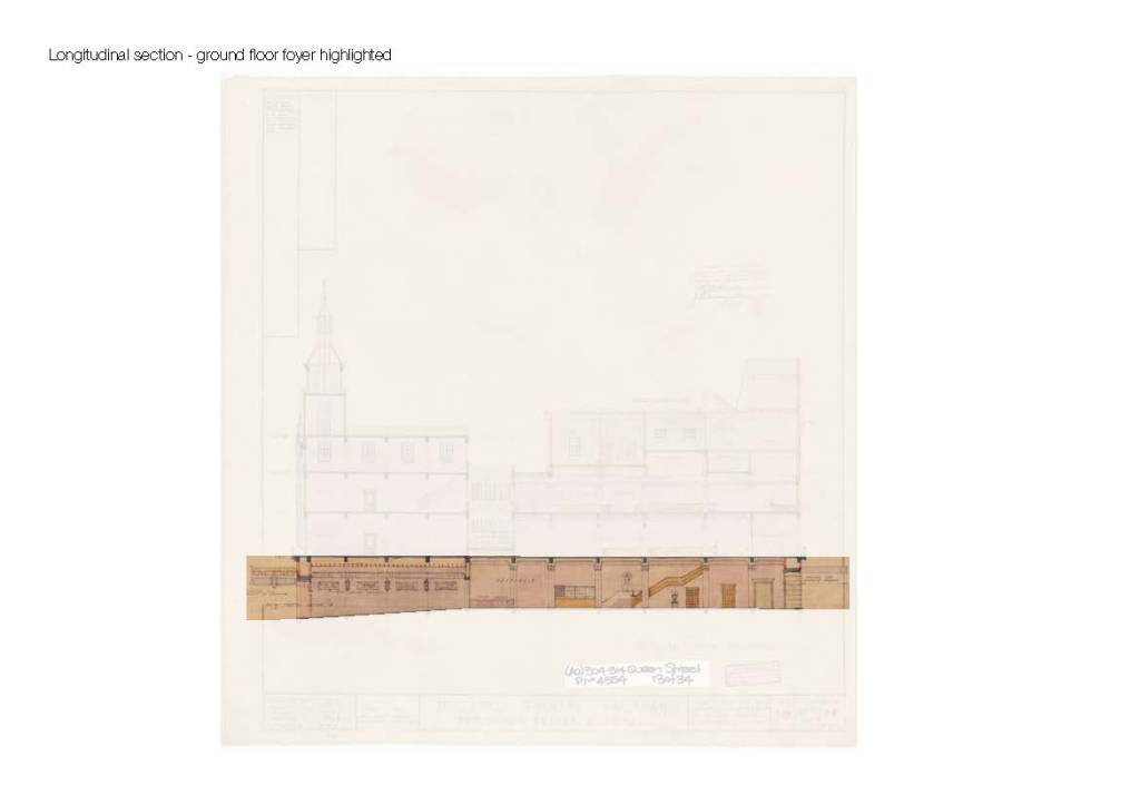
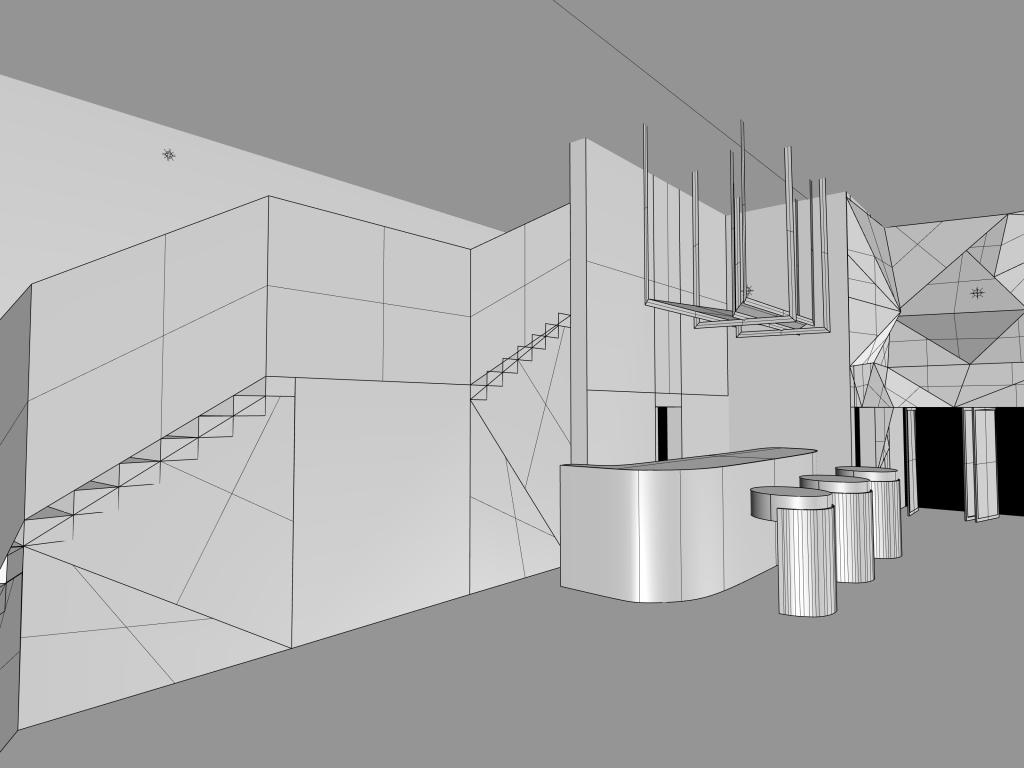
The space we are working on
Sun direction in Auckland
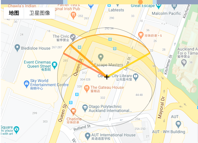
00:00—05:59 — Night
05:59—06:31 — Astronomical twilight
06:31—07:03 — Nautical twilight
07:03—07:32 — Civil twilight
07:03 — Dawn
07:32—07:35 — Sunrise
07:35—17:09 — Daylight
12:22 — Solar noon
17:09—17:12 — Sunset
17:41 — Dusk
17:12—17:41 — Civil twilight
17:41—18:13 — Nautical twilight
18:13—18:44 — Astronomical twilight
18:44—00:00 — Night
Reference: http://sun-direction.com/city/43287,auckland/
Contour
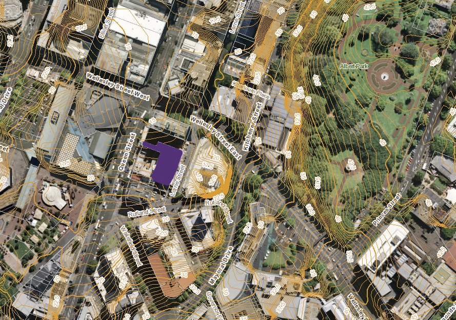
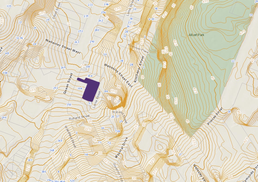
Reference: https://geomapspublic.aucklandcouncil.govt.nz/viewer/index.html
Week 4- Artist Research and Model Making
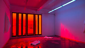
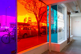
Patryk Stasieczek (b. 1984) is a visual artist living in Vancouver, BC. He holds a Master of Applied Arts from Emily Carr University of Art + Design where he investigated the ontological relationships between photographic acts, objects and experiences. He also holds a Bachelor of Fine Arts in photography and philosophy from Concordia University in Montréal, QC. He is the active director and co-curator of Gallery 295, a young gallery located in the heart of Vancouver’s art district that focuses on emerging contemporary photographic practices and dialogues. He also works as a photographic lab technician at The Lab, and is currently a sessional instructor at Emily Carr University of Art + Design.
He has exhibited nationally within Canada, participating in exhibitions at Access Gallery, Galerie Les Territoires, Charles H. Scott Gallery, Eastern Bloc, FIELD Contemporary, and the FOFA Gallery. His work has been published both nationally and abroad, and was featured on the cover of Hong-Kong based Pipeline Magazine’s 2014 Juried Photography Issue. In 2015 he was nominated for Henry Art Gallery’s BRINK award.
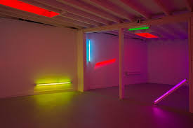
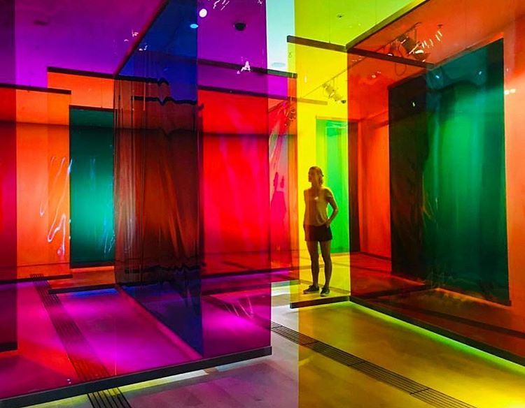
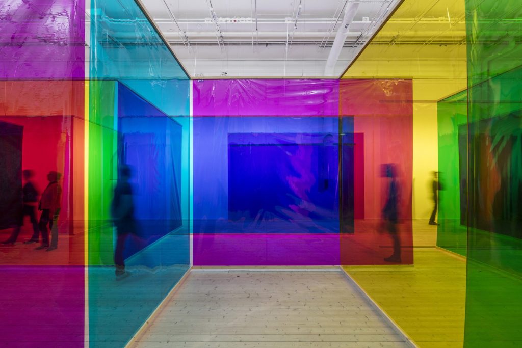
Olafur Eliasson (Icelandic: Ólafur Elíasson; born 1967) is a Danish–Icelandic artist known for sculptures and large-scale installation art employing elemental materials such as light, water, and air temperature to enhance the viewer’s experience. In 1995 he established Studio Olafur Eliasson in Berlin, a laboratory for spatial research. Olafur represented Denmark at the 50th Venice Biennale in 2003 and later that year installed The Weather Project in the Turbine Hall of Tate Modern, London.
Olafur has engaged in a number of projects in public space, including the intervention Green river, carried out in various cities between 1998 and 2001; the Serpentine Gallery Pavilion 2007, London, a temporary pavilion designed with the Norwegian architect Kjetil Trædal Thorsen; and The New York City Waterfalls, commissioned by Public Art Fund in 2008. He also created the Breakthrough Prize trophy. Like much of his work, the sculpture explores the common ground between art and science. It is molded into the shape of a toroid, recalling natural forms found from black holes and galaxies to seashells and coils of DNA.
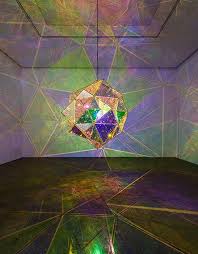
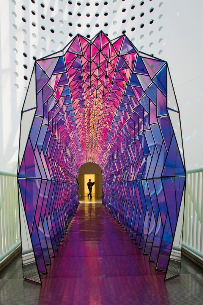
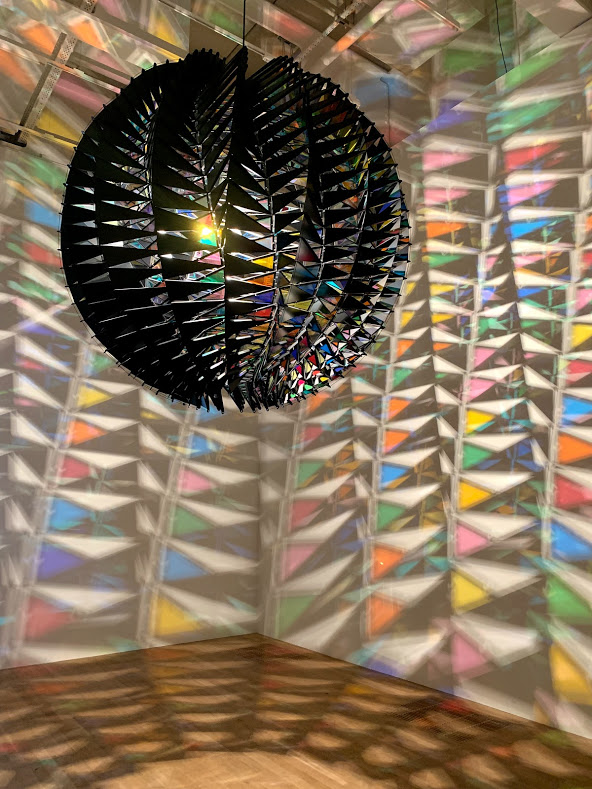
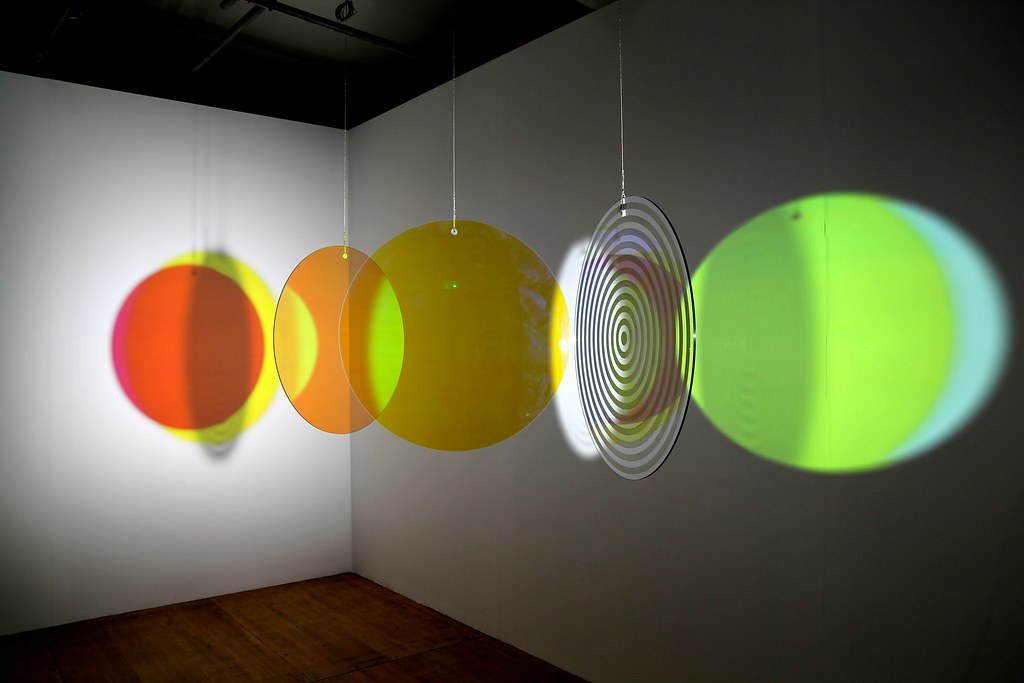
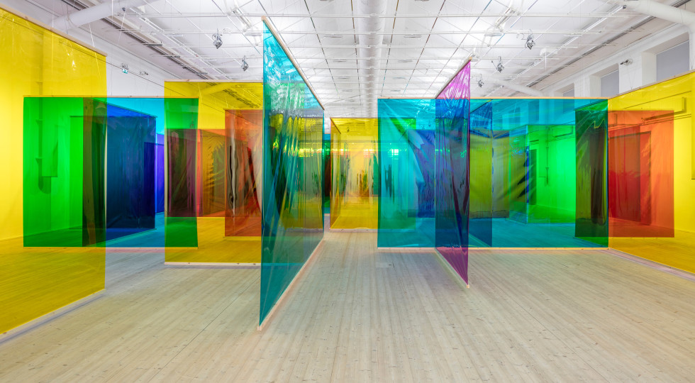
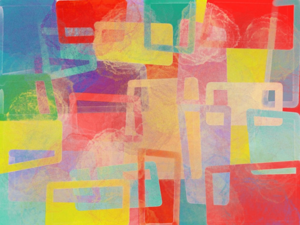
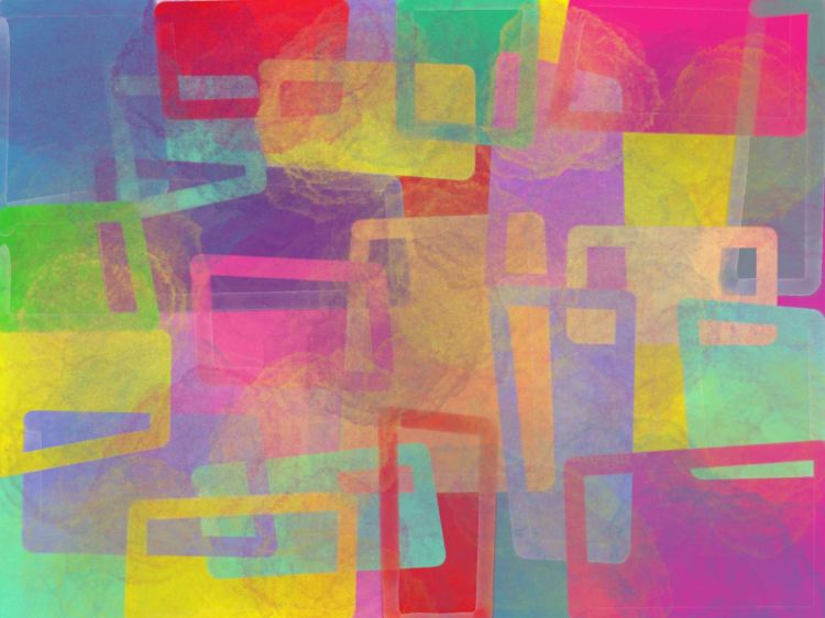
Because they are very good at using bright colours that is why I choose these two artist. This is very attractive to me. When I entered the theatre I noticed that the overall tone of the theatre is very bright, so I think that these colours can be used for new designs.
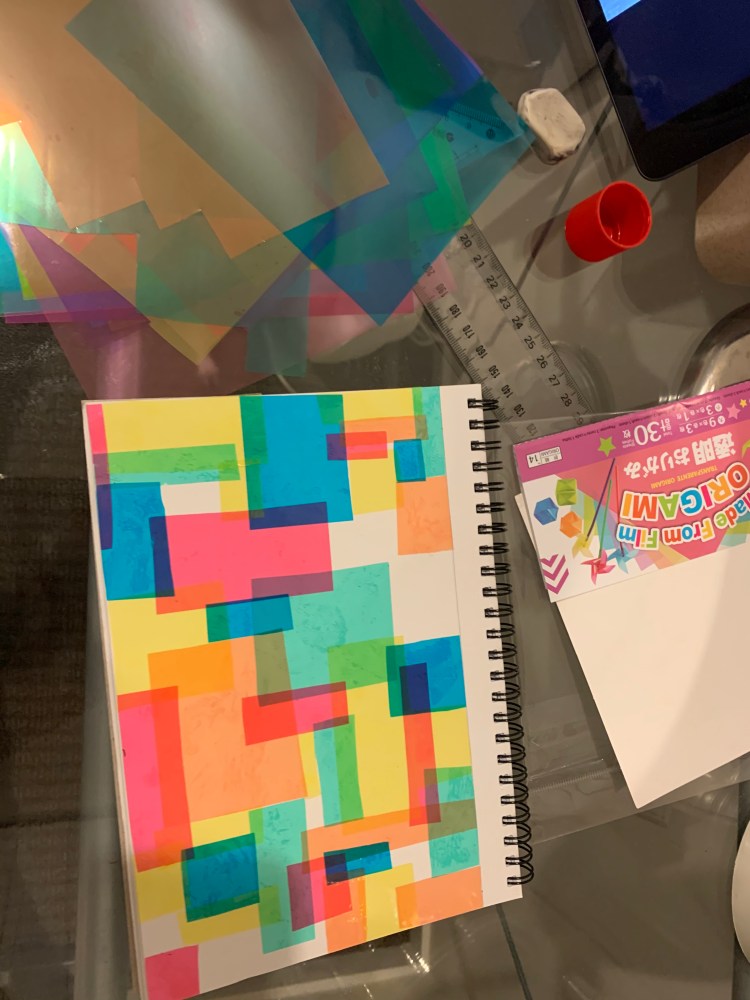
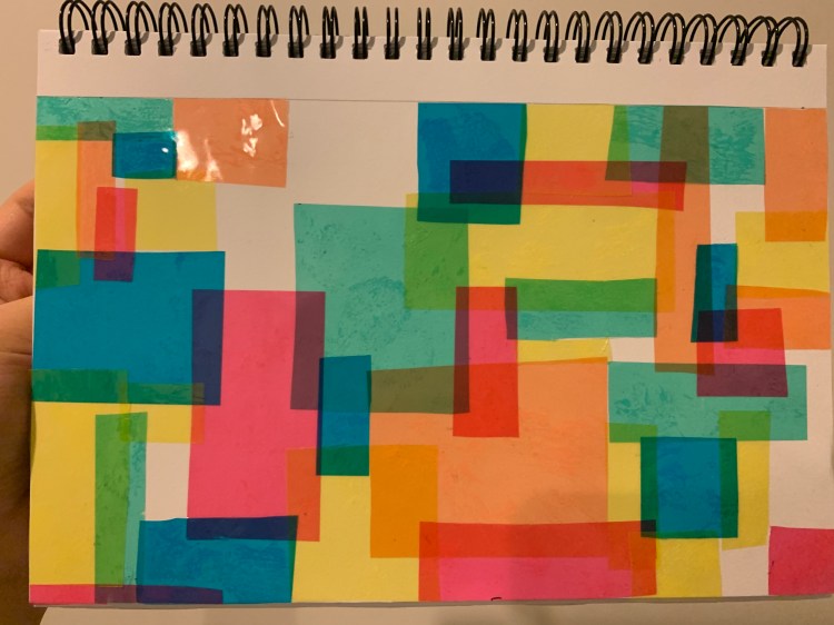
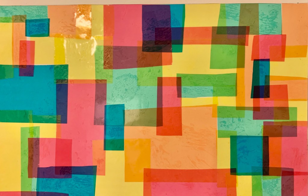
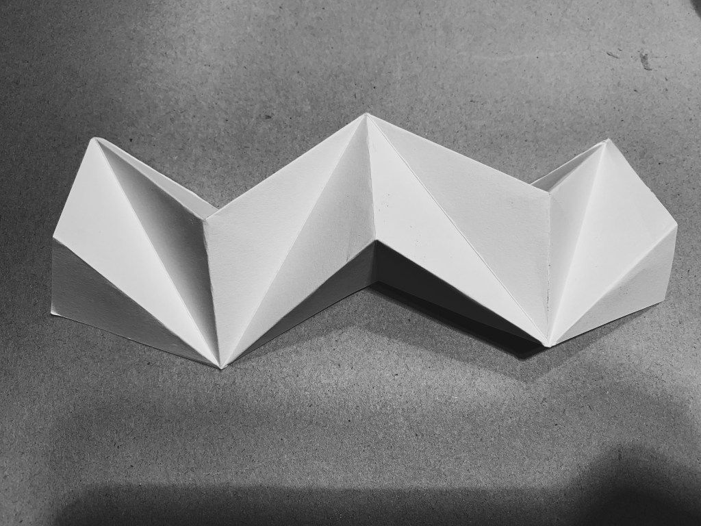
Model Making
First model
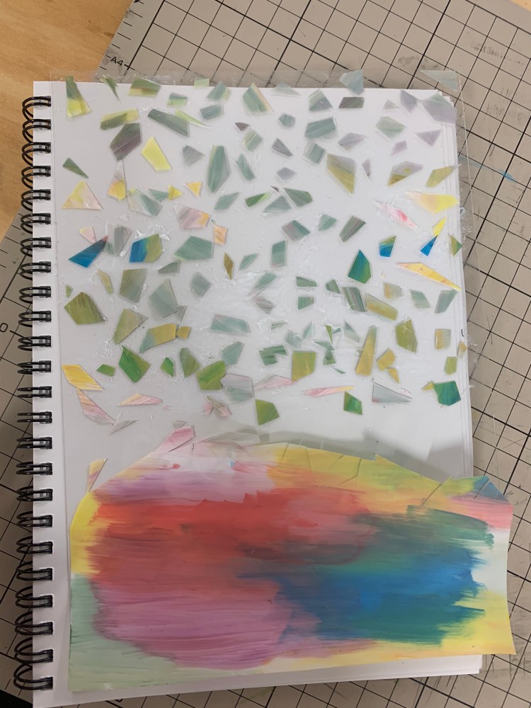
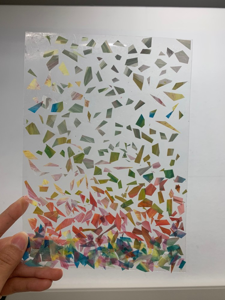
I want to create a gradual change process from high to low. I mixed different colours and applied them on transparent PVC, then cut them into irregular shapes and pasted them on a new PVC.
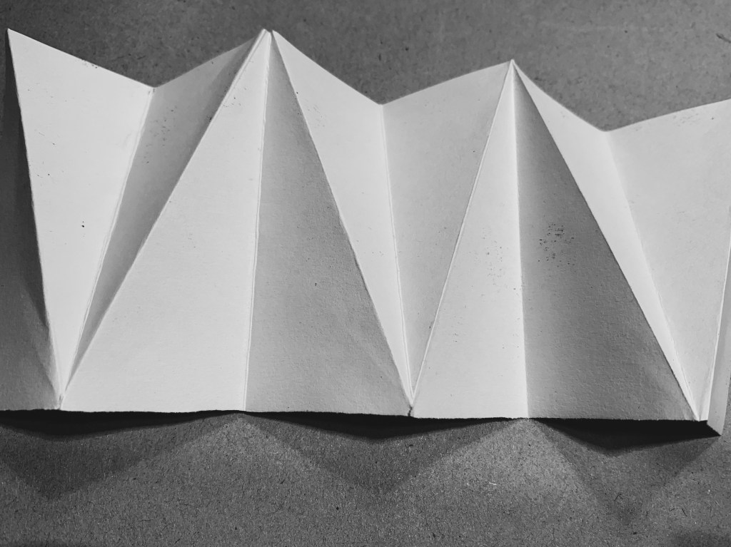
Second Model
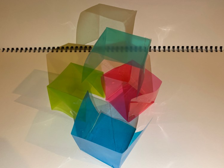

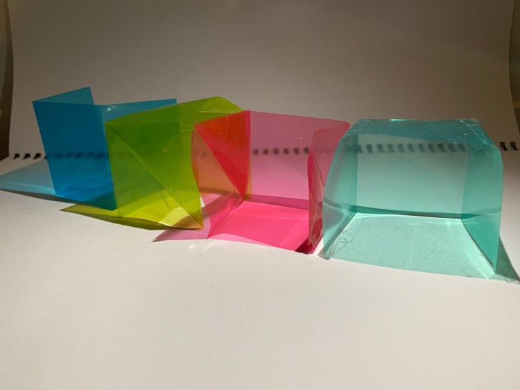
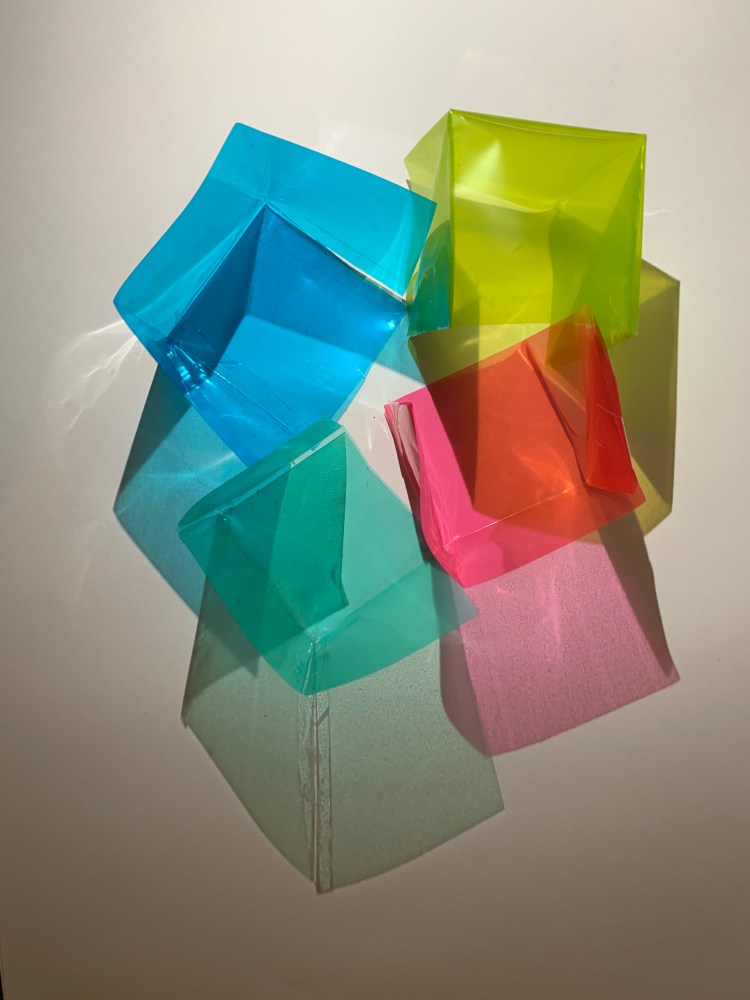
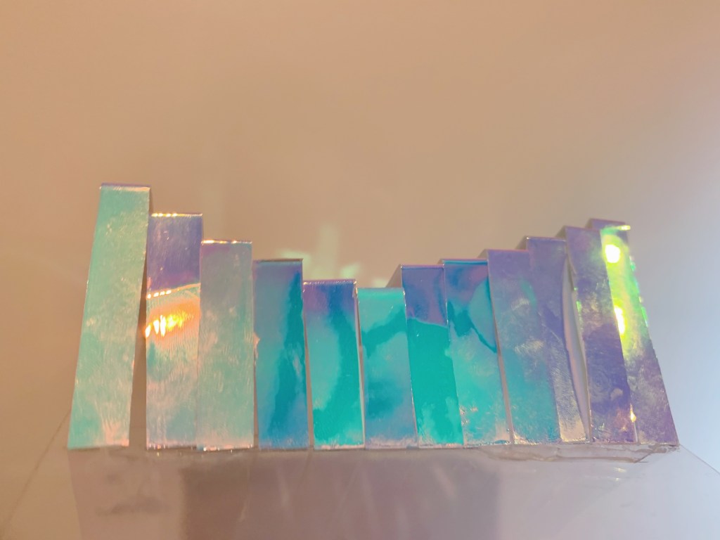
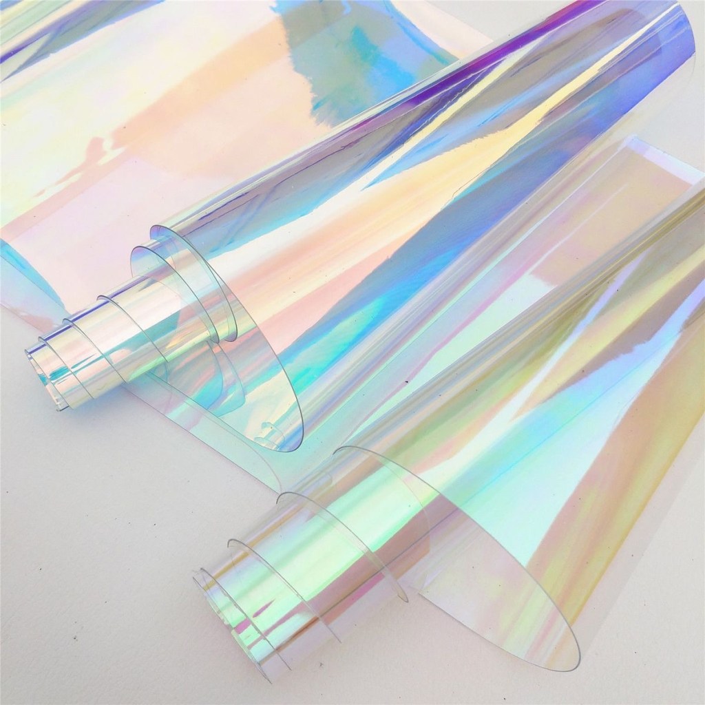
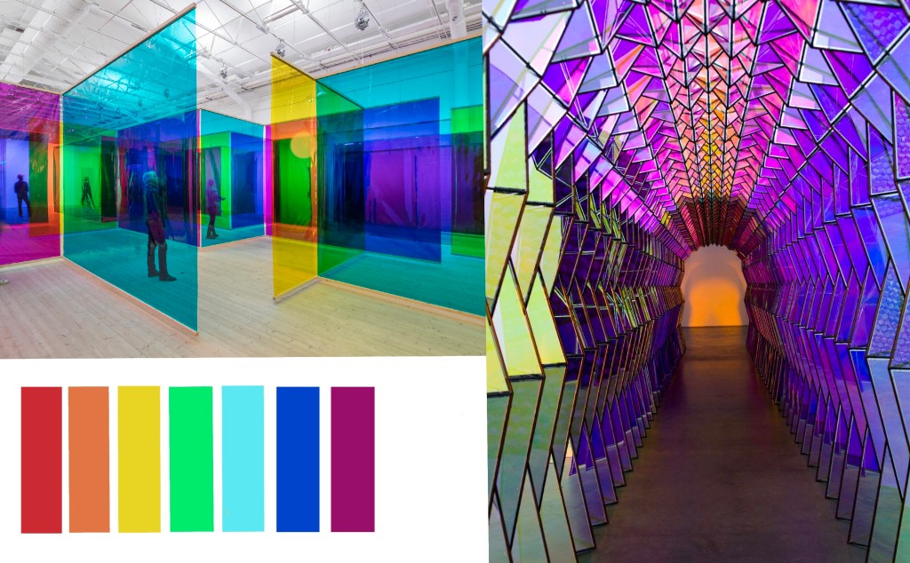
The model was made according to the style of the artist, and the main material used colored cellophane. The main purpose is to experience the changes caused by the superposition of different colors. The spatial change and color change of four cubes with different colors through different angles. This model successfully brought color into the room and observed the color and shape of the shadow.
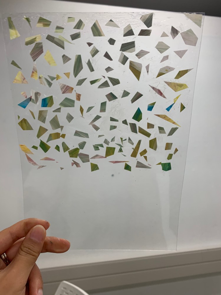
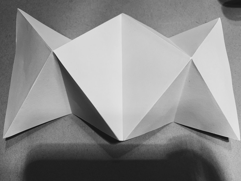
Third Model
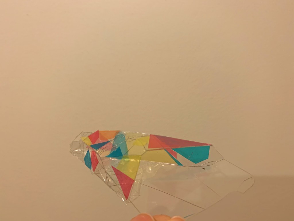
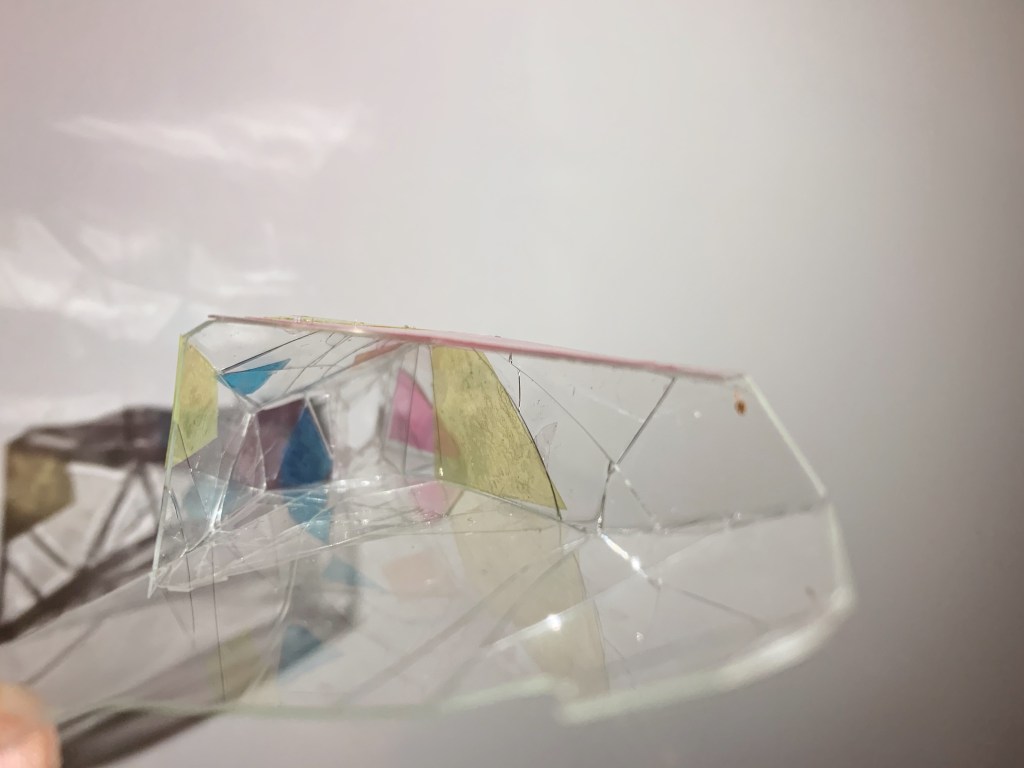
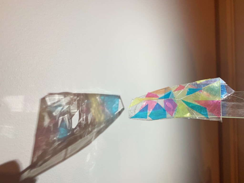
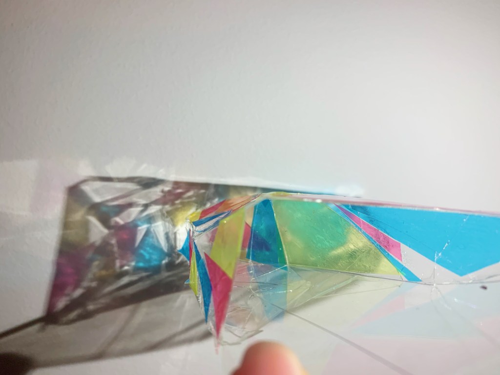
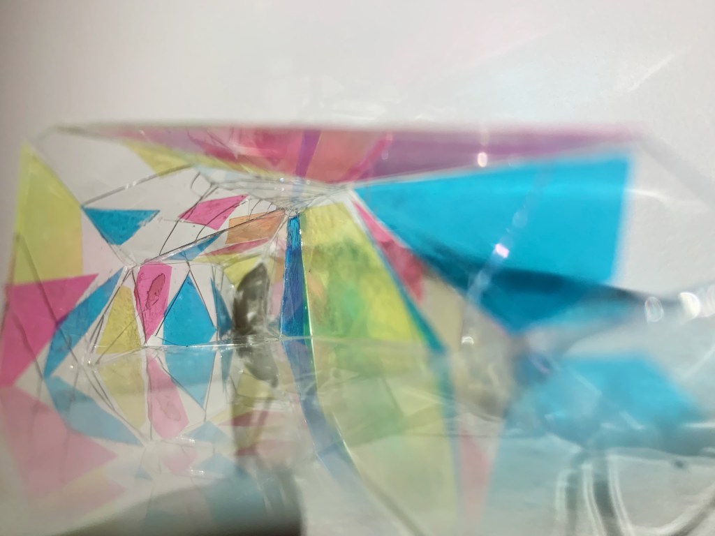
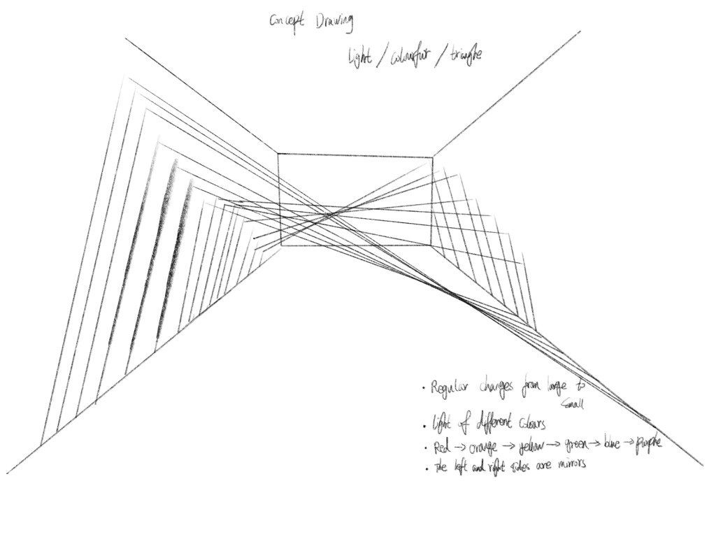
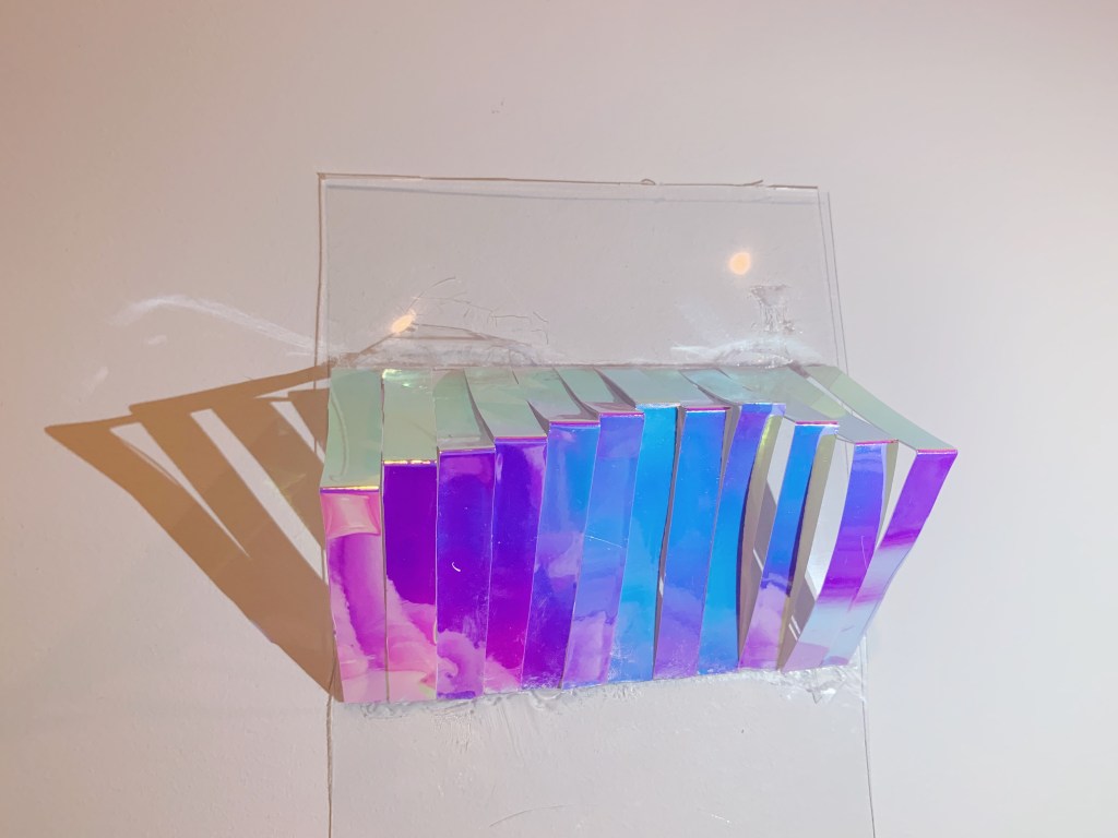
Through the development of the artist’s style, the main materials used glass and colored cellophane, the main purpose is to bring color into the interior space and develop the interior space to the extreme. The space of the model changes gradually from large to small, and the change in the sense of space can be felt from the entrance. It mainly uses geometric mosaics of different sizes and shapes, and the color matching is also irregular. The overall model and shadow can make people feel dreamy.
Week 5- Slow Surface 1
Groups Chosen Surfaces (Group 11)
Summer Zhai 
Tiffany 
Chenyi Zhang 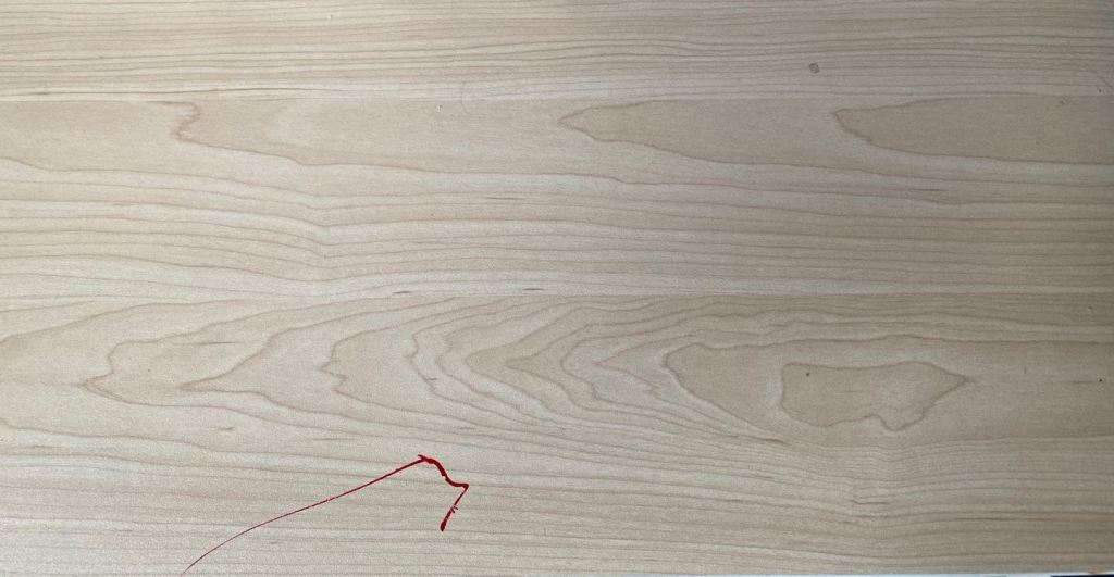
Jieying Xu
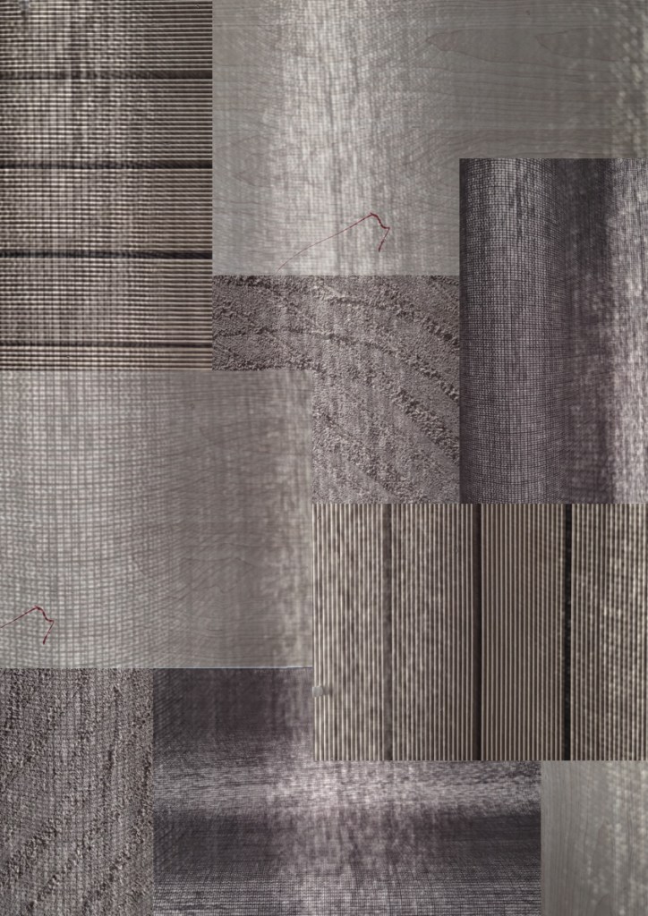
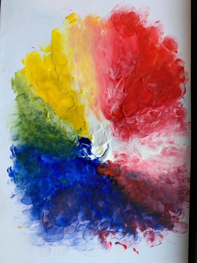
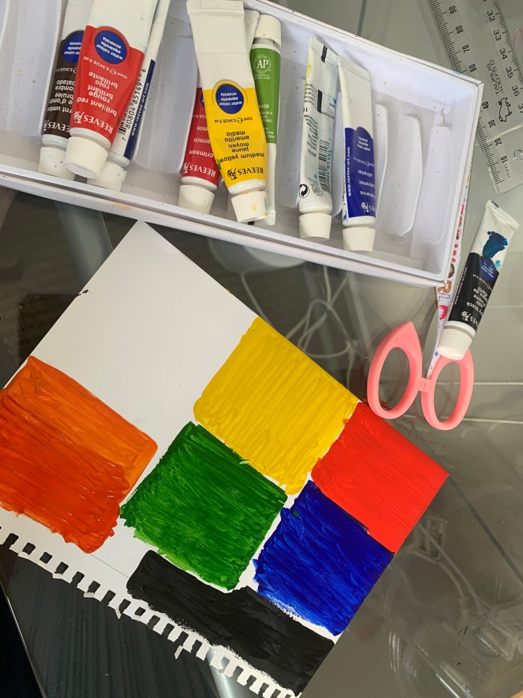
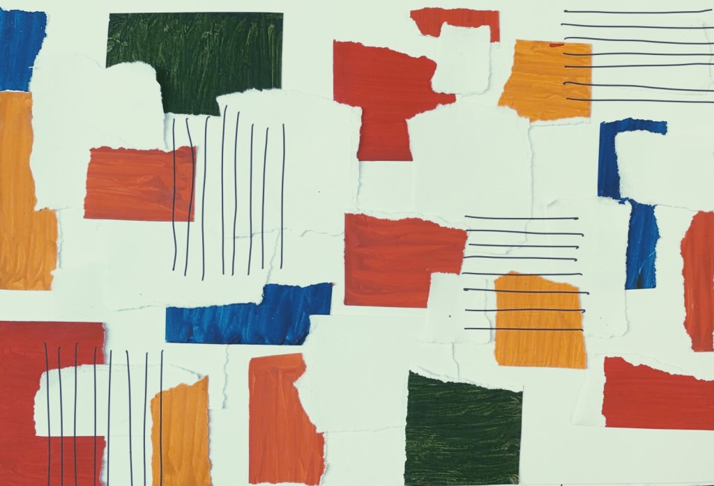
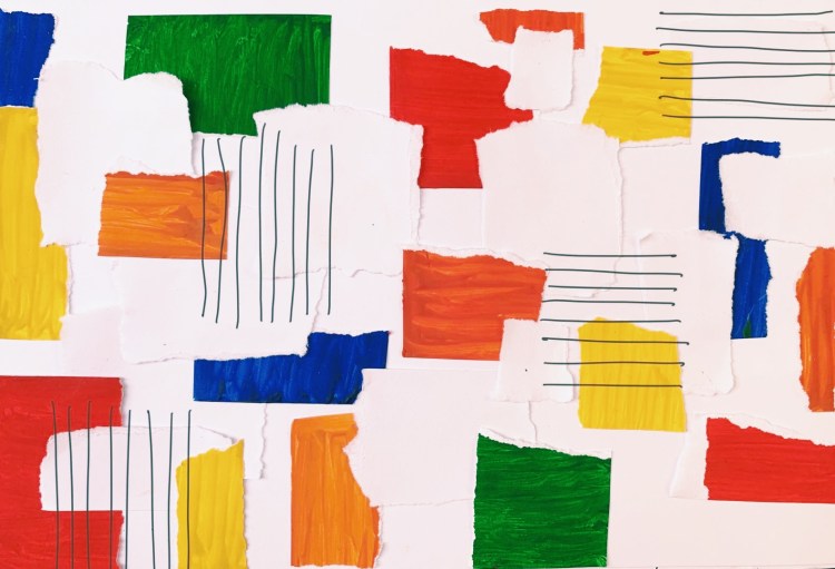
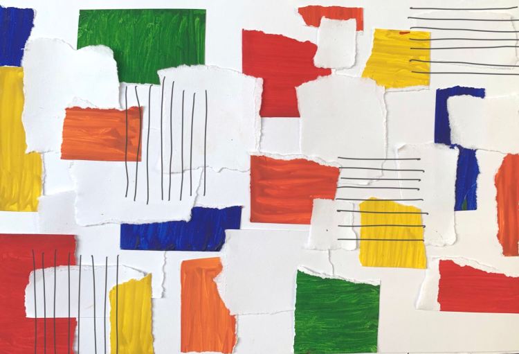
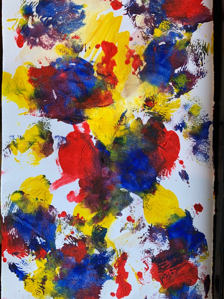
These are some manuscripts. At first I didn’t know how to design my surface, so I tried to draw some manuscripts with three-primary colour (red, yellow, blue) for inspiration.
Surface Design
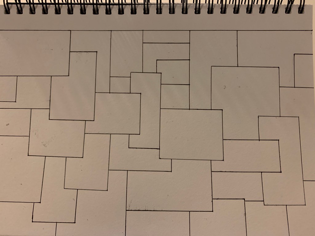
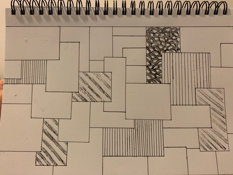
The inspiration for this surface comes from the surface collage of our group but I incorporated other patterns to develop. I use rectangles and squares of different sizes to splice and draw different patterns in the area. Part of these patterns come from the surface of our group and part of them come from some surface patterns that I often see.
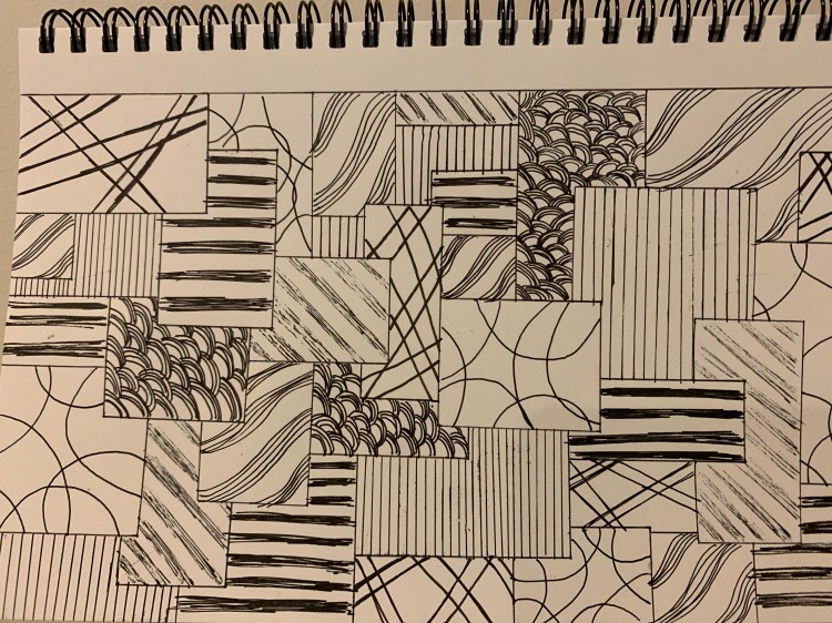
I think the previous surface design is a bit too complicated, so for this one I selected two elements that I think are important and added colours to compare.
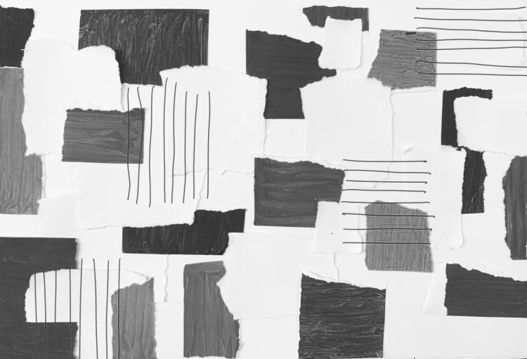
Different colours presented in different shades.
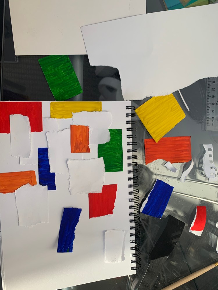
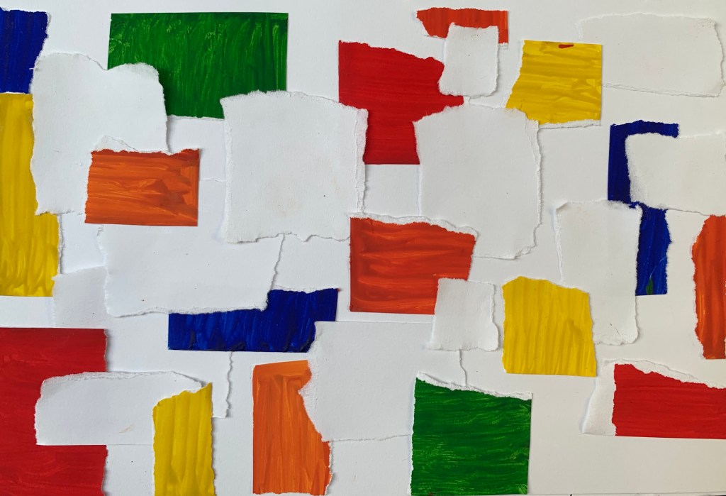
Continue to develop through the second surface, the surface materials used colours, white paper, pen. I tried to express it by stitching and the details of each piece are unique also each piece of paper is torn off. I kept the edges and corners so every details are different. The line comes from the surface I am looking for, the colours comes from the artist I choose.

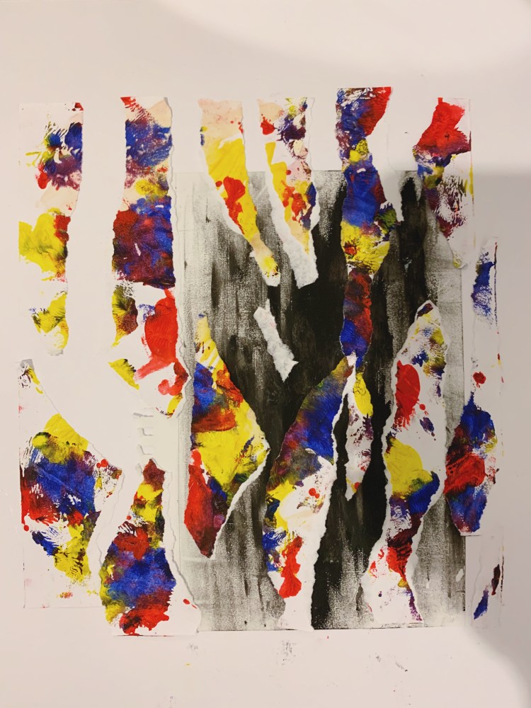
The design concept of this surface comes from the three primary colours. I chose black as the background at the bottom, because I think black is different from all colours. For the design of the upper layer, I used a stitching design, torn up a complete picture and then stitched together and preserved the details of the edges.
I used PVC colour cardboard as the material splicing design. The superposition of different colours will produce different colours, some of which are deep and light. I think this is the charm of stitching, so I will continue to use it in my design.
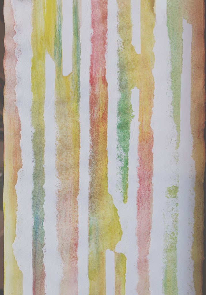
This was developed through the fifth surface. I incorporated the feeling of water-soluble pigments into the outermost layer. Because the outermost edge of the watercolor has a very obvious edge line from the inside to the outside, this texture is very similar to the texture on the desktop. Also, put the pictures in different tones for comparison
Week 6 – Slow Surface II


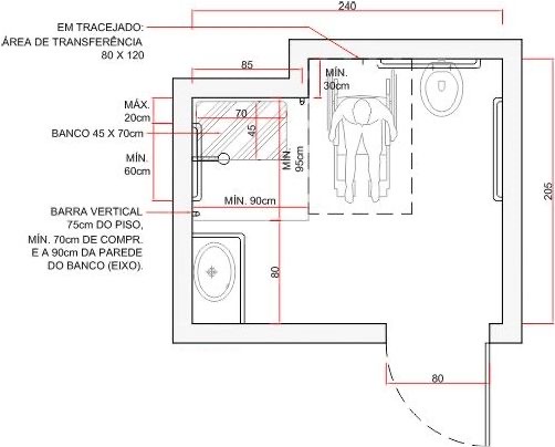
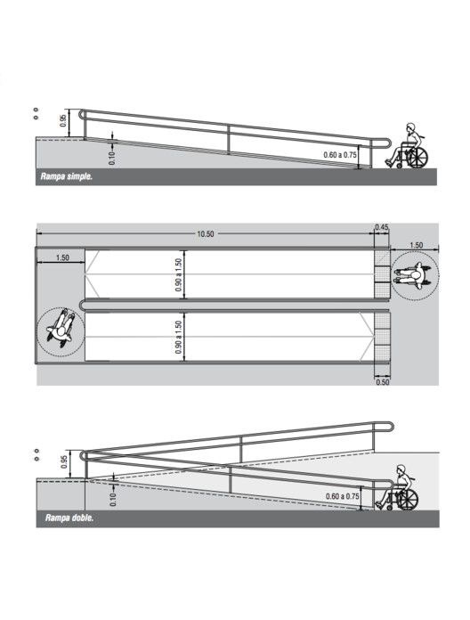
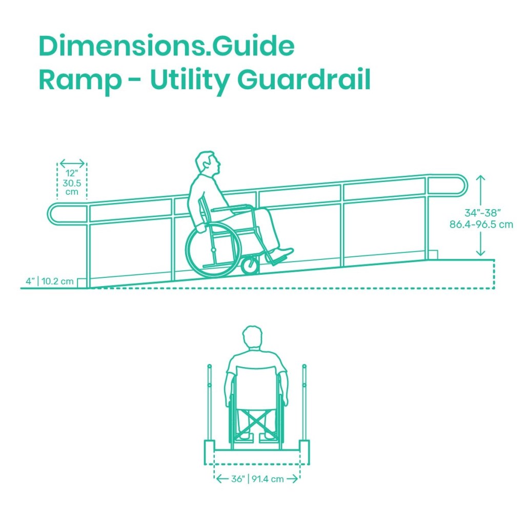
Regulations
Toilets
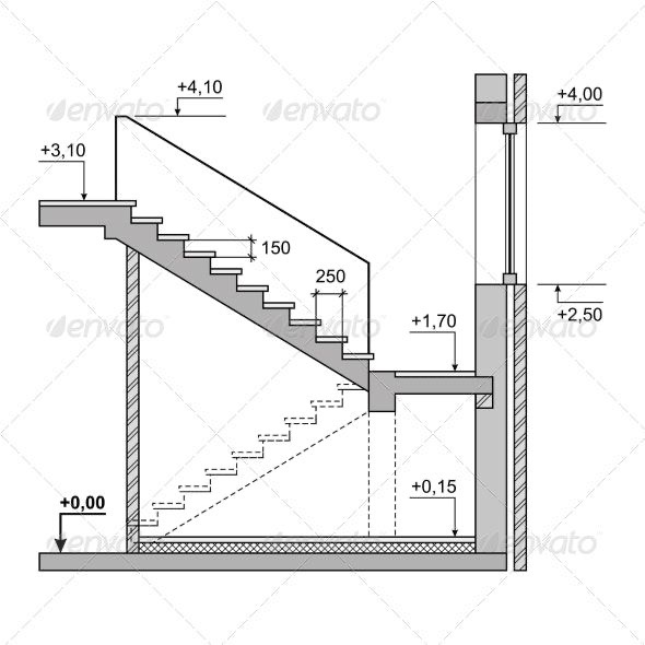
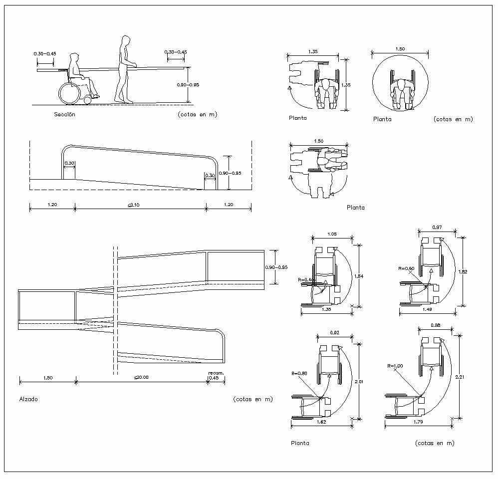
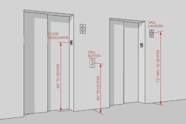
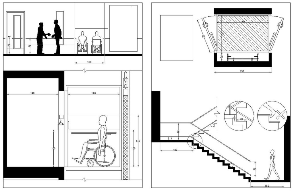
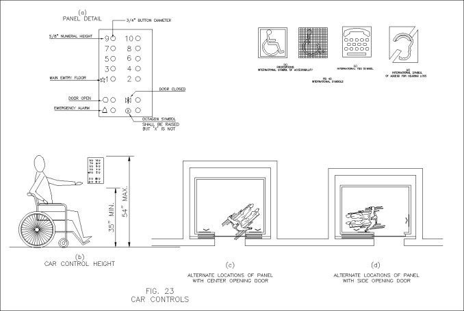
Elevators and Stairs
Week 7-Threshold Moment
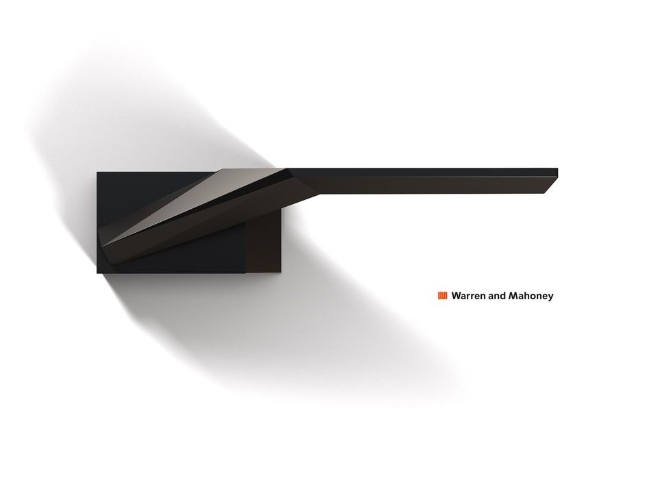
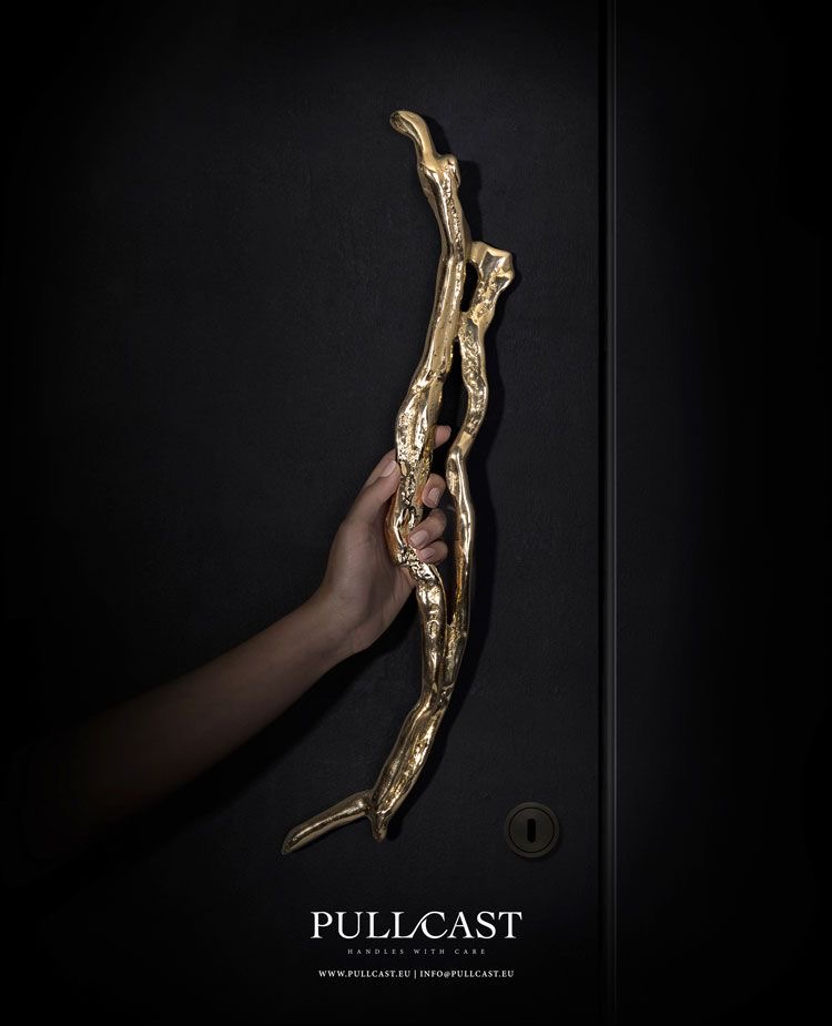
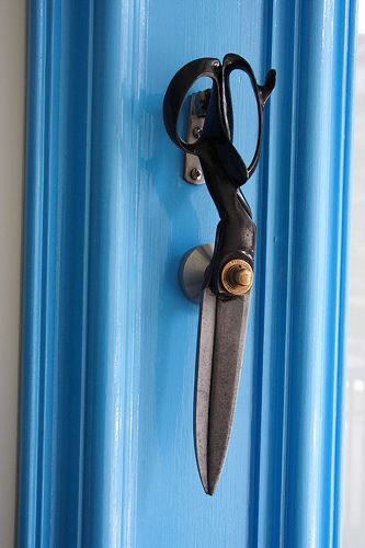
Door Handles Research
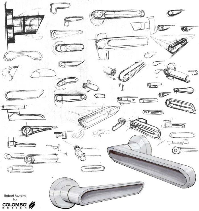
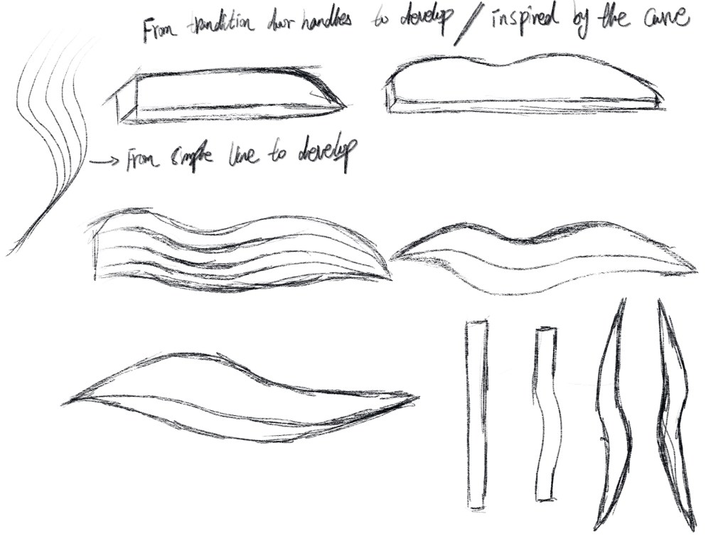
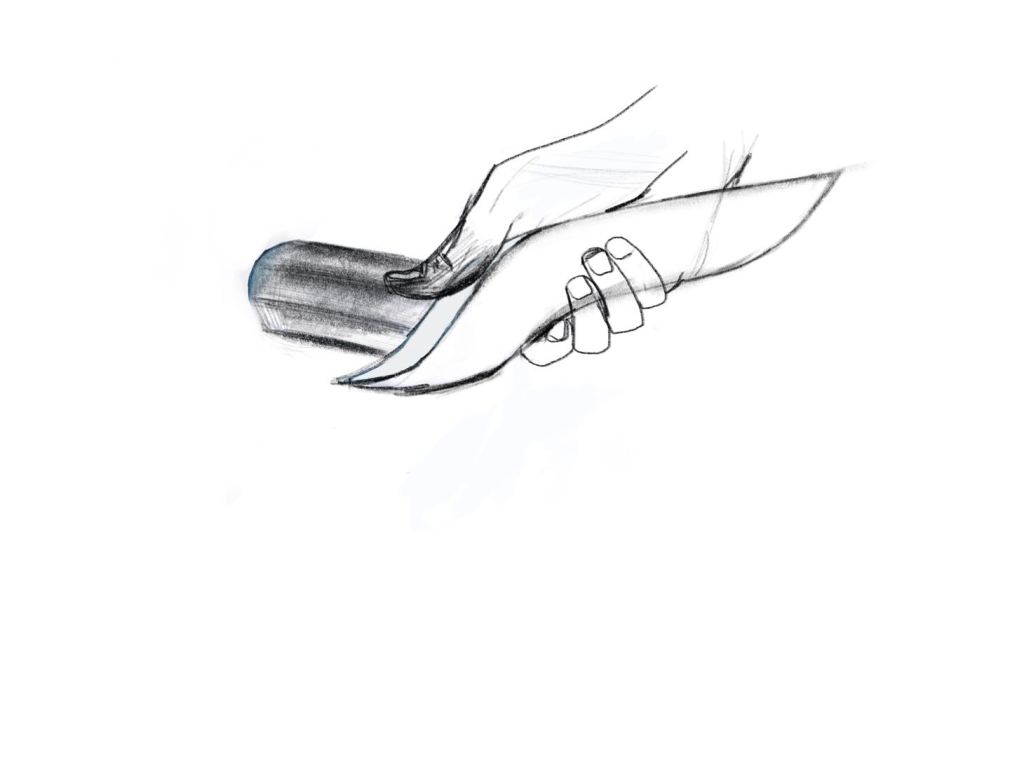
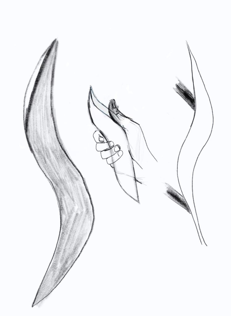
The inspiration is came from simple curves, this draft has shown the development of my ideas and inspiration. The design of door handle is to fit the shape of palm, flexible combined with palm line. The thickness of the door handle can ensure that the user feel comfortable when opening the door and will make sure the door handle won’t slide. The design that use thumb to pull outward as supporting point, will increase the comforts.
Final door handles design
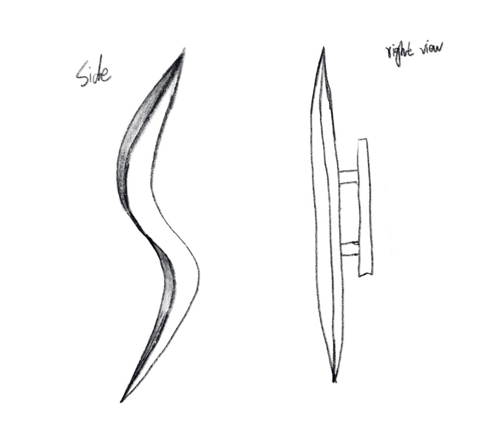
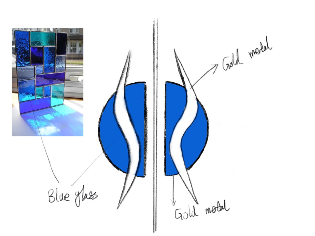
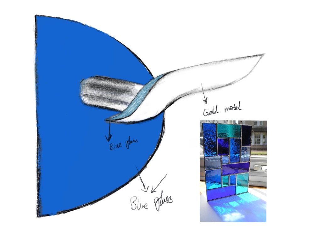
I used light blue glasses and metal as materials. Firstly, the bottom of the door handle is a semicircle design, the inspiration is came from the last surface. Among them, there is the feeling of ink dripping gradually spreads from deep to shallow. Therefore, in used two semi-circle to design a whole circle. I used light blue glasses materials semi-circle at the bottom, to match with the overall tone color of the interior. The door handle used metal materials. Gold metal makes people feel comfortable visually. Warm-toned is a better choice in winter.


Week 8– Starting Intervention
Mapping Exercises
What can be used going forward > what the intervention is your designing > who the user/viewer/ occupant is? How will they use the space? What will they need? What will they experience? – you may have to make more than one map.
What is next?
- Plan, Section, and Perspective view.
- The space for public.
- Confirm accessible elevators and toilets.
- Confirm materials and test all materials.
- Building all space with Rhino.
- Confirm light.
- Site map.
Design Pitch
My artist is Olafur Eliasson, he works in a space research laboratory and he is involved in many public space projects. What’s more interesting is that many of his works are related to nature and use colour. From his works, I can clearly feel the change of light, shadow and colour.What attracted me most was his use of all colours and very attractiveness. When I visited the theatre, I noticed that the overall tone of the interior is very bright, So I think his work can give me some inspiration.
I designed this space as a public space. The main purpose is to create a dreamy and happy space. Let all people who passing by or resting here can feel happiness, relax and dreamy feeling. In this fast-paced era we have all kinds of pressure but also have our own dreams. The purpose of my design is that you can dream freely in this colorful space, without the pressure of reality, without considering the real world, and without hard work. Briefly get rid of the pressure of reality.
I will use color glass as main materials, because the glass itself and the shadow of glass will give people an unrealistic feeling, the light and shadow it refracts are unreal and dazzling. I will use different color glass and the superposition of color from different angles will create new colors and every angle and shadow will be different.
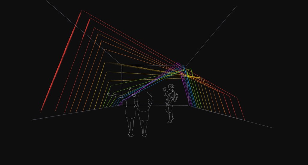
Light research
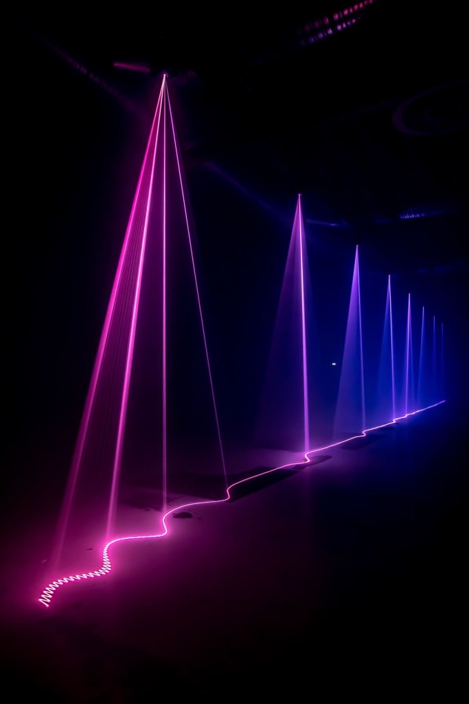
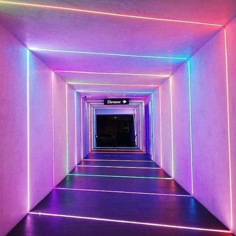
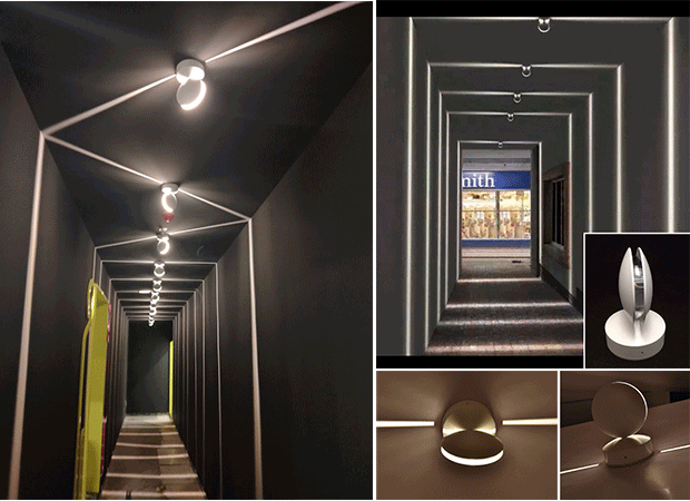
The lights can attract attention and sight. At the entrance, I will design colorful lights to attract visitors. The above pictures show the design effect of lighting. I will design it as a triangle, which will be consistent with the theme of my interior.
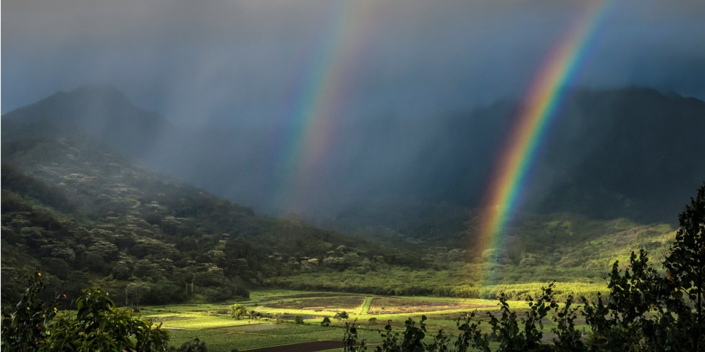
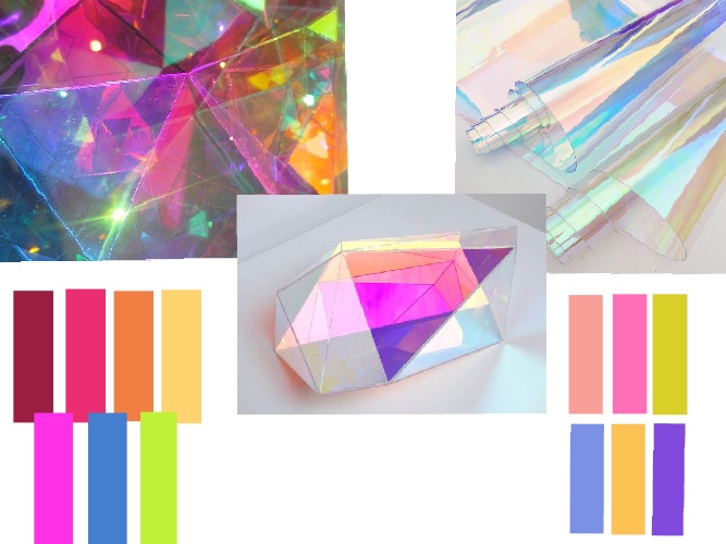
Colour Research
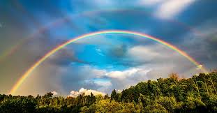
A rainbow is a meteorological phenomenon that is caused by reflection, refraction and dispersion of light in water droplets resulting in a spectrum of light appearing in the sky. It takes the form of a multicoloured circular arc. Rainbows caused by sunlight always appear in the section of sky directly opposite the sun.
Rainbows can be full circles. However, the observer normally sees only an arc formed by illuminated droplets above the ground, and centered on a line from the sun to the observer’s eye.
In a primary rainbow, the arc shows red on the outer part and violet on the inner side. This rainbow is caused by light being refracted when entering a droplet of water, then reflected inside on the back of the droplet and refracted again when leaving it.
Rainbows span a continuous spectrum of colours. Any distinct bands perceived are an artefact of human colour vision, and no banding of any type is seen in a black-and-white photo of a rainbow, only a smooth gradation of intensity to a maximum, then fading towards the other side. For colours seen by the human eye, the most commonly cited and remembered sequence is Newton’s sevenfold red, orange, yellow, green, blue, indigo and violet, remembered by the mnemonicRichard Of York Gave Battle In Vain

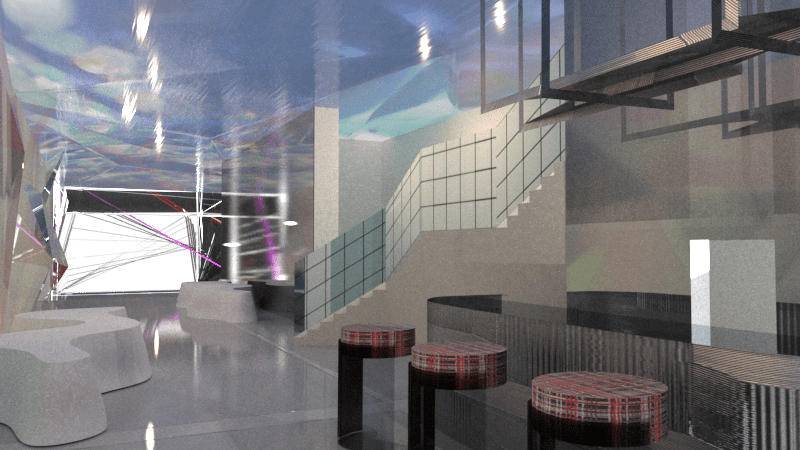
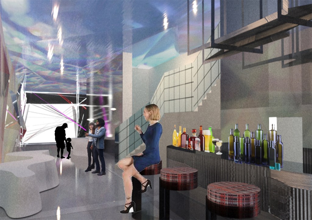
Coffee counter Research
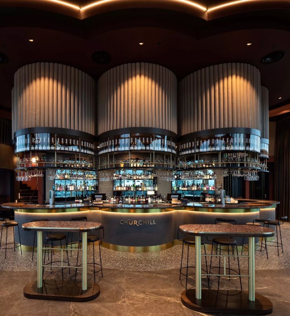
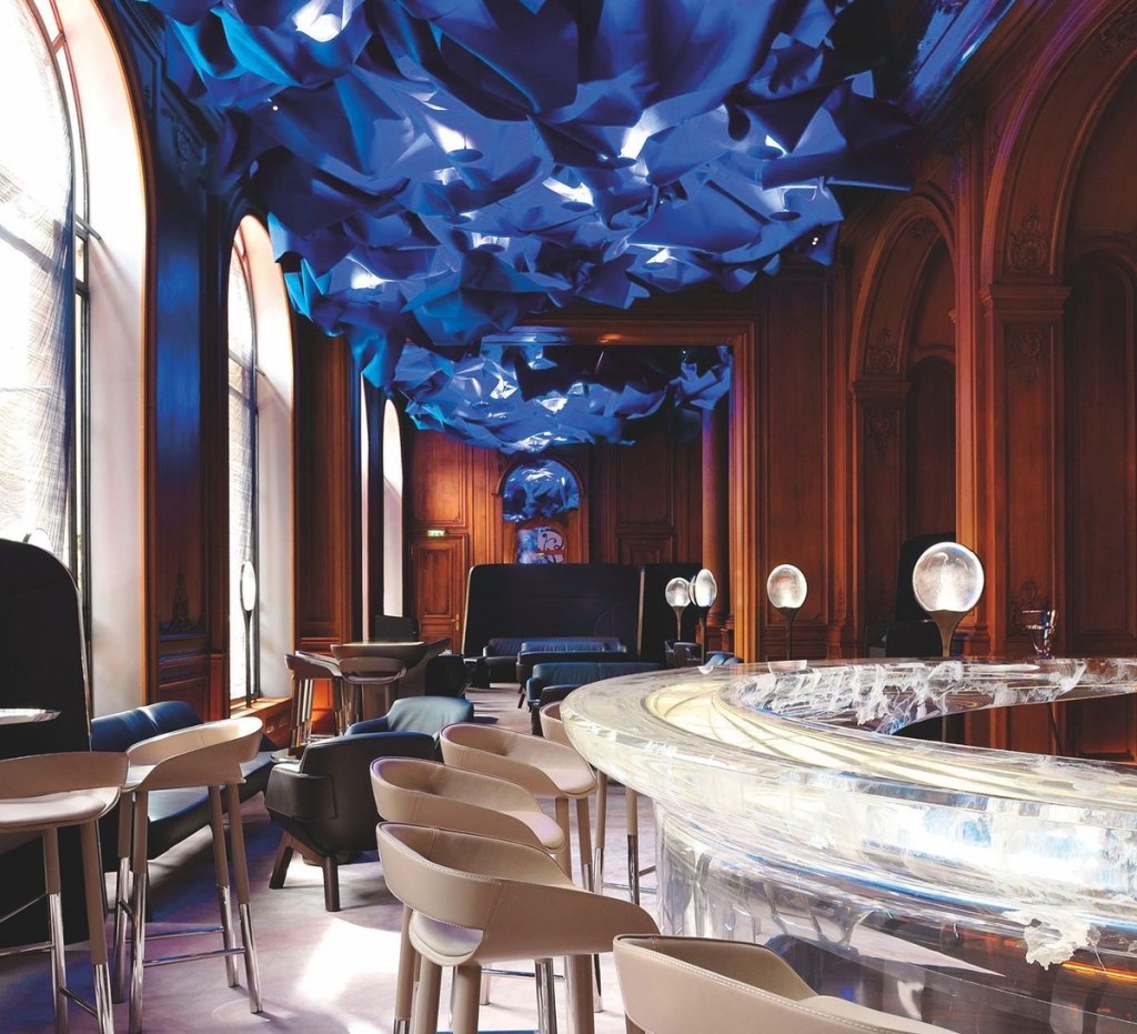
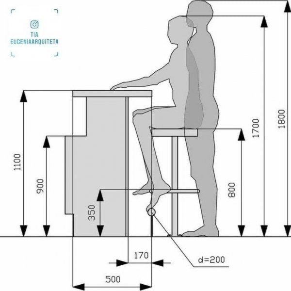
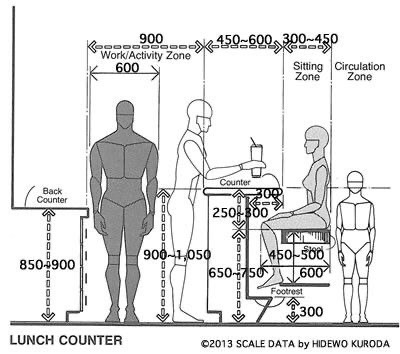
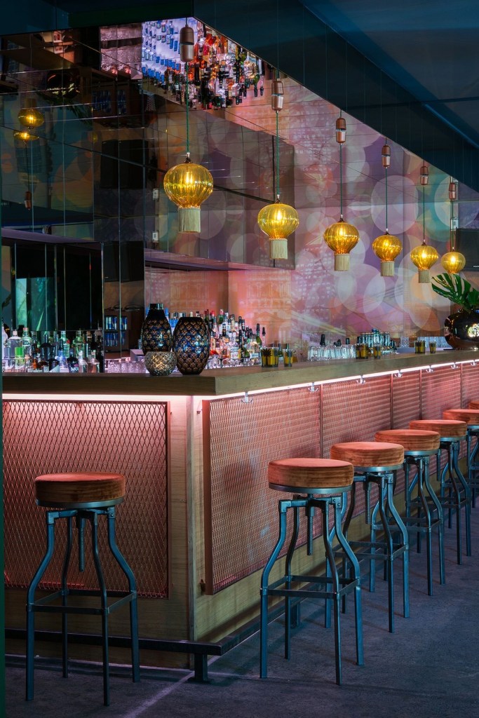
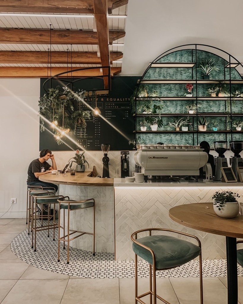
The bar can provide visitors with wine, beverages, coffee and other drinks. It is also a service desk, providing services and information consultation for visitors
Model Making
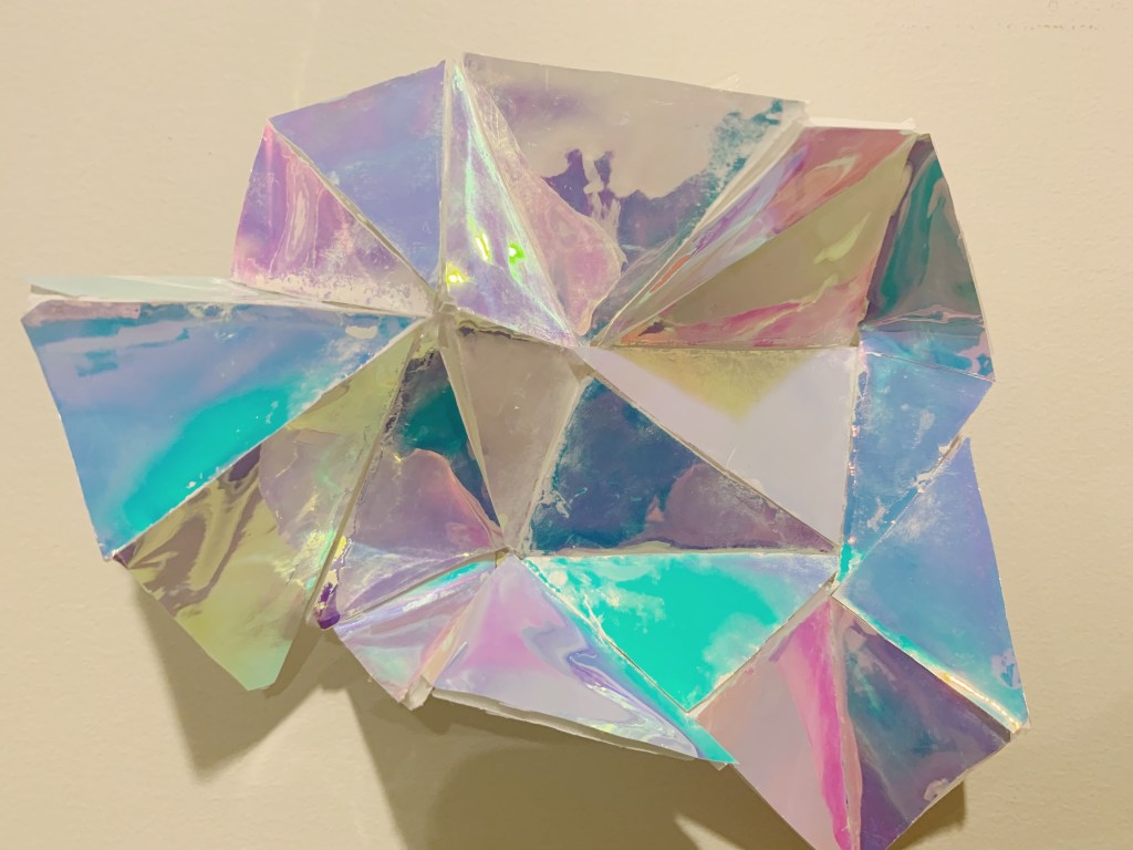
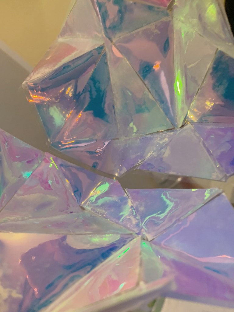
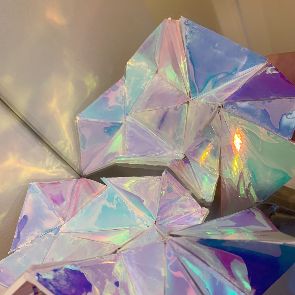
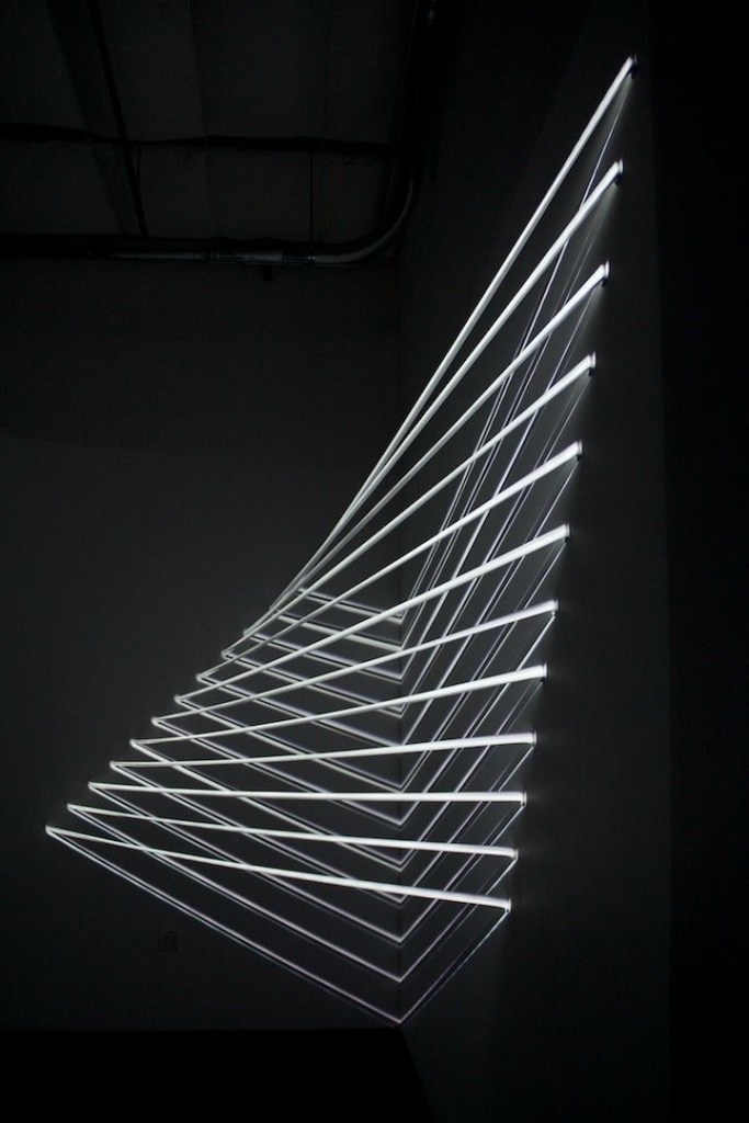
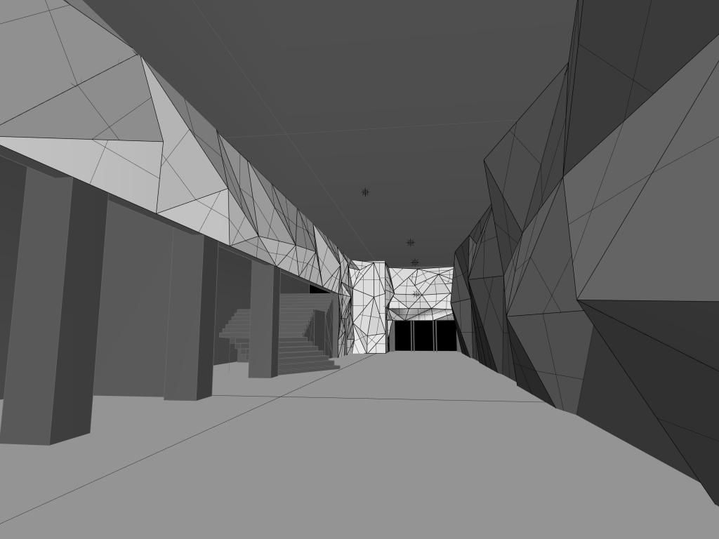
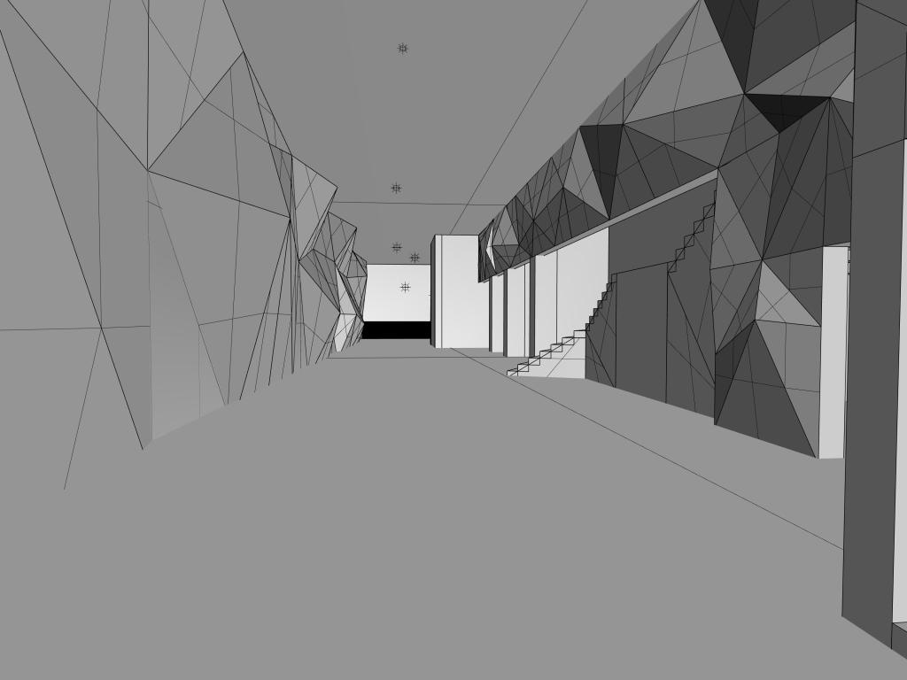
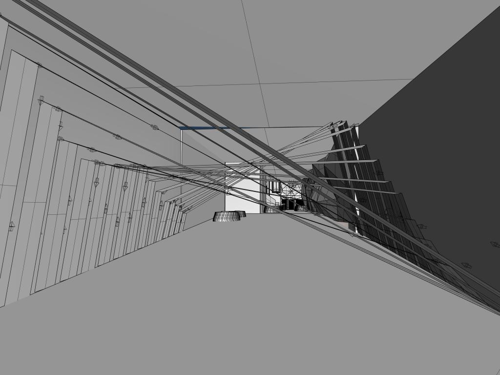
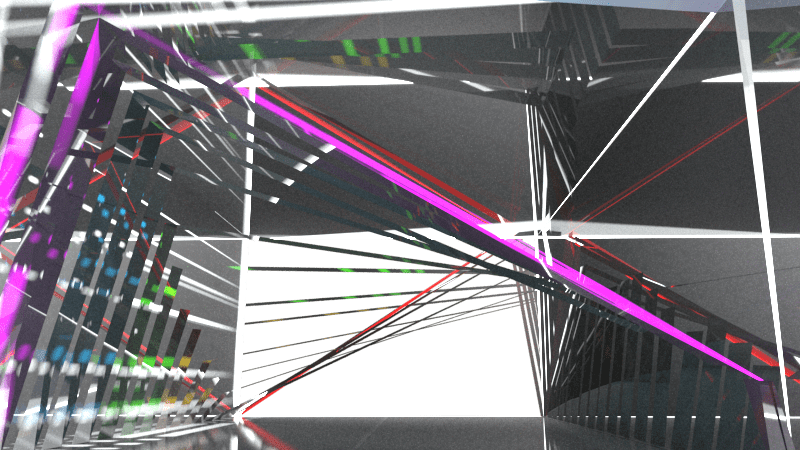
This is the first model. I used laser paper and waste cardboard as materials. I cut the discarded cardboard into triangles of different sizes, and then attached laser paper to these cut triangles and spliced them. Because when I use rhino to start rendering, I found that the material can not render the effect that I wanted. Therefore I made the model, the right side of my design is stitching by different sizes triangles which give the space a sense of hierarchy Mirrors are used on the left wall and roof. Through the refraction of light, the light of the laser glass on the left wall is reflected to the other wall. This will make the entire interior space more spacious in terms of visual effects. However, I explained this idea in the second and third pictures. When I put the model in front of the mirror and can obviously feel the effect after reflection. Althought there were some difficulties while I modeling, it is really not easy to splice different triangles from different angles, however the effect were great success.
This model was made to express the direction of the light at the entrance and the sense of space that can be shown. The lights will be presented as triangles. Gradually change from large to small and then gradually increase. Viewed from the entrance is very deep and spacious. The purpose is to attract people’s attention, and shining things often catch people’s attention. Attract people into the room through the lights and feel the charm of the room. The walls and roof on both sides still use mirrors. Because I have experienced this transformation, people passing by will be attracted, and stop to watch the camera. I think this is a good idea to attract people to approach the room.
Week-10 First model making
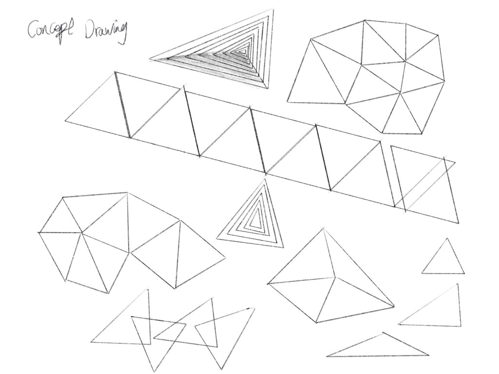
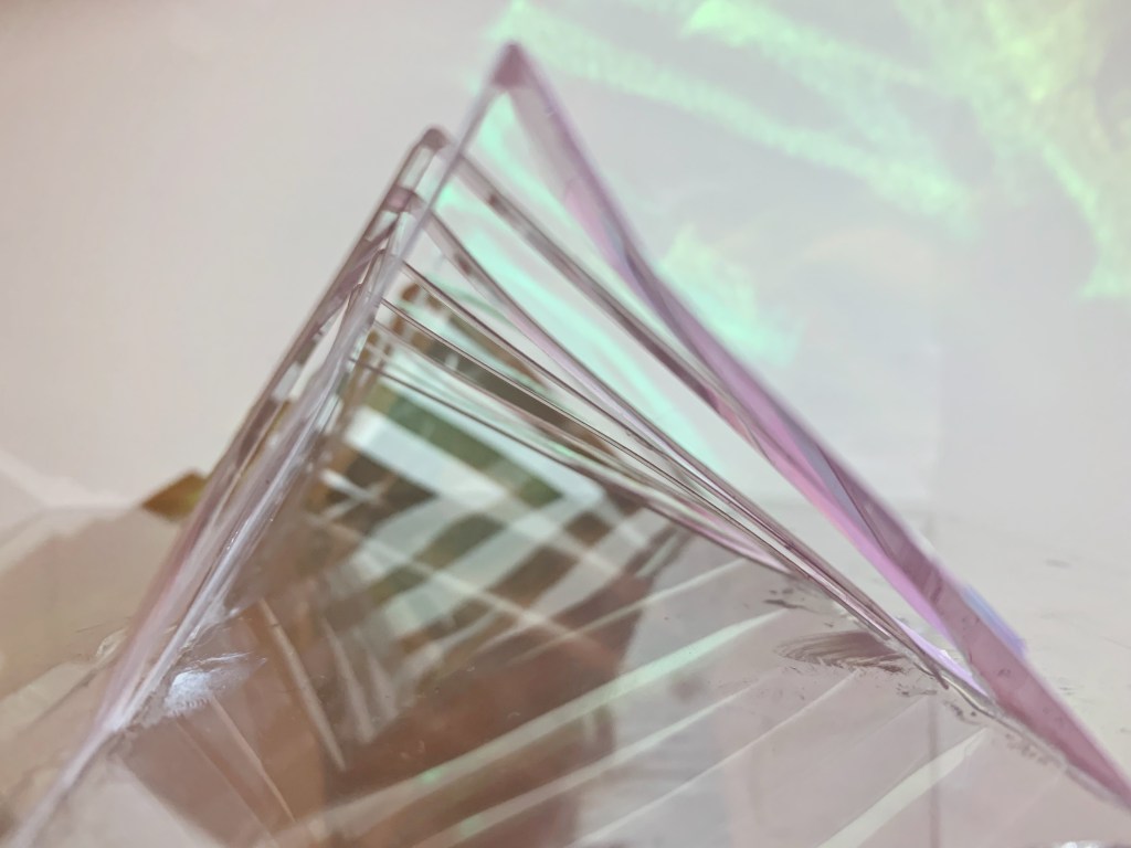
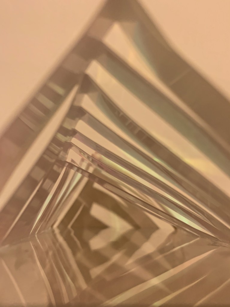
Use triangles to try to conceive my work. The origin of the triangle understanding is obtained from the works of the artist. Then continue to develop the triangle. Because in all structures, the triangle is the most stable.
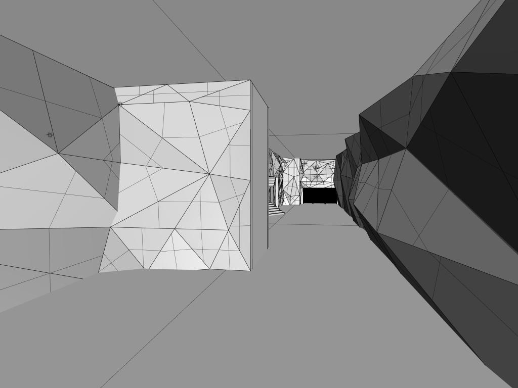
This is the initial model, the process of making the model is not easy, because I need to grasp the angle and direction of each triangle. I used same elements on both sides in this model. However, i found that the indoor becomes crowded after rendered and using the same elements will make the whole space very monotonous. There is nothing that catches the eye. And I even had a big challenge that there are no material that i want in rhino. This will cause the model can not express my thought. Therefore i try to develop this model deeper and deeper. It may be better to try to express the same element in different ways. During the conversation with Kaylee, I got some suggestions. She thought I should try more materials, and the overall style is too similar to my artist. Therefore I will try to do more tests and research to find the most suitable materials and express in different ways.
Reaction in different colour systems
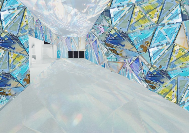
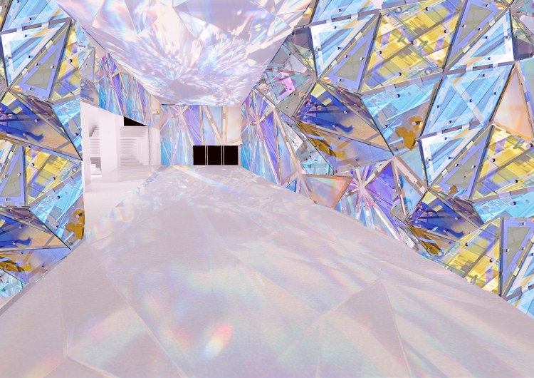
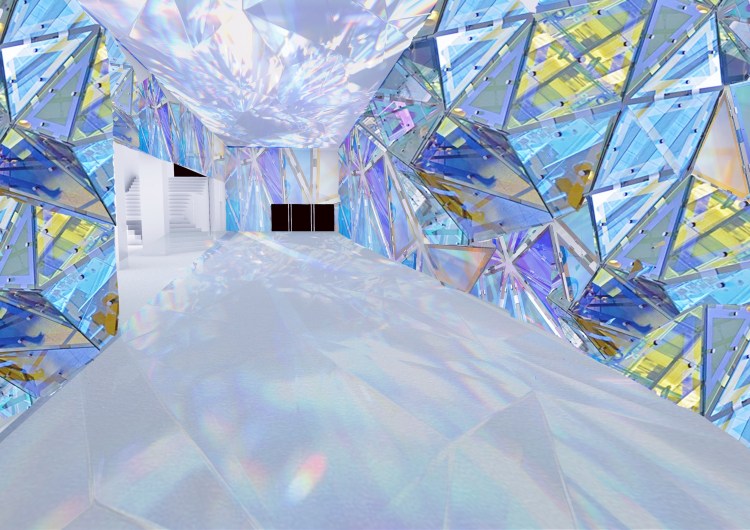
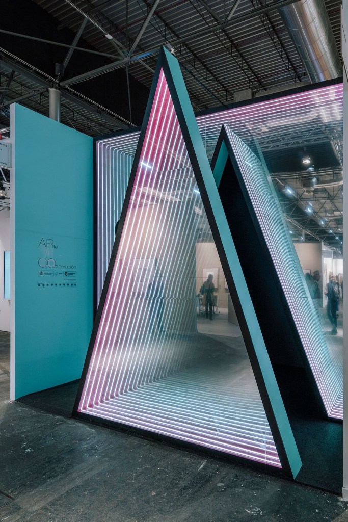
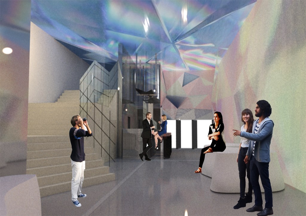
This is a dreamy space where people can walk and take pictures freely, sit and rest at will, etc. I tried to create an atmosphere of this space through the refraction of light. Create a strong spatial-visual effect through the join triangle of different sizes, and make the space atmosphere more romantic and more dreamy through the light of laser glass. For the roof material, I use a mirror to create a strong sense of space through the refraction of light and the reflection of the mirror surface. I used a simple white concrete floor, which allows light to be projected on the ground. And you can clearly see the changes in time. The color of the lamp will change regularly. It changes every ten minutes. Different colors of light will produce different visual effects.
Materials
Colour Palette
Final model making
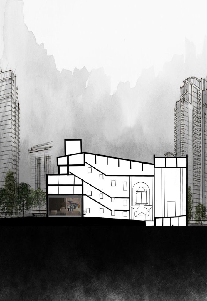
Abstract
In this project, we are asked to re-design the foyer space of St James building.I start thinking according to the artist model, most of Olafur Eliasson’s works are about nature. And the colors he uses are very bright, energetic and balanced, very in line with this theme. Because of the COVID-19, I want to bring real-life feelings into my design. This project I want to convey a space about dreams. In real life, people are always affected by various things, such as environment, social, things, etc. In this fast-paced era, we need a space to freely release pressure. However, this project I want to show a dream world, like a house in a fairy tale, shining, dreaming, beautiful and warm. This is an artistic public space where people passing by or visiting can feel relaxed, happy, and happy. No need to think about the real world, temporarily get rid of the pressure of reality and fully enjoy this color space.
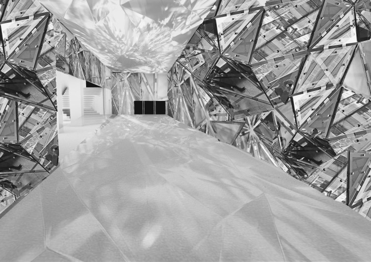
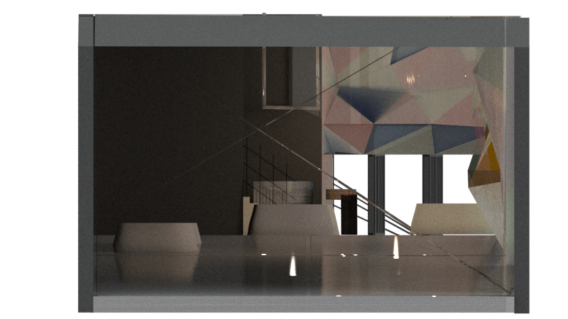
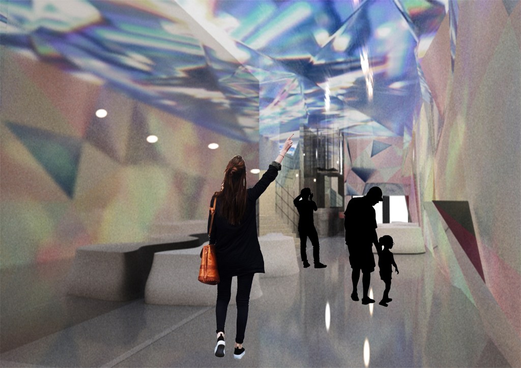
An article on installation art in the course of spatial theory caused me to think. The artist cleverly combines people and space to make both of them merge into one to produce interaction. Therefore at the entrance to Queen St, I used colorful lights to attract people’s attention and guide people to approach the space and feel the dreamy atmosphere. Shiny things tend to attract attention, therefore I used this series of elements throughout the space. In the entire wall on the right side of the internal space, I have used irregular splicing of triangles of different sizes and glass and laser paper as material. The laser paper will emit different light at different angles under the light. Make the whole space full of shining light. The origin of the triangle understanding is obtained from the works of the artist. Then continue to develop the triangle. Because in all structures, the triangle is the most stable. The entire wall and roof on the left are made of mirror. The reflection through the mirror creates an infinite sense of space in a limited space. At the entrance to Lorne St, I designed a coffee bar to provide some convenience or guidance for people in the room. The indoor lighting will also change regularly. Red, orange, yellow, green, blue and purple. These colors are all from nature, developed from the colors of the rainbow.
V -ray rendered image
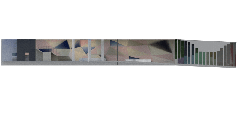
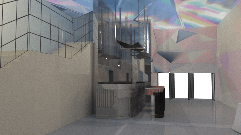
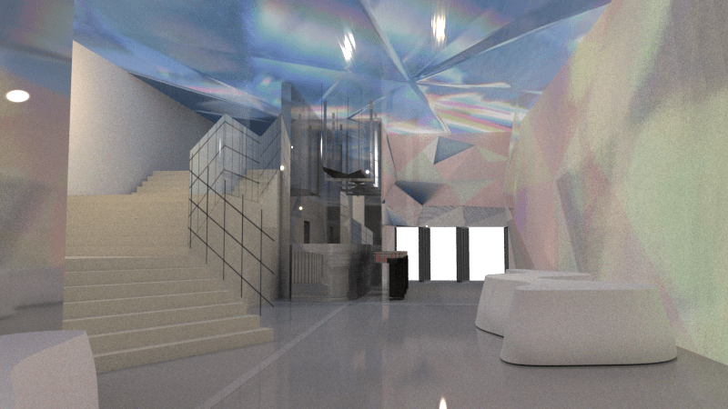
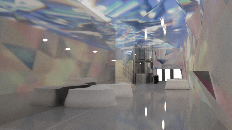
The design on the right side of the wall is a join triangle of different sizes, mainly using laser glass. The design of the left side of the wall and the roof mainly uses mirrors, which can create an infinite sense of space. The colorful shadows can create a dreamy atmosphere, and the reflection of the mirror will make the space deeper. Create an infinite sense of space in a limited space.
The inspiration for the entire design comes from the works of my artist. This is a fast-paced era, we live under various pressures. I hope this space can help people relieve some pressure. This space is much like a glass house in a fairy tale when I was a child. Lights are set at the entrance to attract visitors, the interior space achieves a dreamy visual effect through the reflection of light and the reflection of the mirror. The main purpose is to allow visitors to forget the troubles and pressures in real life after entering this space. This is very similar to an art installation. Nowadays, many exhibitions focus on nature and fantasy. The space is also designed through mirror extension and light reflection. In this supernatural space, people will forget themselves and be silent in this space. Most people take pictures of this moment.
I encountered a lot of problems in the process of rendering, and there is no such material in Rhino. I am trying to solve this problem by other methods
Presentation Audio
https://drive.google.com/file/d/1600Mrjf7b_chjWGe2C_2aCupRzs7GeAp/view?usp=sharing
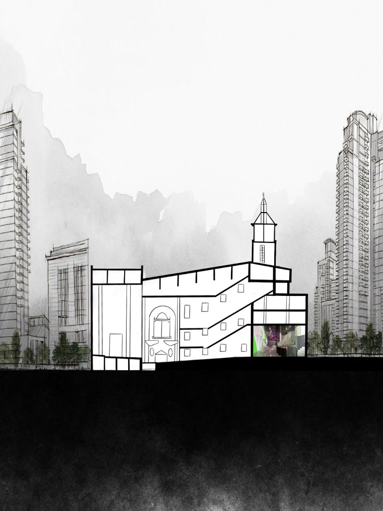
Hand Drawing
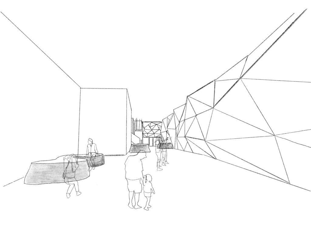
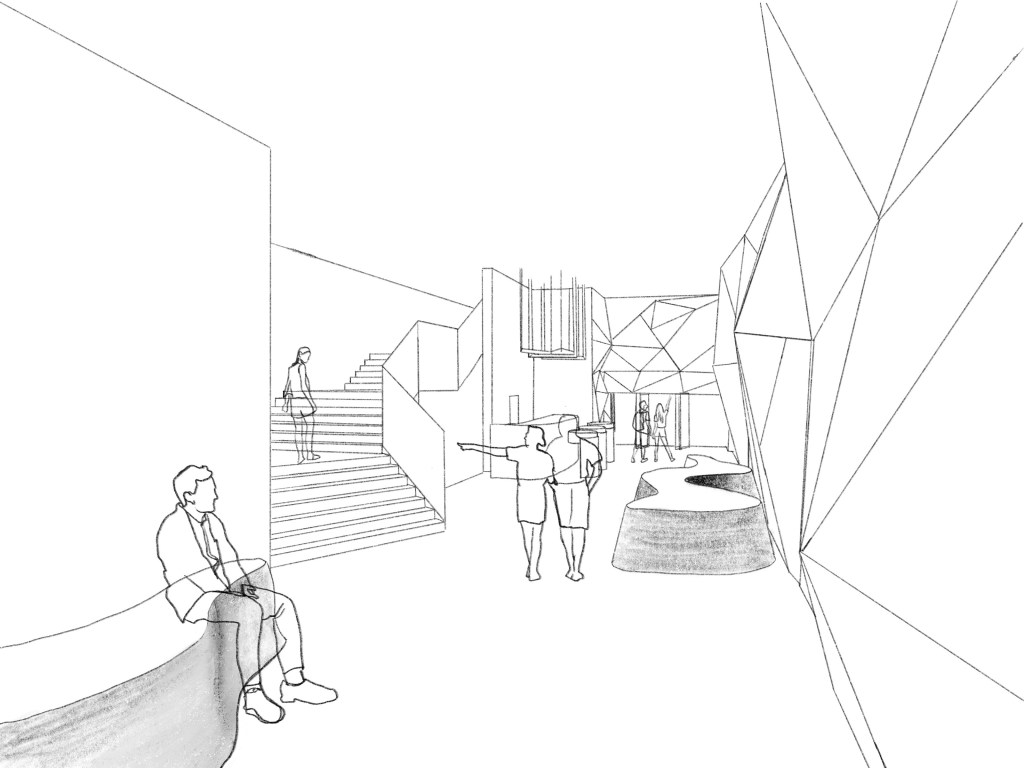
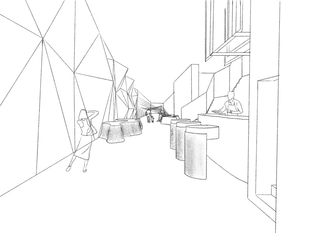
perspective view
Plan and Section